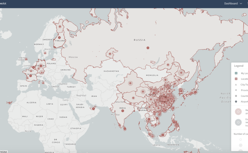
The data that’s being shown in this map are the locations of reported cases of the 2019 coronavirus infection. In addition to marking where cases have been reported, the map also indicates how people have caught the virus. I think the audience of this map are public health officials trying to get a sense of where the epidemic is spreading. If I had to guess, it seems like the goal of this data presentation is twofold. First, by looking at the map, the viewer might be able to get a sense of where the epidemic has spread (or at least where cases have been reported). Second, the map is an interface to find specific outbreaks and learn more about them. When a user clicks on a marker, it brings up a sidebar with details. I think this visualization is effective in the second objective, but not the first. It feels natural to index specific outbreaks of a global epidemic in terms of location. Displaying these geographic units on a map makes navigation easy, especially at different levels of hierarchy (i.e. city, province, and country). That being said, the map is less effective if the goal is to take away high-level conclusions about the epidemic. The map does not display any temporal information, so any notion of “spread” is lost, which is crucial if one wants to contextualize the data on the map. It also doesn’t make clear that these are only reported cases, so the true numbers will certainly be different than those shown here.
Presidential Approval and War
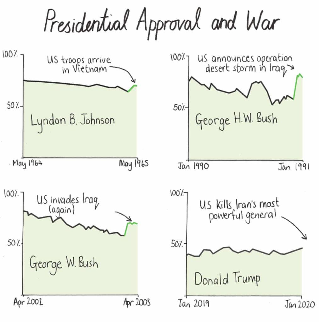
The above graphic includes four, line charts that show U.S. presidential approval ratings during their time in office. The first three charts are of former U.S. Presidents, Johnson, H.W. Bush, and W. Bush. All three charts show a sharp uptick in approval ratings immediately following an act of war between the U.S. and another country. The fourth chart shows the current approval ratings for Donald Trump and the U.S. recent attack Irans highest military official is noted on the x-axis without any data after that moment.
The audience here is anyone concerned with U.S. politics. Given that the article is written for the Guardian, it likely that a liberal person or a moderate conservative would be interested in this information. It’s less likely that this graphic would sway someone who is supportive of this administration and so I would not include them as part of the intended audience.
By juxtaposing information from three similar, historical situations the graphic speculates that the U.S. actions in Iran are motivated by President Trump’s low approval ratings. However, it does not explicitly say this. The graphic serves two purposes: validating the beliefs of someone who is already critical of the current administration and providing food-for-thought for a moderate or independent voter.
I think this method of conveying information is effective because the article does not tell the reader what to think but instead provides a small puzzle for the reader to solve. Solving the puzzle, allows the reader to come to their own conclusion. This is a powerful tool because people are generally more inclined to believe something that they think they came up with themselves — despite the fact that there is only one conclusion that you can arrive at with the information available in the graphic. The current political climate is such that discussions are often heated between opposing viewpoints and little is actually heard. This method of conveying information is less combative and assumes the reader’s intelligence.
Data privacy: Boomers v. Millennials
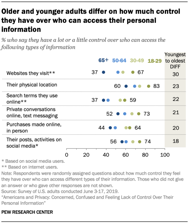
Source: Pew Research Center
This data presentation is about what people belonging to different age groups have to say about how much control they have over who can access their personal information. It has been taken from a survey of US adults conducted by Pew Research Center in 2019.
The wordings used are not too domain specific and are easy to follow. This data presentation is intended for those who are interested to know more about where people stand when it comes to data privacy.
The goal of this presentation is to outline that older and younger people differ when asked about how much control they have over who can access their personal information. The people belonging to 65+ age group feel that they have little control, while people belonging to the 18-29 age group feel relatively more in control.
The choice of using the different data categories on the y-axis makes the graph more readable. The point that the author wants to make is highlighted in the heading, which makes it very clear. The column in the gray which gives the difference between the youngest and the oldest age groups is very instrumental in backing the point made at the top.
The presentation is effective but it can be improved further. Instead of using points, if a multi-category bar chart was used, it would make the graph easier to read. This would also eliminate the need of the column on the right. Additionally, the X-axis scale is a bit confusing. It hasn’t been clearly mentioned if the scale indicates the percentage of people who say or the percentage of people who say they don’t have control over who can access their data.
Homelessness in King County, WA
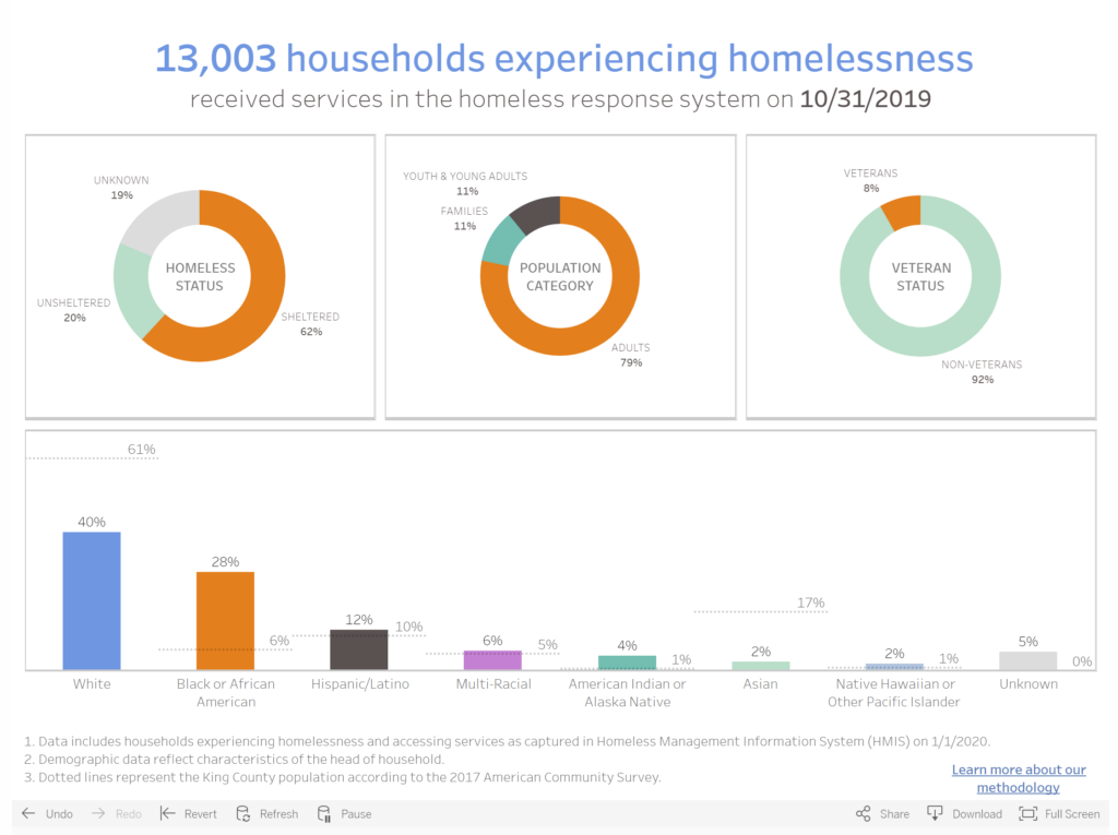
All Home King County is the Seattle/King County Continuum of Care (CoC), which is the designation of local homeless housing task forces across the United States. They are therefore the body that coordinates and implements the regional programs targeting the homeless crisis. The visualization is a part of their online dashboard presenting data that represents the response system implemented in the County.
In this visualization, All Home is sharing demographic information on those who are accessing services as of the end of October of last year. It includes an overall count (13,003 households experiencing homelessness) and then proportions representing their status (sheltered/unsheltered/unknown), their population category (adults/families/youth), their veteran status, and their race/ethnicity vis a vis the general King County Population according to ACS 2017.
The dashboard and the data overall are part of a somewhat recent initiative to try and track more annually granular data on homelessness in the CoC, since federally mandated counts only happen nation-wide once a year. The audience is likely as much for the CoC themselves as it is for a somewhat informed public. In previous years, Seattle/King County had the 3rd largest homeless population in the country, and was under a lot of (reasonable) pressure to show positive results of programs. This dashboard is not only in part about accountability, it is also a means of sharing information and hopefully positive progress on the crisis at hand.
I think that this is a reasonably effective visualization, though I am slightly concerned with data freshness since it says it was last updated in October of last year. Though another tab on the page tracks the count of homeless individuals/households and how it changes over time, it does not show the same demographic breakdowns over time, which I think would be interesting though maybe less compelling.
Ebola vs Other Diseases
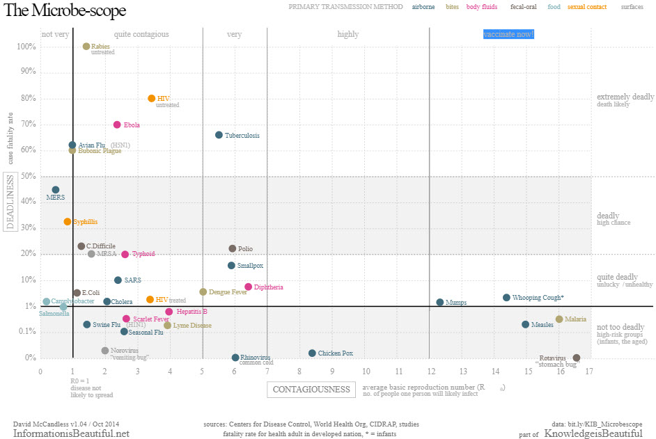
Data: The plot above is visualizing the relative mortality rate and contagiousness (R0) of various diseases by utilizing a simple and familiar scatter plot. Similarly simple, it further educates the public on primary transmission methods via color coding. As a an added aid the scatter plot is further partitioned and labeled into qualitative labels intended to help viewers confirm and internalize their intuition.
Audience: This is clearly intended for the general public. The details of the data have been abstracted down to what is familiar to a non-medical and reasonable educated viewer. If we consider the viewers most likely to view this plot, it is probably someone who is already aware of Ebola’s impact and is investigating further, so the level of detail is just right.
Goals: The image is trying to give the public a general understanding of the risks involved with ebola relative to other diseases with which they are likely more familiar. v
Effectiveness: Its a decently effective visualization overall however it could communicate its message more efficiently. Again, the message is clear and it answers all the question the public is likely to have, but the author could have used a few more visualization techniques to clean up the plot and highlight the most important information.
Note: The category block would not work when posting this so I’m unable to post this as a “viz reviews” category.