Data Story Telling Studio Sketch #3: “Air Filters”

Group: Joshua Feldman, Samra Lakew, Neil PendseAir Quality Dataset: https://aqicn.org/here/

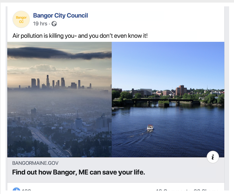
For our sketch, we imagined we were members of GreenPeace trying to develop a campaign to build support for an international air pollution treaty. Our intended audience is under 40 because they will have to live with the effects of poor air quality. This campaign is part of a larger strategy at GreenPeace to engage gen Z in the fight for a greener earth. To generate as much support as possible, we knew our campaign needed to fulfill a few criteria. It had to be:

  1. Understood quickly
  2. Simple for our audience to sign the petition
  3. Shared easily
  4. Engaging


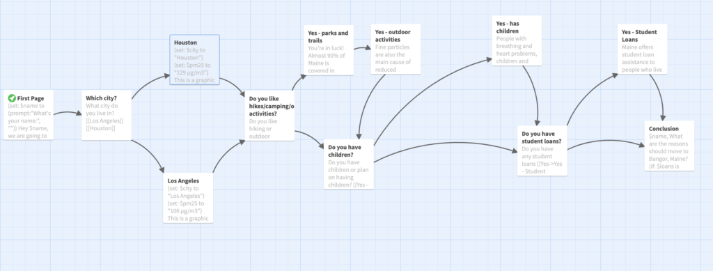
Since our audience was comfortable with social media and video calls, to meet these criteria we designed a series of video filters that can be used on platforms like Snapchat, Zoom, and FaceTime. The filter illustrates the current air quality in a user’s location and has a link to the petition where users can also share the campaign with friends. We show the air quality in two ways. At the top of the screen, we have a bar which fills up as the air pollution gets worse and changes from green to yellow to red. Above the bar, we show the user their current location so they know that this is specific to them.

Additionally, the filters make the pollution in the air visible. As the air pollution in a region gets worse, an increasing number of icons will float around the user and obscure them. We also cover the user with a smog-like haze, which gets thicker and more red when the air is more polluted. 

At the bottom of the screen, we have a button that links to the online petition and users can share the campaign from there. When they sign the petition, they can also sign up for future GreenPeace communications.

When users click on the screen, they can change the icons. When users first turn on the filter, the text “tap on the screen to change the icons” will appear on the screen, so users know about the feature and are immediately pulled into the story.
We also wanted the campaign to be timely. Isolation measures due to the COVID-19 pandemic have improved air quality around the world. Users can see this effect by scrolling back and forwards through time and see how air quality has changed since a shelter-in-place order was put in place in their location.

As the user scrolls back in time, they can see the air quality get worse. There are more icons on the screen and the smog is thicker and more red.

When the user scrolls forward in time, they are able to see the effect of the action they’re taking. Instead of showing a date, we tell the user that this is “tomorrow, if they take action today”. The smog disappears, the PM measure drops down, and the icons change to green jewels.

We feel like this filter meets our 4 original criteria. We hope that users will very quickly be able to see the pollution in the air around them and understand that something needs to be done. To emphasize this point, we tried to communicate the air quality in many different ways: through symbols like the bar, through text, and through video via the filter. 

To make it easy for users to sign the petition, we tried to feature the button prominently and make it link directly to the petition.

We want users to share this campaign broadly. To achieve this goal, we chose a digital medium because sending a link is easier than sharing a physical object.

Finally, to make the campaign engaging, we used a number of techniques to make the user feel part of the story. The video filter literally puts them into data. We also have opportunities for the user to engage with the campaign by tapping to change the icons and scrolling back and forward through time. We also wanted to make a serious topic seem more approachable by taking a more playful approach. We made air pollution seem gross, not dangerous, and the clean air screen looks like the user just won a video game. Hopefully, by seeing themselves in the data story, engaging with the campaign, and feeling like the issue is approachable, users will pay more attention to our message and be more willing to take action.

Buzzy Gardens

by Xio Alvarez, Eileen Hu

Goals

We worked with honeybee colony data and researched the impact of and factors affecting healthy bee populations. This data shows us that there have been some significant decreases in total bee health across the US at various times over the past years and that some factors, such as colony collapse disorder are not very well understood. We also saw that different states have different honeybee stories, since each state will have differing amounts of beekeepers, honeybee colonies, different climates, and different histories of beekeeping. While environmental factors affecting bees are not completely understood, there are many clear actions we can take to help honeybees and wild bees, including planting bee-friendly plants in home gardens, avoiding chemical pesticides, and supporting legislation that protects the environment.

Game Overview

We decided to create a game that would be distributed by a national bee advocacy group as a thank you for donating and aimed at getting home gardeners engaged in the topic. We took on the persona of the Bee Informed Partnership, a real organization that works with beekeepers and provides educational resources and information to the public.

Data

We took a quick look at the raw honeybee colony data from the USDA Agricultural Statistics Datasets and saw a lot of variation in the amount of bee colonies per state over the past years, including significant decreases. Further research told us that honeybee and wild bee health is a real environmental problem. We ultimately decided to use our research to inform the game design and goals rather than being the content of the game.

Game Design

The basic gameplay involves building a “landscape” by setting down flower cards and beehive tokens according to rules that convey the beneficial interdependence between flower and bees. See the gameplay pdf attached to the end of this post for full details.

Our flower cards have 3 possible point values: 5 points for bee-friendly native plants, 3 points for bee-friendly non-native plants, and 1 point for flowers that do not benefit bees. We decided to make the cards relatively simple with the focus on the flower photo. Each card has a short description, with more details that a home gardener might be interested in included in a mini flower factbook that comes with the game.

Our event cards represent relevant real-life events that could affect bee or flower health.

Example set up scenario

When the game is set up, players are assigned roles. A randomly chosen US state card that determines the starting resources available, with the starting number of beehives proportional to the actual number of beekeepers in each state, and the starting number of flowers proportional to the area of the state. For example, California is one of the biggest states in terms of area and number of beekeepers active in the state, so we gave it larger starting numbers.

Example round

Over the course of the game, players will place down flower cards, beehive tokens, and deal with occasional event cards. Flowers must be placed down no more than 2 spaces away from a beehive, and beehives must be placed near a sufficient amount of bee-friendly plants. The game is played for collective points totaled at the end. These two game design decisions encourage players to work together and emphasize that as citizens who care about the environment, we all need to work together to support bee health. We also decided not to impose boundaries with a physical game board to make the landscape feel more flexible and organic.

In developing this game, we tried to balance conveying our message and making the game fun to play!

Resources

US Bee Colony Statistics: https://data.world/siyeh/us-bee-stats-by-state

Bee Informed Colony Loss Map: https://bip2.beeinformed.org/loss-map/

Environmental impact of honeybees: https://www.npr.org/sections/thesalt/2018/01/27/581007165/honeybees-help-farmers-but-they-dont-help-the-environment

How to help bees: https://www.nrdc.org/stories/buzz-about-colony-collapse-disorder https://www.enr.gov.nt.ca/en/services/insects-and-spiders/bees

Moving to Bangor Maine

Claudia Chen, Ife Ademolu-Odeneye, Devin Zhang

BACKGROUND: For this sketch, we created a targeted Facebook ad with a quiz to convince the user to move to Bangor, Maine. The basis of our sketch was the Air Quality dataset, and our target audience was millennials in polluted cities potentially looking to move somewhere new. We acted as the Bangor City Council, attempting to entice people to move somewhere new.

RESEARCH: For our project, we mainly focused on PM 2.5 air quality data. PM 2.5 is fine particulate matter that is around 2.5 microns in diameter. Because of its small size, it is easily inhaled and can be harmful when someone is exposed to it repeatedly or at high quantities. We researched cities that had good and bad levels of PM 2.5, and we found that Bangor, ME had good levels of PM 2.5 while also having several incentives to try and convince people to live there.

FORMAT: For our audience to reach the quiz, we created a targeted Facebook ad to entice people to click in to the quiz. Because the focus of the quiz was around benefits of living in spaces without heavy air pollution, we made our headline about air pollution. That way, the audience had some idea of what they were clicking in to, without giving the novel information away.

Once the ad is clicked on, the quiz we created would begin. The quiz asks the user questions such as where do you live, do you enjoy outdoor activities, and do you have student loans, to provide results pages with the benefits of Bangor as it relates to both air quality and other factors of living there. This is the outline of where the quiz would go according to the user’s responses:

Below are images of a few of the key question & result pages that appear as the user answers the questions.

With the question-answer format of a quiz, we were able to slowly reveal more information to convince the user to move to Bangor. From the city council perspective, we felt this was much more effective than the traditional methods of providing a list or article of reasons to move to Bangor.

SOURCES:

Air Quality Dataset: https://aqicn.org/here/

Bangor Student Loan Initiative: https://www.cnbc.com/2018/10/15/maine-is-providing-student-debt-relief-to-people-willing-to-work-there.html

Maine forest coverage: https://en.wikipedia.org/wiki/Forest_cover_by_state_and_territory_in_the_United_States

Negative effects of PM: https://www.epa.gov/pm-pollution/particulate-matter-pm-basics#effects

Dangers of PM exposure: https://laqm.defra.gov.uk/public-health/pm25.html

PM effects on children and elderly: https://www.health.ny.gov/environmental/indoors/air/pmq_a.htm

Cars in Space! A Data Game

by Gaurav Patekar, Cynthia Hua

We use the Environmental Protection Agency’s Fuel Economy Data which shows how fuel efficient cars can produce drastically lower CO2 emissions, while also saving the driver money due to reduced gas costs. We wanted to tell this story because changing consumer car purchasing decisions is one of the key challenges in reducing overall vehicular pollution. We created a web-game, Cars in Space!, to provide a fun and accessible educational experience on why and how to choose greener cars.

BACKGROUND

Despite the creation of more energy efficient car models, car emissions in the US keep increasing! This is happening partly because Americans haven’t changing their car buying habits and continue to choose bigger, less efficient vehicles over the smaller models [1]. We are creating the web-based game Cars in Space! to educate consumers on the energy-efficient car options that exist and why they are worth purchasing.

AUDIENCE

Our target audience is young car buyers aged 18 – 40. This might include a college student buying a first car, a young professional buying a car for work or a parent buying a family car. We are interested in young buyers because we believe we can impact their car buying decisions over a lifetime by educating them early and because young people have the most cause to be invested in a cleaner environment. 

PLACEMENT

The web game can be featured or advertised on car sites that a buyer might visit such as Consumer Guide, the Kelley Blue Book, or AutoTrader. It can also be advertised on Instagram and other sites millennials browse. It will be advertised as a fun break or gentle introduction for those researching car purchases — with the goal that it will end up positively influencing their decisions. 

CONCEPT

We wanted to create an eye-catching racing game using actual car data. Players will get to choose various cars to drive as they try to go from Earth to Planet X without releasing too much pollution (see Walkthrough for details). We set the game in space as an exciting and unexpected move. The space setting also allows us to deal with data at large scales to demonstrate the long-term impact of fuel-efficient cars.

GAME WALKTHROUGH

Game Title Card: This is the title design of the game.

Game Title Card

Game Introduction: This part of the game teaches the player how to play. 

This sets up the premise of the game — players try to go from the polluted Earth to the possibly hospitable Planet X.
Players choose from cars based on real car data.

Game Data: The next two introductory screens explain how the game data works in terms of Money and Pollution.

Earning Money: You start with a base amount of money and earn more money per mile. Additionally, more energy efficient cars earn more money per mile because of the savings on gas costs. These savings amounts are based on real data. A ticker in the upper corner will show you how much you have earned. See Behind-the-Scenes data for an in-depth explanation of how money is calculated. 

Pollution: You release CO2 per mile that you drive. Amounts are based on real data.

Players earn money, which they can use to buy more cars, as they drive.
Cars release pollution as they drive. Players want to eventually find a car that won’t pollute too much, lest Planet X eventually become over-polluted like Earth as well.
Gameplay still. Note the corner tickers for Planet X Health, Distance, Co2 Emissions and Money Earned.

Pop-up Pollution Alerts

Pop-up alerts periodically explain to you whether your emissions are lower or higher than ideal. The explainers also describe context — for example, what would it be like if everyone drove this car?

Pollution Alert #1
Pollution Alert #2

New Cars

Players unlock new types of cars to buy as they play. This prevents the player from being overwhelmed by too many choices upfront and allows them to learn gradually while playing. This also keeps the game exciting.

New Car Option

Fun

Gameplay includes fun and twisty curves to travel through, pretty planets to see, and various bonuses to go through like stars, asteroids and aliens.

Gameplay Still

Takeaway

At the end of the game, players can view online or save a PDF of the game’s an energy efficient car guide with them that includes all the cars they played with and even those they didn’t! The full guide includes 44 cars, one from each model in the EPA’s dataset. The guide will allow players to contextualize and summarize their learnings, and also be useful for car buying decisions. In the digital guide, players will be able to mouse over images to see fuller data. In the print guide, the data will be printed alongside the images.

Game Logic

Note that since this is a simple web game, there are some fantastical flights of fancy that we take! Obviously most of this is not even barely possible. However, since all of our data is based on real life car data, we believe a user will come away with accurate notions about what they could potentially gain from buying a greener car (even if the metaphor was in space)!

Behind-the-Scenes Game Data (Feel free to skip this section)

This part explains how the game’s calculations work, to demonstrate that we did all the detailed math. But the player does NOT see all these detailed calculations (too distracting!).

  • How Travel Works — The car will travel 6 billion miles to Planet X (Pluto is 4.67 billion miles away)[2]. Cars travel ~400 million miles per minute and the game takes about 15 minutes to play in full unless the player runs out of money or over-pollutes and dies early.  
  • How Cars Work — There are 44 possible cars the player can buy in the game — one sample from every single model in the EPA dataset. Cars become exhausted and need to be replaced every 15-45 seconds. As the player plays, more cars will become unlocked and available for purchase.
  • How CO2 Works — Cars produce CO2 based on their EPA CO2 Score which gives grams of CO2 production per mile. Scores in our dataset range from 200 to 700 grams per mile. 
  • How Money Works — Players earn money as they travel further (the money ticker goes up simply as the game progresses). The money ticker will go up faster for more fuel-efficient cars because they reduce the cost of gas. 
  • Specifically: Cars in our dataset have Highway MPG ranging from 15 to 116. Money goes up at a base rate of ($1 per million miles) for cars with Highway MPG 30 or below (because we want to compare more fuel efficient cars to an average car, not the least efficient clunkers — we feel this comparison is more applicable to the behavior change we want to drive):

Money goes up faster for more efficient cars using this savings calculation:

Gas: $1.5/gallon

Total Money = ($1) * (Miles Traveled) / (1,000,000) + (Money from gas savings)

(Money from gas savings) = (Miles Traveled) * (Savings Per Mile)

(Savings Per Mile) = (Cost per mile at Highway MPG 30 – Cost per mile at Highway MPG X)

  • Players earn bonus $ from driving through asteroids, shooting stars, aliens and other fun bonuses. Players will earn approx. $10,000-20,000 from these bonuses, whose appearance is determined randomly. 
  • Driving the most inefficient car all the way, a player will earn ($6000 + bonuses) over the course of the game. Driving the most efficient car all the way, a player would earn $222 billion over the course of the game. However, it is most likely that a player would earn ~$1-2 billion over the course of the game. 
  • A player would need at most $2 million to buy one of each of the cars in our game.  Cars also become exhausted every 15-45 seconds and need to be replaced throughout the game. Accumulating lots of extra money is just for fun and oxytocin release — and to demonstrate the big long-term value of fuel-efficient vehicles.

Background Research

The following data points were use to calculate Pollution Alerts and other game data:

  • American drivers put 3.22 trillion miles on the nations roads last year, up by 2.8 percent from 2015.[3]
  • Researchers saw an average temperature increase of 1.7 ±0.4°C per trillion tonnes of carbon in CO2 emissions (TtC).[4]
  • According to data from the U.S. Department of Transportation, the average American driver puts in 13,474 miles behind the wheel each year. [5]

BIBLIOGRAPHY

[1] Univ. of Michigan study https://qz.com/494989/todays-buzziest-cars-are-more-fuel-efficient-but-theyre-not-what-americans-are-really-buying/

[2] https://www.space.com/18566-pluto-distance.html

[3] https://www.npr.org/sections/thetwo-way/2017/02/21/516512439/record-number-of-miles-driven-in-u-s-last-year

[4]https://phys.org/news/2016-01-temperature-co2-emissions.html\

[5]https://www.fool.com/investing/general/2015/01/25/the-average-american-drives-this-much-each-year-ho.aspx


MPG, Drive, the Environment: What Car Fits Your Priorities?

Fernanda Ferreira, Tyler Millis, Robert M. Vunabandi

The US Fuel Economy Measures, the result of vehicle testing done by the Environmental Protection Agency, contains more than just data on fuel efficiency. There’s also stats on greenhouse gas emissions and CO2 emissions, and information on the vehicle’s class, drive and fuel. The data show the diversity of vehicle types one can purchase in the United States in 2020 and we decided to tell the story of a car magazine helping you find the right car for your lifestyle, because it allowed us to play with a changing output depending on the selections made by a user.

As an online car magazine, our audience are individuals who are looking to purchase a car. There are over 2400 vehicles in the EPA’s US Fuel Economy Measures and we wanted to create a participatory way for users to quickly hone in on the best car options to fit their lifestyle and preferences. The right vehicle for a buyer driving primarily in the city who cares somewhat about the environment and wants to spend no more than 35,000 USD looks very different from a vehicle for someone who cares a lot about the environment, wants the best fuel efficiency for their buck and is willing to pay extra for a low or even zero emissions car. 

Our goal, however, isn’t to just generate a list of vehicle options for our readers. As a car magazine, we also want to give them information to understand the “why” behind the features and prices of certain vehicles. Below the list of cars, readers can discover more about how fuel efficiency varies with vehicle class, and how this impacts different features.

For this sketch, we took a random selection of 149 cars and added starting price info to the data set. We then generated an algorithm that would filter through the list depending on the preferences of our readers and spit out a list of cars that best fits their lifestyle and preferences, ordered from highest to lowest fuel efficiency (MPG). To get a feel for what the “Car Choice Helper” tool feels like, please click here.

Because this is a car magazine and we aim to do more than just provide information about the best car for a person’s lifestyle, so we also created a sketch of the additional information about cars that would be included in the online magazine. We looked at the relationship between greenhouse gas emission+air pollution scores and the price of the vehicle, focusing on explaining why sports cars are so polluting despite their high prices. In the full online magazine, this would be just one of many sidebars with additional info about different car features and there would also be links to other articles in the magazine. 

We believe this online magazine sketch is a good balance between quick consumer information for someone looking to purchase a vehicle and deeper information for readers who want to know a little bit more about the data set and  cars in general.

Lifestyle and Car Selection Quiz Sketch

For the Car Selection tool, we focused on five parameters: where the driver spends the most time (Highways vs city’s, since this influences MPG), the environmental footprint of the car, size, drive and how much they’re willing to spend.

For instance, if you’re looking to buy a pickup truck with a  4-WD and you don’t care about cost or the environment, there are four cars that fit your specifications: the GMC Sierra AT4, the Chevrolet Silverado, the RAM 1500 and the Ford F150 Raptor. But, let’s say you decide you actually care somewhat about the environment and the amount of air pollution your car is spewing. Then the $28,300 Chevrolet Silverado is your only option. And, if you decide you care a lot about the environment, well… you need to reevaluate your car choices, because no pickup ranks high in the air pollution and greenhouse gas emissions scale no matter how much money you’re willing to spend.  

You can find out the best car for your lifestyle and test the tool yourself here.

What’s up with sports cars and pollution?

The Bugatti Chiron can go from 0 to 60 in 2.5 seconds, according to its manufacturers, making it one of the fastest production cars in terms of acceleration. It’s also one of the most expensive: a Chiron will put you back a cool 2.9 million USD. All that speed comes at a price, and we’re not talking cash. The Chiron emits 516 grams of carbon dioxide per kilometer. That’s 4.3 times higher than the CO2 emitted by new passenger cars and 5 times over the 2020 emissions target set by the European Union[1] .

To reach high speeds–the Bugatti Chiron’s is electronically limited at 261 mph [2] but can theoretically go as high as 300 mph[2] –, sports cars have to gobble up fuel. The average car shopper cares about fuel efficiency, wanting to know the number of miles they’ll get for each gallon of fuel, but that’s not a priority for buyers of sports cars. When British daily newspaper The Telegraph drove the Bugatti Chiron in 2017, it only managed 8.9 mpg (officially it’s 12.5 mpg)[2] . The more gas guzzled, the more carbon dioxide and greenhouse gases are emitted, giving these sleek sports cars an extremely low air pollution score.

The focus on speed is just one of the reasons the most expensive cars are also the least environmentally friendly. The other is the size of the car. Large cars are a status symbol, but just like speed, more fuel is required to drive one around and as such they generate more air pollution. The United States dominates the sale of SUVs–in 2018, 48% of car sales were SUVs–but countries with a growing middle class such as India and China are getting close. And if the trend for bigger and heavier cars continues, it will cancel out the environmental benefits of electric vehicles according to a study from the International Energy Agency[3] .

The price of cars dip as they emit less greenhouse gases and achieve a better air pollution score, but start increasing again once you hit a score of 8 for both measures. Vehicles in the 8+ score category are electric, hydrogen and flex vehicles, marketed for their environmental-friendliness. Electric cars in particular are not historically known for their performance and have often been compact. The new selection of electric vehicles are much more diverse, both in size and performance. Both will cost you however. The Porsche Taycan Turbo can go from 0 to 60 in 2.4 seconds[4], but has a starting price of 150,900 USD. The Tesla Model 3, a 2WD midsized car, costs 39,990 USD, but if you want a 4WD SUV from Tesla, you’ll need to fork over 84,990 USD and your fuel efficiency will also go down. 

Explainer Video

References

Data set: EPA’s Fuel Economy Data

[1] Average emissions for new cars

 [2] Bugatti Chiron’s Facts & Numbers

 [3] Surge in SUV Demands

[4] Porsche Taycan Turbo Source