Raining Data

by Eileen Hu

I sketched out a data sculpture idea using the NYC street tree data that I worked with in sketch 1 (https://datastudio2020.datatherapy.org/2020/03/05/trees-in-nyc-sign-up-to-help/)


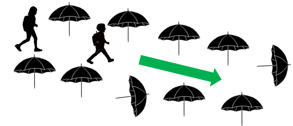
This sculpture would be an installation in Central Park near a playground so it would get traffic from kids. The sculpture would have umbrellas “planted” in the ground, creating a “street” lined with the umbrellas that people could walk down. This connects to the idea that street trees provide shelter and protect the urban environment around them. Originally I was going to mock up what one of the umbrellas would look like with colored paper cutouts, but I realized that the umbrellas in my house are mostly patterned and might be hard to set up in a standing position. Instead, I’m sharing some illustrations that hopefully are enough to convey the concept!


One out of five umbrellas would be knocked over, to represent the one in five street trees in the NY Street Tree Census that were shown to be not in good health (fair or poor health).

To add more information, the umbrellas would have graphics printed on them with a dye that changes from white to colored when wet, a technology that is used for novelty umbrellas.
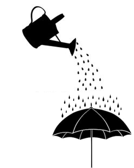
People interacting with the installation would walk through the street and pour water on the umbrellas to reveal facts about NY street trees.


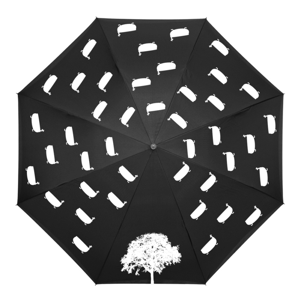
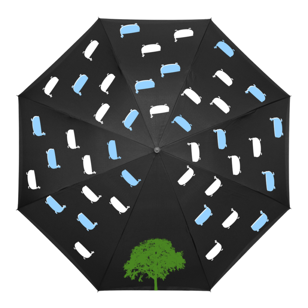
For example, an average street tree will intercept 1432 gallons of stormwater each year, equivalent to about 18 bathtubs. So out of the pattern of bathtubs on an umbrella, 18 would change color. I do need to think more about this representation because it makes the values look like a percentage.

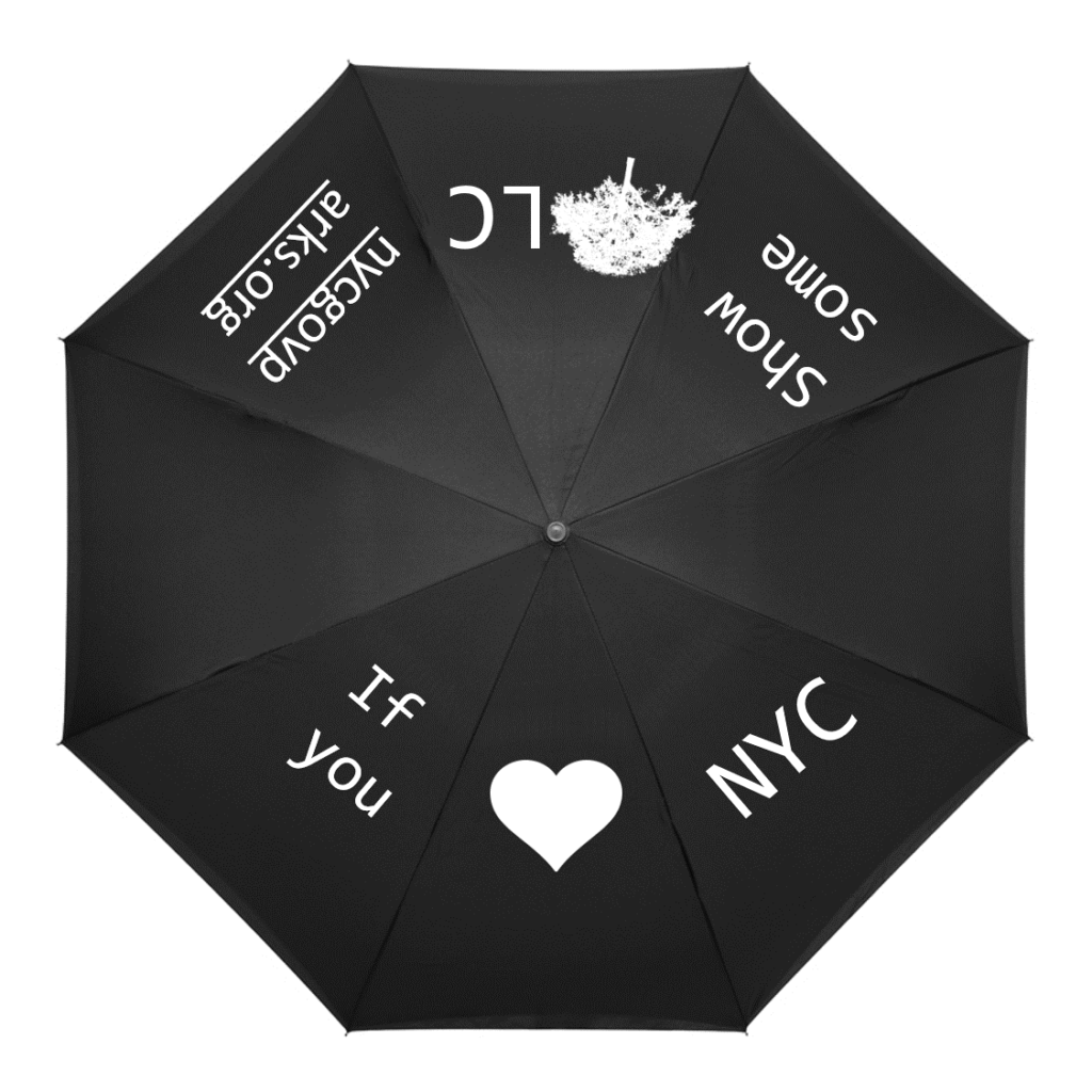
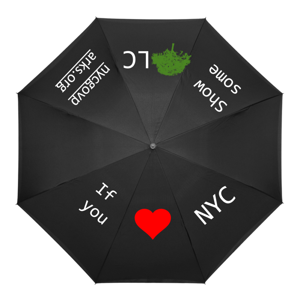
There would also be an accompanying sign with information at the end of the installation that would also direct viewers to a website to learn more, in addition to an umbrella at the end with the call to action to “Show some T(ree)LC”.


I would try to set this up so that water poured out onto the umbrellas would not be wasted, maybe by having the umbrellas sitting in a channel that collects the water which could then later be used for watering plants. In addition, I would plan to have these umbrellas to be available for sale so that people could use them in their everyday lives and engage others.

Buzzy Gardens

by Xio Alvarez, Eileen Hu

Goals

We worked with honeybee colony data and researched the impact of and factors affecting healthy bee populations. This data shows us that there have been some significant decreases in total bee health across the US at various times over the past years and that some factors, such as colony collapse disorder are not very well understood. We also saw that different states have different honeybee stories, since each state will have differing amounts of beekeepers, honeybee colonies, different climates, and different histories of beekeeping. While environmental factors affecting bees are not completely understood, there are many clear actions we can take to help honeybees and wild bees, including planting bee-friendly plants in home gardens, avoiding chemical pesticides, and supporting legislation that protects the environment.

Game Overview

We decided to create a game that would be distributed by a national bee advocacy group as a thank you for donating and aimed at getting home gardeners engaged in the topic. We took on the persona of the Bee Informed Partnership, a real organization that works with beekeepers and provides educational resources and information to the public.

Data

We took a quick look at the raw honeybee colony data from the USDA Agricultural Statistics Datasets and saw a lot of variation in the amount of bee colonies per state over the past years, including significant decreases. Further research told us that honeybee and wild bee health is a real environmental problem. We ultimately decided to use our research to inform the game design and goals rather than being the content of the game.

Game Design

The basic gameplay involves building a “landscape” by setting down flower cards and beehive tokens according to rules that convey the beneficial interdependence between flower and bees. See the gameplay pdf attached to the end of this post for full details.

Our flower cards have 3 possible point values: 5 points for bee-friendly native plants, 3 points for bee-friendly non-native plants, and 1 point for flowers that do not benefit bees. We decided to make the cards relatively simple with the focus on the flower photo. Each card has a short description, with more details that a home gardener might be interested in included in a mini flower factbook that comes with the game.

Our event cards represent relevant real-life events that could affect bee or flower health.

Example set up scenario

When the game is set up, players are assigned roles. A randomly chosen US state card that determines the starting resources available, with the starting number of beehives proportional to the actual number of beekeepers in each state, and the starting number of flowers proportional to the area of the state. For example, California is one of the biggest states in terms of area and number of beekeepers active in the state, so we gave it larger starting numbers.

Example round

Over the course of the game, players will place down flower cards, beehive tokens, and deal with occasional event cards. Flowers must be placed down no more than 2 spaces away from a beehive, and beehives must be placed near a sufficient amount of bee-friendly plants. The game is played for collective points totaled at the end. These two game design decisions encourage players to work together and emphasize that as citizens who care about the environment, we all need to work together to support bee health. We also decided not to impose boundaries with a physical game board to make the landscape feel more flexible and organic.

In developing this game, we tried to balance conveying our message and making the game fun to play!

Resources

US Bee Colony Statistics: https://data.world/siyeh/us-bee-stats-by-state

Bee Informed Colony Loss Map: https://bip2.beeinformed.org/loss-map/

Environmental impact of honeybees: https://www.npr.org/sections/thesalt/2018/01/27/581007165/honeybees-help-farmers-but-they-dont-help-the-environment

How to help bees: https://www.nrdc.org/stories/buzz-about-colony-collapse-disorder https://www.enr.gov.nt.ca/en/services/insects-and-spiders/bees

Vanuatu Cyclone Resilience

by Fernanda Ferreira, Josh Feldman, Eileen Hu

We chose to work with historical tropical cyclone data from NOAA and mapped the cyclone’s paths, finding that this helps convey the amount and accumulating effects of cyclones. We wanted to tell this story because cyclones can be devastating and we wanted to draw attention to their effects and the solutions for reducing their impact.

We presented ourselves as representatives of the island nation of Vanuatu, making the case for increased international aid so that they can make their building more cyclone resilient. We first narrowed in our focus to the South Pacific region after researching cyclone impact. This region is at the frontline of climate change — the Pacific islands are some of the lowest carbon emitters in the world, and yet some of the most impacted by the effects of carbon emissions. For them, climate change isn’t just a matter of moving further inland or adding a barrier, but preserving their existence. We also found in our initial background research that climate change will increase the frequency of severe cyclones, which means higher wind speeds and more destruction.

We further decided to highlight the Cyclone Pam occurring in 2015 and Vanuatu, because like many of the Pacific Islands, Vanuatu isn’t just hit by a cyclone, it’s often engulfed by it. Pam was also a well documented story, both in terms of information from NOAA as well as images and articles that were written at the time. There was also some discussion over how to rebuild Vanuatu, both in the World Bank paper and in an article from the Conversation about the best ways to go about doing this. The Conversation article is especially worth a read, looking at how to balance resilient building features with traditional housing structures, so that buildings can be made safer without trampling over culture. These resources are linked in our references section.

paths of cyclones in South Pacific Basin from 2010-2015 (screenshot of animation)
paths of cyclones around Vanuatu from 2010-2015 (screenshot of animation)

We mapped the cyclone paths in Tableau, creating an animation showing the accumulation of cyclones in the South Pacific cyclone basin region over the period of 2010 to 2015, to show that these cyclones are not one offs and that this region is particularly prone to the effects of cyclones. We used windspeed as a measure of cyclone severity, plotting bigger circles for higher recorded windspeeds. While the most recent cyclones had more complete windspeed data than the earliest ones in the mid-1800s, most of the cyclones still did not have data for every record in their paths. We used a different shape to represent that there was a record of the cyclone’s position but not its windspeed to delineate missing data. In our presentation, we included an inset showing Vanuatu, because this was the focus of our presentation and we wanted to contrast the size of the island with the repeated impact of the tropical cyclones.

We chose to do a powerpoint presentation because this was a likely format that representatives of the Pacific Islands would use to ask for aid. It also forced us to tell this story in two slides and in a quick 3 minutes, which is typically how much time an aid group might get in their pitch to a global recovery fund. It made us really cognizant of what information went in and what was left out.

Cyclone data: 

  • NOAA’s tropical cyclone IBTrACS data (link here)

References:

  • How climate change is making hurricanes more dangerous (link here)
  • Climate and Disaster Resilience – World Bank (link here)
  • Rebuilding a safer and stronger Vanuatu after Hurricane Pam (link here)
  • Cyclone devastation prompts Vanuatu to weigh legal action (link here)
  • Before and after: Cyclone Pam’s impact on Vanuatu (link here)
  • Aid trickles to Vanuatu as relief workers report vast cyclone damage (link here)
  • “We need support.” Pacific Islands seek help and unity to fight climate change (link here)

Eileen’s Data Breadcrumbs 200219

Morning

Document access

  • Captured by
    • Google Docs
      • to check the CMS.631 syllabus and data log hand out!
    • Google Keep
      • to track data log and various other notes to self
    • Info
      • Time of access
      • Time of edit
      • Edits (text)

Schedule

  • Captured by
    • Google Calendar
      • To update a rescheduled meeting
    • Info
      • Edit to calendar event
      • Time of edit for calendar event

Location

  • Captured by
    • Broad Institute security
      • To get into lab for the work day
    • Info
      • Time + identity of tapping into building

Coffee

  • Captured by
    • BostonbeaN Coffee Company
      • Guessing that this fancy coffee machine at least keeps track of how many of each drink it makes
    • Info
      • Type of drink made by the lab coffee machine

Work

  • Captured by
    • Broad Institute
      • Bioinformatics is all about creating and working with digital data – more of a loaf of bread than data breadcrumbs here
    • Info
      • login to computing cluster
      • resources used on computing cluster
      • jobs submitted to computing cluster
      • files created+removed

Afternoon

Subway usage

  • Captured by
    • MBTA
      • Took the T instead of walking because I happened to be near a T stop after running errands
    • Info
      • Money used on CharlieCard
      • + 1 tap into a subway turnstile

Location

  • Captured by
    • MIT Zesiger Fitness Center
      • For team practice
    • Info
      • Time + identity of tapping into building, locker rooms

Physical Activity

  • Captured by
    • Google Sheets
      • I’ve been keeping a workout log digitally since my first year of undergrad, it’s nice to be able to search specific workouts though having a physical notebook was nice too
    • Info
      • Workout log

Evening

Home stats

  • Captured by
    • Eversource utilities company
      • Just from living my life, having the lights on, cooking etc
      • Not sure how fine-grained the info is, but they’re at least figuring out how much to bill the house every month
    • info
      • Electricity usage (kWh used)
      • Internet usage
      • Heat + cooking gas usage

All day

Web

  • Captured by
    • Google Chrome browser
      • Used for many searches and articles throughout the day
    • Pocket
      • To save articles that I found meaningful/interesting/want to read later
    • Info
      • Webpages visited
      • Search terms
      • Time of access
      • Webpages saved

Messaging

  • captured by
    • Slack
      • for work
    • Facebook Messenger
      • to communicate with friends
    • Wechat
      • to communicate with family
    • WhatsApp
      • I normally do not use WhatsApp but an international friend who mainly uses WhatsApp was in town so we used this platform to arrange a meetup, I got to introduce her to her first taste of bubble tea
    • Gmail
      • For more official messages and receiving dormspam
    • Groupme
      • For team groupchat
    • info
      • messages sent, received
      • messages time of sending, receiving, read
      • size of messages

Phone stats

  • Captured by
    • Samsung phone manufacturer
    • Network provider
  • info
    • Mobile data usage
    • Wifi data usage
    • Battery usage

Organization stats

  • Captured by
    • Broad Institute
    • MIT
  • Info
    • Wifi usage

Location

  • Captured by
    • Private + public security cameras in Cambridge (visual)
    • Apps on phone w/ access to location (GPS coordinates)
      • Google Maps
      • etc
    • Info
      • Presence in a certain location

Payments

  • Captured by
    • Credit card company
    • Merchant
      • Today most of the purchases I made were food
    • Budget tracking app
  • Info
    • Merchant
    • Transaction time+date
    • Transaction amount
    • Transaction type (restaurant, groceries, etc)

Physical activity

  • Captured by
    • Samsung Health
      • Automatically tracked though I’m sure I can turn off some of the tracking
    • Info
      • Est steps
      • Est distance walked
      • Est calories burned
      • Est distance walked at diff points in the day
      • Estimated time asleep (calculated from when user is not active on phone)

Sleep Habits of Famous Writers

key for the graphic: Famous Writers’ Sleep Habits and Productivity

Maria Popova has always been one of my favorite writers and I found this graphic on her blog brainpickings.com. The graphic shows sleep habits and literary output for various famous writers, ordered starting with Honore de Balzac who woke up at 1am and ending with Charles Bukowski who would get up at 12pm. It packs a good amount of information into a small icon for each writer – name, lifespan, wake-up time, number of books or collections published separate by category, and awards won. A lot of the information is encoded by colors, mini bar charts and symbols that are unlabeled, which saves space but does require the reader to look at and understand the key provided. All the information included in the chart seems to have been deliberate and relevant to the question for example, writer lifespan was included for context since “length of a writing career influences the volume of literary output” as explained at the top of the chart. The chart leads the eye very clearly, with a line going through the authors presented and a meaningful ordering. The illustrations of the authors make the chart more engaging and remind the reader that there are individual humans behind the data. There’s also visual reinforcement of one of the major datasets – wake-up time – since different times appear at different points around the circle enclosing each writer’s portrait. This does mean there is a good amount of blank space in the figure since each writer’s information is centered for consistency but there needs to be a wide spacing to handle the bar charts of productivity pointing in different directions. I do think this chart is not as effective seen on a large scale – it is meant to be viewed as a poster, but it’s hard to see anything viewing the entire chart in a browser window for example. It’s harder to see overall trends since the individual information is too small when the chart is viewed as a whole. It’s only when you zoom in on a specific writer that the data starts to come into focus. This chart seems to be aimed at people who are interested in literature and potentially those who are interested in optimizing their daily routines for productivity. For people who are willing to spend some time and zoom in on the writers – or maybe just look at their favorite writers – this chart is a fun look into how famous writers lived their lives and a chance to consider how much wake-up time could affect literary productivity.