by Fernanda Ferreira, Josh Feldman, Eileen Hu
We chose to work with historical tropical cyclone data from NOAA and mapped the cyclone’s paths, finding that this helps convey the amount and accumulating effects of cyclones. We wanted to tell this story because cyclones can be devastating and we wanted to draw attention to their effects and the solutions for reducing their impact.
We presented ourselves as representatives of the island nation of Vanuatu, making the case for increased international aid so that they can make their building more cyclone resilient. We first narrowed in our focus to the South Pacific region after researching cyclone impact. This region is at the frontline of climate change — the Pacific islands are some of the lowest carbon emitters in the world, and yet some of the most impacted by the effects of carbon emissions. For them, climate change isn’t just a matter of moving further inland or adding a barrier, but preserving their existence. We also found in our initial background research that climate change will increase the frequency of severe cyclones, which means higher wind speeds and more destruction.
We further decided to highlight the Cyclone Pam occurring in 2015 and Vanuatu, because like many of the Pacific Islands, Vanuatu isn’t just hit by a cyclone, it’s often engulfed by it. Pam was also a well documented story, both in terms of information from NOAA as well as images and articles that were written at the time. There was also some discussion over how to rebuild Vanuatu, both in the World Bank paper and in an article from the Conversation about the best ways to go about doing this. The Conversation article is especially worth a read, looking at how to balance resilient building features with traditional housing structures, so that buildings can be made safer without trampling over culture. These resources are linked in our references section.

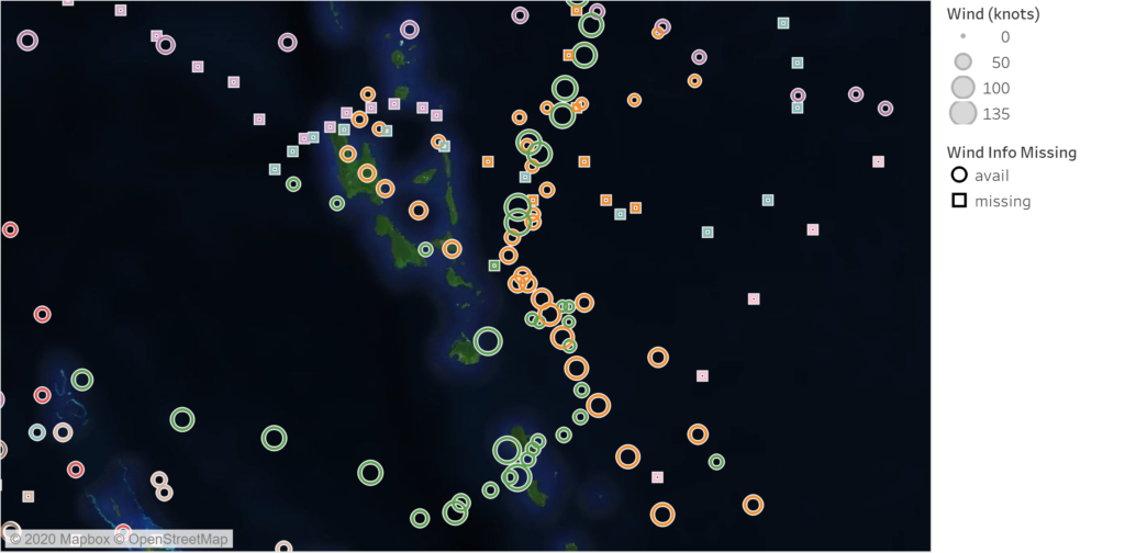
We mapped the cyclone paths in Tableau, creating an animation showing the accumulation of cyclones in the South Pacific cyclone basin region over the period of 2010 to 2015, to show that these cyclones are not one offs and that this region is particularly prone to the effects of cyclones. We used windspeed as a measure of cyclone severity, plotting bigger circles for higher recorded windspeeds. While the most recent cyclones had more complete windspeed data than the earliest ones in the mid-1800s, most of the cyclones still did not have data for every record in their paths. We used a different shape to represent that there was a record of the cyclone’s position but not its windspeed to delineate missing data. In our presentation, we included an inset showing Vanuatu, because this was the focus of our presentation and we wanted to contrast the size of the island with the repeated impact of the tropical cyclones.
We chose to do a powerpoint presentation because this was a likely format that representatives of the Pacific Islands would use to ask for aid. It also forced us to tell this story in two slides and in a quick 3 minutes, which is typically how much time an aid group might get in their pitch to a global recovery fund. It made us really cognizant of what information went in and what was left out.
Cyclone data:
- NOAA’s tropical cyclone IBTrACS data (link here)
References:
- How climate change is making hurricanes more dangerous (link here)
- Climate and Disaster Resilience – World Bank (link here)
- Rebuilding a safer and stronger Vanuatu after Hurricane Pam (link here)
- Cyclone devastation prompts Vanuatu to weigh legal action (link here)
- Before and after: Cyclone Pam’s impact on Vanuatu (link here)
- Aid trickles to Vanuatu as relief workers report vast cyclone damage (link here)
- “We need support.” Pacific Islands seek help and unity to fight climate change (link here)
Hi! Thank you for sharing your work.
I was drawn to your project because the bright neon colors in the map were quite eye-catching. It made me think immediately that there was a complex data narrative here to unpack.
That being said, I wished the map would have provided me with more guidance upon closer observation. For example, the legend was a bit hard to read as the symbols did not look exactly like the symbols on the map. There was also no text or title on the map that might have guided my eye-line more — it would have helped to have some of the things you said during the powerpoint labeled or highlighted visually on the map as an accompaniment.
I thought the animation was really well done! It was very informative to see the cyclones slowly being played out over time rather than just seeing them all at once on a map. I think that visualization alone draws people in and really drives home the point you are making about how hard this area was hit. Especially, thinking it is so affected by changes in carbon emission, yet doesn’t contribute much itself.
I wonder if making the colors more transparent would be better since there are so many cyclones over each other. It is easy to see that there are many cyclones in one area, but transparency on the color might show that more clearly.
There was a lot of great things to this presentation. I liked seeing both the global view of the cyclones around the South Pacific regions, which kind of appeals more to one’s pragmatic side, and zooming in on one specific place in Vanuatu, which really appeals on one’s emotional side and makes the cyclones “real”. It was also nice that the presentation was done as if the pitch was real (i.e., under 3 min like it’d be in this kind of proposal).
One thing that could improve would be the original map. During the presentation, as you were speaking, the map was already animated from the start well before you said what the map was showing. That was confusing and distracting. Also, there was a lot of things on the map (which seems to have been a design choice?), but I still feel like it could have been made a bit cleaner maybe by using transparent colors (so that they can stack on top of each other but we as readers of the map can still see where each cyclone started/went).
Otherwise I really liked the sketch 😀
This is a really interesting narrative. I think the animation is a good way to convey your message and your analysis is clear. One thing I would change in the animation is either the colors of the your wind knots or the relative scale as it is difficult to visualize right now. Otherwise you could select fewer cyclones to include in the graphic
I like the animation and the bright colors used on the map, it does a great job of clearly illustrating the issue of severe cyclones.
I think it would have been great to include discussion of policies that could be implemented globally that could redirect money to places like Vanuatu that are especially vulnerable to climate change but are not high emitters. This graph could be used to argue for policies such as carbon taxes and natural capital calculations.
I like the animation and the bright colors used on the map, it does a great job of illustrating the cyclones.
I think it would have been great to include discussion of policies that could be implemented globally that could redirect money to Vanuatu such as carbon taxes and natural capital cancanions
I like the animation and the bright colors used on the map, it does a great job of illustrating the cyclones.
I think it would have been great to include discussion of policies that could be implemented globally that could redirect money to Vanuatu such as carbon taxes and natural capital as a replacement for GDP.
This is an incredibly detailed, strong narrative sketch that pulls from multiple sources of data.
Centrality of maps:
Your introductory map showing the paths of various storms in relation to Vanuatu is well framed, but visually hard to digest. In a further iteration I’d suggest making these thin lines so they don’t occlude the geographical context. On the other hand, the sheer scale of the storms definitely comes across! The animation is well used. Narrowing into the path of Pam, and supplementing with satellite images works well.
Rationale for design choices:
Your post-presentation segment documents your rationale for the time period and geographic focus quite well.
Layers of reading:
Starting with the broad context and then narrowing into cyclone Pam is a nice way to dig deeper. I imagine I’d be able to explore the map of the various cyclones manually if I was there in the room with you.
Appropriate data use:
You’ve looked at the paths of storms and narrowed into a specific region that is greatly effected – this feels appropriate to me.
Suitability for audience:
Your slides are overly dense, which sadly is exactly what the audience for this kind of presentation would probably expect.
Narrative:
Casting yourself as a resilience project is a good simplifying decision to make your context very clear here. Your “first chapter” effectively moves from the broader context to your specific concerns. The photos are a solid addition to humanize the toll of the storms. The data you provide about the impact of Pam is a nice way to rationalize the requests you make for help in “chapter 2”.