by Xio Alvarez, Sarah Mousa, and Devin Zhang
The tropical cyclones database includes granular meteorological data on all cyclones ever recorded by NOAA. While many people have some general familiarity with the categorizations given to cyclones, we precieved a gap between the highly specific data presented in the database and the physical impact of the storms themselves. Most people will understand that a category 5 is stronger than a category 2 cyclone, but the magnitude of difference and what that atmospheric pressure and wind speed actually appears as on the ground are less understood.
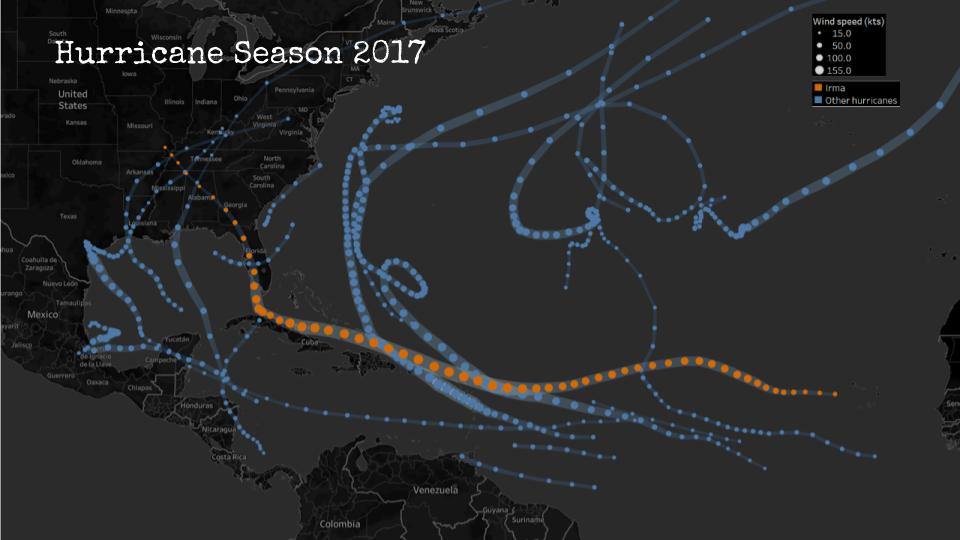
We decided to take this data and develop a sketch for a a tv series called “The Life of a Storm” which would connect the meteorological details of historical cyclones to the images and stories of their impacts on the ground. One thing that was clear from the data was that each storm moves through many phases and is felt differently in different places. Our news research also showed us that similar storms can have different impacts depending on how prepared people are for their arrival. The intention of this series is to educate a general public audience on the impacts of different storms and the types of preparedness and policies that are effective in mitigating their effects.
“The Life of A Storm: Hurricane Irma”
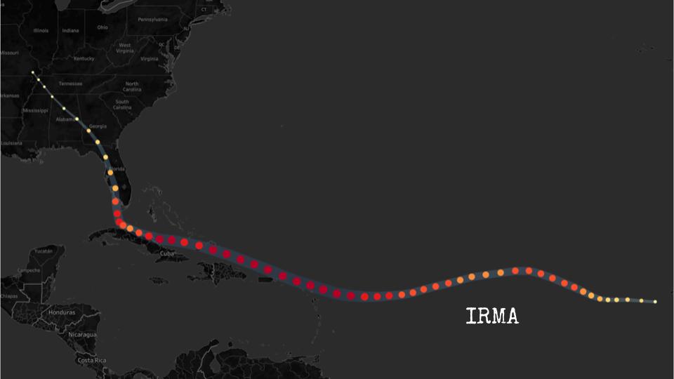
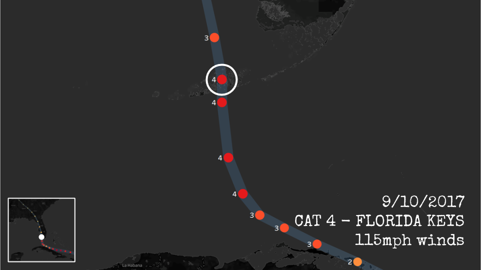
Our sketch looks at Hurricane Irma, one of many cyclones from the dataset that struck the Carribean and southern coast of North America in the hurricane season of 2017. Irma is a useful storm for us to use for this premier episode as it began as a category 5 and proceeded to make landfall as it progressed through its decline, tracking across western Florida before downgrading to a tropical storm and then depression over Georgia and Alabama. Our sketch geographically locates the storm as it downgrades, stopping at each point to understand how the effects were felt on the ground and what types of damage were typical in that area. We connect these images to stories from neighbors and victims in their own words.
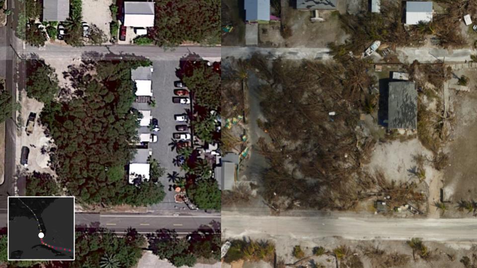
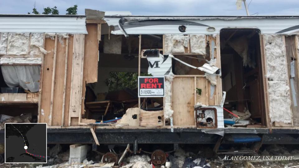
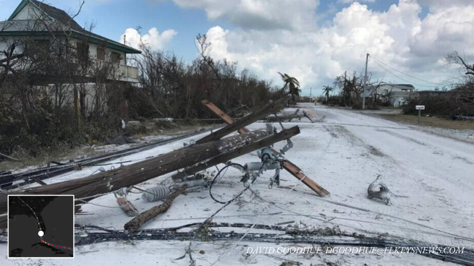
Our hope is that by traversing levels of abstraction (maps to satellites to photos), we are able to create a memorable connection between the technical language of emergency management and meteorology.
Other Sources
Satellite Images: Google Earth
News reporting:
Cuba:
- https://www.miamiherald.com/news/nation-world/world/americas/cuba/article194517349.html
- https://www.usatoday.com/story/news/world/2017/09/10/cuba-sees-devastation-hurricane-irma/651125001/
Florida:
- https://www.sun-sentinel.com/news/weather/hurricane/fl-reg-keys-visual-then-now-20180907-story.html
- https://www.miamiherald.com/news/weather/hurricane/article172742816.html
- https://www.miamiherald.com/news/local/community/florida-keys/article217950495.html
- https://www.orlandosentinel.com/weather/hurricane/os-hurricane-irma-damage-in-naples-and-southwest-florida-pictures-20170912-photogallery.html
- https://www.washingtonpost.com/national/health-science/tampa-bays-escape-from-irma-was-more-than-luck-some-say/2017/09/15/5f7b618e-9a20-11e7-87fc-c3f7ee4035c9_story.html
Georgia:
- https://wgxa.tv/news/local/photos-hurricane-irma-damage-across-middle-georgia
- https://www.weather.gov/ffc/2017_Irma#winddamagephoto
In this sketch, I liked the juxtaposition of human scale imagery in the form of pictures with the high-level dataset of cyclones which lacks the human context. I think the sketch helps us visualize better what a category 5 or category 3 storm means and helps us empathize better with the people affected by it.
As one of the objectives of the sketch is to educate the audience about the types of preparedness and policies in mitigating the impact of the storms, I feel the sketch can emphasize more on that and show how a certain policy or strategy (ex: timely evacuation) helped avoid loss of life and resources.
I really liked the combination of map and satellite image approach to this sketch. Seeing a holistic view of these storms and then looking specifically at real images of the impact they had is very powerful. I especially liked the idea of being able to use the slider to go back and forth between satellite imagery since it not only makes the comparison easy, but it gives some power to the reader and lets them engage as much as they want with the content.
I wish, at least in the sketch, there was a key for the map visualization once you focused on Irma. It wasn’t clear what the shades of red were for until you zoomed far enough into the map. I initially thought it was some sort of impact metric aside from category since that was already shown in size. Once again, this was cleared up when the video/map zoomed in enough to show the category numbers, but I was distracted for a bit with the confusion.
As other people have mentioned, I liked that you connected the data to human impact. I also liked the angle of anthropomorphizing the storm through the name “Life of a Storm” and the way the color scheme and text choices made the maps feel like evidence in a crime investigation. That got me more engaged and put me into the mode of thinking about this as an investigation.
Given that the format will be a TV series, it would be interesting to explore what makes each storm unique. While people’s stories and the overall impacts of each storm will obviously not be the same, on a high level it seems that every episode will have a very similar format, generally showing analogous news stories and pictures. Is there some way to incorporate a hook for each different storm into the narrative? Or might this iteration of the data visualization be more successful in a different format such as an interactive webpage from a science education organization?
I find this sketch very insightful in terms of presenting accessible material to visually identify the differences between storm characterization and physical impacts. One way you could improve on this sketch is to include images from categories 1 and 2, which would help your audience also understand what to expect from an average, minimal damage-causing storm.
I loved this! It was very insightful and educational. The story was well presented. The before and after images were really cool. I like the fact that you had also mentioned the after effects of landfall in each places. I believe that many lives were saved because of the measures but I guess the monetary losses were still huge. Adding them would make the story even more impactful!
I really like the approach you took by framing it as an educational TV-Series. Many people would benefit by being more knowledgeable on how to prepare for hurricanes and the impact. It might be useful to show the wind speed as Km/h or Mi/h since people like me might not be very knowledgeable about the conversion from Knots to Km/h and it might be difficult to put it in perspective. I believe the intensity of the color also encodes the category of the hurricane and adding it to the legend would help clarify it as well. Very much like the way the hurricane path is shown on the map as it feels very natural.
This is a visually well-developed walk through of an engaging, narrative. The maps frame the story, while other data augments and answers the “so what” questions nicely.
Centrality of maps:
The first map of the paths is well presented. The visual sets a strong tone and shows the context for Irma well. The mapping onto dot color and size is a well thought out decision. Zooming from the abstract map to the satellite images is also well done. Using zooming in/out as your narrative scaffold is also well supported with maps, satellite imagery, and on-the-ground impacts.
Rationale for design choices:
You justify the focus on Irma well, as well as the 5 points you’ve focused on. I appreciate that you bring in effective uses of symbols and quotes here as well, humanizing this.
Layers of reading:
Navigate from the overall path down to each specific place is a nice way to dive into the data. Flipping from the impacts to the precautions/outcomes is a great way to take the narrative of the storm into the points of the whole thing from a human perspective.
Appropriate data use:
Narrowing into one storm is a nice way to pull relatability and meaning out of this scientific dataset. You’ve brought in other datasets about the impact effectively.
Suitability for audience:
Casting yourself as educators was a good choice to give you context for using the data. The visual design and narrative structure make sense for this context.
Narrative:
The “life of a storm” framing is a nice way to draw the audience in. The structure of following it’s physical path is a strong use of the geography of the storm to scaffold the story. Your sketch gives us a sense of how this would work really well.