Which climate factors drive early wine grape harvests?

Hamed Mounla, Sule Kahraman, Thiago Medaglia

A study on the differential effects of selected climate factors on French wine grape harvesting

VIDEO: https://youtu.be/qVcJgMXCHdA

We have chosen to work with the dataset of grape harvest dates (GHD) series that has been compiled from international, French and Spanish literature and from unpublished documentary sources from public organizations and from wine-growers: https://www.ncdc.noaa.gov/paleo-search/study/13194

After analysing the data, we decided to google for other references, and that’s how we’ve found the following article: https://www.carbonbrief.org/climate-change-brings-early-grape-harvests-for-french-wine 

That specific piece was inspired by a study published at the journal Nature (Climate change decouples drought from early wine grape harvests in France) in March 21, 2016: https://www.nature.com/articles/nclimate2960

With our key references at mind (others are listed over this blogpost), we then discussed narrative and audience, making the following decisions: 

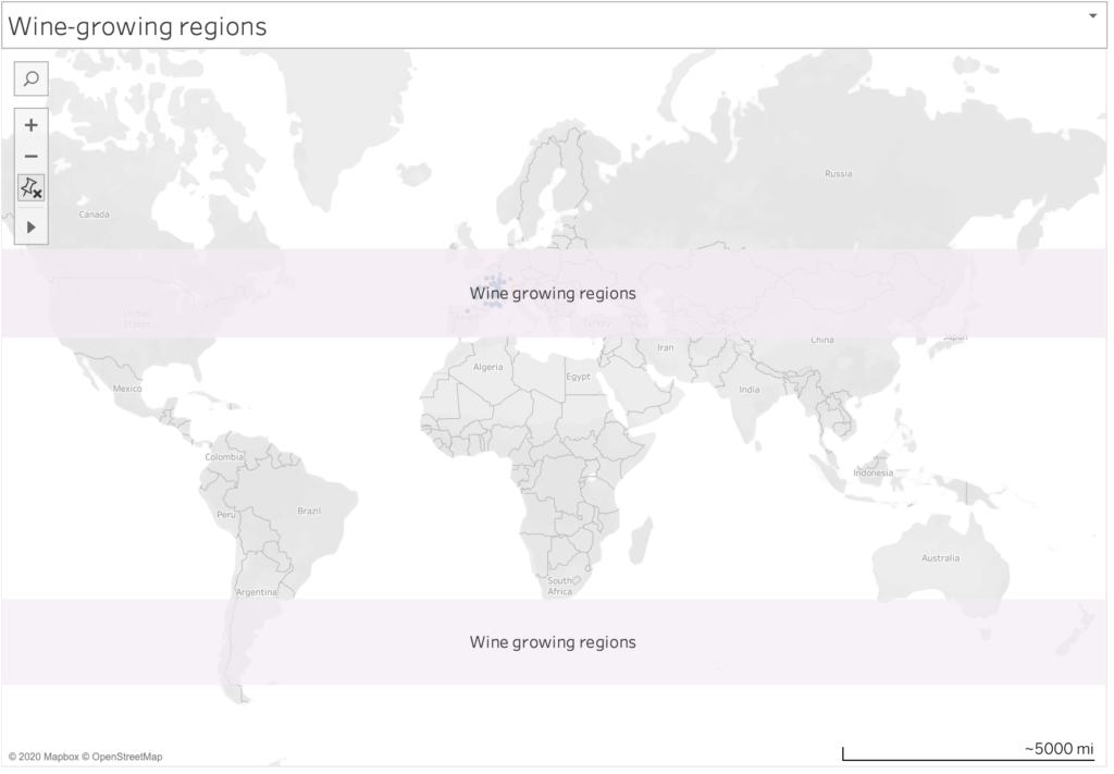
Idea: Geographically visualize the differential effects of climate factors on grape harvest dates

Analysis results:

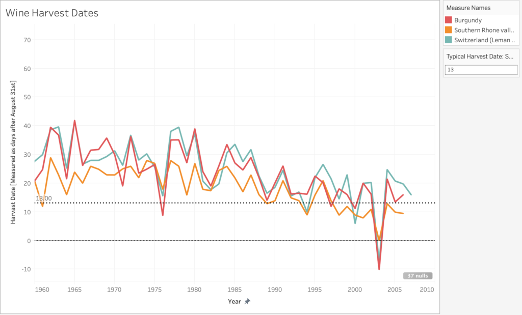
Part 1: Exploring Correlations Between Selected Climate Factors and GHDFigure 1. Grape Harvest Date versus climate observations (temperature, precipitation and PDSI(Palmer Drought Severity Index)) demonstrating correlation between GHD and climate. 

  • Observed high and significant correlations between GHD (Grape Harvest Date) and temperature. (High R^2 and low p-value, i.e. R^2=0.704, p<0.0001). The linear relationship is negative, i.e. As temperature increases, the harvest dates start becoming earlier.
  • Observed high and significant correlations between GHD (Grape Harvest Date) and precipitation. (High R^2 and low p-value, i.e. R^2=0.241, p<0.0001) between 1901 and 1980 but low and insignificant correlations between 1981 and 2007. The linear relationship is positive, i.e. As precipitation increases, the harvest dates start becoming later. While this relationship was true in the early-mid20th century, it has not been as pronounced in recent years. 
  • Observed high and significant correlations between GHD (Grape Harvest Date) and PDSI. (High R^2 and low p-value, i.e. R^2=0.241, p<0.0001) between 1901 and 1980 but low and insignificant correlations between 1981 and 2007. The linear relationship is positive, i.e. As PDSI increases, the harvest dates start becoming later. While this relationship was true in the early-mid 20th century, it has not been as pronounced in recent years. 
  • Because the clearest correlation is between temperature and GHD, we chose to use the temperature in our data story. 

Part 2: Multi-regression model:

Part 3: Plotting temperature correlations on the map

Figure 2: Grape Harvest Date – Temperature correlation (1900-1980)

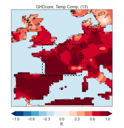
Figure 3: Grape Harvest Date – Temperature correlation (1981-2007)

Conclusion:

The data analysis shows that the warmer temperatures, characteristic of the Climatic Change caused by anthropogenic interference, have been a consistent factor of early harvests and high quality wines in France. The data also indicate a fundamental change in the role of the availability of droughts and humidity as large-scale factors in the timing of the harvest and the quality of wine in France and Switzerland, as demonstrated by the scientific article published in Nature. However, in our maps, we decided to focus on the correlation between harvesting and temperature. 

How climate change is impacting Millenial winos

Team: Olivia Yue, Samra Lakew

Our data story is a video inspired by accounts like @nowthisnews on Instagram. Our goal with this video is to communicate the impacts of climate change with the changing taste of wine around the world. The decision to create an Instagram post was meant to reach our target audience of millennials, who are now the generation that consumers the most wine worldwide.

The data says that Old World wine-producing countries in Europe are experiencing shorter wine harvesting seasons. The seasons are shortening due to climate change and increasing temperatures globally. We want to tell this story because it demonstrates how the goods we consume regularly are changing both in how they are made and how they taste.

We use the 700 years of grape harvest dataset for this data story. The dataset shows the harvest date (counting from August 31st) of every year starting in the 1500s. We decided to focus on the regions with the most data. We then decided to the data from 1960-2007 to clearly illustrate the impact that climate change has had on growing seasons.

Traditionally grapes for wine have grown in regions between 30-50 degrees latitude in the northern and southern hemispheres. As temperature rises, the ideal conditions for growing grapes move further towards the poles into higher altitudes. For regions that are experiencing higher temperatures harvest times are shorter and the alcohol content is higher in grapes. In response, growers are changing the types of grapes they grow to more resilient strains and sometimes to different types of wine altogether. All of these factors will impact the kinds of wine we drink and the way that they taste.

Things we could expand on in the future:

  • Add dataset that shows the new growing regions and explain why they are now suitable for growing (ie, locations at a high altitude and lower latitude, or lower altitude at a higher latitude)
  • Download Tableau map layer for latitude and longitude gridlines
  • Comparing the volume of wine produced by certain grapes as growers shift to more
  • Comparing the volume produced by different regions over time

Sources:

https://www.ncdc.noaa.gov/paleo-search/study/13194

https://www.washingtonpost.com/business/2020/01/31/wine-climate-change-/

https://www.nationalgeographic.com/science/2019/09/wine-harvest-dates-earlier-climate-change/#close

https://blog.mineral.agency/the-millennial-wine-consumer-72d2e53947f7?gi=d947021ff607

Vanuatu Cyclone Resilience

by Fernanda Ferreira, Josh Feldman, Eileen Hu

We chose to work with historical tropical cyclone data from NOAA and mapped the cyclone’s paths, finding that this helps convey the amount and accumulating effects of cyclones. We wanted to tell this story because cyclones can be devastating and we wanted to draw attention to their effects and the solutions for reducing their impact.

We presented ourselves as representatives of the island nation of Vanuatu, making the case for increased international aid so that they can make their building more cyclone resilient. We first narrowed in our focus to the South Pacific region after researching cyclone impact. This region is at the frontline of climate change — the Pacific islands are some of the lowest carbon emitters in the world, and yet some of the most impacted by the effects of carbon emissions. For them, climate change isn’t just a matter of moving further inland or adding a barrier, but preserving their existence. We also found in our initial background research that climate change will increase the frequency of severe cyclones, which means higher wind speeds and more destruction.

We further decided to highlight the Cyclone Pam occurring in 2015 and Vanuatu, because like many of the Pacific Islands, Vanuatu isn’t just hit by a cyclone, it’s often engulfed by it. Pam was also a well documented story, both in terms of information from NOAA as well as images and articles that were written at the time. There was also some discussion over how to rebuild Vanuatu, both in the World Bank paper and in an article from the Conversation about the best ways to go about doing this. The Conversation article is especially worth a read, looking at how to balance resilient building features with traditional housing structures, so that buildings can be made safer without trampling over culture. These resources are linked in our references section.

paths of cyclones in South Pacific Basin from 2010-2015 (screenshot of animation)
paths of cyclones around Vanuatu from 2010-2015 (screenshot of animation)

We mapped the cyclone paths in Tableau, creating an animation showing the accumulation of cyclones in the South Pacific cyclone basin region over the period of 2010 to 2015, to show that these cyclones are not one offs and that this region is particularly prone to the effects of cyclones. We used windspeed as a measure of cyclone severity, plotting bigger circles for higher recorded windspeeds. While the most recent cyclones had more complete windspeed data than the earliest ones in the mid-1800s, most of the cyclones still did not have data for every record in their paths. We used a different shape to represent that there was a record of the cyclone’s position but not its windspeed to delineate missing data. In our presentation, we included an inset showing Vanuatu, because this was the focus of our presentation and we wanted to contrast the size of the island with the repeated impact of the tropical cyclones.

We chose to do a powerpoint presentation because this was a likely format that representatives of the Pacific Islands would use to ask for aid. It also forced us to tell this story in two slides and in a quick 3 minutes, which is typically how much time an aid group might get in their pitch to a global recovery fund. It made us really cognizant of what information went in and what was left out.

Cyclone data: 

  • NOAA’s tropical cyclone IBTrACS data (link here)

References:

  • How climate change is making hurricanes more dangerous (link here)
  • Climate and Disaster Resilience – World Bank (link here)
  • Rebuilding a safer and stronger Vanuatu after Hurricane Pam (link here)
  • Cyclone devastation prompts Vanuatu to weigh legal action (link here)
  • Before and after: Cyclone Pam’s impact on Vanuatu (link here)
  • Aid trickles to Vanuatu as relief workers report vast cyclone damage (link here)
  • “We need support.” Pacific Islands seek help and unity to fight climate change (link here)

The Life of a Storm

by Xio Alvarez, Sarah Mousa, and Devin Zhang

The tropical cyclones database includes granular meteorological data on all cyclones ever recorded by NOAA. While many people have some general familiarity with the categorizations given to cyclones, we precieved a gap between the highly specific data presented in the database and the physical impact of the storms themselves. Most people will understand that a category 5 is stronger than a category 2 cyclone, but the magnitude of difference and what that atmospheric pressure and wind speed actually appears as on the ground are less understood.

We decided to take this data and develop a sketch for a a tv series called “The Life of a Storm” which would connect the meteorological details of historical cyclones to the images and stories of their impacts on the ground. One thing that was clear from the data was that each storm moves through many phases and is felt differently in different places. Our news research also showed us that similar storms can have different impacts depending on how prepared people are for their arrival. The intention of this series is to educate a general public audience on the impacts of different storms and the types of preparedness and policies that are effective in mitigating their effects.

“The Life of A Storm: Hurricane Irma”

Our sketch looks at Hurricane Irma, one of many cyclones from the dataset that struck the Carribean and southern coast of North America in the hurricane season of 2017. Irma is a useful storm for us to use for this premier episode as it began as a category 5 and proceeded to make landfall as it progressed through its decline, tracking across western Florida before downgrading to a tropical storm and then depression over Georgia and Alabama. Our sketch geographically locates the storm as it downgrades, stopping at each point to understand how the effects were felt on the ground and what types of damage were typical in that area. We connect these images to stories from neighbors and victims in their own words.

Our hope is that by traversing levels of abstraction (maps to satellites to photos), we are able to create a memorable connection between the technical language of emergency management and meteorology.

Other Sources

Satellite Images: Google Earth

News reporting:

Cuba:

  • https://www.miamiherald.com/news/nation-world/world/americas/cuba/article194517349.html
  • https://www.usatoday.com/story/news/world/2017/09/10/cuba-sees-devastation-hurricane-irma/651125001/

Florida:

  • https://www.sun-sentinel.com/news/weather/hurricane/fl-reg-keys-visual-then-now-20180907-story.html
  • https://www.miamiherald.com/news/weather/hurricane/article172742816.html
  • https://www.miamiherald.com/news/local/community/florida-keys/article217950495.html
  • https://www.orlandosentinel.com/weather/hurricane/os-hurricane-irma-damage-in-naples-and-southwest-florida-pictures-20170912-photogallery.html
  • https://www.washingtonpost.com/national/health-science/tampa-bays-escape-from-irma-was-more-than-luck-some-say/2017/09/15/5f7b618e-9a20-11e7-87fc-c3f7ee4035c9_story.html

Georgia:

  • https://wgxa.tv/news/local/photos-hurricane-irma-damage-across-middle-georgia
  • https://www.weather.gov/ffc/2017_Irma#winddamagephoto

Historical French Wine Labels

Team members: Claudia Chen, Sam Ihns, Robert M. Vunabandi

We explored the wine dataset (700 Years of Grape Harvests), and decided to take an approach where we are wine advertisers and our audience is made of wine and history enthusiasts. We advertise through wine labels, so we made 3 wine labels highlighting 3 specific points in history with interesting events related to the harvests of wine at that time.

Data

The 700 Years of Grape Harvests dataset contains, for each of 27 regions in Europe (most of which were in France), the number of days since August 31 after which grapes were harvested in each of the years from 1354 to 2007. While the time range is huge, a lot of the dataset was missing for various reasons. The main reason were that not all regions started recording this information at the same time (the region of Burgundy is the one that was first). In addition, due to various historical events, some parts of the data were missing heavily.

Sketches

For our sketches, we made wine labels. The idea behind each label is that the label will be attached to a wine bottle and will give specific details about the historical context under which the wine was made. We chose to focus on French regions because most of the dataset was focused on France and within the dataset, French regions had the least amount of data missing. So, each label presents a story in a specific point in time when a notable event took place and changed the history of wine in France. In addition to that, we chose to focus on specific regions (as opposed of looking at all the regions and comparing them) because it allowed us to better tell a compelling advertising story on a wine bottle.

So, here are the 3 sketches we have:

Great Wine Blights, 1868:

Champagne Riots, 1910:

World War II, 1941:

Video

Other Sources

Overall wine production:

Wine Blight:

1910 Riots:

World War II: