To Invest in Wine, Invest in Climate

How climate change impacts wine


By Eugenio Zuccarelli, Tyler Millis and Neil Pendse

Wine has been part of our society since the beginning of humanity. The first evidence of wine-making dates back to 6000 BC and the practice spans the millennia from prehistory to the Roman Empire, through the Renaissance, all the way to the present— and we are all thankful for that.

Wine-making has become not just like any other form of activity, but almost an art. An art that over these 700 years has become not only a pleasure for the palate but a form of alternative investment, especially in uncertain times. An art so important that we have detailed records of the grape-harvesting dates for the last 700 years.

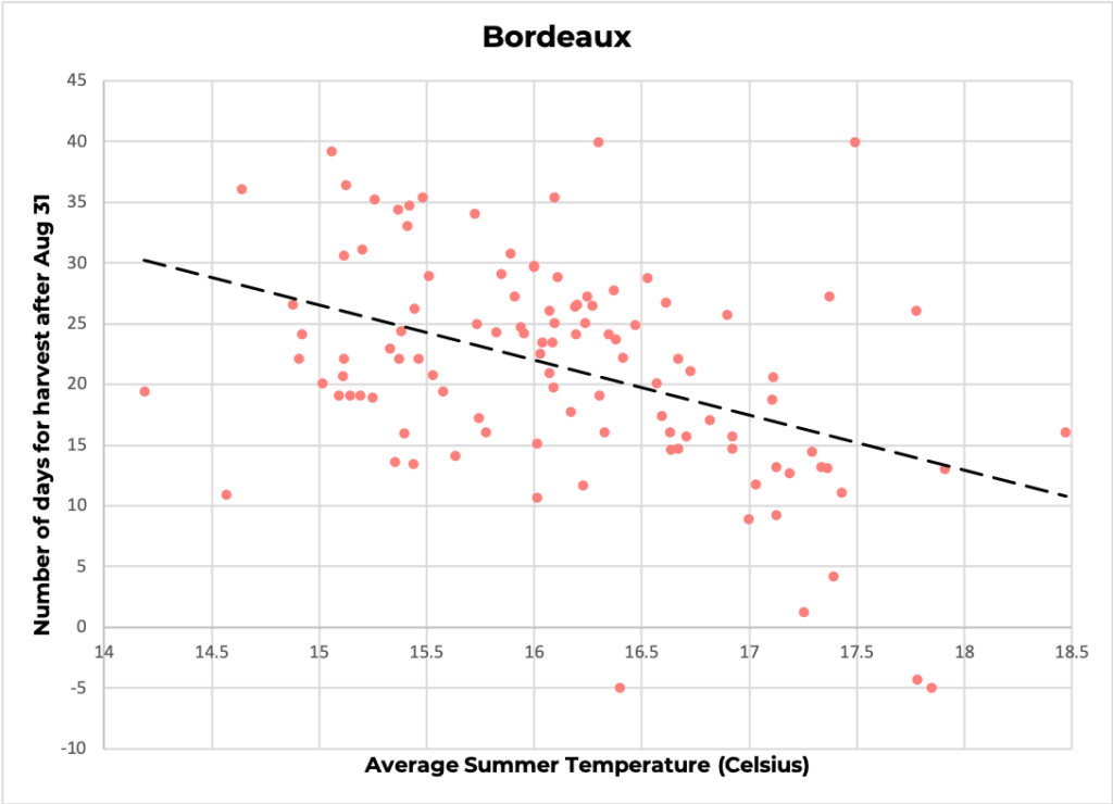
Over just the last century, however, climate change has taken a toll on wine-making. Rising temperatures have shifted the harvesting dates earlier in the year, causing the grapes to ripen faster. The harvest date is, indeed, a key element of wine-making: harvest too early and the wine will not have developed the chemicals that give each region its unique flavour; harvest too late and the grape accumulates too much sugar, making the wine more alcoholic.

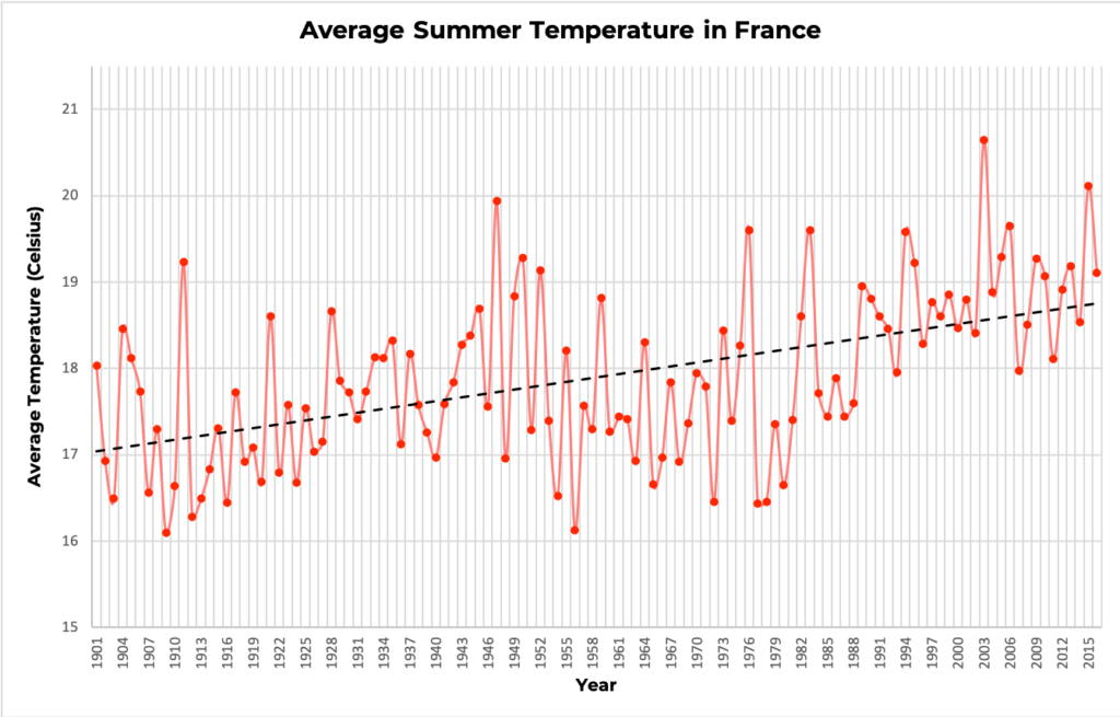
Over the last centuries, temperature and harvesting dates have oscillated together in a somewhat cyclical pattern. Temperature rose between the 10th and 14th century speeding up ripening, shifting the grape harvesting dates, which fell earlier in the summer. Temperature cooled down between 1400 and 1800, in what is called the Little Ice Age, and, correspondingly, grapes took longer to mature.

https://public.tableau.com/shared/F3BKP2B3F?:display_count=y&:origin=viz_share_link&:embed=y

Over just 100 years, climate took such a sharp increase, that grapes are now harvested almost two weeks before the historical average. Regions in the South of France have seen harvests wiped out by rising temperature. In July 2019 alone, some regions saw temperatures as high as 45.9 °C (114.6 °F). Many governments have pledged to limit temperature rise to 1.5 °C in the next thirty years, but this limited increase alone could have disastrous effects on wine production.

This not only threatens to continue to destroy vineyards themselves but also wine investors’ gains. If we do not act now, the rapidly shifting harvesting dates will irremediably change the taste of classics such as Bordeaux and Bourgogne wines, producing wine that is neither suitable to drink nor to invest, strongly damaging wine producers, connoisseurs and investors.


Who Are We: Investigative data journalists working for a magazine such as Bloomberg or The New Yorker.

Who Is Our Target Audience: Affluent people who invest in wine and have the resources to counter climate change through policy change both at the industrial and national level.

Goal: Plots of increasing temperature aren’t convincing enough for people to take action against climate change and sometimes even accept that the climate is changing. However, it has been seen that stories which people can relate to and which are backed by data have the power to convince people about a hypothesis. In this article, we are using people’s love for wine to convince them that they need to take action against climate change.

Tools Used: Static Maps, Interactive Maps (Tableau), Scatter Plots

The article can also be found here.

Datasets used: 

  1. Western Europe 650 Year Grape Harvest Date Database
  2. World Bank Group climate change knowledge portal

The Path of Damage

by Ife Ademolu-Odeneye, Cynthia Hua, Gaurav Pateker

The data we used shows that Cyclone Fani moved through North India causing significant damage to communities and ecologies. We wanted to tell this story in order to demonstrate the link between scientific data (on cyclones) and social data (on the damage they cause). We created an interactive, educational display for a science museum using data on the location and damage caused by a cyclone.

Data

Our initial data was the Tropical Cyclone Dataset from The National Oceanic and Atmospheric Administration, which gave the location and wind speed/pressure data for many cyclones. We ended up narrowing into use data on one specific cyclone, 2019’s Cyclone Fani, with data on location and windspeed.

Initial Data Exploration

This section is not part of our final sketch — it just explains our process, feel free to skip. We explored the data initially by mapping it several ways — by year (A), for a specific basin (B), and by wind speed/pressure (C). We observed that: 

  1. (A) A global map seemed too zoomed out — the localized, social impact of the cyclone’s damage seemed less visible. Therefore, we decided to focus on one specific cyclone — allowing us to zoom in and give a concise narrative instead of getting lost in the large scale of the data.
  2. (B) Mapping a cyclone’s path alone merely gave us a series of lines that did not immediately tell a story. Therefore, we decided to include additional data from outside the NOAA dataset — so that our narrative could go beyond wind speed and air pressure. 
  3. (C) Wind speed and pressure might be more informative if contextualized alongside the cyclone’s damage.  Therefore, we decided to demonstrat the social impact of cyclones — the way it caused damage to communities, infrastructures, and ecologies — in order to explain why tracking cyclones is important.

Data Sketch Summary

We decided to create an interactive art display for a science museum:

  • Audience — Families visiting a science museum looking for an engaging and educational representation of cyclones. The display should aesthetically draw in visitors (selective use of bright colors, not too much clutter) and allow for interactive learning.
  • Context — We imagine this map will be part of a larger exhibit on cyclones/weather. This map ties in scientific data with image data showing social impact. 
  • We focus on Cyclone Fani — a spring 2019 tropical cyclone hitting North India that was the strongest cyclone to strike India in the last two decades, causing severe damage to areas in its path.

Set-up

We created a table-mounted display that is:

  • Shows the path of Cyclone Fani over a larger background map of North India. Sits next to a wall map showing the global context.
  • Touch-interactive — Allows the user to select various points along the cyclone path to learn more.
  • Allows multiple people to interact with it simultaneously as would be the case in a museum setting
  • Table-top display — to allow users of various heights (children and adults) to interact with all aspects of the display

Display

Our map display shows the path of Cyclone Fani over a larger background map of North India:

  • The background is kept simple and two-toned so as not to distract the user from the main focus — the cyclone path. We removed map depictions of roads, rivers, mountains, labels/names or other detail irrelevant to our narrative. The path is the most noticeable bright color. 
  • The path has clickable points. When a user clicks on a point, more details about the cyclone’s impact at that point is revealed. 
  • When a user clicks on a point, interactive slider images pop up showing damage before and after. The user can also click LOOK CLOSER to learn more, EXPLAIN to read facts about the area/cyclone (including data on top wind speeds and date of cyclone activity) or ZOOM OUT to go back.
Main Display (after a user clicks on a point)
  • LOOK CLOSER: An interactive feature allows users to find changes before and after by circling them via the touchscreen. They can also click to see what other users circled. This makes the user pay more detailed attention to noticing what has changed themselves.
LOOK CLOSER Feature