How climate change impacts wine
By Eugenio Zuccarelli, Tyler Millis and Neil Pendse
Wine has been part of our society since the beginning of humanity. The first evidence of wine-making dates back to 6000 BC and the practice spans the millennia from prehistory to the Roman Empire, through the Renaissance, all the way to the present— and we are all thankful for that.
Wine-making has become not just like any other form of activity, but almost an art. An art that over these 700 years has become not only a pleasure for the palate but a form of alternative investment, especially in uncertain times. An art so important that we have detailed records of the grape-harvesting dates for the last 700 years.
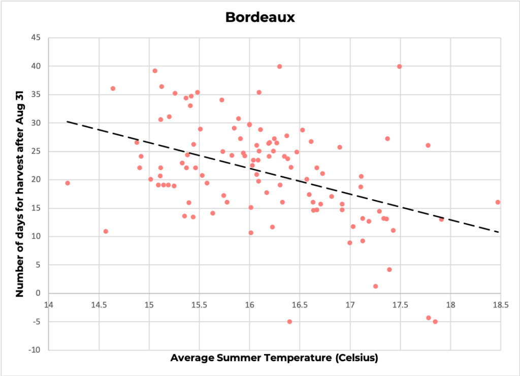
Over just the last century, however, climate change has taken a toll on wine-making. Rising temperatures have shifted the harvesting dates earlier in the year, causing the grapes to ripen faster. The harvest date is, indeed, a key element of wine-making: harvest too early and the wine will not have developed the chemicals that give each region its unique flavour; harvest too late and the grape accumulates too much sugar, making the wine more alcoholic.
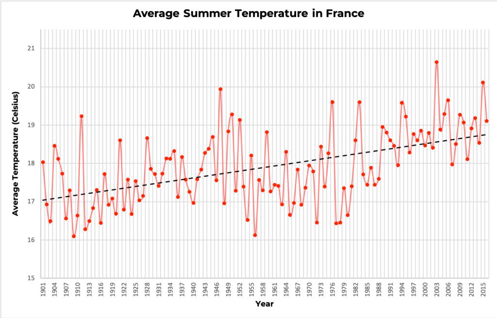
Over the last centuries, temperature and harvesting dates have oscillated together in a somewhat cyclical pattern. Temperature rose between the 10th and 14th century speeding up ripening, shifting the grape harvesting dates, which fell earlier in the summer. Temperature cooled down between 1400 and 1800, in what is called the Little Ice Age, and, correspondingly, grapes took longer to mature.


https://public.tableau.com/shared/F3BKP2B3F?:display_count=y&:origin=viz_share_link&:embed=y
Over just 100 years, climate took such a sharp increase, that grapes are now harvested almost two weeks before the historical average. Regions in the South of France have seen harvests wiped out by rising temperature. In July 2019 alone, some regions saw temperatures as high as 45.9 °C (114.6 °F). Many governments have pledged to limit temperature rise to 1.5 °C in the next thirty years, but this limited increase alone could have disastrous effects on wine production.

This not only threatens to continue to destroy vineyards themselves but also wine investors’ gains. If we do not act now, the rapidly shifting harvesting dates will irremediably change the taste of classics such as Bordeaux and Bourgogne wines, producing wine that is neither suitable to drink nor to invest, strongly damaging wine producers, connoisseurs and investors.
Who Are We: Investigative data journalists working for a magazine such as Bloomberg or The New Yorker.
Who Is Our Target Audience: Affluent people who invest in wine and have the resources to counter climate change through policy change both at the industrial and national level.
Goal: Plots of increasing temperature aren’t convincing enough for people to take action against climate change and sometimes even accept that the climate is changing. However, it has been seen that stories which people can relate to and which are backed by data have the power to convince people about a hypothesis. In this article, we are using people’s love for wine to convince them that they need to take action against climate change.
Tools Used: Static Maps, Interactive Maps (Tableau), Scatter Plots
The article can also be found here.
Datasets used:
- Western Europe 650 Year Grape Harvest Date Database
- World Bank Group climate change knowledge portal
I found the approach of using wine as an entryway for environmental awareness for affluent people who are wine connoisseurs and investors in the wine industry very unique and cleaver.
Considering the target audience and the topic of the article, it might be more impactful and inviting to use a topical aesthetic for the maps. Maybe the map used in the background could be made simpler by omitting some of the details and could be made in a more wine/grape-related color scheme.
I liked that you are connecting outside datasets such as average temperature to help demonstrate some trends in wine harvesting. I also like the interactivity – with maps like this it is often difficult to show trends over time on a single map, so an interactive chart helps the reader explore their own trends.
I think it would be have been helpful to more concretely link wine harvesting dates with average temperatures in the maps. For example, some other type of encoding (map background, dot size, etc.) could have been used for temperature. Or, you may consider having a linked line chart highlighting temperature in a particular year as you are interacting with the map.
Choosing an investigative article as a vehicle is a great choice because wine lends itself well to these narrative nonfiction pieces — there are a lot of visuals you can use, there are characters in the form of consumers and growers and you have a well defined storyline. That being said, I’m not sure a magazine article is the best format to reach the audience you’re looking for. I think a more direct option is to go to an economic conference like Davos, where most people are affluent, have the opportunity to have real climate change impacts and, since they’re affluent, probably consider themselves wine connoisseurs. A post-meetings presentation of the data by a group representing French vineyards (and serving French wines as an enticement to get people to go to the presentation) would be a different way to get the message out. Still, the wine story is great and the maps+visuals you have to support your argument work really well. One small thing, this may be my computer, but it wasn’t always easy to tell the difference between darker reds and lighter reds in the average harvest day maps.
I like the choice to focus on wine investors and to use wine to reach an audience that is often considered to be relatively unaffected by climate change. As someone who also used this dataset and struggled to visualize changing GHD on maps, I really like the way that you visualized the changing harvest dates on the map.
I think that if you were to build upon this story, it would be great to attach a dollar amount to the potential losses associated with this topic and routes they can take to protect their investment through climate change advocacy.
You’ve got the bones of a nice article here, with a nice narrative that goes from context, to impact, to an answer to the “so what” question.
Centrality of maps:
The first maps are a bit subtle. Using text labels for each dot would reinforce the subtle shading difference (they are just super hard to see). When you have so few datapoint separating the label lookup onto the key isn’t a great decision. Perhaps an animation would have helped too (ie. The earliest harvest shows up first)?
Rationale for design choices:
Your back-story justifies the overall narratives structure well. Including the photos and recent history helps a lot here.
Layers of reading:
You go from the broad context into the details for each region well. I like that you drop them into an interactive after the “slide show” style approach to the maps.
Appropriate data use:
Your rationale for the 10-year average is well explained. The 10-year average is well explained.
Suitability for audience:
Setting yourself up as journalists gives you good criteria for making decisions about what to present. You justification of using this data in a magazine for this audience make sense.
Narrative:
Using wine as the way into climate change is a nice response to the goals of the course. The first graph feels a little too specific (focuses on Bordeaux) – shouldn’t this be a broader context; perhaps I’d flip the order of the first two charts? It also includes a bunch of extraneous marks, lines, etc that make it harder to see the main story. Including the call-to-action is a nice note to where the course is going.