Yvonne Jansen, Kasper Hornbæk. A Psychophysical Investigation of Size as a Physical Variable. IEEE Transactions on Visualization and Computer Graphics, Institute of Electrical and Electronics Engineers, 2016, 22 (1), pp.479 – 488.
Short Summary
In this paper, a study of how people perceive physical data visualizations reveals that (1) people are quite good at interpreting 3D bars based on length (2) people are not very good at interpreting spherical volumes, though slightly better with spherical surface areas.
Some interesting takeaways include the context/history of design psychology and a mathematical model for perception, which I summarize below.
Context
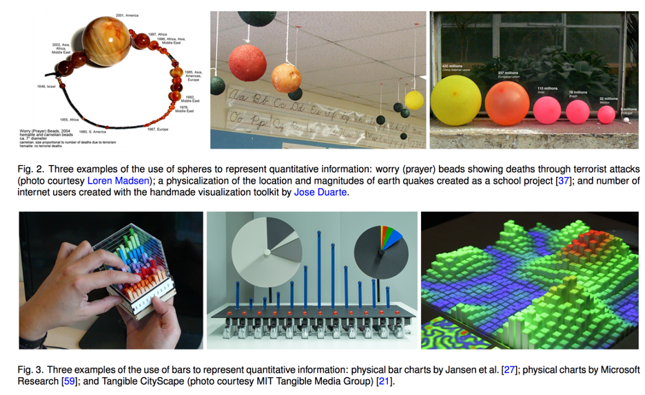
The paper situates itself within a field of design psychology that has historically tried to understand how to effectively communicate information through visual presentation. Past researchers in this field helped define best-use principles for 2D data charts and for mapping — such as developing the idea that position of a dot might be better at communicating quantitative information than size of a dot in a chart (see work of Cleveland and McGill).
However, little research exists for 3D data physicalizations. Additionally, past studies have shown significant variation in volume perception among people.
Application
The authors note that data physicalizations are increasing with the increased access to fabrication technology, increased usage of data and other factors. Past research has shown data physicalizations can aid communication by increasing engagement and engaging non-visual senses. Knowing which variables people have trouble perceiving accurately can help designers make more informed decisions, the authors say, but note this does not mean those variables should necessarily be always avoided.
Experiment
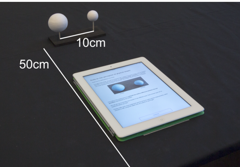
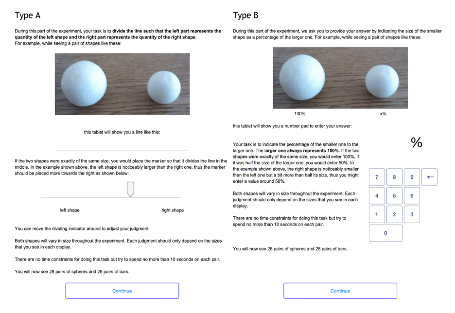
The study asked participants to see a series of shapes meant to represent certain quantities, and then to judge their relative sizes.
The experiment’s user interface allowed participants to deliver their response via a slider or via entering a number. Participants were able to see the shapes physically and via an image.
Math Model
The authors include a mathematical model for quantitizing perception: Steven’s power law, which relates perceived quantity (P) to a true quantity (S) through two factors a and b which are to be experimentally determined.
P=bS^(a)
However, they note that the disadvantage of this model, which represents perception through a single variable, is that perception can vary widely between people.
Results
Bars: People perceived bars quite accurately, in line with previous studies for 2D bars. Perception followed a more linear response curve than for spheres— meaning that as the actual size (S) went up, perception (P) went up correspondingly.
Spheres: People are likely to perceive data incorrectly if it is represented in terms of sphere volume, with a tendency to underestimate (19% error rate). However, if data is encoded in terms of sphere surface area, accuracy improves (9% error rate).
For spheres, perception showed a slightly more exponential curve, meaning that as actual size (S) went up, perception (P) went up as well but more slowly at first.
It is also notable that in interviews participants generally expressed lower confidence in their sphere estimates, some apologizing to say they were “not very good at this”.
Variation: The authors found little individual variation in estimates, suggesting these results are useful as representation of common perception inaccuracies.
Questions to Think About
- What other aspects of data physicalization perception could benefit from this type of psychological research?
- Based on these findings, what might be some direct actions that educators or data visualizers can take to make their work more effective?
- What might be some limitations of this type of study? And how might this type of study be augmented?
Some personal thoughts
In my opinion, it was quite interesting to better understand the history of design psychology research, and how it may have contributed to the more standardized approaches to mapping and 2D charts we see in the professional setting today. However, it can also be argued that this type of research historically contributed to standardizing 2D visualizations in a way that scholars advocating for more creativity within data representation or mapping are pushing against today (whether authors intended to or not).
On a more conceptual level, I felt that treating perception as purely a scientific, and mathematical, variable may ignore the more complex way that people interact with objects and aesthetics. The researchers asked participants in the study to try to quantify their perceptions, but I don’t think this act of quantifying is what people naturally do when seeing a set of objects. When I see a data sculpture, I don’t actively try to estimate the sizes based on perception — and I’m not sure my subconscious does either. I would be interested to see more work that might delve into what narratives people take away from data sculptures whether or not they involve a perception of quantities.
I also feel that perception cannot be treated as an unchanging biological variable, but as something that evolves temporally and may vary spatially. Art historians have suggested that society’s ability to perceive depth may have been affected by developments in painting, and scientist have found differences in perception across different cultures. While reading this paper, I wondered how proliferations in 2D visualizations might have affected the historically accepted findings from design psychology, and how other developments may similarly affect 3D physicalizations.
Finally, I noted that the authors presented fairly small objects and wondered how these size perceptions might vary at larger scales — scales comparable to the human body for example.