Team members: Claudia Chen, Sam Ihns, Robert M. Vunabandi
We explored the wine dataset (700 Years of Grape Harvests), and decided to take an approach where we are wine advertisers and our audience is made of wine and history enthusiasts. We advertise through wine labels, so we made 3 wine labels highlighting 3 specific points in history with interesting events related to the harvests of wine at that time.
Data
The 700 Years of Grape Harvests dataset contains, for each of 27 regions in Europe (most of which were in France), the number of days since August 31 after which grapes were harvested in each of the years from 1354 to 2007. While the time range is huge, a lot of the dataset was missing for various reasons. The main reason were that not all regions started recording this information at the same time (the region of Burgundy is the one that was first). In addition, due to various historical events, some parts of the data were missing heavily.
Sketches
For our sketches, we made wine labels. The idea behind each label is that the label will be attached to a wine bottle and will give specific details about the historical context under which the wine was made. We chose to focus on French regions because most of the dataset was focused on France and within the dataset, French regions had the least amount of data missing. So, each label presents a story in a specific point in time when a notable event took place and changed the history of wine in France. In addition to that, we chose to focus on specific regions (as opposed of looking at all the regions and comparing them) because it allowed us to better tell a compelling advertising story on a wine bottle.
So, here are the 3 sketches we have:
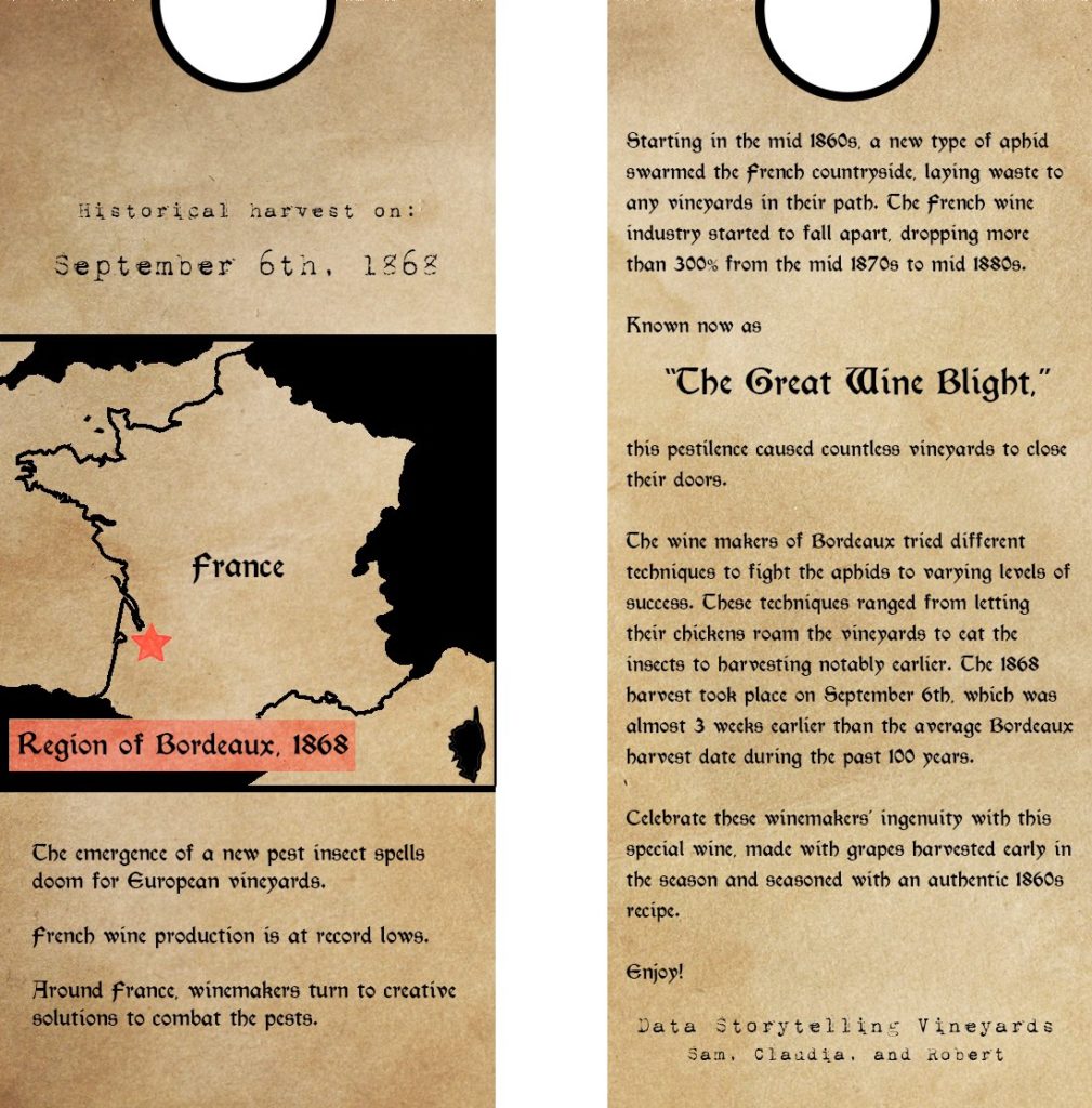
Great Wine Blights, 1868:
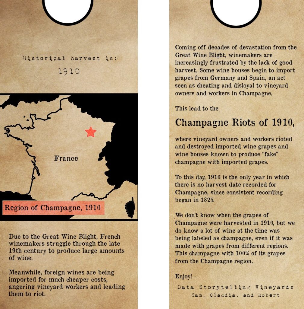
Champagne Riots, 1910:
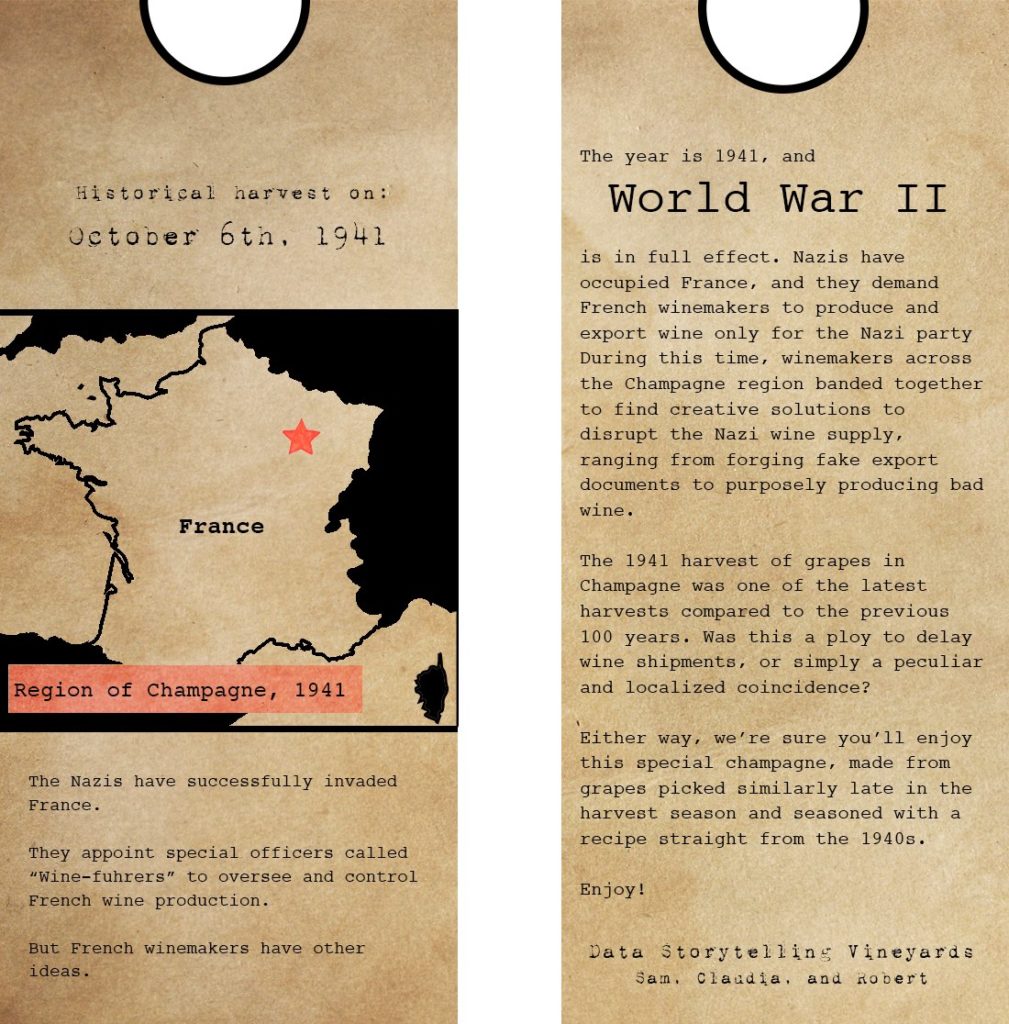
World War II, 1941:
Video
Other Sources
Overall wine production:
- Wine Production for France by FRED
- Charting 3 Epic Collapses of French Wine Production (From 1830 – 1938) by Vinepair
Wine Blight:
- Wine Production for France by FRED
- Charting 3 Epic Collapses of French Wine Production (From 1830 – 1938) by Vinepair
- Wikipedia: Great French Wine Blight
1910 Riots:
- The Champagne Riots of 1910 and what Led to Them by Wine Frog
- The Champagne Riots of 1910 and how they Started
- Wikipedia: Champagne Riots
World War II:
Hi! I really liked your map work — I thought the aesthetics and idea to do a wine label was really clever and distinctive. In particular, I like the way the style of the maps immediately related to its historical and regional theme, and it was clear what narrative I was looking at even before I started reading.
One thing I would have appreciated additionally is if imagery had been used more in the storytelling. The stories were mostly told through text and it would have been nice to see some of the imports/exports or troop movements mapped via arrows or other symbols.
This is a great concept and presentation – the creative use of titles, maps, and font sizes aren’t just aesthetic, they make the story easy to read. In terms of constructive feedback: I see how you used the data to choose your stories, and reference data points in the narrative but it does not feel like the data is the center of the story, rather it feels like the data is used to compliment or enhance the historical narrative told through text. If there is a way that the data could carry the story that would be great. I am also not certain what the main takeaway is–if it is that winemaking is tied to history, then that is clear.
These labels are aesthetically pleasing.
The font and colors are chosen to emphasize the historical focus.
Using a simple map makes a lot of sense, using terrain would detract from the data. However, it would be interesting to show how the geography of France has changed in some ways. For example, the map of France during WW2 could show the line of Nazi Occupation at that time to show that Champagne was in the occupied region. The labels do a really good job of telling the story and have some really interesting takeaways, however, I think the maps could do a bit more to help tell this story while.
The purpose of labels is to encourage people to buy a bottle of wine so I could see how having this label would work to this effect.
I like the wine label approach, by both telling a compelling story and representing data in a concise way. I believe by telling a story about the wine, people are more interested into trying it out because it is more emotionally connected to them and they might feel like they “taste a bit of history”. I would probably have expanded a bit more the geographic aspect, since stories are mostly told through the text. I would also color in the same color France and Corsica, while everything else in black, both neighbouring countries and sea.
This is a creative approach to telling a data story that integrates history of a place well.
Centrality of maps:
The location map is front and center on the label. The geographic historical event is a nice way to make something work within the context of the assignment for this sketch.
Rationale for design choices:
Your rationale for avoiding the change-over-time story makes sense with the context you’ve set up. Discovering the story of the Champagne riots was a nice example of the factoid story.
Layers of reading:
The map narrows the location well and introduces the area, and then the longer narrative on the back is some nice history. What I think is missing is the middle layer of reading, perhaps some symbols to represent the historical moment could have helped here.
Appropriate data use:
Your walk-through of how you set-up and dug-into the data is good (but dwells a little too much on explaining the data). You “melted” the data well – can you add a link to that to support other project we might do in the rest of the semester?
Suitability for audience:
Picking the labels is a creative approach to thinking about how we tell data stories – lots of constraints, but a fun playground to think about. This Is an appropriate response for the audience you’ve specified.
Narrative:
It is hard to build a whole story on a tiny label. Including the historical event is a neat idea, and reinforces the geography of the place a little bit.
This is a really creative use of the data! I liked how you incorporated the historical focus into the overall aesthetic of the visualization through colours, fonts, and tone. Something that would have been interesting to play with is how to better emphasize the historical aspects of the maps. The way cultures understand space changes overtime. Right now, time is only mapped to the visual through the date at the bottom. There are some really awesome historical maps that you could look at for inspiration.
@Rahulb Here’s a link to the converted data:
(1) Converted into one table:
https://docs.google.com/spreadsheets/d/1nFdwsXL0UzxVe9gecv2khlHqZGCzhZfNLLfuUaxci8A/edit?usp=sharing
(2) Converted into one table and generated *some* values:
https://docs.google.com/spreadsheets/d/1asNNHo2gnO6y2RhDk1nKQ405UXCvkagARtpJcISIW5g/edit?usp=sharing
The original data came from https://www.ncdc.noaa.gov/paleo-search/study/13194. In (1), we simply took the latitude and longitude values from the locations sheet and put all the regions into one column. In (2), in addition to the above, we also generated missing values for years in-between non-missing values. We made sure to mark whether the values were generated or not. Here’s a link to the script that generated (1): https://gist.github.com/robertvunabandi/767675136c3dfa8600aa6310ee253008, and here’s a link to the script that generated (2): https://gist.github.com/robertvunabandi/f7f23345b987b8c5d2c58c11745334ab.