by Ife Ademolu-Odeneye, Cynthia Hua, Gaurav Pateker
The data we used shows that Cyclone Fani moved through North India causing significant damage to communities and ecologies. We wanted to tell this story in order to demonstrate the link between scientific data (on cyclones) and social data (on the damage they cause). We created an interactive, educational display for a science museum using data on the location and damage caused by a cyclone.
Data
Our initial data was the Tropical Cyclone Dataset from The National Oceanic and Atmospheric Administration, which gave the location and wind speed/pressure data for many cyclones. We ended up narrowing into use data on one specific cyclone, 2019’s Cyclone Fani, with data on location and windspeed.
Initial Data Exploration
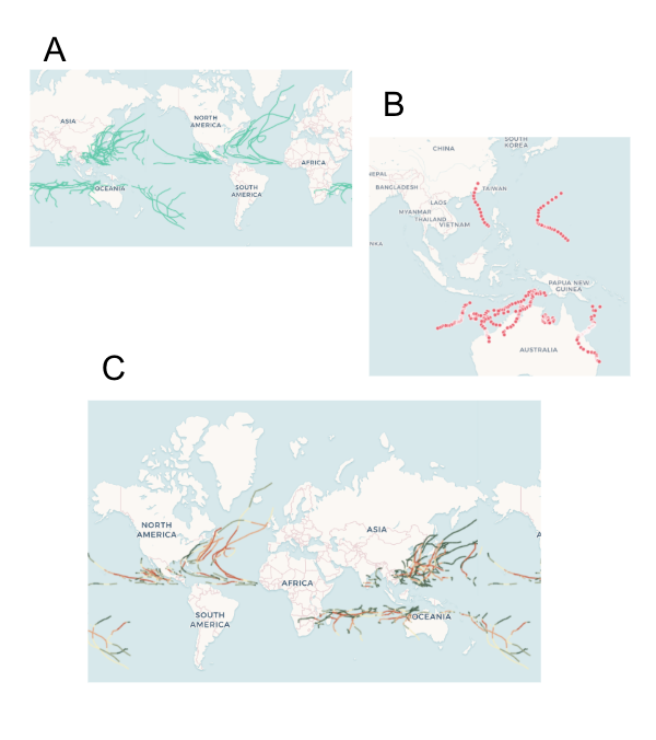
This section is not part of our final sketch — it just explains our process, feel free to skip. We explored the data initially by mapping it several ways — by year (A), for a specific basin (B), and by wind speed/pressure (C). We observed that:
- (A) A global map seemed too zoomed out — the localized, social impact of the cyclone’s damage seemed less visible. Therefore, we decided to focus on one specific cyclone — allowing us to zoom in and give a concise narrative instead of getting lost in the large scale of the data.
- (B) Mapping a cyclone’s path alone merely gave us a series of lines that did not immediately tell a story. Therefore, we decided to include additional data from outside the NOAA dataset — so that our narrative could go beyond wind speed and air pressure.
- (C) Wind speed and pressure might be more informative if contextualized alongside the cyclone’s damage. Therefore, we decided to demonstrat the social impact of cyclones — the way it caused damage to communities, infrastructures, and ecologies — in order to explain why tracking cyclones is important.
Data Sketch Summary
We decided to create an interactive art display for a science museum:
- Audience — Families visiting a science museum looking for an engaging and educational representation of cyclones. The display should aesthetically draw in visitors (selective use of bright colors, not too much clutter) and allow for interactive learning.
- Context — We imagine this map will be part of a larger exhibit on cyclones/weather. This map ties in scientific data with image data showing social impact.
- We focus on Cyclone Fani — a spring 2019 tropical cyclone hitting North India that was the strongest cyclone to strike India in the last two decades, causing severe damage to areas in its path.
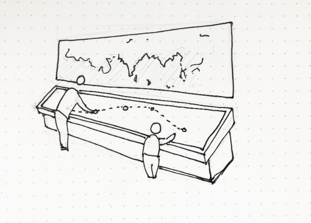
Set-up
We created a table-mounted display that is:
- Shows the path of Cyclone Fani over a larger background map of North India. Sits next to a wall map showing the global context.
- Touch-interactive — Allows the user to select various points along the cyclone path to learn more.
- Allows multiple people to interact with it simultaneously as would be the case in a museum setting
- Table-top display — to allow users of various heights (children and adults) to interact with all aspects of the display
Display
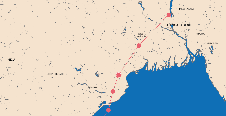
Our map display shows the path of Cyclone Fani over a larger background map of North India:
- The background is kept simple and two-toned so as not to distract the user from the main focus — the cyclone path. We removed map depictions of roads, rivers, mountains, labels/names or other detail irrelevant to our narrative. The path is the most noticeable bright color.
- The path has clickable points. When a user clicks on a point, more details about the cyclone’s impact at that point is revealed.
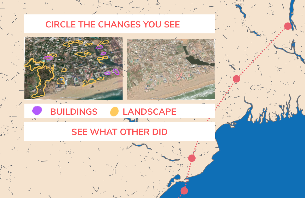
- When a user clicks on a point, interactive slider images pop up showing damage before and after. The user can also click LOOK CLOSER to learn more, EXPLAIN to read facts about the area/cyclone (including data on top wind speeds and date of cyclone activity) or ZOOM OUT to go back.
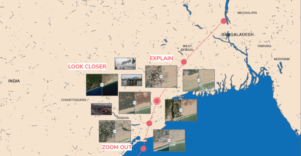
- LOOK CLOSER: An interactive feature allows users to find changes before and after by circling them via the touchscreen. They can also click to see what other users circled. This makes the user pay more detailed attention to noticing what has changed themselves.
Cool idea to do it as a science display! one thing that could make this better is a narrative to draw people into why learning about cyclones matter. Maybe starting with a story about how the regions/people were affected, or some explanation about the how the cyclone in India is related to their lives wherever the display is.
I love the premise of a museum display! You did an amazing job of thinking of the use cases that would occur if it was made real (multiple users, accessible to a wide audience, bright and enticing). One thing I would adjust from this angle however is the ability for the audience to add their own color/drawing to the exhibit (which could very easily be vandalized/misconstrued)… to keep this same element but make it tamper-proof it would be cool to have pre-drawn areas that give the impression that the audience can draw on it, but throw away any drawings the audience actually does.
I also like all the different elements the user can focus on after selecting a point on the line – the images all do a great job at showing the real, on-the-ground cost of the cyclone. One way it could maybe be improved is aligning all the pictures so they’re less cluttered/randomly assorted.
All around, great job!
Love the museum display! I think in the last sketch we’d talked about the challenges of a younger audience and I think the interactive-ness of identifying damage on the images does a lot to make this more accessible to younger kids.
One thing that I think is worth thinking about is the level of abstraction in your map. You took away a lot of terrain and political markers for the sake of clarity but I think that that kind of context can be important at a certain scale, especially if you’ve chosen a specific place to focus on. Identifying some landmarks between the map and the satellite images might help with making the connection between a visualization and a place people are familiar with.
I really liked how you made design choices tied to the format of a science museum presentation and how you added humanity to the story by including pictures of the impact. The interactive “look closer” activity is a creative way to engage museum-goers! I agree with Sam though that the details could be adjusted to fit the setting a bit more. Tracking the circles that people have drawn (assuming that they always draw circles) could be challenging from the exhibit software perspective. Maybe you could ask people to tap the screen, and show a heat map of where everyone has tapped? I do like the idea of showing what other people have decided, since there isn’t really an obvious right or wrong answer for this activity.
Another thing that you could update is the clarity of the buttons — if I understand correctly, “look closer” is an option for certain images while “zoom out” and “explain” are options for that entire view. And if there are unambiguous icons you could use (like a + and – magnifying glass) that could help it look less cluttered.
It could also be useful to include prompts to make it clear that the points are clickable from the bigger view, and once the point is clicked, highlight it in a new color (rather than just putting a circle around it) to make it more obvious that the pictures are relevant to that one point.
This was a cool project and I enjoyed seeing your design process!
You’ve designed a strong interactive that needs a bit more framing and context-setting to pull people in.
Centrality of maps:
The whole interactive is based on the geography of the path of the story nicely. I would have liked the time axis to be added to this in some way. Your rationale for the visual treatment is strong.
Rationale for design choices:
Your “back story” explains how you ended up where you did quite well. Your thoughts about why to show the impact of the storm make sense. Your visual treatment of the map is well thought out, as are your invitations for interaction.
Layers of reading:
The interactive display is built around progressively revealing more detail quite nicely. The 3 -pronged invitation is nice for each place. I also like the invitation to circle an area to make it more interactive and participatory.
Appropriate data use:
Using this data to design an educational display for a museum makes sense. You’ve integrating other data sources well.
Suitability for audience:
The design of a display and wall-map is well thought out. The information included makes sense for the context of the museum. I’m not sure this would work for the youngest audiences, but that’s OK – it is hard to connect to all ages in one piece of a larger exhibit.
Narrative:
This is mostly exploratory, not explanatory. I think some overall framing in the graphic treatment would help a lot to get someone into the piece (even though it is part of a larger exhibit). Some kind of narrative about “on the ground” experience of living through a storm would help frame it – “what does it feel like”, or “I lived through it” or something. I think you’ve thought about this, but I don’t see it baked into your explanation or sketch. Your “look closer”, “explain”, and “zoom out” are a nice take on narrative structure once you’re down in the details of a place.