I chose to make a sculpture of my group’s analysis on the differential effects of selected climate factors on grape harvest date of French wines. In my sculpture, I represent grapes as wine bottles, precipitation as glasses of water, and temperature as candles. I map the data by varying the precipitation with the number of glasses of water uses and varying the temperature with the number of candle wicks used. My sculpture includes a timeline of grape harvest dates (January-June) and (July-December).
I try to show that between 1901 and 1980, both precipitation and temperature had statistically significant effects on changes in grape harvest dates. In particular, higher precipitation corresponded to later grape harvest dates (shift wine bottles to the right) and higher temperatures corresponded to earlier grape harvest dates (shift wine bottles to the left).
I then try to show that between 1980 and 2007, only temperature had a statistically significant effect on changes in grape harvest dates. Increasing the precipitation does not shift the wine bottles, but higher temperatures yield a strong and significant leftward shift of the wine bottles.
Data:
Grape Harvest Dates
NOAA National Centers for Environmental Information
Climate
Factors (Temperature, Precipitation, and Palmer Drought Severity Index)
A study on the differential effects of selected climate factors on French wine grape harvesting
VIDEO: https://youtu.be/qVcJgMXCHdA
We have chosen to work with the dataset of grape harvest dates (GHD) series that has been compiled from international, French and Spanish literature and from unpublished documentary sources from public organizations and from wine-growers: https://www.ncdc.noaa.gov/paleo-search/study/13194
That specific piece was inspired by a study published at the journal Nature (Climate change decouples drought from early wine grape harvests in France) in March 21, 2016: https://www.nature.com/articles/nclimate2960
With our key references at mind (others are listed over this blogpost), we then discussed narrative and audience, making the following decisions:
Idea: Geographically visualize the differential effects of climate factors on grape harvest dates
Audience: amateur French wine club members in the US
Although Climate Change is an important topic concerning a broad audience, we want to focus on a specific group for effective communication.
Limited to French wine because of our analysis
Limited to US because presentation is in English
Narrative: effect of climate change on French grape harvest dates
Climate observations: Climatic Research Unit (CRU) Time-Series (TS) of High Resolution Gridded Data of Month-by-month Variation in Climate (Jan. 1901- Dec. 2012)
Part 1: Exploring Correlations Between Selected Climate Factors and GHDFigure 1. Grape Harvest Date versus climate observations (temperature, precipitation and PDSI(Palmer Drought Severity Index)) demonstrating correlation between GHD and climate.
Observed high and significant correlations between GHD (Grape Harvest Date) and temperature. (High R^2 and low p-value, i.e. R^2=0.704, p<0.0001). The linear relationship is negative, i.e. As temperature increases, the harvest dates start becoming earlier.
Observed high and significant correlations between GHD (Grape Harvest Date) and precipitation. (High R^2 and low p-value, i.e. R^2=0.241, p<0.0001) between 1901 and 1980 but low and insignificant correlations between 1981 and 2007. The linear relationship is positive, i.e. As precipitation increases, the harvest dates start becoming later. While this relationship was true in the early-mid20th century, it has not been as pronounced in recent years.
Observed high and significant correlations between GHD (Grape Harvest Date) and PDSI. (High R^2 and low p-value, i.e. R^2=0.241, p<0.0001) between 1901 and 1980 but low and insignificant correlations between 1981 and 2007. The linear relationship is positive, i.e. As PDSI increases, the harvest dates start becoming later. While this relationship was true in the early-mid 20th century, it has not been as pronounced in recent years.
Because the clearest correlation is between temperature and GHD, we chose to use the temperature in our data story.
Part 2: Multi-regression model:
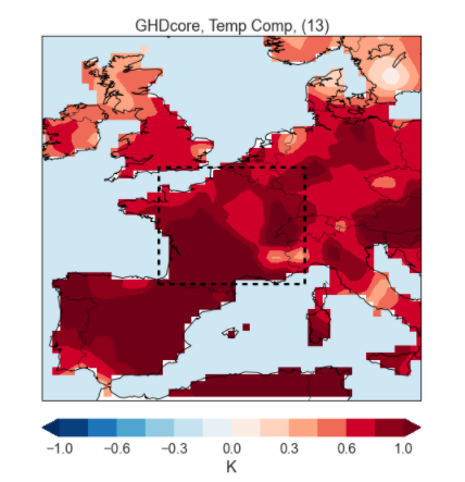
Part 3: Plotting temperature correlations on the map
Figure 2: Grape Harvest Date – Temperature correlation (1900-1980)
Figure 3: Grape Harvest Date – Temperature correlation (1981-2007)
Conclusion:
The data analysis shows that the warmer temperatures, characteristic of the Climatic Change caused by anthropogenic interference, have been a consistent factor of early harvests and high quality wines in France. The data also indicate a fundamental change in the role of the availability of droughts and humidity as large-scale factors in the timing of the harvest and the quality of wine in France and Switzerland, as demonstrated by the scientific article published in Nature. However, in our maps, we decided to focus on the correlation between harvesting and temperature.
The data presentation that I recently saw was by “thawraecon”, an Instagram page that was created at the start of the October revolution in Lebanon. The page’s purpose is to provide data-driven economic insights that explain how past governments, ministries, and policies brought the country to its current economic collapse, while emphasizing the urgent need for change, growth, and development.
The presentation is targeted particularly to Lebanese citizens but also to non-Lebanese citizens who are interested in acquiring knowledge and information on Lebanon’s economy. Given the purpose of the page, which is to share economic facts that are easy to understand, I think the presentation does a good job at highlighting the poor state of Lebanon’s road network. On the first page, the main statistic, “85% of Lebanon’s road network is in fair or poor condition”, is clearly the center of the story given the size of the font used. The second page is insightful in terms of breaking down the level of urgency for the different type of roads. The schematic is clear and sophisticated as it uses broken/not broken blocks to symbolize the proportion of roads that are in good/poor condition.
One way I think this presentation could have been more helpful would be the breakdown of the road network by geographic area as such a breakdown could help identify which improvement in road infrastructure would lead to the highest return on investment in terms of GDP for Lebanon in the least amount of time.