Hamed Mounla, Sule Kahraman, Thiago Medaglia
A study on the differential effects of selected climate factors on French wine grape harvesting
VIDEO: https://youtu.be/qVcJgMXCHdA
We have chosen to work with the dataset of grape harvest dates (GHD) series that has been compiled from international, French and Spanish literature and from unpublished documentary sources from public organizations and from wine-growers: https://www.ncdc.noaa.gov/paleo-search/study/13194
After analysing the data, we decided to google for other references, and that’s how we’ve found the following article: https://www.carbonbrief.org/climate-change-brings-early-grape-harvests-for-french-wine
That specific piece was inspired by a study published at the journal Nature (Climate change decouples drought from early wine grape harvests in France) in March 21, 2016: https://www.nature.com/articles/nclimate2960
With our key references at mind (others are listed over this blogpost), we then discussed narrative and audience, making the following decisions:
Idea: Geographically visualize the differential effects of climate factors on grape harvest dates
- Audience: amateur French wine club members in the US
- Although Climate Change is an important topic concerning a broad audience, we want to focus on a specific group for effective communication.
- Limited to French wine because of our analysis
- Limited to US because presentation is in English
- Narrative: effect of climate change on French grape harvest dates
- Independent variables: temperature, precipitation, PDSI (Palmer Drought Severity Index)
- Dependent variables: GHD (grape harvest dates)
- Data:
- Grape harvest Dates: https://www1.ncdc.noaa.gov/pub/data/paleo/historical/europe/europe2012ghd.xls
- Climate observations: Climatic Research Unit (CRU) Time-Series (TS) of High Resolution Gridded Data of Month-by-month Variation in Climate (Jan. 1901- Dec. 2012)
- Precipitation data: http://data.ceda.ac.uk/badc/cru/data/cru_ts/cru_ts_3.21/data/pre
- Temperature data:
- http://data.ceda.ac.uk/badc/cru/data/cru_ts/cru_ts_3.21/data/tmp
- PDSI: Palmer Drought Severity Index data:
- http://data.ceda.ac.uk/badc/cru/data/PDSI/PDSI_CRU_TS_3.10.01_based
Analysis results:

Part 1: Exploring Correlations Between Selected Climate Factors and GHDFigure 1. Grape Harvest Date versus climate observations (temperature, precipitation and PDSI(Palmer Drought Severity Index)) demonstrating correlation between GHD and climate.
- Observed high and significant correlations between GHD (Grape Harvest Date) and temperature. (High R^2 and low p-value, i.e. R^2=0.704, p<0.0001). The linear relationship is negative, i.e. As temperature increases, the harvest dates start becoming earlier.
- Observed high and significant correlations between GHD (Grape Harvest Date) and precipitation. (High R^2 and low p-value, i.e. R^2=0.241, p<0.0001) between 1901 and 1980 but low and insignificant correlations between 1981 and 2007. The linear relationship is positive, i.e. As precipitation increases, the harvest dates start becoming later. While this relationship was true in the early-mid20th century, it has not been as pronounced in recent years.
- Observed high and significant correlations between GHD (Grape Harvest Date) and PDSI. (High R^2 and low p-value, i.e. R^2=0.241, p<0.0001) between 1901 and 1980 but low and insignificant correlations between 1981 and 2007. The linear relationship is positive, i.e. As PDSI increases, the harvest dates start becoming later. While this relationship was true in the early-mid 20th century, it has not been as pronounced in recent years.
- Because the clearest correlation is between temperature and GHD, we chose to use the temperature in our data story.
Part 2: Multi-regression model:

Part 3: Plotting temperature correlations on the map

Figure 2: Grape Harvest Date – Temperature correlation (1900-1980)
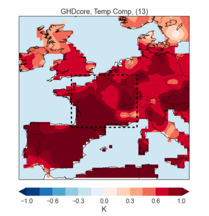
Figure 3: Grape Harvest Date – Temperature correlation (1981-2007)
Conclusion:
The data analysis shows that the warmer temperatures, characteristic of the Climatic Change caused by anthropogenic interference, have been a consistent factor of early harvests and high quality wines in France. The data also indicate a fundamental change in the role of the availability of droughts and humidity as large-scale factors in the timing of the harvest and the quality of wine in France and Switzerland, as demonstrated by the scientific article published in Nature. However, in our maps, we decided to focus on the correlation between harvesting and temperature.
impressive analysis. one thing that could be improved on is zoning in on making your audience care about the data. if they are wine club members, love wine, and have enough money to be in a wine club, maybe there could be a call to action to contribute to climate action organizations, or some pointers on what types of wine are most resilient to climate change and how to invest their money those regions.
I thought your analysis was really well done and does a convincing job telling the story of the effect of climate change on grape harvest date.
One thing I think you could improve is the visual display of your data, given your audience is amateur French wine members. They may not have the technical skills to interpret what exactly is being plotted on your map visualization (i.e. what “K” on the heatmap legend means).
Echoing a previous comment, this is an impressive analysis but you’ve really limited your audience to Amateur Wine Enthusiasts who also have a relatively significant data background. I think if there was more context on what the different effects are, even tying them to specific moments and vintages might help ground the results better in your audience’s mind, making it a more useful advocacy tool.
One thing that was great: The initial regression graphs were really on point. Like, they provided a very easy way to convey the fact that temperature influences grape harvest date. This was also a great way to analyze this data.
One thing that may need work: While the above analysis was great, our group also looked at this data. One thing we found was that the date when grapes are harvested are heavily dependent on what type of wines winemakers are looking to make. So, it would have been nice to say a thing or two about whether there might be confounding factors: how much of the change was coming from winemakers choosing to make their wine differently or evolving their wine-making process and not necessarily just temperature?
The analysis was very complete. The plots that you have come up with are really interesting. The maps also look really good. One thing that I’d suggest is to make the map scale more understandable. I couldn’t interpret K just by looking at the map and even after reading that it’s the correlation I don’t fully understand what it is. Maybe a line or two on how it was calculated would be helpful!
This is a nice analysis, but this isn’t stitched together into a narrative for this audience well.
Centrality of maps:
Your maps are a reasonable choice for representing the geographic nature of the impact of temperature on harvest date, but are presented without visual context. Your voice explanation provides some of this, but I would have appreciated more explanatory visual design to help understand the two maps of the different time periods.
Rationale for design choices:
You’ve provided strong rationale for why you picked certain factors and time periods. One note is that I wonder why you picked 1980 as the key year to split your analysis.
Layers of reading:
If I look at all the pieces you’ve included I mostly see a detailed, and super-detailed presentation of the data for readers. I don’t see an introduction that pulls me in by setting up some context and then pulling me into a narrative about it.
Appropriate data use:
Your analysis is data-heavy, but your video introduces it well. I won’t dig into an analysis of your correlations, because this course focuses on the story.
Suitability for audience:
Your audience is well defined, giving you solid criteria for making design choices. Your note about providing the multi-variate analysis as an addendum makes sense – this audience won’t be interested in this expect for you to prove your trustworthiness. Showing lots of numbers is certainly one way to do this.
Narrative:
You did a good job citing your sources and other work that inspired your sketch. The key piece I take away here is that temperature is the driving factor here, from your quick analysis. The problem is that you’ve presented this as a research report with suggestions about how they could be introduced to the wine club, rather than a narrative story that walks us through the context, impacts, and relevance of the data.