Team: Olivia Yue, Samra Lakew
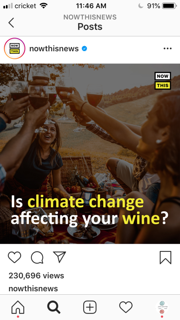
Our data story is a video inspired by accounts like @nowthisnews on Instagram. Our goal with this video is to communicate the impacts of climate change with the changing taste of wine around the world. The decision to create an Instagram post was meant to reach our target audience of millennials, who are now the generation that consumers the most wine worldwide.
The data says that Old World wine-producing countries in Europe are experiencing shorter wine harvesting seasons. The seasons are shortening due to climate change and increasing temperatures globally. We want to tell this story because it demonstrates how the goods we consume regularly are changing both in how they are made and how they taste.
We use the 700 years of grape harvest dataset for this data story. The dataset shows the harvest date (counting from August 31st) of every year starting in the 1500s. We decided to focus on the regions with the most data. We then decided to the data from 1960-2007 to clearly illustrate the impact that climate change has had on growing seasons.
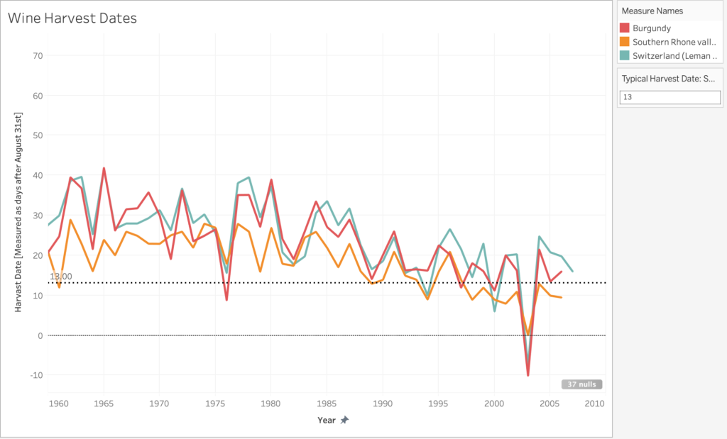
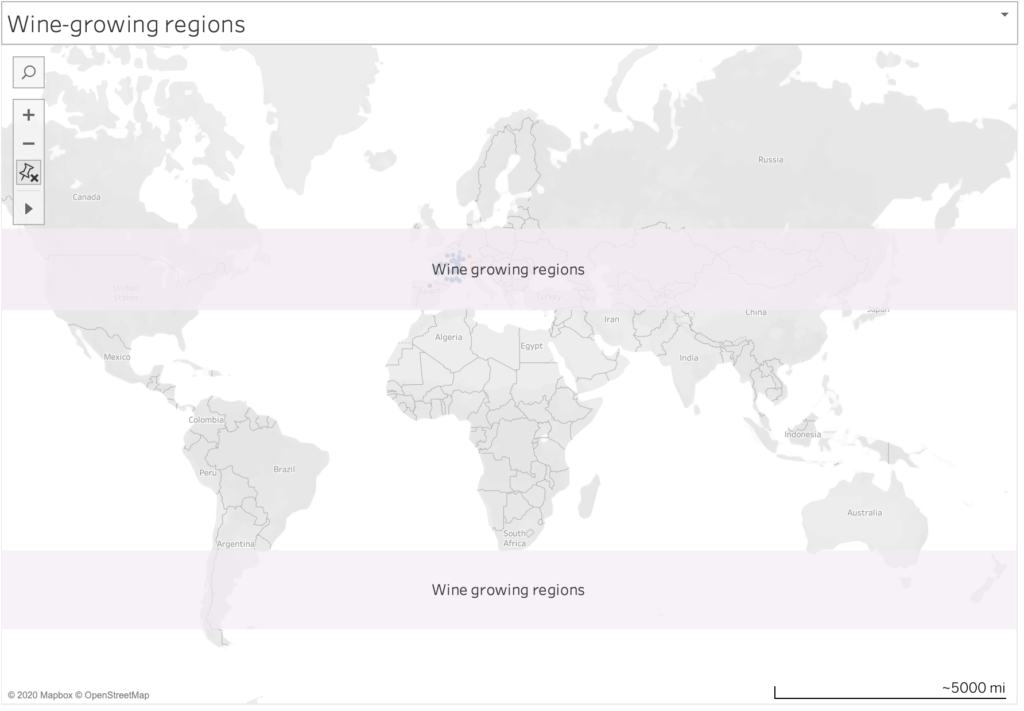
Traditionally grapes for wine have grown in regions between 30-50 degrees latitude in the northern and southern hemispheres. As temperature rises, the ideal conditions for growing grapes move further towards the poles into higher altitudes. For regions that are experiencing higher temperatures harvest times are shorter and the alcohol content is higher in grapes. In response, growers are changing the types of grapes they grow to more resilient strains and sometimes to different types of wine altogether. All of these factors will impact the kinds of wine we drink and the way that they taste.
Things we could expand on in the future:
- Add dataset that shows the new growing regions and explain why they are now suitable for growing (ie, locations at a high altitude and lower latitude, or lower altitude at a higher latitude)
- Download Tableau map layer for latitude and longitude gridlines
- Comparing the volume of wine produced by certain grapes as growers shift to more
- Comparing the volume produced by different regions over time
Sources:
https://www.ncdc.noaa.gov/paleo-search/study/13194
https://www.washingtonpost.com/business/2020/01/31/wine-climate-change-/
https://www.nationalgeographic.com/science/2019/09/wine-harvest-dates-earlier-climate-change/#close
https://blog.mineral.agency/the-millennial-wine-consumer-72d2e53947f7?gi=d947021ff607
I think this concept is great for communicating why a target audience that may be apathetic should care about climate change by focusing on something that may be important to them. I also like the visuals, they are easy to follow and the ‘instagram’ post looks realistic.
My main constructive feedback is that I am not sure that all data points are at service of the main message; for example, why is it a problem (for a Millenial wine consumer) that the location or timing of seasons change? I think, if you had more time on this, I would just make sure that every data point somehow serves your main message – the takeaway I got from here is more around how climate change may be contributing to changes in when and where wine is made but not that it is significantly harmful.
I really enjoy the idea of having this presented as a sort of click-baity Instagram/Twitter video, since it’s a way to deliver a snappy message. And the choice of thumbnail image is spot on – that’s exactly the type of filter NowThisNews would use on this image.
Because I like the concept so much, I wish the group had really leaned into the concept, by adding music and including references from pop-culture, especially those that are relevant to the millennials you’re targeting (such as, a clip from Sideways). There’s also some pieces of information that I think would be helpful to add (e.g., the name of the regions in the first map with the dot and something about the usual harvest time before discussing how much that has changed with climate change) since these would be a way to add context for the viewer.
I like how this group accurately portrayed the chosen form. I could very much see this appearing on my Instagram feed and paying attention as the first frame has a simple heading.
Telling the viewer what to look for in the graph before the graph is viewed is also very effective as when the chart appears it is clear to look for a downward trend. Unfortunately, you cannot see the y-axis which means it is very difficult to tell what the graph is trying to show. Also, it might be more effective to use a scatter plot with a line of best fit given that there isn’t a “smooth” connection between neighboring data points. On the final map maybe highlighting some of the specific locations of new and old vineyards would give more tangible detail as to where the wine production is happening.
Great project! The video did a great job showing the data and pushing your narrative. With the overwhelming amount of things on social media vying for a user’s attention, forty five seconds is a very solid length and you do a good time stating your case quickly and in an interesting manner. I especially like the Ken Burns-style pan over some of the images, something I feel like I see in every NowThis video and is also a really easy way to make a video feel more alive.
A lot of the things that could make this more impactful are simply related to spending more time on the video editing (which like I get you probably know, and it’s not in the scope of the project). Things like the moving, floating region over the map being made less blocky and some of the static images being turned to video would make the entire video flow much better.
All in all, great job.
I really loved the medium you chose to tell your story in. I definitely see this as a targeted ad I would receive on my Instagram! You did a really good job following the format that these videos traditionally had, which made watching it really enjoyable.
One suggestion I have is to include some sort of call to action at the end. It could be something as simple as highlighting sustainable wine brands to encouraging people to recycle their wine bottles- some wine-related call to action could help make the message stronger.
You’ve got a strong simple story explained effectively in the medium you choose.
Centrality of maps:
The introductory map shows up in a good spot in the narrative, but the three sites could have used labels. The chart showing decreasing wine dates is a candidate for smoothing so the visual isn’t so jarring. The sliding yellow highlight area showing the region of growth moving north is well used on top of the map – this is definitely a geographic story (though a citation on the slide would have helped).
Rationale for design choices:
The Instagram choice makes sense for the audience. A missing piece I see is that you don’t justify why you picked those three sites; a quick note saying “let’s look at three wineries” or something would have helped there.
Layers of reading:
You start off with the main story, and then dig in effectively to details. I would have liked to see a few more layers here, but I understand that the project timeline was awkward with the closure in the middle of it.
Appropriate data use:
The grape data is central to this story. My quick reading doesn’t show any mis-use of the data.
Suitability for audience:
You’ve justified your choice of medium well based on the audience – that was a good simplifying decision. This narrative makes sense for this audience to me.
Narrative:
Your text is well edited and clear. It summarizes the key points of the story quite well. You’ve connected the data to the audience’s context nicely. One missing piece would be something about what the wineries are doing about it.
This is awesome! I really like that you borrowed some the effective data storytelling techniques developed by Now This. I especially liked how you used short annotations with key words highlighted to get your message across really quickly. Something I think could have made this even better would be to make the figures simpler. In my opinion, since the viewer only has a few seconds to read the image, the visual has to be simple to the point of being a bit ridiculous.