5Boro Bouquet Feedback

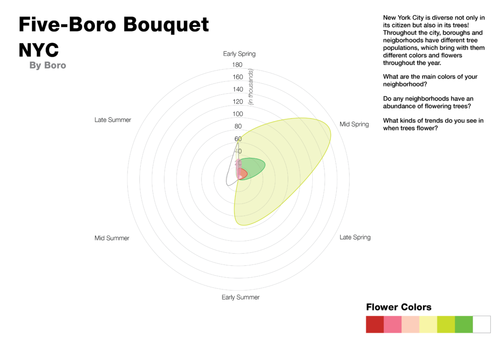
by Xio Alvarez, Eileen Hu, and Olivia Yao

CONTEXT

Original Sketch

Intended Audience: New York City residents, tourists planning to go to NYC, flower enthusiasts

GOALS

Our goals in testing this sketch with its intended audience can be broken out into short, medium, and long-term goals.

Short Term: look appealing enough to engage organically, leave knowing more about the colors of flowering trees in the boroughs, and share the visualization with others

Medium Term: to promote inter-neighborhood travel and tourism around trees to see flowers, to avoid neighborhoods with high flowering rates when allergies are a concern, to visit NYC to see flowering trees

Long Term: increased citizen engagement/involvement in tree/flower planting in their own neighborhood, increase requests for tree planting through parks, public works projects, increased volunteer-ship in urban forestry and parks, increased pride in place/ownership of the neighborhood.

Our original test plan was to run a survey on the charts themselves through a google form (form found here) shared through our own social networks concurrently with a more in depth interview series with a few people walking through the sketch of the site as the original sketch intended the final product to be. By bifurcating our testing/interviewing processes, we hoped to get an understanding of the high-level readings of our graphics through the standalone surveys and a more in depth understanding of our audience’s needs in the visualization through the in-depth interviews.

FINDINGS

From our standalone survey, we found that, at the resolution that the sketch was rendered, we needed to provide more context in order for the visualization to be approachable. With the introduction of a bit more explanation, most respondents felt that they had learned something new from the charts, and expressed an interest in learning more about their city’s greenspace. Some comments we received were:

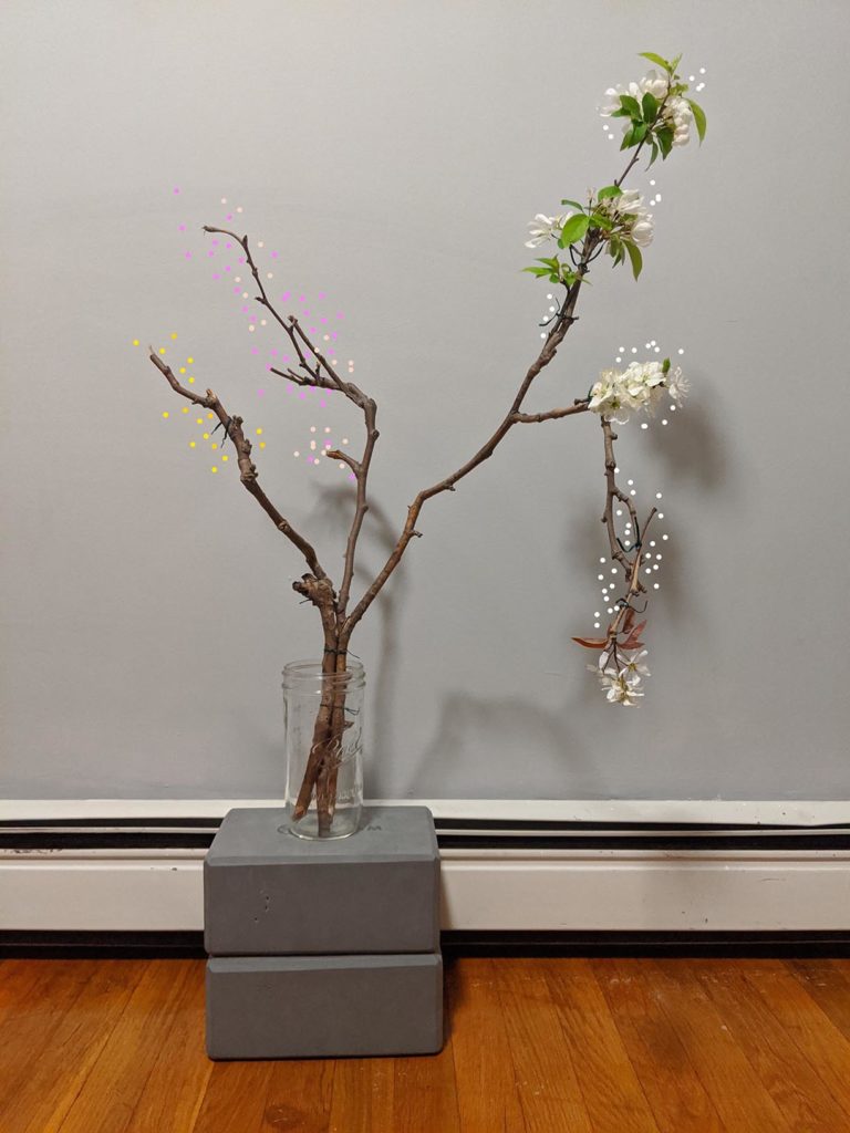
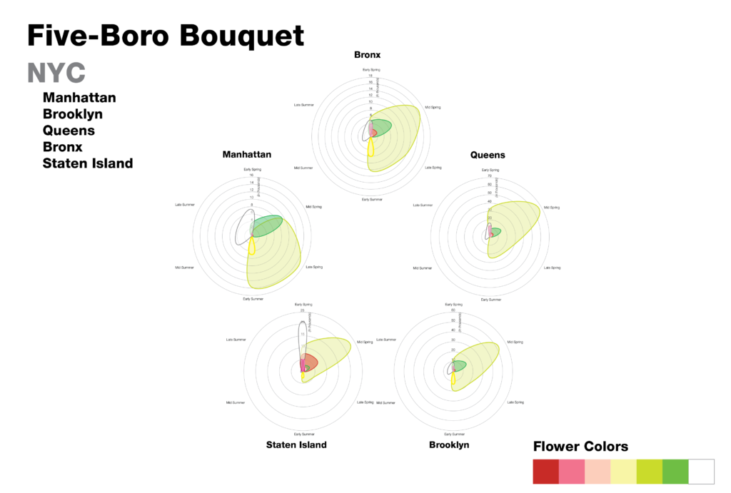
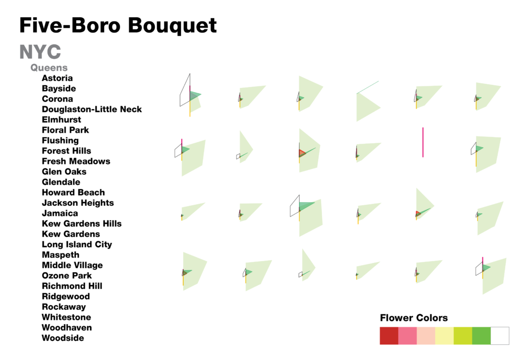
“it’s pretty! could you make the graphs look like flowers? That would maybe make it more shareable.” 

“i think the site made the charts more understandable but just looking at the charts alone, I was really confused at what I was looking at.”

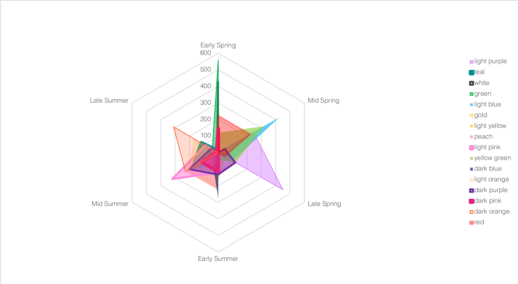
This feedback tracked with what we heard in our in depth interviews. Some interviewees found the visualizations not technical enough and bemoaned the loss of data resolution in the representation, while others said the symbology could be leaned into further in order to be more approachable, making the graphs even more floral and introducing representative flower images. We also heard that we needed to provide more contextual information to introduce the dataset and the graphs before allowing people to explore the data through the graphs. Many said that pushing the visuals would make it more engaging, and we read from that the sense that the data alone might not bring people in. That said, most interviewees reported that they felt like they had learned something new by engaging with the visualization, either about trees or about the city.

Moving forward, we saw two areas for improvement — with the standalone charts, we thought it would be important to introduce a title and a questioning prompt in order to bring people in more directly, as well as adding flowers to contextualize the colors. With the interactive explorer, we would look to introduce more clear levels of reading into the visualization, with more depth and more clarifications of the data. One thing we heard in our interviews that we thought would be interesting to introduce was a map component, moving beyond neighborhood names to allow users to explore the data in a new way. In a later iteration of the project, we might consider also allowing users to switch between different graph types, using the radar graph flowers as a hook but giving users a more familiar way to explore the data.

Branching Out

For this sculpture, I revisited our first sketch (  https://datastudio2020.datatherapy.org/2020/03/05/the-city-in-bloom/ )

The sculpture attempts to be an approximation of a tree, where the different branches are all the different trees that are in bloom in a neighborhood right now. Larger branches correspond to a larger population of trees (in this sketch, the white flowers have the largest branch), and the number of branching moments corresponds to the number of tree species that fit in that category of flower color.

In pursuing high fidelity in terms of materials, I ended up a little limited in palette (also, I should clarify — these are all fallen branches, no trees were harmed!)

Data: 2015 data from the NYC Tree Census from the NYC Parks Department.  ++ information on tree flower colors

The Life of a Storm

by Xio Alvarez, Sarah Mousa, and Devin Zhang

The tropical cyclones database includes granular meteorological data on all cyclones ever recorded by NOAA. While many people have some general familiarity with the categorizations given to cyclones, we precieved a gap between the highly specific data presented in the database and the physical impact of the storms themselves. Most people will understand that a category 5 is stronger than a category 2 cyclone, but the magnitude of difference and what that atmospheric pressure and wind speed actually appears as on the ground are less understood.

We decided to take this data and develop a sketch for a a tv series called “The Life of a Storm” which would connect the meteorological details of historical cyclones to the images and stories of their impacts on the ground. One thing that was clear from the data was that each storm moves through many phases and is felt differently in different places. Our news research also showed us that similar storms can have different impacts depending on how prepared people are for their arrival. The intention of this series is to educate a general public audience on the impacts of different storms and the types of preparedness and policies that are effective in mitigating their effects.

“The Life of A Storm: Hurricane Irma”

Our sketch looks at Hurricane Irma, one of many cyclones from the dataset that struck the Carribean and southern coast of North America in the hurricane season of 2017. Irma is a useful storm for us to use for this premier episode as it began as a category 5 and proceeded to make landfall as it progressed through its decline, tracking across western Florida before downgrading to a tropical storm and then depression over Georgia and Alabama. Our sketch geographically locates the storm as it downgrades, stopping at each point to understand how the effects were felt on the ground and what types of damage were typical in that area. We connect these images to stories from neighbors and victims in their own words.

Our hope is that by traversing levels of abstraction (maps to satellites to photos), we are able to create a memorable connection between the technical language of emergency management and meteorology.

Other Sources

Satellite Images: Google Earth

News reporting:

Cuba:

  • https://www.miamiherald.com/news/nation-world/world/americas/cuba/article194517349.html
  • https://www.usatoday.com/story/news/world/2017/09/10/cuba-sees-devastation-hurricane-irma/651125001/

Florida:

  • https://www.sun-sentinel.com/news/weather/hurricane/fl-reg-keys-visual-then-now-20180907-story.html
  • https://www.miamiherald.com/news/weather/hurricane/article172742816.html
  • https://www.miamiherald.com/news/local/community/florida-keys/article217950495.html
  • https://www.orlandosentinel.com/weather/hurricane/os-hurricane-irma-damage-in-naples-and-southwest-florida-pictures-20170912-photogallery.html
  • https://www.washingtonpost.com/national/health-science/tampa-bays-escape-from-irma-was-more-than-luck-some-say/2017/09/15/5f7b618e-9a20-11e7-87fc-c3f7ee4035c9_story.html

Georgia:

  • https://wgxa.tv/news/local/photos-hurricane-irma-damage-across-middle-georgia
  • https://www.weather.gov/ffc/2017_Irma#winddamagephoto

The City in Bloom

Xio Alvarez, Trish Cafferkey, & Cynthia Hua

Our group chose to explore the New York City Tree Census data, which is collected and disseminated by the NYC Parks Department. In particular, we worked with the 2015 dataset.

The data say what types of trees have been planted all across the city, complete with locational data and species, presenting different tree-demographic profiles across the different neighborhoods. We thought that, with the addition of some more information about the qualitative character of the trees themselves, we could tell an interesting story about the way trees can impact the atmosphere of the city. We want to tell this story because we think that, while people may mostly notice trees when they are doing something like flowering or changing, their presence in a city, borough, or neighborhood can have outsized impacts on quality of life for their neighbors.

An all-city bloom

We joined the tree census data with a dataset from Plantium containing the times of year the trees (18 trees for this sketch) flower, and the color of the blooms. Charting this radially, we produced a series of jurisdictional “blooms” and “bouquets” which reflect the different plantings around the city, and when in the year they are at their peak bloom.

For our audience, we considered two sets of individuals with opposing sets of needs that might appreciate this type of service — those who chase flowers (tourists, photographers) and those who have allergies and might want to avoid them.

the Five-Boro blooms (a bouquet)
The Queens neighborhood bouquet

By looking at the neighborhoods and boros together, we can get a sense of the different character profiles of the flowering trees in the neighborhood. We can see which neigborhoods have more trees than others, and how some neighborhoods have irregular presentations over the course of a year.

As we designed this sketch, we realized that there were additional considerations we would need to account for if we wanted to move forward with a more complete story. With just this presentation of data, we would need to normalize for the area of the different jurisdictions, as right now they are all presented as though they have equal area, which does not support our story. Our sketch also stops at the neighborhood level, and we think it would be interesting to allow users to create a chart of their block or street. Finally, since the census is a regularly updated dataset (around every 5 years), we thought it would be interesting to include previous census years to show how the city’s blooms have changed over time.

An additional dataset we would be interested in including would be information on other flowering plants in the city, which would produce a more vibrant and extensive chart.

a mock up with more flowering plants

Xio’s Data Log – 2/21

Social Data / Chatting

In my day-to-day, I would guess that I am producing the most information through this category of activity. I have multiple active group chats on WhatsApp, which can leave breadcrumbs about my location and activity calendar (when/where I am messaging more frequently). I also use messenger on Android, which I imagine collects similar bits of data though in a less secure environment.

For work and school, I set up my MIT email to work through my personal gmail account for convenience. Our department’s computer team tells me that this means Google reads all of my emails now. My lab and another student group I work with communicate over Slack; they are not the most active but I do check them regularly throughout the day.

The last set of communication channels worth mentioning are Instagram and Reddit. I posted a neighborhood-tagged photo on instagram that morning, which of course provided some location data as well as information on some of my tastes, which I’m sure instagram takes in concert with the things I like to target more and more effective ads into my feed. On Reddit, I mostly read (rather than comment) but the subreddits I follow probably paint a pretty detailed picture of my online interest profile.

Moving Around

I’ve been using Bluebike to get around lately while I put off some bike repairs until it gets warmer. Because it’s a docking system, they collect my start/end points as we saw in the data we explored a few classes back, as well as the information attached to my subscription through MIT. I plan trips using the app Citymapper, so they get more granular information about my trips.

I was good about packing coffee/food today, so I didn’t pay for anything with my credit card — though on a normal day there would at least be some data on my caffeine, lunch, or afternoon snack habits around my neighborhood and/or campus.

As I moved around, the Fit app on android tracked my steps and my location.

Getting Online

I primarily use chrome for my web browsing because it makes it easy to pick things up across machines and between my phone and my computer. Most of the group projects I am on work between Dropbox and the Google Drive suite of products (often both).

I used the MIT VPN from my apartment to get access to research materials online through the library, requiring my MIT ID. I used google scholar to help in researching which articles would be useful, leaving behind information about both my work and my interests

Other Things

I use an alarm clock app that (supposedly) tracks my sleep cycles to help wake me up at easier times, which means that there’s some behavioral data being collected even in my sleep.

I opt-in to sending analytics for many of the sofware that I have on my laptop, which likely means that my usage of things like adobe creative cloud registers somewhere in their analytics platform.