Xio Alvarez, Trish Cafferkey, & Cynthia Hua
Our group chose to explore the New York City Tree Census data, which is collected and disseminated by the NYC Parks Department. In particular, we worked with the 2015 dataset.
The data say what types of trees have been planted all across the city, complete with locational data and species, presenting different tree-demographic profiles across the different neighborhoods. We thought that, with the addition of some more information about the qualitative character of the trees themselves, we could tell an interesting story about the way trees can impact the atmosphere of the city. We want to tell this story because we think that, while people may mostly notice trees when they are doing something like flowering or changing, their presence in a city, borough, or neighborhood can have outsized impacts on quality of life for their neighbors.
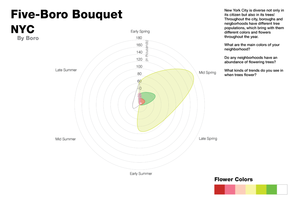
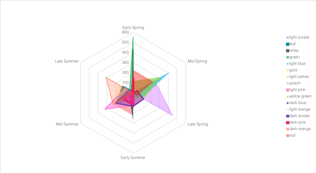
We joined the tree census data with a dataset from Plantium containing the times of year the trees (18 trees for this sketch) flower, and the color of the blooms. Charting this radially, we produced a series of jurisdictional “blooms” and “bouquets” which reflect the different plantings around the city, and when in the year they are at their peak bloom.
For our audience, we considered two sets of individuals with opposing sets of needs that might appreciate this type of service — those who chase flowers (tourists, photographers) and those who have allergies and might want to avoid them.
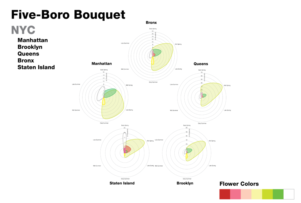
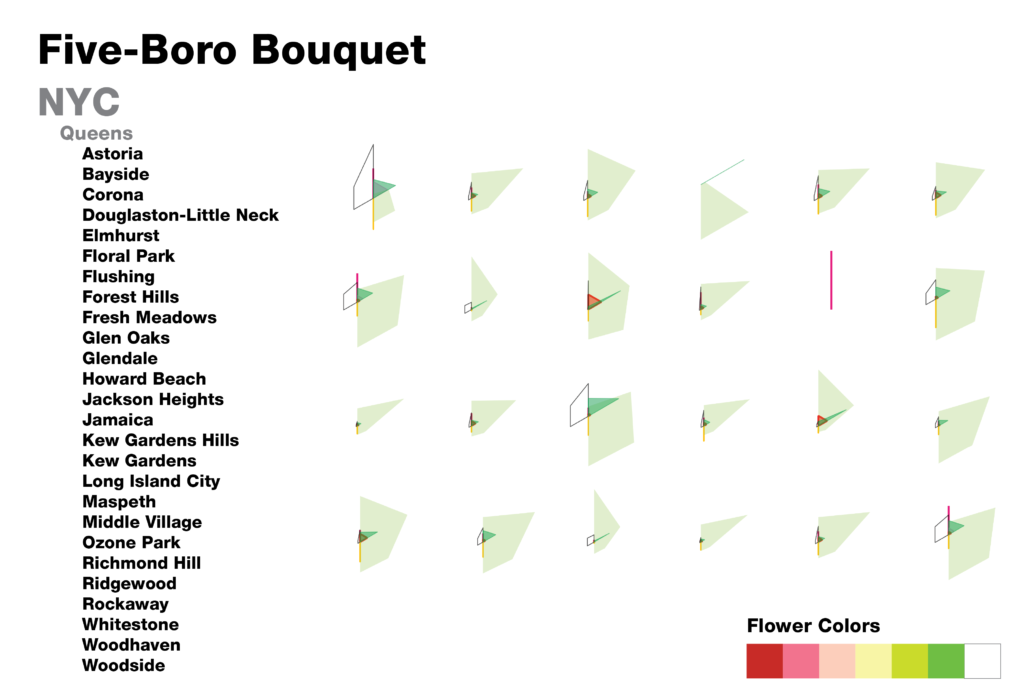
By looking at the neighborhoods and boros together, we can get a sense of the different character profiles of the flowering trees in the neighborhood. We can see which neigborhoods have more trees than others, and how some neighborhoods have irregular presentations over the course of a year.
As we designed this sketch, we realized that there were additional considerations we would need to account for if we wanted to move forward with a more complete story. With just this presentation of data, we would need to normalize for the area of the different jurisdictions, as right now they are all presented as though they have equal area, which does not support our story. Our sketch also stops at the neighborhood level, and we think it would be interesting to allow users to create a chart of their block or street. Finally, since the census is a regularly updated dataset (around every 5 years), we thought it would be interesting to include previous census years to show how the city’s blooms have changed over time.
An additional dataset we would be interested in including would be information on other flowering plants in the city, which would produce a more vibrant and extensive chart.