Wine Label Feedback Collection

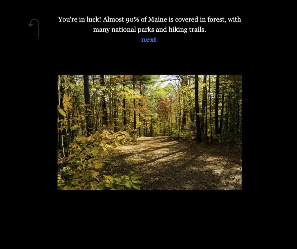
Sam Ihns and Claudia Chen

For our impact assessment, we collected feedback on the wine label sketch (here) from the maps/creative maps unit. Because this sketch came from a commercial perspective, we sought to survey the most promising commercial audience. We found that in the U.S., over 40% of all wine is consumed by millennials (source), so we surveyed 20 millennials to gain more insight about the effects of our historical wine labels. 

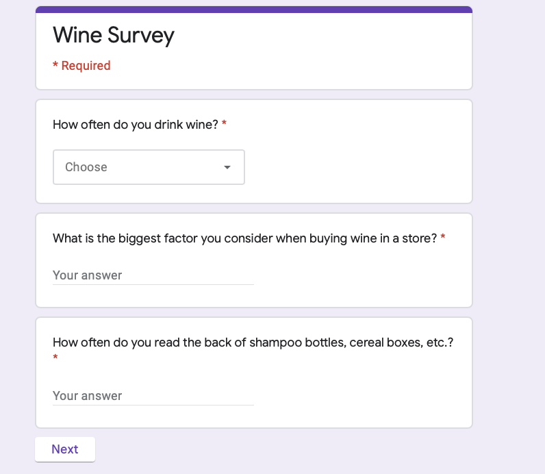
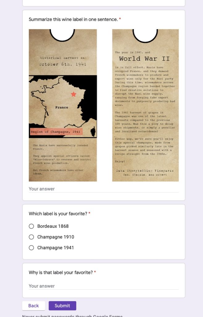
Before iterating on the labels, we wanted to figure out what people got out of the wine labels and how they interacted with the labels. We also wanted to find which of the three wine labels was most interesting/enticing. Our test plan was to send out a Google Form (pictured below), first getting insight on their drinking habits, then asking them to summarize the wine labels in one sentence and what their favorite label was.

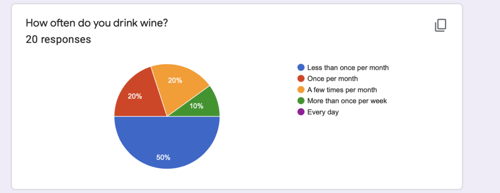
The breakdown of our respondents’ drinking habits is as follows:

The breakdown of people’s favorite labels is as follows:

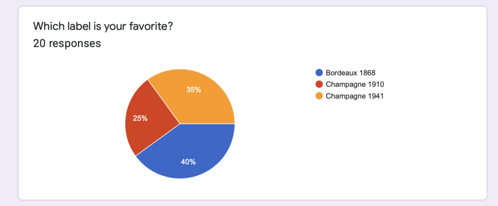
Overall, people liked the Champagne 1941 and the Bordeaux 1868 labels the most, but for vastly different reasons. People who preferred the Champagne 1941 label preferred it because they felt it had the most interesting and compelling story involving human beings. People who preferred the Bordeaux 1868 label preferred it because they felt the aesthetic and font matched the historical time period the best. People also said that they tended to read larger things like cereal boxes instead of smaller shampoo bottles, and that the labels themselves felt crammed and could be difficult to read in a sitting where an entire bottle of wine would be used. Finally, people said the map was difficult to read, so we shaded out the other countries. With these points in mind, we pivoted to produce a boxed wine label instead of a wine bottle label.\

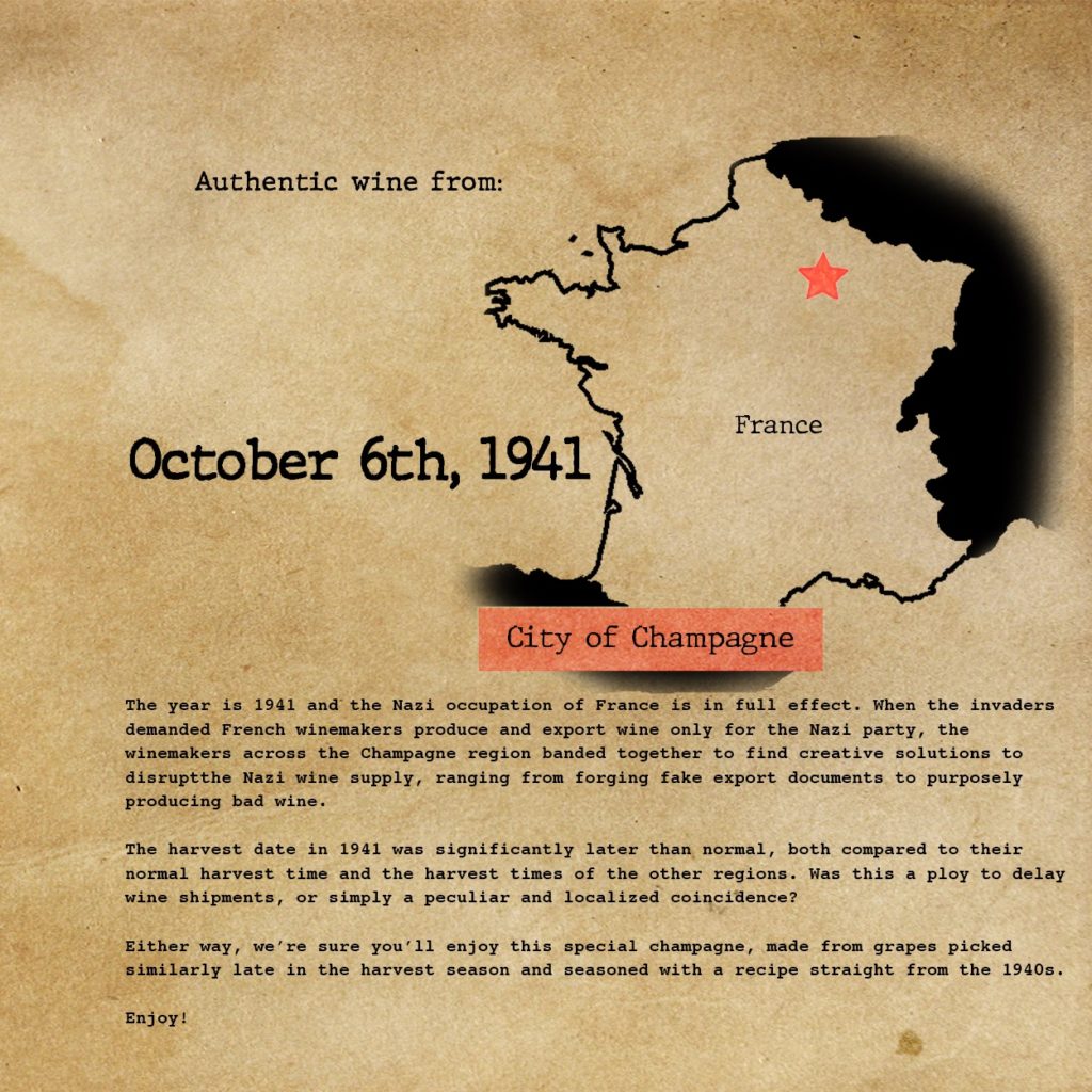
As far as understanding effects of the labels themselves, people tended to be more interested in stories that were more directly related to human beings. For example, the Bordeaux 1868 label was about The Great Wine Blight, and survey respondents recognized that the blight was largely out of the hands of the winemakers, making the story less interesting than the Champagne 1941 label that talked about direct contact and communication with Nazis. We also found that people had drastically different interpretations in their wine label summaries- about 50% were acutely aware of the use of the historical perspective to sell more wine, while the other 50% were more focused on the story being told on the label.

A few people also mentioned that they felt negatively after they read the label because the story told wasn’t particularly happy, which could impact a wine’s sales negatively. However, it wouldn’t be good to deliberately make a sad historical story happier just for the sake of commercial sales/making the audience less sad. To balance this out, it would make sense to narrow our target audience down to history bluffs more and millennials in general less. This would also make future impact assessments more concise.

Trees in NYC: School Art Project

For this sketch, I created wire sculptures to represent the proportion of trees in New York City that are in good health. These wire sculpture kits would be handed out to students in a New York City elementary school art class, with 80% of the students with materials to create a healthy tree (green tree), and 20% of the students with materials create an unhealthy tree (brown tree). The idea is that after students notice that not everyone has the same wire tree kit, there would be discussion and dialogue about the health of trees in New York and how students can get involved. The handout created in a previous sketch (pictured below) would then be distributed to students.

Dataset: https://data.cityofnewyork.us/Environment/2015-Street-Tree-Census-Tree-Data/pi5s-9p35

Moving to Bangor Maine

Claudia Chen, Ife Ademolu-Odeneye, Devin Zhang

BACKGROUND: For this sketch, we created a targeted Facebook ad with a quiz to convince the user to move to Bangor, Maine. The basis of our sketch was the Air Quality dataset, and our target audience was millennials in polluted cities potentially looking to move somewhere new. We acted as the Bangor City Council, attempting to entice people to move somewhere new.

RESEARCH: For our project, we mainly focused on PM 2.5 air quality data. PM 2.5 is fine particulate matter that is around 2.5 microns in diameter. Because of its small size, it is easily inhaled and can be harmful when someone is exposed to it repeatedly or at high quantities. We researched cities that had good and bad levels of PM 2.5, and we found that Bangor, ME had good levels of PM 2.5 while also having several incentives to try and convince people to live there.

FORMAT: For our audience to reach the quiz, we created a targeted Facebook ad to entice people to click in to the quiz. Because the focus of the quiz was around benefits of living in spaces without heavy air pollution, we made our headline about air pollution. That way, the audience had some idea of what they were clicking in to, without giving the novel information away.

Once the ad is clicked on, the quiz we created would begin. The quiz asks the user questions such as where do you live, do you enjoy outdoor activities, and do you have student loans, to provide results pages with the benefits of Bangor as it relates to both air quality and other factors of living there. This is the outline of where the quiz would go according to the user’s responses:

Below are images of a few of the key question & result pages that appear as the user answers the questions.

With the question-answer format of a quiz, we were able to slowly reveal more information to convince the user to move to Bangor. From the city council perspective, we felt this was much more effective than the traditional methods of providing a list or article of reasons to move to Bangor.

SOURCES:

Air Quality Dataset: https://aqicn.org/here/

Bangor Student Loan Initiative: https://www.cnbc.com/2018/10/15/maine-is-providing-student-debt-relief-to-people-willing-to-work-there.html

Maine forest coverage: https://en.wikipedia.org/wiki/Forest_cover_by_state_and_territory_in_the_United_States

Negative effects of PM: https://www.epa.gov/pm-pollution/particulate-matter-pm-basics#effects

Dangers of PM exposure: https://laqm.defra.gov.uk/public-health/pm25.html

PM effects on children and elderly: https://www.health.ny.gov/environmental/indoors/air/pmq_a.htm

Trees In NYC: Sign Up To Help!

By: Claudia Chen, Eileen Hu, and Thiago Medaglia

The data say around 1 in 5 street trees in New York are in “fair” or “poor” condition (as opposed to “good” condition). We want to tell this story because children in the area can help improve these tree conditions by getting involved. We’ve chosen to tailor our message to middle school students in New York City in the form of a handout for them to take home. Information on the handout is tailored to each of 5 boroughs of NYC, with the goal of personalizing the graphic and allowing readers to see themselves in the data. With this, we hope students will sign up to help volunteer and improve tree conditions in NYC.

We started out by analyzing the 2015 NYC street tree census, which showed us how many street trees there are in NYC and the distribution across boroughs. The data also showed us that about 17% of trees (in NYC overall and in each borough) were evaluated as having fair or poor health (rather than good health). It also had a limited amount of data on the estimated number of stewards per tree which led us to the city’s Citizen Stewardship Program that encourages people to volunteer to care for, plant and learn about trees. We decided to tell the story of how trees help us and how we can help trees, from the perspective of the NYC Parks & Recreation Department.

This led us to look for data regarding tree impact in the city. Impact for each individual tree varies depending on tree species/maturity and there was no data available regarding total benefits for the current street trees in NYC by borough. However, we were able to find a dataset analyzing total benefits of street trees from 2005 data with detailed models. We used these total benefits and the total number of trees at the time to get the approximate average benefit per NYC street tree. Then we multiplied those averages by the actual number of trees in each borough and rounded the numbers to make them approachable. Finally, we contextualized the numbers using familiar objects, for example, converting megawatt hours to the number of fully charged iPhones. 

For this project, we paid more attention to the question of how to represent the benefits accurately and to make them more personal in terms of presentation rather than looking for surprising patterns within the original dataset. This led to some interesting challenges. We had to make choices regarding how much it was acceptable to round the numbers and what comparisons to make. For example, for “trees reduce CO2 by around x tons per each year”, we were considering using “x miles of car CO2 emissions” or “offsetting CO2 emissions from driving from the earth to the moon x times” rather than “weight of x blue whales”. We thought about how we wanted to represent the diversity of the city when putting in figures for the kids. We had to figure out how to balance putting in the cool facts we found vs keeping the infographic from getting cluttered. However, the whole process was instructive and interesting, and we even got to add in some symbolism with the idea of “1 in 5 trees is not in good health,” indicated by a dark brown leaf for every 1 in 5 leaves on the infographic. The smaller leaves were also designed to lead the reader through the infographic, pointing to the specific facts to read.

Sources

Specific borough and tree condition data:

https://data.cityofnewyork.us/Environment/2015-Street-Tree-Census-Tree-Data/pi5s-9p35

Impact per tree:

https://www.milliontreesnyc.org/downloads/pdf/nyc_mfra.pdf

Happiness from trees:

https://greatergood.berkeley.edu/article/item/why_trees_can_make_you_happier

Context conversions: 

https://www.livestrong.com/article/350103-measurements-for-an-olympic-size-swimming-pool/

https://en.wikipedia.org/wiki/Blue_whale

https://www.epa.gov/greenvehicles/greenhouse-gas-emissions-typical-passenger-vehicle

https://blogs.oracle.com/utilities/iphone-6-charging-47-cents

Claudia’s Data Log

Chatting with people:

My day started with responding to messages on Messenger and iMessage, as well as checking my email to make a to-do list of emails to respond to during the day. In order to communicate with my friends and family, I use Facebook Messenger and iMessage heavily on a daily basis. I would say 70% of my text communication is on Messenger, 10% is on iMessage, and 10% is on other platforms; besides Messenger and iMessage, I also use Gmail, Slack, and GroupMe to communicate throughout the day. I use Gmail for all of my email services, including my MIT email which forwards itself to my Gmail inbox. Throughout the day, I also checked GroupMe, which is what my living group uses to communicate with each other. My UROP uses Slack, though the volume of messages there is fairly low, and I didn’t end up using it today. 

Using Facebook’s Messenger, Apple’s iMessage, Google’s Gmail, and Microsoft’s GroupMe on a daily basis means that I rely on four of the biggest technology companies for my basic communication. They each have my long-standing personal data, as well as temporary location data throughout the day.

Moving around town:

I live in Burton Conner, where there are cameras at the entrances, and residents are required to tap in. I know that the Burton Conner security cameras saw me walk out around 8:30 a.m. At around 9:00, I paid for Dunkin with my credit card. At 11:00, I got Cava in Kendall Square with a good friend of mine and used Apple Pay to foot the bill. These three events paint a pretty good picture of where I spent my morning.

In the early evening around 5:00 p.m., I tapped my ID into McCormick Dance Studio for the first two hours of my dance practice. There are also cameras at the McCormick entrance. At 8:00, I tapped into the Z Center for more dance practice. Finally, at around 9:30 p.m., I walked back to Burton Conner where I tapped in again and was also visible in the security cameras.

Although I didn’t use any form of transit besides my feet today, my location was still very well documented because of the large quantity of tap access doors on campus, as well as the use of digital payment systems.

Getting online:

Today I read the news on the New York Times online, did work on Stellar, Google Docs, Google Sheets, and WordPress, and casually browsed Instagram, YouTube, and Twitter. For all of these sites, I have an account with my basic personal information.

I use my overarching G Suite account for YouTube, Docs, and Sheets, so all of this information is also tied along with my Gmail. For Stellar, I have to use my MIT authentication to log on, associating all of that data with my collegiate footprint. My Instagram is tied to my Facebook, and my Twitter is also linked to my other social accounts. Thinking about this really highlights how associated all of my social accounts are and how connected each node of my data log is.

Other things:

Even when I’m not using applications on my phone, some of them are collecting data and my location from me. I also have a Microsoft Cortana smart speaker in my room, collecting all sorts of data about what I’m saying, when I’m waking up, and what I’m listening to. This exercise has led me to realize that if you combined all of the data I leave behind in a day, you can paint a really accurate picture of what I’m up to.