Sam Ihns and Claudia Chen
For our impact assessment, we collected feedback on the wine label sketch (here) from the maps/creative maps unit. Because this sketch came from a commercial perspective, we sought to survey the most promising commercial audience. We found that in the U.S., over 40% of all wine is consumed by millennials (source), so we surveyed 20 millennials to gain more insight about the effects of our historical wine labels.
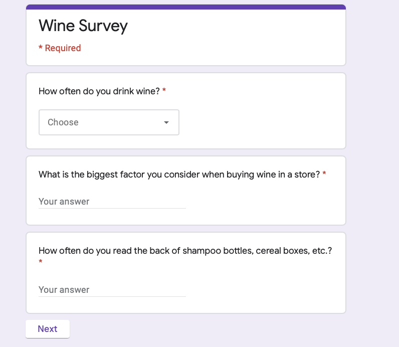
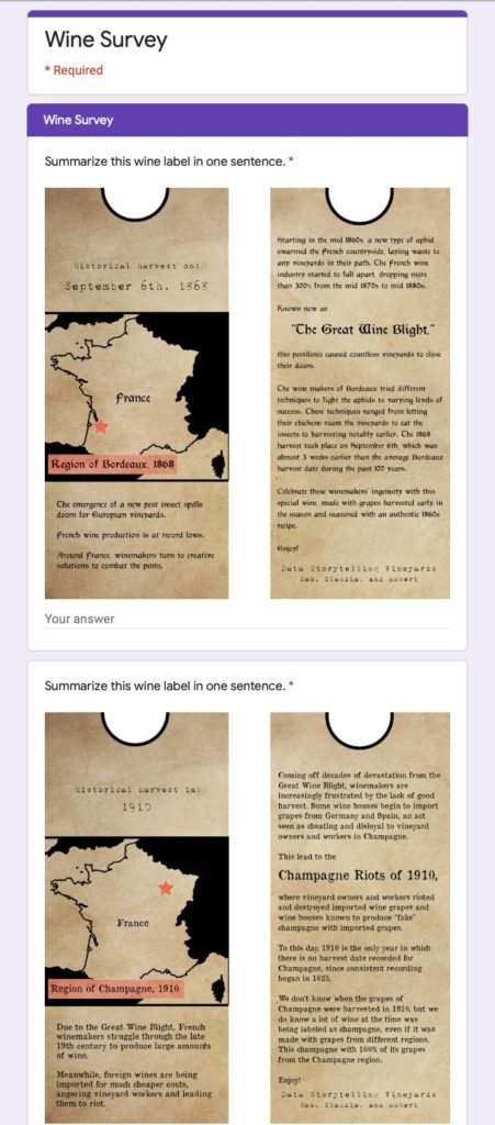
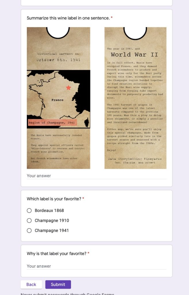
Before iterating on the labels, we wanted to figure out what people got out of the wine labels and how they interacted with the labels. We also wanted to find which of the three wine labels was most interesting/enticing. Our test plan was to send out a Google Form (pictured below), first getting insight on their drinking habits, then asking them to summarize the wine labels in one sentence and what their favorite label was.
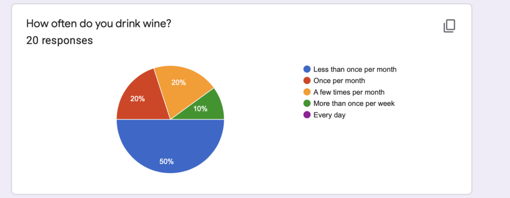
The breakdown of our respondents’ drinking habits is as follows:
The breakdown of people’s favorite labels is as follows:
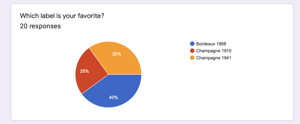
Overall, people liked the Champagne 1941 and the Bordeaux 1868 labels the most, but for vastly different reasons. People who preferred the Champagne 1941 label preferred it because they felt it had the most interesting and compelling story involving human beings. People who preferred the Bordeaux 1868 label preferred it because they felt the aesthetic and font matched the historical time period the best. People also said that they tended to read larger things like cereal boxes instead of smaller shampoo bottles, and that the labels themselves felt crammed and could be difficult to read in a sitting where an entire bottle of wine would be used. Finally, people said the map was difficult to read, so we shaded out the other countries. With these points in mind, we pivoted to produce a boxed wine label instead of a wine bottle label.\
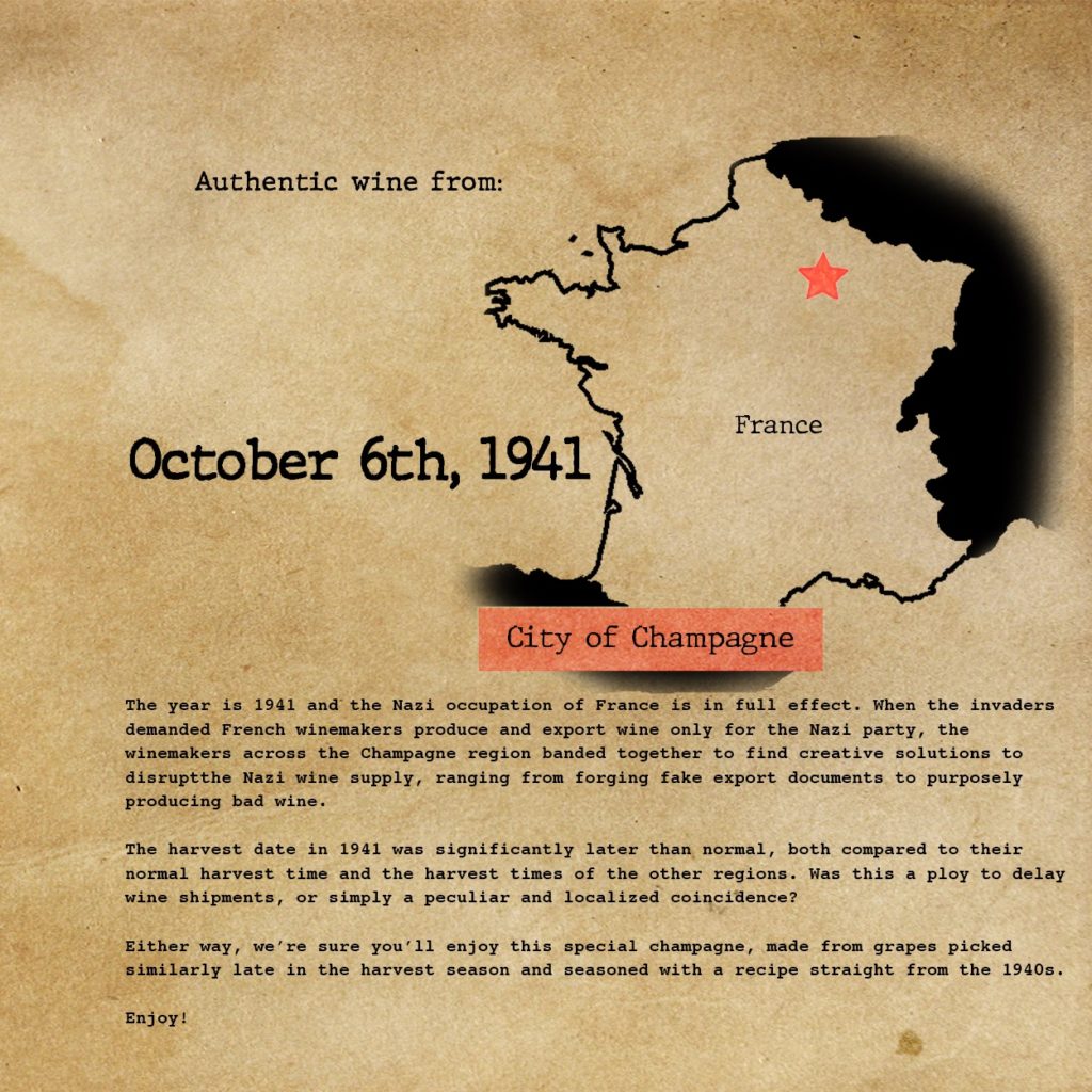
As far as understanding effects of the labels themselves, people tended to be more interested in stories that were more directly related to human beings. For example, the Bordeaux 1868 label was about The Great Wine Blight, and survey respondents recognized that the blight was largely out of the hands of the winemakers, making the story less interesting than the Champagne 1941 label that talked about direct contact and communication with Nazis. We also found that people had drastically different interpretations in their wine label summaries- about 50% were acutely aware of the use of the historical perspective to sell more wine, while the other 50% were more focused on the story being told on the label.
A few people also mentioned that they felt negatively after they read the label because the story told wasn’t particularly happy, which could impact a wine’s sales negatively. However, it wouldn’t be good to deliberately make a sad historical story happier just for the sake of commercial sales/making the audience less sad. To balance this out, it would make sense to narrow our target audience down to history bluffs more and millennials in general less. This would also make future impact assessments more concise.