DHS’ Swelling Underside

Fernanda Ferreira

“Wow, I truly believe I’m looking at an iceberg made of paper,” Edna definitely did not say to herself

Summary

For my dataset I chose the “Freedom of Information Act Annual Reports 1975-2018” set compiled by A. Jay Marquette, a journalism and media studies professor at Marquette University. The dataset collects the number of received, processed and denied/granted (plus a lot of other details) FOIA requests sent to federal departments. I chose the data set because I filed a FOIA in December and have been curious about the process ever since.

FOIAs, which give the public the right to request access to federal documents, memos and internal communication, are essential in keeping the government open and accountable. Investigative journalists, for instance, use FOIA requests to gather information and uncover wrongdoing. But the Freedom of Information Act, signed in 1967, only grants access to make a request; it doesn’t guarantee that you’ll get the documents you’re looking for.

The “FOIA Annual Reports” dataset demonstrated two trend: a steady increase in the number of FOIA requests filed and, for certain departments, an increase in the number of partial grants and full denials of requests. I focused the sketch on the Department of Homeland Security because of the number of FOIA requests sent to the DHS, the drop in full grants given, and, lastly, the large number of issues that fall under the DHS purview (terrorism, immigration, pipelines, etc). The DHS was established post-9/11 and there is information on FOIA requests from 2003 to 2018.

The sculpture is a two-story glass aquarium with 16 “icebergs” (one for each year of FOIA requests and they are made out of paper to represent government documents) in a contemporary art museum. Visitors enter on the second floor and see just the tip of the iceberg, which represents FOIA requests granted in full (a layer of opaque blue limits their view of the underside). Visitors then descend to the first floor, where they get an underwater view of the icebergs, showing the vast underbelly of FOIA requests that are denied in full or only partially granted. As the years pass, the size of the underside of the iceberg increases.

This sculpture plays on the imagery of an iceberg and the overused “tip of the iceberg” phrase to show the increasing number of denied FOIAs and asks the museum’s visitors to remember that each denied FOIA is a story that is being hidden from the American public.

Sketch

Shocked by the number of FOIAs that are not granted in full, Batgirl looks away in despair

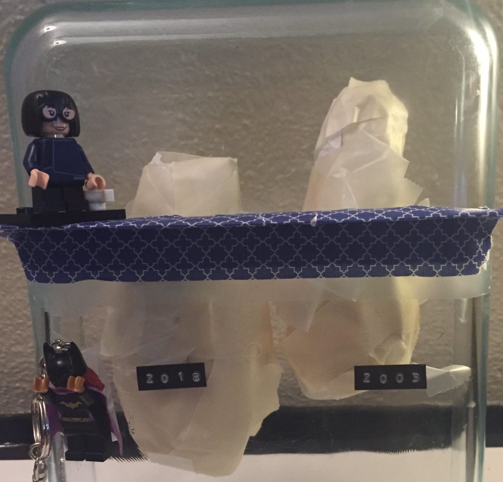
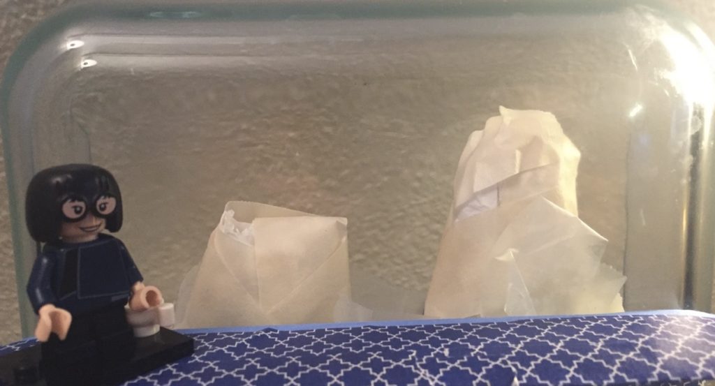
The sketch is (obviously) a very paired down version of the sculpture using a Pyrex casserole dish to represent the aquarium, two icebergs (2003 and 2018) made of tissue paper and tape, and two Lego figurines (Batgirl and Edna Mode) to represent visitors at the museum.

It’s hard to see in the image, but the icebergs have different sizes since there were 160,902 requests in 2003 and 374,945 in 2018. Shown above the water (denoted here as the blue platform on which Edna stands) are the total “granted” requests (40% in 2003 and 6.9% in 2018), while below is every FOIA that was completely denied or only partially granted.

I think we all recognize the image of blacked-out government documents. To keep with the theme of information that is withheld, descriptions about the data of the sculpture will also be displayed with partially blacked out sentences and words.

In putting the sketch together, I quickly noticed how hard it is to include more information into a data sculpture, both for aesthetic and comprehension purposes. For instance, the government has a number of exceptions it can evoke to deny a request. I tried to include that information by creating different bands on color on the iceberg underside, but it looked silly and was hard to comprehend.

References

Wagner, A.Jay, “[Data] Freedom of Information Act Annual Reports 1975-2019” (2020). College of Communication Research Data. 1.
https://epublications.marquette.edu/comm_data/1

MPG, Drive, the Environment: What Car Fits Your Priorities?

Fernanda Ferreira, Tyler Millis, Robert M. Vunabandi

The US Fuel Economy Measures, the result of vehicle testing done by the Environmental Protection Agency, contains more than just data on fuel efficiency. There’s also stats on greenhouse gas emissions and CO2 emissions, and information on the vehicle’s class, drive and fuel. The data show the diversity of vehicle types one can purchase in the United States in 2020 and we decided to tell the story of a car magazine helping you find the right car for your lifestyle, because it allowed us to play with a changing output depending on the selections made by a user.

As an online car magazine, our audience are individuals who are looking to purchase a car. There are over 2400 vehicles in the EPA’s US Fuel Economy Measures and we wanted to create a participatory way for users to quickly hone in on the best car options to fit their lifestyle and preferences. The right vehicle for a buyer driving primarily in the city who cares somewhat about the environment and wants to spend no more than 35,000 USD looks very different from a vehicle for someone who cares a lot about the environment, wants the best fuel efficiency for their buck and is willing to pay extra for a low or even zero emissions car. 

Our goal, however, isn’t to just generate a list of vehicle options for our readers. As a car magazine, we also want to give them information to understand the “why” behind the features and prices of certain vehicles. Below the list of cars, readers can discover more about how fuel efficiency varies with vehicle class, and how this impacts different features.

For this sketch, we took a random selection of 149 cars and added starting price info to the data set. We then generated an algorithm that would filter through the list depending on the preferences of our readers and spit out a list of cars that best fits their lifestyle and preferences, ordered from highest to lowest fuel efficiency (MPG). To get a feel for what the “Car Choice Helper” tool feels like, please click here.

Because this is a car magazine and we aim to do more than just provide information about the best car for a person’s lifestyle, so we also created a sketch of the additional information about cars that would be included in the online magazine. We looked at the relationship between greenhouse gas emission+air pollution scores and the price of the vehicle, focusing on explaining why sports cars are so polluting despite their high prices. In the full online magazine, this would be just one of many sidebars with additional info about different car features and there would also be links to other articles in the magazine. 

We believe this online magazine sketch is a good balance between quick consumer information for someone looking to purchase a vehicle and deeper information for readers who want to know a little bit more about the data set and  cars in general.

Lifestyle and Car Selection Quiz Sketch

For the Car Selection tool, we focused on five parameters: where the driver spends the most time (Highways vs city’s, since this influences MPG), the environmental footprint of the car, size, drive and how much they’re willing to spend.

For instance, if you’re looking to buy a pickup truck with a  4-WD and you don’t care about cost or the environment, there are four cars that fit your specifications: the GMC Sierra AT4, the Chevrolet Silverado, the RAM 1500 and the Ford F150 Raptor. But, let’s say you decide you actually care somewhat about the environment and the amount of air pollution your car is spewing. Then the $28,300 Chevrolet Silverado is your only option. And, if you decide you care a lot about the environment, well… you need to reevaluate your car choices, because no pickup ranks high in the air pollution and greenhouse gas emissions scale no matter how much money you’re willing to spend.  

You can find out the best car for your lifestyle and test the tool yourself here.

What’s up with sports cars and pollution?

The Bugatti Chiron can go from 0 to 60 in 2.5 seconds, according to its manufacturers, making it one of the fastest production cars in terms of acceleration. It’s also one of the most expensive: a Chiron will put you back a cool 2.9 million USD. All that speed comes at a price, and we’re not talking cash. The Chiron emits 516 grams of carbon dioxide per kilometer. That’s 4.3 times higher than the CO2 emitted by new passenger cars and 5 times over the 2020 emissions target set by the European Union[1] .

To reach high speeds–the Bugatti Chiron’s is electronically limited at 261 mph [2] but can theoretically go as high as 300 mph[2] –, sports cars have to gobble up fuel. The average car shopper cares about fuel efficiency, wanting to know the number of miles they’ll get for each gallon of fuel, but that’s not a priority for buyers of sports cars. When British daily newspaper The Telegraph drove the Bugatti Chiron in 2017, it only managed 8.9 mpg (officially it’s 12.5 mpg)[2] . The more gas guzzled, the more carbon dioxide and greenhouse gases are emitted, giving these sleek sports cars an extremely low air pollution score.

The focus on speed is just one of the reasons the most expensive cars are also the least environmentally friendly. The other is the size of the car. Large cars are a status symbol, but just like speed, more fuel is required to drive one around and as such they generate more air pollution. The United States dominates the sale of SUVs–in 2018, 48% of car sales were SUVs–but countries with a growing middle class such as India and China are getting close. And if the trend for bigger and heavier cars continues, it will cancel out the environmental benefits of electric vehicles according to a study from the International Energy Agency[3] .

The price of cars dip as they emit less greenhouse gases and achieve a better air pollution score, but start increasing again once you hit a score of 8 for both measures. Vehicles in the 8+ score category are electric, hydrogen and flex vehicles, marketed for their environmental-friendliness. Electric cars in particular are not historically known for their performance and have often been compact. The new selection of electric vehicles are much more diverse, both in size and performance. Both will cost you however. The Porsche Taycan Turbo can go from 0 to 60 in 2.4 seconds[4], but has a starting price of 150,900 USD. The Tesla Model 3, a 2WD midsized car, costs 39,990 USD, but if you want a 4WD SUV from Tesla, you’ll need to fork over 84,990 USD and your fuel efficiency will also go down. 

Explainer Video

References

Data set: EPA’s Fuel Economy Data

[1] Average emissions for new cars

 [2] Bugatti Chiron’s Facts & Numbers

 [3] Surge in SUV Demands

[4] Porsche Taycan Turbo Source

Fernanda’s Data Log – 02/17

Chatting With People
I started the day in Seattle and I used WhatsApp for both texting and calling, sent a number of emails using both Outlook and Gmail, texted with iMessenger, and made some comments on Instagram before my flight. I’m sure all of these logged my location and mapped out who I was interacting with. When I sent a few WhatsApp messages from Boston, that allowed the app to know that my location had changed.
Moving Around Town
Since I was traveling, I used Lyft twice (getting to Sea-Tac and then getting home from Logan), so that company knows I’ve switched coasts. I also traveled by JetBlue so my ticket got scanned at least twice (going through security and getting on the plane) and, because I bought my ticket using my Gmail account, both Google and JetBlue knew my travel plans beforehand and also my movements. While waiting for the plane I purchased hot chocolate with credit card, so Bank of America knows I was in Seattle, which they already knew because my Lyft account is associated with my credit card. Lastly, I went through two airports, so I definitely showed up in a number of security cameras.
Getting Around
I browsed Hulu, Twitter, NYTimes, New Yorker, NYTimes Crossword, some online Mahjong both before and during the flight. All of these (with the exception of Mahjong) are websites I have subscriptions for so they already have my basic profile. I also logged into most of these on JetBlue’s Fly-Wifi, so if they’re collecting data to add to my profile, they have all of this now.
Other Things
I have no idea if airport security saves data (probably), but if they do, there are now scans of me and my luggage in their files.

Coronavirus: Fatality vs. Infectivity

I have a PhD in virology, so it’s been interesting to see how information about the novel coronavirus (nCoV) is being presented. There’s a lot that we still don’t know about nCoV, which means people have been creating projections with varied estimates of how contagious the virus is as well as estimates of case fatality rates (CFRs). There is a lot of fear-mongering going on about the outbreak, with people only showing the projections based on worst case scenarios for CFR and infectivity. At the same time, it would be naive to underestimate nCoV, and individuals calculating its impact using the lowest transmission and CFR estimates are also not super helpful.

Which is why I like this CFR vs infectivity figure from the NYTimes. It shows the estimates for nCoV (reddish square) while also demonstrating how it compares to previous Coronavirus outbreaks (SARS in 2002, MERS in 2012) as well as other viruses. This figure illustrates two things pretty effectively: (1) epidemiologists are still at the information gathering phase, and (2) the CFRs for nCoV are below those for SARS and MERS.

This graph is part of a larger information packet from the Times, all of which add more nuance to the nCoV situation. I think most readers will have a bit more peace of mind and after reading the packet and especially after seeing this graph. My one quibble is using a log scale for CFR. It’s a great solution for showing super spread-out data, but it ends up placing the nCoV square towards the middle of the graph, making it seem like the CFR is much higher than < 3%, especially to readers who might not be familiar with log scales.

Link to NYTimes Page: Click here