I have a PhD in virology, so it’s been interesting to see how information about the novel coronavirus (nCoV) is being presented. There’s a lot that we still don’t know about nCoV, which means people have been creating projections with varied estimates of how contagious the virus is as well as estimates of case fatality rates (CFRs). There is a lot of fear-mongering going on about the outbreak, with people only showing the projections based on worst case scenarios for CFR and infectivity. At the same time, it would be naive to underestimate nCoV, and individuals calculating its impact using the lowest transmission and CFR estimates are also not super helpful.
Which is why I like this CFR vs infectivity figure from the NYTimes. It shows the estimates for nCoV (reddish square) while also demonstrating how it compares to previous Coronavirus outbreaks (SARS in 2002, MERS in 2012) as well as other viruses. This figure illustrates two things pretty effectively: (1) epidemiologists are still at the information gathering phase, and (2) the CFRs for nCoV are below those for SARS and MERS.
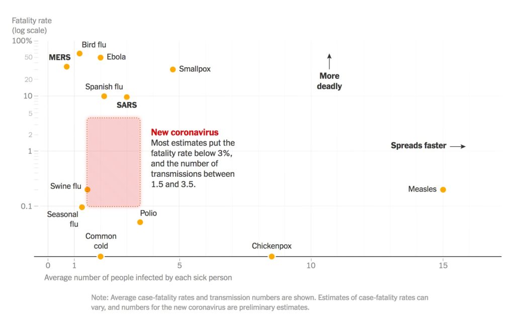
This graph is part of a larger information packet from the Times, all of which add more nuance to the nCoV situation. I think most readers will have a bit more peace of mind and after reading the packet and especially after seeing this graph. My one quibble is using a log scale for CFR. It’s a great solution for showing super spread-out data, but it ends up placing the nCoV square towards the middle of the graph, making it seem like the CFR is much higher than < 3%, especially to readers who might not be familiar with log scales.
Link to NYTimes Page: Click here