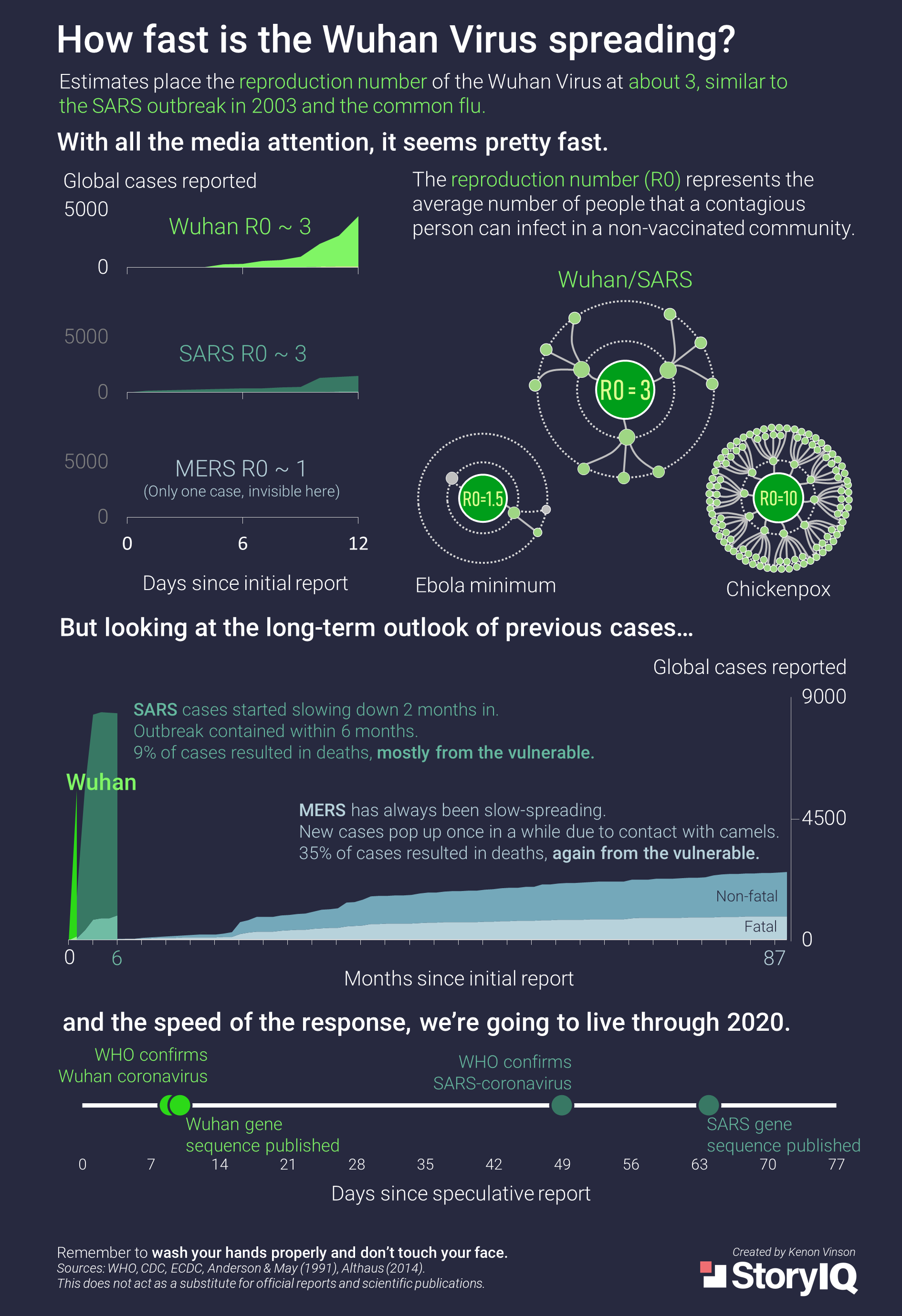
This data presentation compares statistics about the Wuhan Coronavirus to other viral outbreaks to communicate that the Wuhan coronavirus is less dangerous than its public perception. The graphic displays cases reported in time since the initial report and a timeline of major response markers such as confirmation of the virus by WHO and gene sequencing. In addition, the graphic introduces a measure called the reproduction number, which is related to how contagious the disease is. Based on the color scheme and quantitative quality of this data, I think that the intended audience is people with higher education in STEM fields. The dark colors are reminiscent of technological displays or science-based marketing. In addition, the emphasis on numbered data and the statement about media attention implies that the intended audience takes a skeptical approach to words and is more convinced by statistics. The data was a little difficult to interpret without the guidance of explanatory text, but was understandable after some analysis. On a separate note, I really appreciated the flow of the bolded white text which created a one-sentence summary of the poster. In my opinion, the presentation was effective as it convinced me that the media has exacerbated public concern about the virus. However I will note that I am definitely a subsection of the intended audience, and this presentation of data may not convince other viewers.