Sickly wine

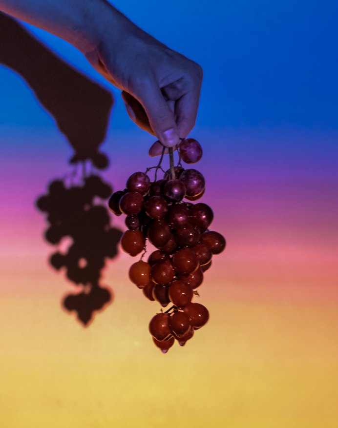
I used the grape vine as a sculpture of the geographic story about how climate change has affected wine. I tried to incorporate three senses (taste, touch, sight) to capture more of the data.

Taste: I poked holes in the grapes on the bottom of the vine and soaked the grapes in a sugary solution for a couple of hours. After this, the grapes on the bottom were significantly sweeter (disgustingly so) than the non-soaked grapes at the top.

Touch: because of the high concentration of the sugary solution, the grapes at the bottom were much softer and felt wilted. This fit in with the concept that grapes are ripening faster on the vine and going bad in the heat. In addition, the grapes were sticky and really unpleasant to the touch.

Sight: I wanted to communicate how heat was changing the taste of the grapes, so I created a gradient of hot to cold (orange to blue).

In the end, the grapes near the top were more desirable, showing that wine growing regions are moving north.

Chatting with People

I woke up for the day and couldn’t find my phone. I used my partner’s phone to Find my iPhone, so my location at the time was the same as his. When I found my phone, I sent a brief text and responded to emails.

Moving Around Town

I spent the morning walking around Manhattan, so I could be tracked via surveillance/traffic cameras. I used apple maps to navigate to Rockefeller Center, so my phone knew my location and the pace at which i was walking. I took the subway back home, so my location could be tracked by the stops I got on/off at.

Getting Online

I used instagram and facebook throughout the day, so my phone could keep track of the times I was most likely to be on/off my phone, and what kinds of content I spent time looking at.

Other Things

I bought snacks at a Hmart in the evening using my credit card. In the evening, I went to a bar and used cash, but i definitely checked social media at the bar. For dinner my partner used his name to reserve a table for two, so it’s possible that I could be traced to that location.

Wuhan coronavirus data

This data presentation compares statistics about the Wuhan Coronavirus to other viral outbreaks to communicate that the Wuhan coronavirus is less dangerous than its public perception. The graphic displays cases reported in time since the initial report and a timeline of major response markers such as confirmation of the virus by WHO and gene sequencing. In addition, the graphic introduces a measure called the reproduction number, which is related to how contagious the disease is. Based on the color scheme and quantitative quality of this data, I think that the intended audience is people with higher education in STEM fields. The dark colors are reminiscent of technological displays or science-based marketing. In addition, the emphasis on numbered data and the statement about media attention implies that the intended audience takes a skeptical approach to words and is more convinced by statistics. The data was a little difficult to interpret without the guidance of explanatory text, but was understandable after some analysis. On a separate note, I really appreciated the flow of the bolded white text which created a one-sentence summary of the poster. In my opinion, the presentation was effective as it convinced me that the media has exacerbated public concern about the virus. However I will note that I am definitely a subsection of the intended audience, and this presentation of data may not convince other viewers.