Fernanda Ferreira, Tyler Millis, Robert M. Vunabandi
The US Fuel Economy Measures, the result of vehicle testing done by the Environmental Protection Agency, contains more than just data on fuel efficiency. There’s also stats on greenhouse gas emissions and CO2 emissions, and information on the vehicle’s class, drive and fuel. The data show the diversity of vehicle types one can purchase in the United States in 2020 and we decided to tell the story of a car magazine helping you find the right car for your lifestyle, because it allowed us to play with a changing output depending on the selections made by a user.
As an online car magazine, our audience are individuals who are looking to purchase a car. There are over 2400 vehicles in the EPA’s US Fuel Economy Measures and we wanted to create a participatory way for users to quickly hone in on the best car options to fit their lifestyle and preferences. The right vehicle for a buyer driving primarily in the city who cares somewhat about the environment and wants to spend no more than 35,000 USD looks very different from a vehicle for someone who cares a lot about the environment, wants the best fuel efficiency for their buck and is willing to pay extra for a low or even zero emissions car.
Our goal, however, isn’t to just generate a list of vehicle options for our readers. As a car magazine, we also want to give them information to understand the “why” behind the features and prices of certain vehicles. Below the list of cars, readers can discover more about how fuel efficiency varies with vehicle class, and how this impacts different features.
For this sketch, we took a random selection of 149 cars and added starting price info to the data set. We then generated an algorithm that would filter through the list depending on the preferences of our readers and spit out a list of cars that best fits their lifestyle and preferences, ordered from highest to lowest fuel efficiency (MPG). To get a feel for what the “Car Choice Helper” tool feels like, please click here.
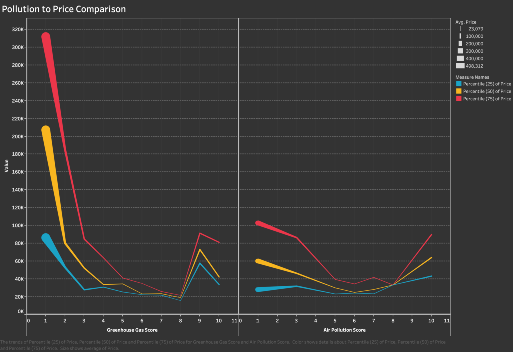
Because this is a car magazine and we aim to do more than just provide information about the best car for a person’s lifestyle, so we also created a sketch of the additional information about cars that would be included in the online magazine. We looked at the relationship between greenhouse gas emission+air pollution scores and the price of the vehicle, focusing on explaining why sports cars are so polluting despite their high prices. In the full online magazine, this would be just one of many sidebars with additional info about different car features and there would also be links to other articles in the magazine.
We believe this online magazine sketch is a good balance between quick consumer information for someone looking to purchase a vehicle and deeper information for readers who want to know a little bit more about the data set and cars in general.
Lifestyle and Car Selection Quiz Sketch
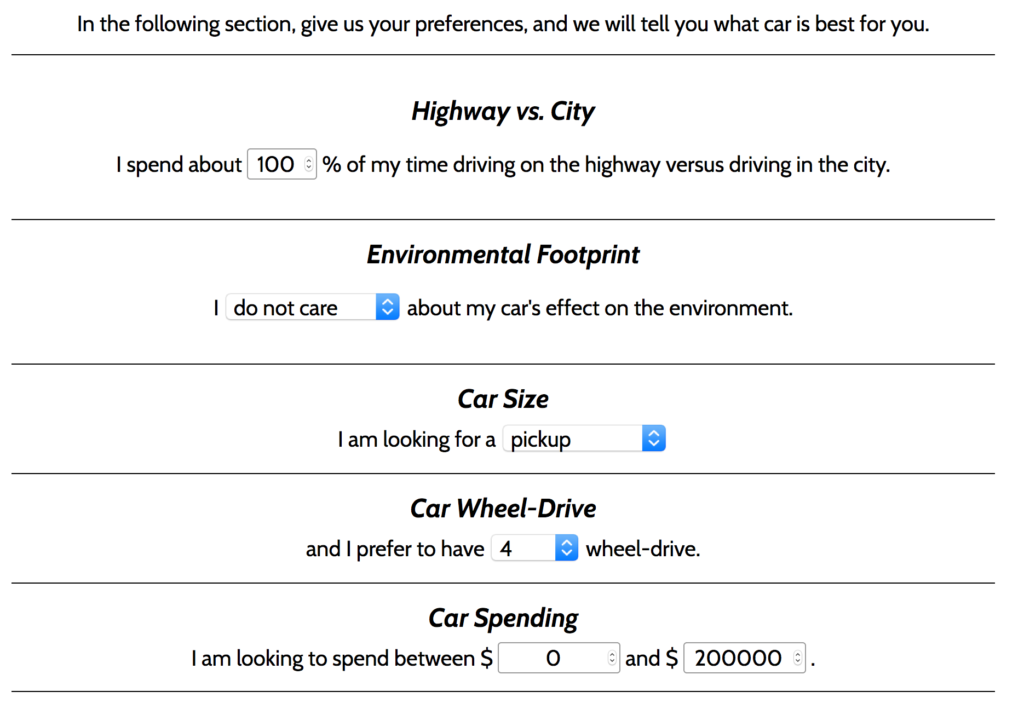
For the Car Selection tool, we focused on five parameters: where the driver spends the most time (Highways vs city’s, since this influences MPG), the environmental footprint of the car, size, drive and how much they’re willing to spend.
For instance, if you’re looking to buy a pickup truck with a 4-WD and you don’t care about cost or the environment, there are four cars that fit your specifications: the GMC Sierra AT4, the Chevrolet Silverado, the RAM 1500 and the Ford F150 Raptor. But, let’s say you decide you actually care somewhat about the environment and the amount of air pollution your car is spewing. Then the $28,300 Chevrolet Silverado is your only option. And, if you decide you care a lot about the environment, well… you need to reevaluate your car choices, because no pickup ranks high in the air pollution and greenhouse gas emissions scale no matter how much money you’re willing to spend.
You can find out the best car for your lifestyle and test the tool yourself here.
What’s up with sports cars and pollution?
The Bugatti Chiron can go from 0 to 60 in 2.5 seconds, according to its manufacturers, making it one of the fastest production cars in terms of acceleration. It’s also one of the most expensive: a Chiron will put you back a cool 2.9 million USD. All that speed comes at a price, and we’re not talking cash. The Chiron emits 516 grams of carbon dioxide per kilometer. That’s 4.3 times higher than the CO2 emitted by new passenger cars and 5 times over the 2020 emissions target set by the European Union[1] .
To reach high speeds–the Bugatti Chiron’s is electronically limited at 261 mph [2] but can theoretically go as high as 300 mph[2] –, sports cars have to gobble up fuel. The average car shopper cares about fuel efficiency, wanting to know the number of miles they’ll get for each gallon of fuel, but that’s not a priority for buyers of sports cars. When British daily newspaper The Telegraph drove the Bugatti Chiron in 2017, it only managed 8.9 mpg (officially it’s 12.5 mpg)[2] . The more gas guzzled, the more carbon dioxide and greenhouse gases are emitted, giving these sleek sports cars an extremely low air pollution score.
The focus on speed is just one of the reasons the most expensive cars are also the least environmentally friendly. The other is the size of the car. Large cars are a status symbol, but just like speed, more fuel is required to drive one around and as such they generate more air pollution. The United States dominates the sale of SUVs–in 2018, 48% of car sales were SUVs–but countries with a growing middle class such as India and China are getting close. And if the trend for bigger and heavier cars continues, it will cancel out the environmental benefits of electric vehicles according to a study from the International Energy Agency[3] .
The price of cars dip as they emit less greenhouse gases and achieve a better air pollution score, but start increasing again once you hit a score of 8 for both measures. Vehicles in the 8+ score category are electric, hydrogen and flex vehicles, marketed for their environmental-friendliness. Electric cars in particular are not historically known for their performance and have often been compact. The new selection of electric vehicles are much more diverse, both in size and performance. Both will cost you however. The Porsche Taycan Turbo can go from 0 to 60 in 2.4 seconds[4], but has a starting price of 150,900 USD. The Tesla Model 3, a 2WD midsized car, costs 39,990 USD, but if you want a 4WD SUV from Tesla, you’ll need to fork over 84,990 USD and your fuel efficiency will also go down.
Explainer Video
References
Data set: EPA’s Fuel Economy Data
[1] Average emissions for new cars[2] Bugatti Chiron’s Facts & Numbers
[4] Porsche Taycan Turbo Source
I think this would be a really helpful tool! It’s great because it solves a problem for a user while nudging them in a societally positive direction. Something that I might think more about is the number of charts you show to the user. Maybe you would have changed this in a more hi-fi version of the sketch, but seeing all the visuals on one page was a bit overwhelming. Since the user is using the tool to make their life simpler, it feels like the charts add more complexity than necessary. Maybe you could have options to go deeper in certain areas for the most interested users.
I think this is a great way to help somebody view possible options for a car purchase. The list of questions seems clear and well-organized, and can serve as a checklist for things that the user may want to consider when buying a car. It’s also fairly flexible, allowing the user to opt out of certain decisions or select a large price range.
One minor suggestion if you were moving this beyond the sketch stage would be to integrate the choices with the graphs a bit more (perhaps side-by-side), so it feels more interactive. That way, it is easier for the user to switch between options and see what changes.
I think that the encodings in the pollution to price comparison can be a little bit confusing to read. The lines connect across discrete (I think) score ratings, and for a single score, it is not clear that the different points represent parts of the same distribution. In addition, I would question whether you need to encode the avg price with thickness when you already have the 50th percentile as an “average” measure.
I really love the tool! It’s simple and effective. If you are going to productionize this sketch you can probably make the graphics more attractive to the user. And probably you can also tweak your model so that it is biased towards producing energy efficient results!
I really like the idea behind the sketch, to create a simple car filtering tool based on your preferences and suggesting green options within your budget and requirements.
One thing that might be helpful for the user is to suggest options that are considerably better for the environment but lie slightly outside your selection, for example, if the user has selected a standard SUV and there’s a greener small SUV option, that sketch could also suggest that.
Hi! It was cool to see another group use car data for their project. We also did that for our project and your tool reminded me of a similar tool on the EPA’s website to help consumers make car buying decisions.
I think integrating the data into an algorithm is a smart way to make this tool — so the average car buyer doesn’t have to think about any of the small details. One suggestion I would have is that I think many tools to help consumers pick cars based on a preference quiz do exist already, so I would be interested in a feature or design that might make your tool more unique. For example, I think graphics and design can do a lot to communicate to a particular audience. Anyways, thanks for sharing!
This is a nice example of an interactive piece to see your point in a multi-dimensional space of choices, and could benefit from some more thinking about how the pieces fit together.
Centrality of participation:
This is clearly inspired from the choice-driven examples we showcased, and I think it follows the invitation pattern well. I’m glad you were able to mock this up in HTML; that really helps understand how it feels to go through the interactive.
Rationale for design choices:
The interactive matches the idea of an online car magazine pretty well. The results of the interactive are a little hard to read – I think further iteration is needed to make it clear and self-explanatory.
Layers of reading:
The article and the invitation to put in your own criteria are the main layers here. The results visualized add more in. I can see the path to further information, but would appreciate a stronger link fro the quiz back to the accompanying article (because I think the quiz is a lot more shareable online). You suggest this in the video, and I think it is a good idea.
Appropriate data use:
Your sample selection is justified well. I like the addition of the price data and the rationale for it. The bar chart of pollution vs. cost has an aesthetic feel that matches the idea of a car magazine (for me), but doesn’t really match the rest of the visual treatment. You’re highlighting a bunch of the dimensions of comparison here, but I think you aren’t remembering some of the lessons from the “charts and graphs” sketch – ie. echoing the story of the chart with text above, removing extraneous decoration, etc.
Suitability for audience:
Casting yourself as a car magazine obviously resonates well with the dataset you’ve chosen to work with. I think the data dives would appeal to the technically minded of those readers, that that glut of charts probably makes sense here.
Narrative:
The story that pairs with the interactive has a nice lead in – focusing in on sports cars and pollution. I think have a tighter link between it and the interactive would help us understand how they fit together.
Call to action:
The audience here is those thinking about buying a car, so your goal of informing them more based on the data about the cars makes sense. The interactive accomplishes that well.
I think this is very interesting! Would be fun to have a follow-up quiz after you’ve informed your audience about their environmental footprint where you can buy your car based on emissions rather than money, which (in a market-efficient world) should be similar to buying cars based on price because the externality of carbon emissions would be priced in.