By Eugenio Zuccarelli, Olivia Yao and Sam Ihns
Bee population has experienced a dramatic decline over the last decades as the data say, bringing the colonies of some states in particular to record lows. We aimed at targeting farmers who can take action to effectively help to restore bee populations to sustainable levels, by using interactive questionnaires where the farmer can input his answers. We want to tell this story because it can have a positive impact on farmers practices, leading to a recovery for the bee population and better farmers products through a more aware use of pesticides.
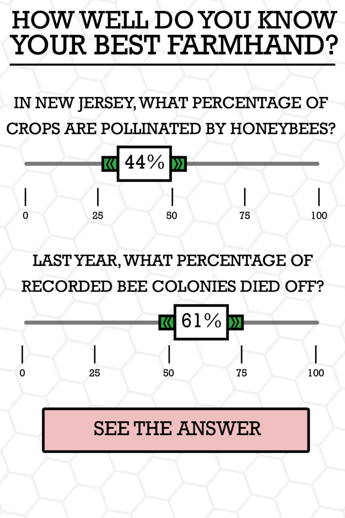
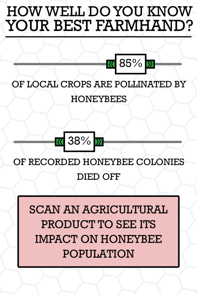
These questionnaires are placed as touch-screens (e.g. iPads) in stores for farmers supplies, ideally closer to the check-out, where shoppers can be drawn to them by the questions. These questions consist of insights about the bee population decline over time across their state, and the impact that different pesticides can have on them. After entering their answer, the true value is shown on the screen, hopefully having a shock factor on the farmer.
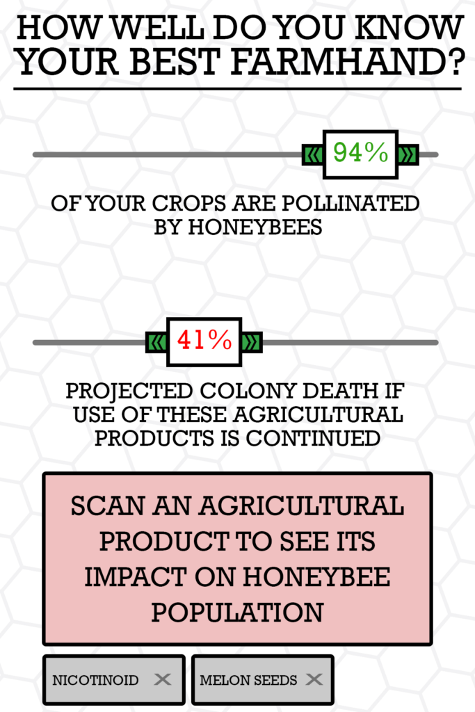
As an additional form of interactivity, the person can scan a pesticide that they are going to purchase, to see the impact that it would lead to the environment (e.g. the drop of bee population that was due to using that mix of chemicals, etc.). The farmer can then be recommended a different type of pesticide, showing a lower degree of harm to the bee population and foods.
To form the questionnaires, we used the bee population dataset, analysing the statistics of bee colonies, beekeepers and loss of population by state. This can more effectively help target states individually with statistics more relevant to each, and having a digital questionnaire makes having one per state relatively easy to do.


I really enjoy the connection of bee colony collapse to pesticides, since it both delves into what is causing the collapse in the first place and also suggests a solution to the problem (buy a different pesticide). I think the graphics are cute and fit the participatory game that you have created. My comment is super small in the grand scheme, but I’m not sure the check-out is the best placement for the iPads. If you put the iPads with the game in the aisle where the pesticides are sold, farmers will be able to compare different pesticides right there (it’s also fun to keep scanning different things and see how the results change) and make a decision there, versus making one at the checkout where they might not want to run back to aisle to swap pesticides. You want to make the pesticide swap as easy as possible for farmers so that they actually follow through.
I really like how you found an audience that could potentially have a big impact on this problem. I also really like how you engage the farmers first by having them guess the correct answer (rather than just presenting them with stats). I wonder if there’s more you can do at the end to translate this great story into action. Once they scan their items, maybe you could provide them with similar products that would be better for the bee population. Or maybe just show the items in the store that have the best impact on bee populations.
I love the concept of this game. The graphics are amazing. I don’t think it needs a lot of improvement, but one possible suggestion is to directly showcase the brand of pesticides which is the best for bees instead of asking them to scan their pesticides (I think pesticide bags are huge and might be difficult to pick up and scan if your iPad is in a fixed position).
I really like the idea of educating farmers about bees and the effects of pesticides while they are shopping for it. I think its a great fit. I also really appreciate how the questions are simple yet inviting. It’s a good activity to do while waiting in the checkout line.
Maybe an additional feature to think about in the game could be an automated suggestion for a bee-friendly pesticide in the same category.
This is solid start for an interactive kiosk, but needs some more thinking about how people move beyond the first layer of the interaction.
Centrality of participation:
The overall design as an interactive display invites participation. That display is also a survey, reinforcing the participatory element. I appreciate the thinking about letting people scan their purchases to learn more about their environmental impact (though I wonder how the retailer would feel about that potentially discouraging purchases of lucrative items).
Rationale for design choices:
Small note – when you “see the answer” that screen should show the participant what they guessed (so they don’t forget).
Layers of reading:
I think the quiz piece would benefit from a “learn more” invitation after the participant is shown if they were right or wrong. Overall I would have liked to see more of your thinking about how the participant could dive deeper (if they are stuck in a long, slow moving line for instance).
Appropriate data use:
The high-level introduction is data-centered nicely. I like that you focused in on one state based on further research into the context of the data.
Suitability for audience:
The idea of putting an interactive display in farm-supply stories seems reasonable, and gives you good constraints for your other design choices.
Narrative:
The title is a solid take on trying to turn this into a story, and sets the tone for the Q&A quiz-like format of the first piece of the interactive.
Call to Action:
I like the call to scan the items you are buying, and you suggest that there’d be a way to learn more about their impact. I would have liked to see a suggestion for how this could be included.