Air Pollution Video Filter Campaign

Team: Josh Feldman, Samra Lakew, Neil Pendse

Initial Iteration: https://datastudio2020.datatherapy.org/2020/04/22/data-story-telling-studio-sketch-3-air-filters/

Changes in this iteration:

Based off the feedback we received from the class in our initial iteration, we changed the following in our data story:

  • We removed references to changes in air pollution caused by the coronavirus in order to simplify the design
  • We heard that the scrolling to see different time periods was confusing, so we removed that feature.
  • We made the data story more interactive by only showing the clean air filter once the user signed up for the campaign
  • We added Greenpeace branding
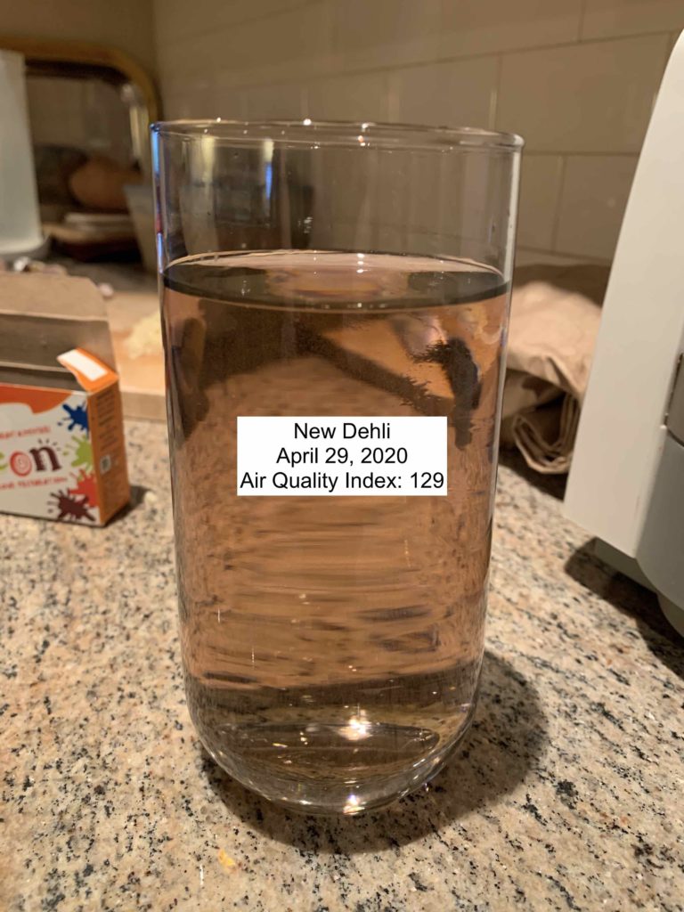
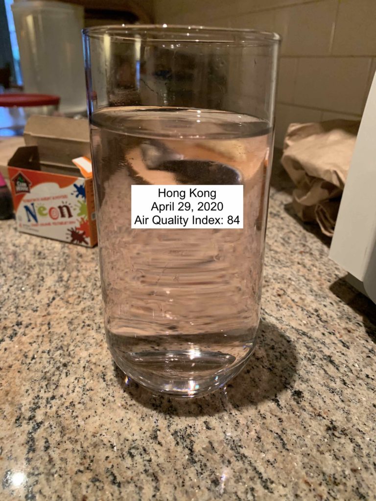
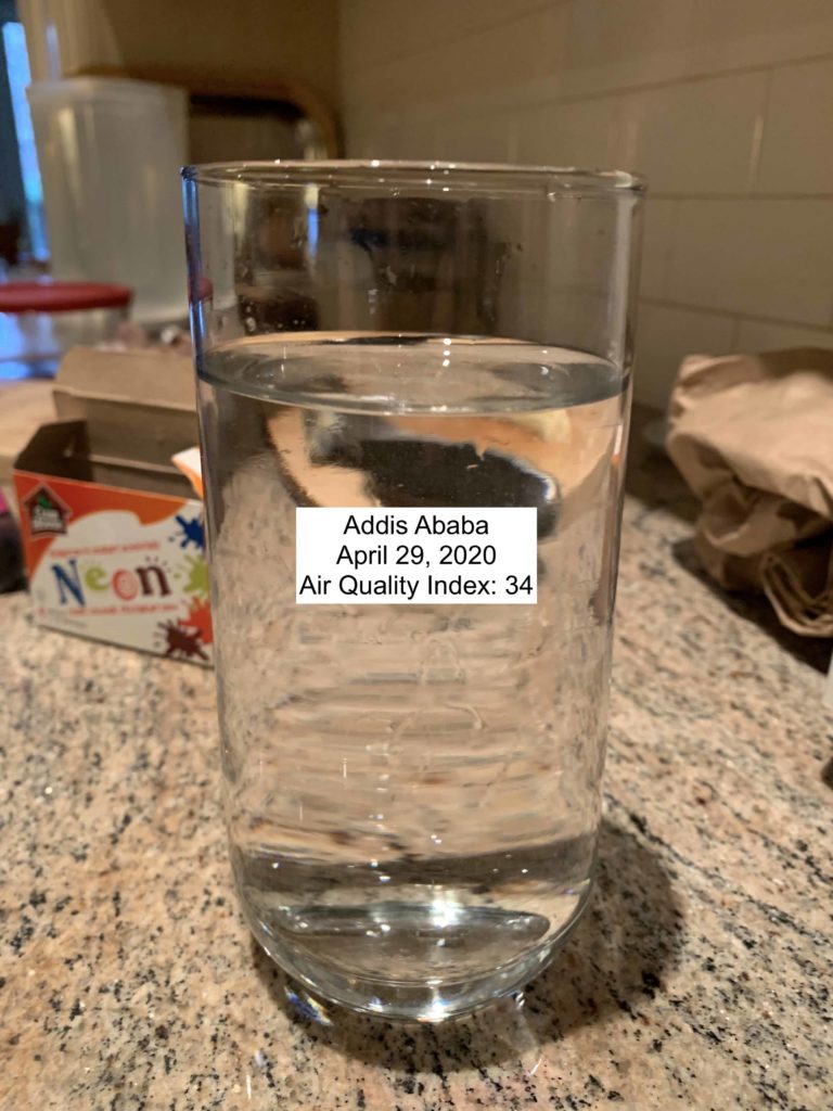
  • We only map the air quality index to color and not to the width of the bar, since we heard that it wasn’t clear that the bar changed based on your location.

Audience:

Our audience remained the same. Our intended target audience is under 40 because they will have to live with the effects of poor air quality. If Greenpeace gains their ongoing support, it will ensure the continuity of our organization and movement. There is no specific region we are targeting with this campaign.

Goals

Our goals were to:

  1. Increase signatures for this Greenpeace campaign on clean air
  2. Engage our audience in the fight for clean air
  3. Increase support for Greenpeace

We based these goals off of our logic modelling exercise.

Test Plan

To evaluate our campaign, we made an online form where users would complete a pre-survey, try a static version of our data story, and complete a post survey.

Results

We received 20 responses to our survey. 95% of our respondents were between 20 and 30 years old, which is within our target audience. While we can make some tentative conclusions about how users in this age range respond to the data story, it is unclear how those under 20 or in their thirties will react to the campaign. While limited with respect to age, our sample covered a few different types of locations including Beijing, Singapore, New York, Los Angeles, New Delhi, and Cambridge (MA). 

Positive feedback:

  • 100% of respondents understood that it was a Greenpeace’s project
  • Positive impressions of Greenpeace grew from 17.6% to 70.6%
  • 94.1% of people said they had fun with the filter!
  • The proportion of people saying they were not likely to take action to improve air quality in their location dropped from 40% to 20% (though all of these people changed to the “somewhat likely” category)

These results suggest that our current iteration of the data story is improving millenial’s perception of Greenpeace and that they had fun with the filter. There was also some evidence that the data story made it more likely that our users will take action to reduce air pollution, but very few respondents were confident that they would do so. Ideally we would follow up with our users to see if their behaviour changed.

Negative feedback:

  • 58.8% of people were “somewhat likely” to share the filter 
  • Users did not change their opinion on the quality of air in their location
  • 64.7% said they would sign up for the newsletter. 

The negative feedback we observed in the surveys suggests that we need to learn more about why users don’t want to share the filter. It is also interesting that many users said they had fun with the filter and felt like the air quality in their area was poor, but didn’t sign up for the campaign. We need to learn more about the barriers preventing users from signing up for the campaign.

In the free text sections of the survey, we got the feedback that we should change some stylistic aspects of the filter:

  • “Simpler explanation for laymen”
  • “poop emojis in the filter were a bit excessive tbh”
  • “the filter should be more appalling”

This suggests that the playful tone we took might not be most effective for this subject. We should experiment with how users respond to a serious/appalling story in a medium that is typically light hearted.

Conclusions

  1. Our current iteration of the data story is improving millenial’s perception of Greenpeace
  2. Our audience is having fun with the video filters
  3. There is some suggestive evidence that our audience is being motivated to take action to fight air pollution – we should follow up on this.
  4. We need to learn more about why users don’t want to share the filter.
  5. We need to learn more about the barriers preventing users from signing up for the campaign.
  6. We should experiment with how users respond to a serious/appalling story in a medium that is typically light hearted.

Drink Your Pollution

I wanted to experiment with using water as a medium for data storytelling. In particular, I thought water could be an interesting way to tell data stories through other senses like taste and touch.

The dataset I’m using is the air World Air Quality Index Project dataset. In the original data story I worked on, we tried to make pollution tangible by showing it through video filters. In the same vein, I wanted to show air pollution by mixing food coloring and water according to how much pollution is in the air at a given place and time.

The audience of the data story would select a time and location and then drink the water associated with that air quality index reading. Potentially this could be used to compare between places or a single place over time. I think the latter would be more effective because you could “drink” the air of your home 100 years ago to feel the difference.

Since the video filters were originally a data story for GreenPeace, this could be an in person component of this campaign for canvassers to use. The feeling associated with drinking murky water would hopefully help create an emotional response to poor air quality and generate support for the fight to reduce air pollution.

Josh’s Data Log

Chatting With People
I used a variety of apps throughout the day that recorded data on me in a variety of mediums. When I woke up, I spent time on Twitter and Facebook – not commenting, just scrolling. I accessed these sites through Chrome, so Google also had access to this behaviour. In addition to social media, I sent iMessages, texts, and had phone calls and a FaceTime video call. I took a flight in the middle of the day, so my lack of internet connectivity for this period would almost certainly show up in social media activity logs.

Moving Around Town
My mobility patterns were a bit out of the ordinary since I was flying from Toronto to Boston. To get from A to B, I first looked up how long it would take to get to the airport on Google maps. Then I called an Uber, and the driver took me off at the airport. My airline and border security recorded information on me while I was in the airport. I suspect there is a lot of surveillance at the airport, so my guess is that a lot of my data was taken during this period. I took an Uber from the airport in Boston to my house. Additionally, I ate lunch and dinner out and picked up a prescription, which means my credit card company, pharmacy, and the restaurants I went to all have access to my location.

Getting Online
I spent most of the day doing homework, which involved looking up documentation for coding languages. I also sent some emails on Gmail and streamed some music on Spotify.

Other Things
Since I was away from Boston for most of the day, I created data through my absence. For example, I usually use BlueBikes to get around, but I didn’t use them today, which they could use to infer that I was out of town.

Map of Coronavirus Outbreaks

The data that’s being shown in this map are the locations of reported cases of the 2019 coronavirus infection. In addition to marking where cases have been reported, the map also indicates how people have caught the virus. I think the audience of this map are public health officials trying to get a sense of where the epidemic is spreading. If I had to guess, it seems like the goal of this data presentation is twofold. First, by looking at the map, the viewer might be able to get a sense of where the epidemic has spread (or at least where cases have been reported). Second, the map is an interface to find specific outbreaks and learn more about them. When a user clicks on a marker, it brings up a sidebar with details. I think this visualization is effective in the second objective, but not the first. It feels natural to index specific outbreaks of a global epidemic in terms of location. Displaying these geographic units on a map makes navigation easy, especially at different levels of hierarchy (i.e. city, province, and country). That being said, the map is less effective if the goal is to take away high-level conclusions about the epidemic. The map does not display any temporal information, so any notion of “spread” is lost, which is crucial if one wants to contextualize the data on the map. It also doesn’t make clear that these are only reported cases, so the true numbers will certainly be different than those shown here.