I wanted to experiment with using water as a medium for data storytelling. In particular, I thought water could be an interesting way to tell data stories through other senses like taste and touch.
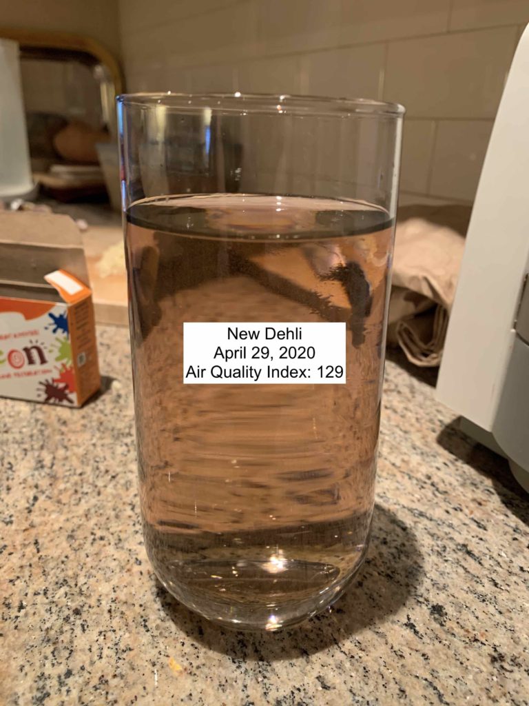
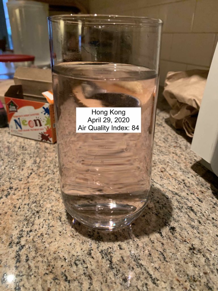
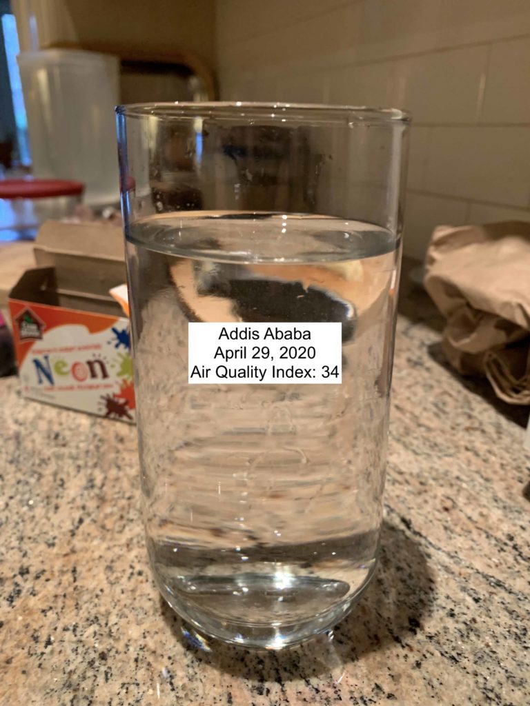
The dataset I’m using is the air World Air Quality Index Project dataset. In the original data story I worked on, we tried to make pollution tangible by showing it through video filters. In the same vein, I wanted to show air pollution by mixing food coloring and water according to how much pollution is in the air at a given place and time.
The audience of the data story would select a time and location and then drink the water associated with that air quality index reading. Potentially this could be used to compare between places or a single place over time. I think the latter would be more effective because you could “drink” the air of your home 100 years ago to feel the difference.
Since the video filters were originally a data story for GreenPeace, this could be an in person component of this campaign for canvassers to use. The feeling associated with drinking murky water would hopefully help create an emotional response to poor air quality and generate support for the fight to reduce air pollution.