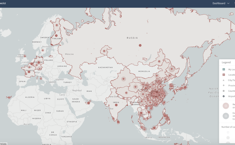
The data that’s being shown in this map are the locations of reported cases of the 2019 coronavirus infection. In addition to marking where cases have been reported, the map also indicates how people have caught the virus. I think the audience of this map are public health officials trying to get a sense of where the epidemic is spreading. If I had to guess, it seems like the goal of this data presentation is twofold. First, by looking at the map, the viewer might be able to get a sense of where the epidemic has spread (or at least where cases have been reported). Second, the map is an interface to find specific outbreaks and learn more about them. When a user clicks on a marker, it brings up a sidebar with details. I think this visualization is effective in the second objective, but not the first. It feels natural to index specific outbreaks of a global epidemic in terms of location. Displaying these geographic units on a map makes navigation easy, especially at different levels of hierarchy (i.e. city, province, and country). That being said, the map is less effective if the goal is to take away high-level conclusions about the epidemic. The map does not display any temporal information, so any notion of “spread” is lost, which is crucial if one wants to contextualize the data on the map. It also doesn’t make clear that these are only reported cases, so the true numbers will certainly be different than those shown here.