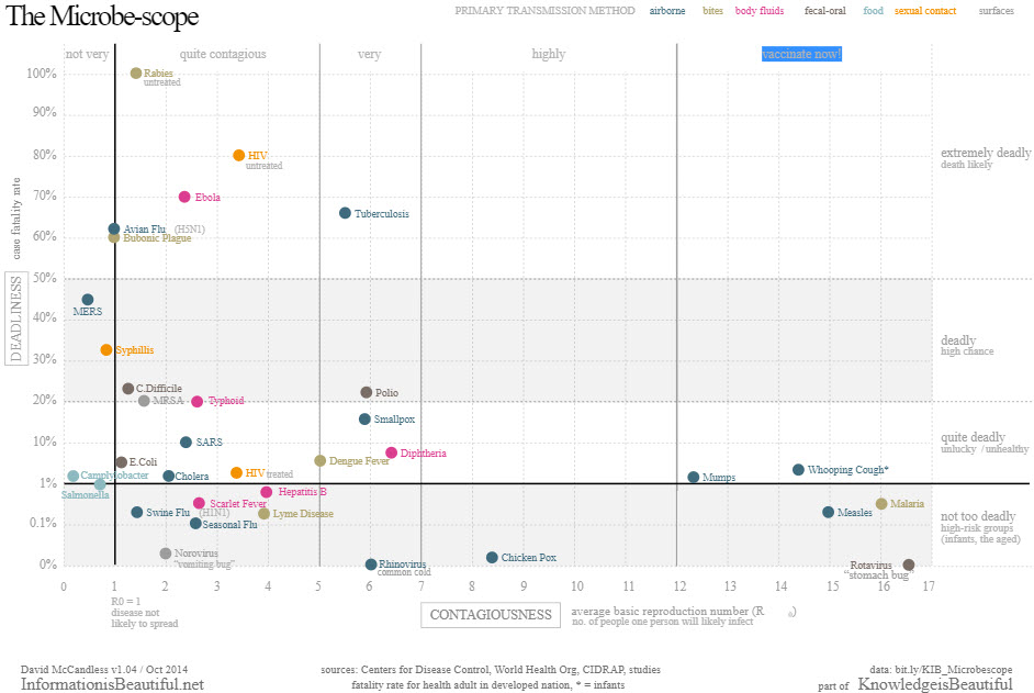
Data: The plot above is visualizing the relative mortality rate and contagiousness (R0) of various diseases by utilizing a simple and familiar scatter plot. Similarly simple, it further educates the public on primary transmission methods via color coding. As a an added aid the scatter plot is further partitioned and labeled into qualitative labels intended to help viewers confirm and internalize their intuition.
Audience: This is clearly intended for the general public. The details of the data have been abstracted down to what is familiar to a non-medical and reasonable educated viewer. If we consider the viewers most likely to view this plot, it is probably someone who is already aware of Ebola’s impact and is investigating further, so the level of detail is just right.
Goals: The image is trying to give the public a general understanding of the risks involved with ebola relative to other diseases with which they are likely more familiar. v
Effectiveness: Its a decently effective visualization overall however it could communicate its message more efficiently. Again, the message is clear and it answers all the question the public is likely to have, but the author could have used a few more visualization techniques to clean up the plot and highlight the most important information.
Note: The category block would not work when posting this so I’m unable to post this as a “viz reviews” category.