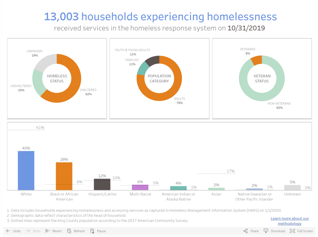
All Home King County is the Seattle/King County Continuum of Care (CoC), which is the designation of local homeless housing task forces across the United States. They are therefore the body that coordinates and implements the regional programs targeting the homeless crisis. The visualization is a part of their online dashboard presenting data that represents the response system implemented in the County.
In this visualization, All Home is sharing demographic information on those who are accessing services as of the end of October of last year. It includes an overall count (13,003 households experiencing homelessness) and then proportions representing their status (sheltered/unsheltered/unknown), their population category (adults/families/youth), their veteran status, and their race/ethnicity vis a vis the general King County Population according to ACS 2017.
The dashboard and the data overall are part of a somewhat recent initiative to try and track more annually granular data on homelessness in the CoC, since federally mandated counts only happen nation-wide once a year. The audience is likely as much for the CoC themselves as it is for a somewhat informed public. In previous years, Seattle/King County had the 3rd largest homeless population in the country, and was under a lot of (reasonable) pressure to show positive results of programs. This dashboard is not only in part about accountability, it is also a means of sharing information and hopefully positive progress on the crisis at hand.
I think that this is a reasonably effective visualization, though I am slightly concerned with data freshness since it says it was last updated in October of last year. Though another tab on the page tracks the count of homeless individuals/households and how it changes over time, it does not show the same demographic breakdowns over time, which I think would be interesting though maybe less compelling.