Review of Olympic Medal Visuals

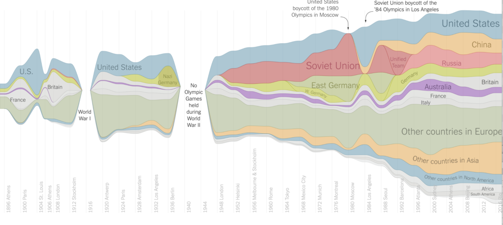
This article uses multiple visuals conveying Olympic medals won by countries; the first visual provides an overview of total medals per country or region, while the visuals that follow disaggregate this information by sport. The visuals are striking in that they convey a lot of information – the longer you engage with it, the more you discover. The first visual gives a timeline; the locations of Olympics; the years in which Olympics were not operating; years in which select countries were not participating; and a sense of trends related to both medals by country and total medals awarded at the Olympics. On the sport-disaggregated charts, you can also hover your mouse over the image to see exactly how many of each type of medal any given country won, in any given year. I am impressed by the amount of information conveyed within a visual. However, as a reader, I do not think that the visuals are easily accessible. It took my sometime and reading to understand the visuals and discover its dimensions. I believe that this is because the author of the visuals attempted too many dimensions in lieu of simple and well-labeled visuals. There are notable aspects that could be improved – for example, the y axis is un-labeled and should be for clarity; the wave patterns in the chart would be easier to read if they were aligned at the bottom. Regardless, I think communicating too much information is the largest pitfall of this visual – and that aside from the Olympic-history enthusiast or data visuals/storytelling analyst, the message of the graphics will be lost to audiences.

https://www.nytimes.com/interactive/2016/08/08/sports/olympics/history-olympic-dominance-charts.html

About this Class

We are swimming in data – “Big” and small, global and personal. And we are also facing complicated problems like Climate Change and inequality whose stories can only be told by including data. The need for public understanding of data-driven issues is higher than ever before. But raw data doesn’t make a good story… and that’s where you come in.

This class is focused on how to tell stories with data to create social change. We will learn through case studies, invited guests, examples, and hands-on work with tools and technologies. We will introduce basic methods for research, cleaning and analyzing datasets, but the focus in on creative methods and media for data presentation and storytelling. This is NOT a data science course, nor is it a data visualization course, nor is it a statistics course.  We will consider the emotional, aesthetic and practical effects of different presentation methods as well as how to develop metrics for assessing impact. Over the course of the semester, students will work in small groups to create “sketches”, each using a different technique for telling a data-driven story.  Think about a sketch as a half-realized project; where you have implemented just enough of the most important details of the idea in order for us to understand your vision. A sketch is NOT a fully realized presentation of a data story. For the final project, students will have the chance to expand on one of these sketches to create fully realized presentation of a data-driven story. Why is this called a studio? This course has few lectures and lots of group project work time.

The course is open to all technical levels and backgrounds. We will prioritize students with a strong background in one or more of the following areas: journalism, software development, data analysis, documentary, visual and performing arts.

This semester the course will have a special focus on climate change data. Most examples will use data related to this topic, homework will be related to it, and sketches and final projects must be connected to it as well.