Analyzing Personal Contribution of The Beatles Members

Source: http://duelingdata.blogspot.com/2016/01/the-beatles.html

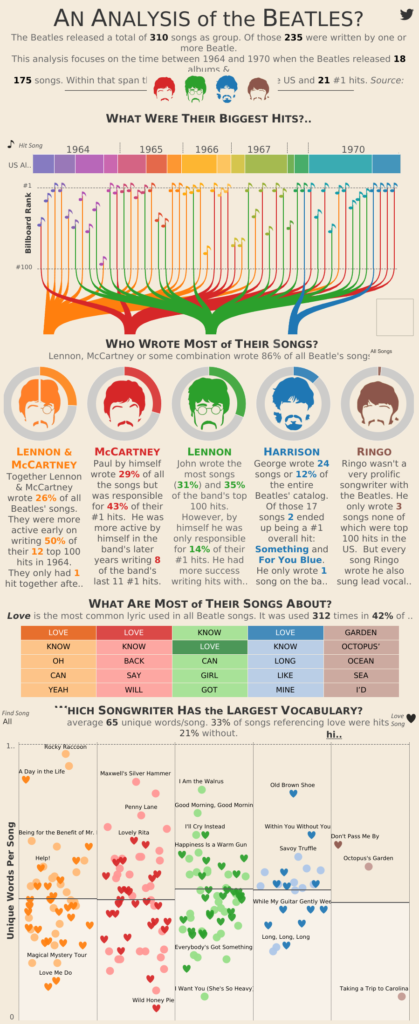
Recently, I have stumbled upon this great infographic analyzing the individual contribution of each of The Beatles members. It uses creative ways to communicate information in a clean and aesthetic fashion.

In the first graph, the author succeeds in explaining in an easy-to-understand presentation of the different songs that each member wrote with a few details about each song. The author uses a combination of (1) An silhouette of the author to identify him, (2) A color of the line to assign each song to its creator, (3) Location on the horizontal axis to represent year, (4) Location on the vertical axis to represent billboard rank, and (5) A color of the note to (also) represent the year. Five clear pieces on a single graph. The only thing that I would change in order to improve this format is to color the note (5) in the same color of the line, as coloring it according to the year doesn’t add any information and only causing confusion.

The third part, about the most common words, is a little stale to my taste. Beyond the notion that Love is the most common word, it’s hard to get any interesting insights from it.

The ending part is again clear and creative. I loved the heart sign to represent love songs, and it is easy to get a notion of the distribution for different members. The only improvement that I could suggest for this part is explaining the meaning of the horizontal line in the middle of each box, which, I can only guess, means average.

How Global Trade Runs on U.S. Dollars | WSJ

Youtube Video Link

Global Currency Trades for Various Currencies

The video uses the data shown in the image above to make the case that the US dollars is used in more global trades that any other currency, then it goes on to explain that because of that fact, almost all global trades technically touch US soil. That gives US a lot of power to enforce doing business in a way that is compliant with US laws.

This video is shared by the Wall Street Journal, so I believe that the target audience is probably just about everyone. However, it wouldn’t be far-fetched to say that its subscribers are likely left leaning, which would imply that maybe the content it releases is for slightly left-leaning individuals.

Overall, it appears to me that the goal is to show how much power US has and at the same time show that a growing number of countries are working to stop this kind of power that the US has. And to that, it’s up to the reader to form their opinions. If that is the goal, then I think this is effective. The video was very much leaning on an informational side, and so it let’s me make my own decisions about what I think should or shouldn’t happen.

Lebanon’s road network

The data presentation that I recently saw was by “thawraecon”, an Instagram page that was created at the start of the October revolution in Lebanon. The page’s purpose is to provide data-driven economic insights that explain how past governments, ministries, and policies brought the country to its current economic collapse, while emphasizing the urgent need for change, growth, and development. 

The presentation is targeted particularly to Lebanese citizens but also to non-Lebanese citizens who are interested in acquiring knowledge and information on Lebanon’s economy. Given the purpose of the page, which is to share economic facts that are easy to understand, I think the presentation does a good job at highlighting the poor state of Lebanon’s road network. On the first page, the main statistic, “85% of Lebanon’s road network is in fair or poor condition”, is clearly the center of the story given the size of the font used. The second page is insightful in terms of breaking down the level of urgency for the different type of roads. The schematic is clear and sophisticated as it uses broken/not broken blocks to symbolize the proportion of roads that are in good/poor condition. 

One way I think this presentation could have been more helpful would be the breakdown of the road network by geographic area as such a breakdown could help identify which improvement in road infrastructure would lead to the highest return on investment in terms of GDP for Lebanon in the least amount of time. 

Coronavirus: Fatality vs. Infectivity

I have a PhD in virology, so it’s been interesting to see how information about the novel coronavirus (nCoV) is being presented. There’s a lot that we still don’t know about nCoV, which means people have been creating projections with varied estimates of how contagious the virus is as well as estimates of case fatality rates (CFRs). There is a lot of fear-mongering going on about the outbreak, with people only showing the projections based on worst case scenarios for CFR and infectivity. At the same time, it would be naive to underestimate nCoV, and individuals calculating its impact using the lowest transmission and CFR estimates are also not super helpful.

Which is why I like this CFR vs infectivity figure from the NYTimes. It shows the estimates for nCoV (reddish square) while also demonstrating how it compares to previous Coronavirus outbreaks (SARS in 2002, MERS in 2012) as well as other viruses. This figure illustrates two things pretty effectively: (1) epidemiologists are still at the information gathering phase, and (2) the CFRs for nCoV are below those for SARS and MERS.

This graph is part of a larger information packet from the Times, all of which add more nuance to the nCoV situation. I think most readers will have a bit more peace of mind and after reading the packet and especially after seeing this graph. My one quibble is using a log scale for CFR. It’s a great solution for showing super spread-out data, but it ends up placing the nCoV square towards the middle of the graph, making it seem like the CFR is much higher than < 3%, especially to readers who might not be familiar with log scales.

Link to NYTimes Page: Click here

Wuhan coronavirus data

This data presentation compares statistics about the Wuhan Coronavirus to other viral outbreaks to communicate that the Wuhan coronavirus is less dangerous than its public perception. The graphic displays cases reported in time since the initial report and a timeline of major response markers such as confirmation of the virus by WHO and gene sequencing. In addition, the graphic introduces a measure called the reproduction number, which is related to how contagious the disease is. Based on the color scheme and quantitative quality of this data, I think that the intended audience is people with higher education in STEM fields. The dark colors are reminiscent of technological displays or science-based marketing. In addition, the emphasis on numbered data and the statement about media attention implies that the intended audience takes a skeptical approach to words and is more convinced by statistics. The data was a little difficult to interpret without the guidance of explanatory text, but was understandable after some analysis. On a separate note, I really appreciated the flow of the bolded white text which created a one-sentence summary of the poster. In my opinion, the presentation was effective as it convinced me that the media has exacerbated public concern about the virus. However I will note that I am definitely a subsection of the intended audience, and this presentation of data may not convince other viewers.