Economic Pollution

Sule Kahraman, Hamed Mounla, Sarah Mousa

The data says that correlations between economic growth rates and carbon emissions vary widely across country. We want to tell this story because it could undermine a key argument for non-restrictive emissions policies and drive greater policy actions towards curbing environmentally-harmful emissions. 

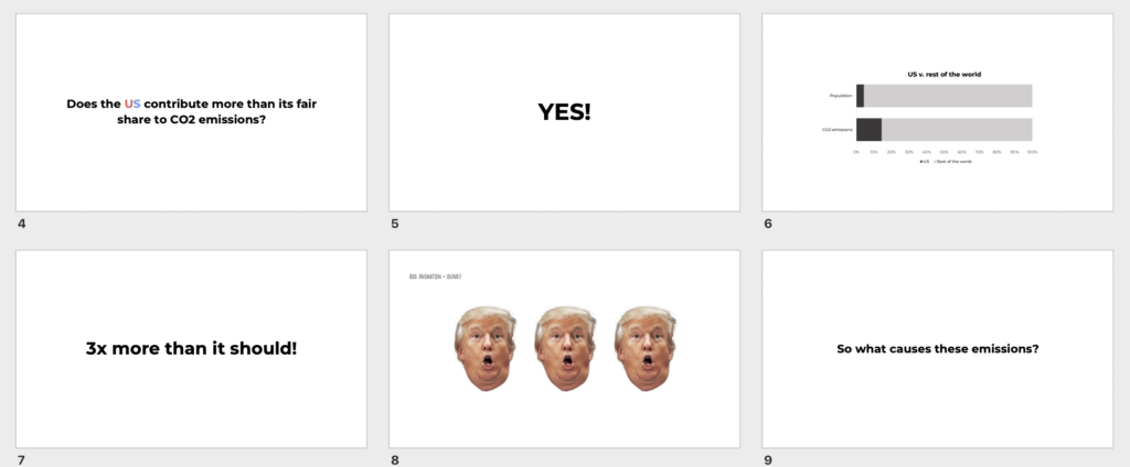
Original Post: The original blogpost we used for this assignment is on charting correlations between CO2 emissions and economic growth. Originally, that post was designed for a politically-influential audience; we suggested attendees of the Davos World Economic Forum since it uniquely gathers influential figures from around the world. The message of the visuals is that 1) economic growth is possible without dramatic increases in carbon footprints and that 2) policy actions can shape outcomes both in terms of growth and carbon emissions; or namely, that it is policies that dictate correlations between economic growth and carbon emissions.

Updated Presentation: We incorporated feedback recieved on that assignment with the main goal of enhancing the clarity of the visuals for the audience. Our study participants received this updated version of our presentation. In this version, we updated for clarity, with knowledge that audience members would interact with the visuals with no added explanations from our end. One important addition is a legend and key for our visual, to ensure that the symbols we used are understood. Additionally, we added messaging throughout the presentation, hinting towards our motivation and process for creating these visuals.

Our Audience Is: For this assignment, we needed to identify a different audience than originally intended (Davos participants), due to logistical constraints. We opted for members of the MIT Energy Conference – a local, student audience with interests in energy policy and who aspire to be influential in this field. We expect that this audience is somewhat knowledgable and opinionated regarding the topic, making them, like Davos participants, potentially more difficult to convince if they have opposing views. For those who already hold an opnion similar to our messaging, our project may simply serve as confirmation.

Our Goals Are: With this assignment, we wanted to test: 1) whether the message of the visualizations–that economic growth rates and CO2 emissions are not intrinsically highly correlated–is clear; 2) how audiences with different degrees of background knowledge; certainty in their opinions; and of diverse baseline opinions react to the message in terms of their opinions, and motivations to take any relevant action; and 3) what type of action, if any, did the visualization inspire.

Test Plan: In designing an assessment of the effects of the data visualizations, we opted to use a pre- and post-survey, consisting of questions that the recepient would answer before and after viewing the visualizations. Theoretically, the survey is underpinned by the assumption that 1) audiences viewing this have diverse knowledge, experience, and opinions on the topic at hand; and 2) individual perspectives impact the way that recepients understand and interpret the visualizations. In an attempt to identify how these factors may impact interpretation, in the pre-survey we ask the recepient to 1) self-rate their expertise on economic growth and climate change topics; 2) identify their prior opinion on the relationship between economic growth and climate change; and 3) rate their level of confidence in this opinion. We hypothesize that the visualizations may not be as effective for those highly confident in an opposing view; although it could convince those less confident in the same view, and it can serve as confirmation for those already in agreement. In additoin to asking for their opinion on the topic in the post-survey, the recepient has the opportunity to answer an open-ended question on how the visualization affected their views on the topic; and an additional open-ended question asking whether and what actions the visualization may have influenced. The open-ended questions leave room for more in-depth understanding of unanticipated effects of the visualization.

Results: 

Our test consisted of 5 participants.

  • Level of background: Participants self-reported background knowledge ranging from 4-7 on a scale of 1-10
  • Baseline Opinion: Most participants believed that the relationship between economic growth and carbon emissions is positive; a minority believed that there is no significant relationship. 
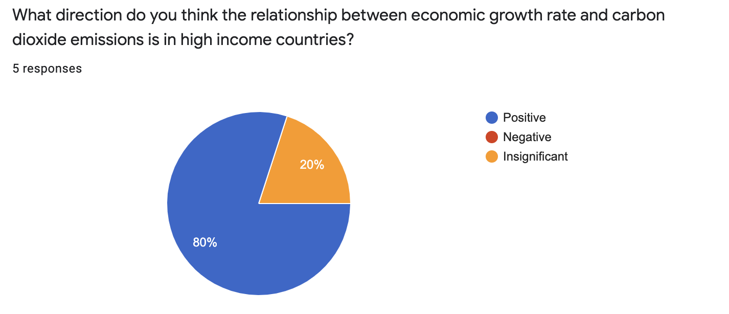
  • Level of Confidence: Participants were confident in their answers, and self-reported a confidence-level of 5-8 out of 10.
  • Impact on Opinion: No participants reported that they were un-affected by the presentation; they reported either that 1) their baseline opinion was confirmed; 2) their opinion was changed; 3) that they were now unsure and needed to conduct additional research; or 4) no change. The participants then explained further in the open-ended question–showing us that even for respondants who reportred a confirmed-opinion or no change, there was important changes in their thoughts on the underlying mechanisms between economic growth and CO2 emissions. For example, one respondant noted that: 

While there is still seems to be a positive relationship between economic growth rate and carbon emissions, the relative increase in the latter doesn’t necessarily have to scale linearly with the former. By pursuing environmentally-friendly policy initiatives, we can mitigate the environmental risk of economic growth.”

This important subtlty around the nature of the correlation and the underlying mechanism is at the core of our message, and appears to have been successfully communicated.

  • Action: Our presentation does not come with an explicit call to action–designed for influential policymakers, it is intended to inspire action with the scope of the professional work of the individual viewer. This audience is students, and we expected, at least, an interest in learning more about the topic. One participant did note this–“I looked more into how Sweden’s policies (and those of Scandinavia in general) have been able to mitigate its carbon footprint as it grows economically, as compared to the US and China.” For one participant, it prompted further digging into a tangential topic: “I am interested in how the after-effects of carbon footprint of large economic world players materializes most heavily on the poorest and most underdeveloped locations.” At the level of this particular audience, prompting further thinking on and research into a topic is an ideal action-based outcome.
  • Room for improvement: Our audience was left convinced that for some countries it is possible to achieve economic growth without a high level of carbon emissions; but they were left wondering exactly how this was done, and which policies created this effect. In a future opportunity to expand on this project, we would go further in identifying and demonstrating links between specific policy actions and emission outcomes in Sweden vs the US and China. 

No More Honey

-Sarah Mousa

I was inspired by the bee dataset and chose three data points tied to bee colonies from the state of California from 1989; 2000; and 2016. These three data points show a drop in bee colonies, by 30% from 1989 to 2000 and by 50% from 1989 to 2016.

Description:

I used honey (a product of bees) to demonstrate the proportion drop in bee colonies (in this case, in the state of California for abovementioned years); the use of honey is a way to make the issue more tangible to people (an alternative I was considering was showing a rise in cost of honey to indicate decreasing supply).

Audience:

The honey in jars shows clear decrease that is easy to grasp for a wide age range. It is intended as a trigger for a wider audience, to inspire them to do their research on what is causing drops in bees, and what can be done about it.

Reason #457 to vote blue

The Anti-Lobby Lobby Club

Reason #457 to vote blue: CO2 Emission economics

Neil Pendse | Sarah Mousa

The data say that 1) energy companies are major contributors to CO2 emissions and 2) that lobbyists tied to these companies pay exorbitant sums to American politicians, with peaks in spending tied directly to moments where there is critical legislation at stake.  We want to tell this story because we believe that young American voters who care about climate change have the ability to change this, but need to know about it first.

The process

We started this process by exploring global World Bank data on key drivers of carbon dioxide emissions. On learning that electricity and transport are leading global causes, we were curious as to how this dynamic played out in the United States and why it is able to continue despite strong discourse surrounding climate change. We suspected that while there may be progress on individual levels and awareness around how our personal consumption choices may impact climate change, that the large-scale drivers of the problem was really industry with too high a vested financial interest to divest from its current production approaches. A symptom of this high vested interest is how much these companies are willing to spend to protect their business activities–hence our interest in lobby spending. We were surprised by the intensity of spending by electricity companies and how neatly these lined up with mainly Republican candidates. We came across many articles that showed how lobbyists spent money prior to critical voting periods, and how that directly blocked legislation that would limit their activities–and ultimately limit CO2 emissions. We do not believe the voting public is generally aware of this and opted for a more optimistic approach where we assume elections, and the electorate, have the power to change the status quo.

The construction of a narrative, format, and aesthetic style revolved around our target audience. We decided on young voters because although they are more likely to believe in the importance of tackling climate change, they tend are not turning out to vote as needed. That decision meant that we needed an engaging approach fit for a generation notorious for its short attention span.

Who we are

A cheeky social media platform motivating young, educated populations to vote by demonstrating the tangible impact of their voice using data.

Our target audience

American voters between the ages of 18 and 30. Our followers are predominantly students or young professionals with university degrees. We focus on this demographic with the aim of getting out the vote, especially in key states. Our audience is generally left-leaning and will have some awareness of the issues we are addressing, but may not be fully aware of the extent to which these issues are directly fueled by politics and can be changed.

Our format

We have created a series of Instagram stories that our followers can click through to learn why companies continue to get away with high levels of CO2 emissions in the United States. In addition to a series of Instagram stories, we will also turn this into an animated video that can serve as a more permanent post on our Instagram page.  

Our narrative and aesthetic style

We cater to our audiences. The narrative is quick, back-and-forth, and clickable. We do not want to lose the audience’s attention. Aesthetically, our work is minimalistic and contains bits of share-worthy humor.

Data Sources and Inspiration

[a] https://data.worldbank.org/indicator/EN.ATM.CO2E.KT?end=2014&locations=US-1W&start=1960&view=chart

[b] https://www.worldometers.info/world-population/population-by-country/

[c] https://www.epa.gov/ghgemissions/overview-greenhouse-gases#carbon-dioxide

[d] http://shrinkthatfootprint.com/greenest-electricity-source

[e] https://link.springer.com/article/10.1007%2Fs10584-018-2241-z

[f] https://www.opensecrets.org/industries/contrib.php?cycle=2020&ind=E

Inspiration: https://www.bloomberg.com/graphics/2015-whats-warming-the-world/

Data Log – Sarah

Action Data Collection Tool Data Collected Category
Answer WhatsApp messages, an Instagram message, and emails Whatsapp Instagram Outlook Time and location of activity Content of messages (?) Chatting Getting online
Ordered Starbucks for pickup Starbucks App Time and location of origin, location of pickup Moving around town
Rode the T T Card Time and location of departure Moving around town
Lunch at HKS Credit Card Time, location, price, and items for lunch Moving around town
Printing Harvard ID Time, location, title, number of pages printed Other
Return Library books Harvard ID Time, location, books returned Other
Research Google Time, location, content of searches Other
Rode the T T Card Time, location of departure Moving around town
Ordered groceries Amazon Time, contents, price of order, home address Moving around town
Watch television Netflix Time, location, content Other

Review of Olympic Medal Visuals

This article uses multiple visuals conveying Olympic medals won by countries; the first visual provides an overview of total medals per country or region, while the visuals that follow disaggregate this information by sport. The visuals are striking in that they convey a lot of information – the longer you engage with it, the more you discover. The first visual gives a timeline; the locations of Olympics; the years in which Olympics were not operating; years in which select countries were not participating; and a sense of trends related to both medals by country and total medals awarded at the Olympics. On the sport-disaggregated charts, you can also hover your mouse over the image to see exactly how many of each type of medal any given country won, in any given year. I am impressed by the amount of information conveyed within a visual. However, as a reader, I do not think that the visuals are easily accessible. It took my sometime and reading to understand the visuals and discover its dimensions. I believe that this is because the author of the visuals attempted too many dimensions in lieu of simple and well-labeled visuals. There are notable aspects that could be improved – for example, the y axis is un-labeled and should be for clarity; the wave patterns in the chart would be easier to read if they were aligned at the bottom. Regardless, I think communicating too much information is the largest pitfall of this visual – and that aside from the Olympic-history enthusiast or data visuals/storytelling analyst, the message of the graphics will be lost to audiences.

https://www.nytimes.com/interactive/2016/08/08/sports/olympics/history-olympic-dominance-charts.html