Sule Kahraman, Hamed Mounla, Olivia Yao
Our audience for our data story is the attendants of the World Economic Forum, who are the world’s top leaders meeting to shape the global, regional and industry agendas for the year. We want these influential actors that can have a great impact on climate change to think and talk about climate change, not only on stage, but also behind the scenes. We believe that these are the people who we need to target with our data presentation as they are responsible for enacting political change and climate action.
We want to tell this story because we want to show that if the countries and leaders take the right actions, economic growth is possible without increasing carbon print. We are calling for a better measure of aggregate carbon emissions to account for economic growth and the status of an economy as a developed or emerging market. Our approach to presenting the data is effective as it includes an interactive chart as well as more sophisticated analysis when running the regressions. This allows us to capture our target audience’s attention while delivering the type of analysis that they likely expect our presentation to have.
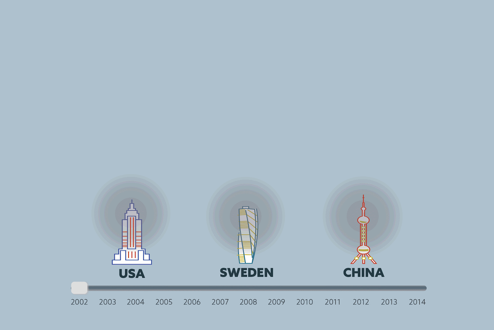
We designed our data story to be told on a large interactive board on the hallways of the conference. From far we aim to draw attendants’ attention by the size and the visuals of our data story.
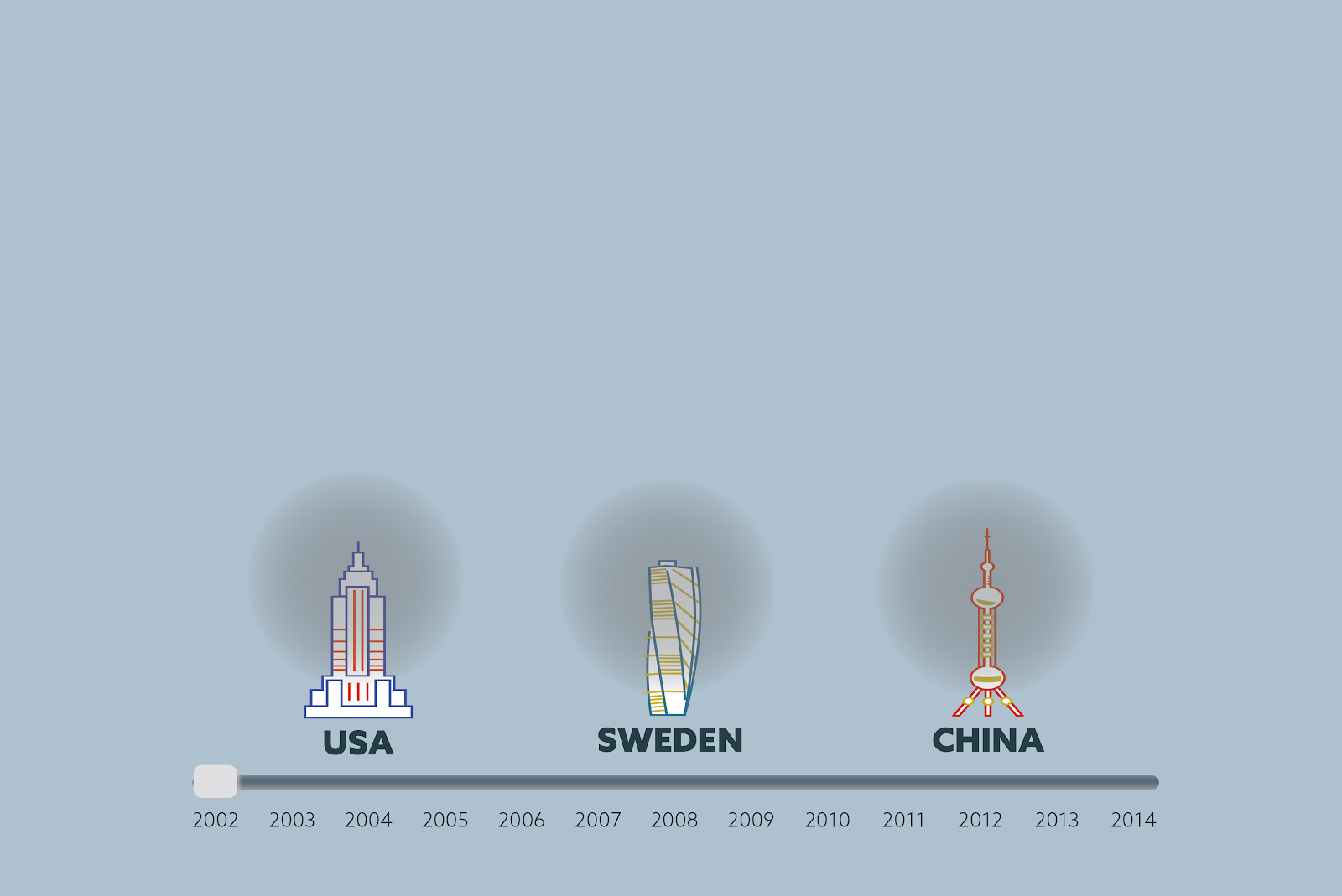
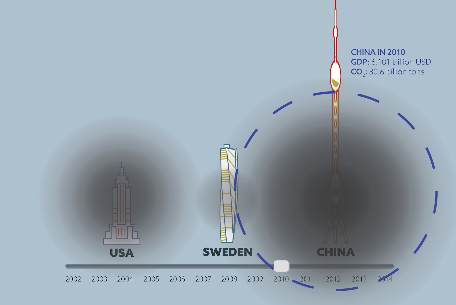
When the person approaches the interactive board, then they can drag the timeline to see the change in economic growth and CO2 emissions. The charts were created using Adobe Illustrator and Photoshop, with building height representing GDP growth rate and size of the the black circle representing CO2 emissions.

We selected the time range as 6 years before and 6 years after the 2008 financial crisis as it provides a good framing and structure for our story. We normalized the building heights, which represent GDP of each country, to 1 in 2002 so that we can emphasize economic and emissions growth over years across the 3 countries rather than the absolute GDP value. The density and size of the black circles represent the CO2 emissions, which were also normalized to 1 for the aforementioned reason.
While sliding the timeline, the viewer can also tap on the country that they’re interested in to see detailed statistics. We assume that our audience have the background to understand the statistics we’re showing in text because they understand economy.
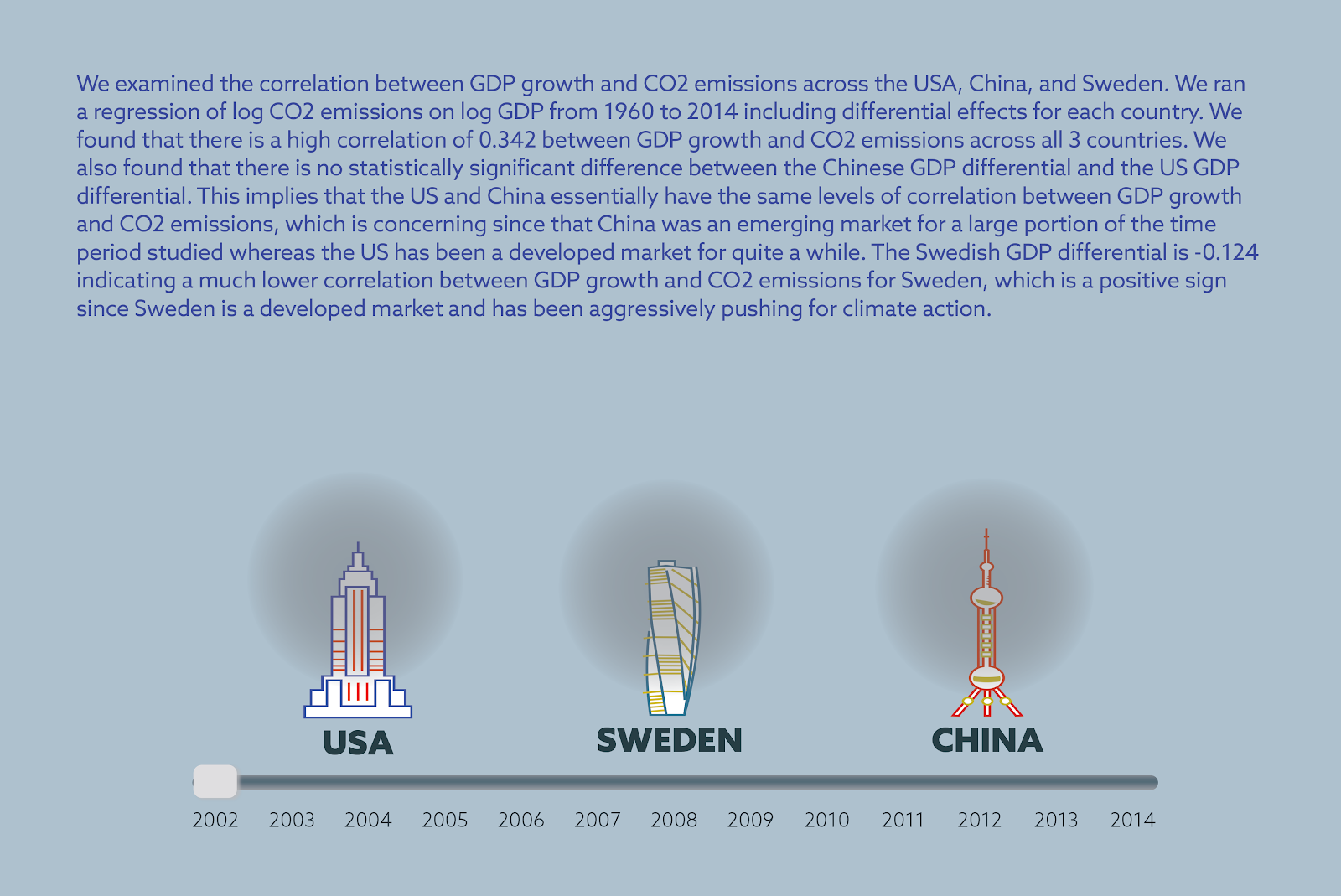
After looking at countries individually, the viewer can also click on the summary option to see the results of the statistical analysis we do. We show the results as text with an explanation of the statistical analysis and the statistical terms which make the results significant.
We hope that after being moved by the visuals, our viewers can further discuss the statistics between each other.
For our data story, we used two datasets from World Bank: CO2 emission data(https://data.worldbank.org/indicator/EN.ATM.CO2E.KT) and GDP data (https://data.worldbank.org/indicator/NY.GDP.MKTP.CD). Both of these datasets span a timeline from 1960 to 2014 and we used all the data available for our data analysis. However we implemented the data visualization only for the years between 2002 and 2014 (centered around 2008) The reason for this decision is that we assume that our audience of world leaders and economists know about the 2008 recession and can have an immediate reaction when they see the timeline of the visualization.
The statistical analysis we ran with the CO2 emission and GDP data show that there is a statistically significant high correlation between change in economic growth and CO2 emissions in the United States and China, whereas in the case of Sweden, the correlation is much lower and less significant. Correlation between GDP growth and CO2 emissions is the same for the US (which is a developed economy) and China (which is an emerging economy), whereas correlation is significantly lower for Sweden (which is a developed economy.)

We found that there is a high correlation of 0.342 between GDP growth and CO2 emissions across all 3 countries. We also found that there is no statistically significant difference between the Chinese GDP differential and the US GDP differential. This implies that the US and China essentially have the same levels of correlation between GDP growth and CO2 emissions, which is concerning since that China was an emerging market for a large portion of the time period studied whereas the US has been a developed market for quite a while. The Swedish GDP differential is -0.124 indicating a much lower correlation between GDP growth and CO2 emissions for Sweden, which is a positive sign since Sweden is a developed market and has been aggressively pushing for climate action.
For the next iteration of our sketch, we would want to add all countries to our system so that the user could choose which countries they would like to compare and visualize in the beginning. We also would change the colors of our visuals to be stronger so that it can draw more attention and make the viewer feel something.