In this sculpture I try to represent the change in the rate of grape harvest in France, hence I used only the French bottles. The number of bottles for each century maps to the grape harvest volume in that century. I chose to represent the future with a wine glass that has very little amount of wine in it to highlight the magnitude of the threat and to draw attention to the urgency of the matter.
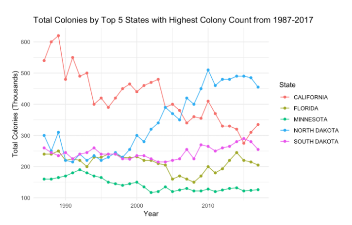
The Bee Colonie Statistics data from data.world say that since the 1990s, there’s been a drastic decrease in honey bee populations, and this trend has continued until today. While honey bees have seen increases in some states, in some states they have seen decreases. This story about bee colonies is very complicated to tell because there is no certain cause for these changes and states behave differently. Therefore, we focus on one state for the sketch: California who used to have an enormous number of bee colonies and has seen drastic decreases over the last couple of decades.
Figure 1: Total Colonies by Top 5 States with Highest Colony Count from 1987-2017
We want to tell this story of bees in California because we want people to take action against climate change. We chose K-5th Grade as our audience because it is important to inform the younger generation what will become a huge problem very soon. Our goals are to warn this young audience about what’s happening to the bees by putting themselves in the shoes of the bees through this game and to encourage them to understand their own role in contributing positively to creating bee-friendly ecologies. With the tool of empathy in this game, we want to create the urgence for their actions.
Data sources we used are the Bee Colony Survey Data by State, Bee Colony Statistics, data.world. We think that this game is an appropriate and effective way to tell the data story because it can be difficult to relate to bees sometimes and feel urged to take action immediately. With this game we put the kids in the shoes of the bees and make them realize the increase in deaths of bee colonies while playing the game. When we give them the option of taking an action or not, we’re showcasing that they can change the future of bees, therefore themselves. After probing their curiosity and stimulating their emotions, we immediately suggest possible actions they can take to save the lives of the bees in real life.
We hope that teachers will incorporate this game into their curriculum and actually take action with their students on a dedicated day at their school or go visit a beekeeper with their students.
Students register for the game with their name and choose a state where they want to play the game in.
We chose to use the state of California for the sketch purpose, but the next iteration of this sketch would incorporate all the available states in the dataset.
We also chose to use three levels in our sketch, but the number of levels can be extended for the next iteration.
We represent the bee colonie data by changing the ratio of bee to buildings in each level.
Level 1: Player bee is in California in 1989 where there are 62,000 bee colonies.
[While switching to a new level, we state facts about the changes in the data.]
“In the last 25 years, HALF of your friends and their families died because of climate change. We are sorry for your loss.”
Level 2: Player bee is in 2016 where there are 31,000 bee colonies in California.
At the end of Level 2, we again give facts about the predicted changes in the data and ask the player whether they will take action or not.
“Without climate action, we estimate that you will be losing another half of your friends and their families in the next 25 years. Maybe you’ll be amongst those. Will you take action to save the lives of your friends and your family? Will you take action to save the bees?”
We ask them to choose one of these options:
A. Yes, I will take action. → Level 3A: 2040. Bee colonies numbers rose again and there are plenty of homes for the bees.
B. No, I won’t take action. → Level 3B: 2040. Bee lost another half of their friends and their families in the next 25 years.
At the end of the game, we encourage the player to take action by explaining what they can to take action and save the bees.
1 in every 3 bites of food is made possible by bees and other pollinators. Sadly, in 2017-2018, the US lost over 40% of managed beehives. To save the lives of your bee friends, you can take this action.
Everyone can make a positive impact to help bees and the environment. Feel the power of individual action! Learn what you can do to change the world – one bee and student at a time!
PLANT FOR POLLINATORS
Planting a pollinator garden helps honeybees immensely. Bees rely on the nectar and pollen from nearby flowers for their survival; when flowers are scarce, bees can starve. By planting a pollinator garden, you’re ensuring that bees have a source of food year round — just be sure your garden is pesticide free.
Want to learn which plants are right for your planting zone, or how to get organic seeds? Check out our Pollinator Gardenresource page.
GO PESTICIDE FREE
Pesticides are harmful to humans and worse for bees. The chemicals and pest control treatments used on lawns and gardens weaken bees, and are especially damaging if applied to flowers in full bloom. Research shows that neonicotinoid pesticides linger in the nectar and pollen of flowers, where bees are most likely to come into contact with them. These treatments weaken bee immune systems and make them more susceptible to disease and infestation by pests. For resources on bee-friendly means of pest control, read our Natural Pest Controlguide.
SWARM? NO PROBLEM
Swarming is a natural process that occurs when colonies of honey bees have outgrown their hive. If you see a swarm, contact a beekeeper’s association; many bee-conscious groups will collect swarms to keep or relocate them to a safer new home. Honeybees in a swarm are very gentle and present very little danger, but can be made aggressive if disturbed or sprayed with water. Just leave them alone and wait for help to arrive.
BE PART OF THE SOLUTION
Ecologists and researchers interested in honeybees have started reaching out to citizens for help in huge research projects. You can provide vital information to these projects, all of which add to our knowledge of what we can do to help the struggling honey bee. Check them out and get involved!
Planet Bee’s ZomBee Watch Project– A brand-new Citizen Science lesson created by Planet Bee and created in collaboration with Professor John Hafernik’s ZomBee Watch program. This 3-day lesson involves the construction of light traps in order to catch and examine “ZomBees”, or bees which have been parasitized by zombie flies.
The Great Sunflower Project – The world’s largest citizen science project, aimed at gaining a better understanding of pollinators and their conservation.
NASA Honeybee Net Study – investigates the relationship between plant and animal life cycles by measuring the weight of honeybee hives throughout the year.
Our audience for our data story is the attendants of the World Economic Forum, who are the world’s top leaders meeting to shape the global, regional and industry agendas for the year. We want these influential actors that can have a great impact on climate change to think and talk about climate change, not only on stage, but also behind the scenes. We believe that these are the people who we need to target with our data presentation as they are responsible for enacting political change and climate action.
We want to tell this story because we want to show that if the countries and leaders take the right actions, economic growth is possible without increasing carbon print. We are calling for a better measure of aggregate carbon emissions to account for economic growth and the status of an economy as a developed or emerging market. Our approach to presenting the data is effective as it includes an interactive chart as well as more sophisticated analysis when running the regressions. This allows us to capture our target audience’s attention while delivering the type of analysis that they likely expect our presentation to have.
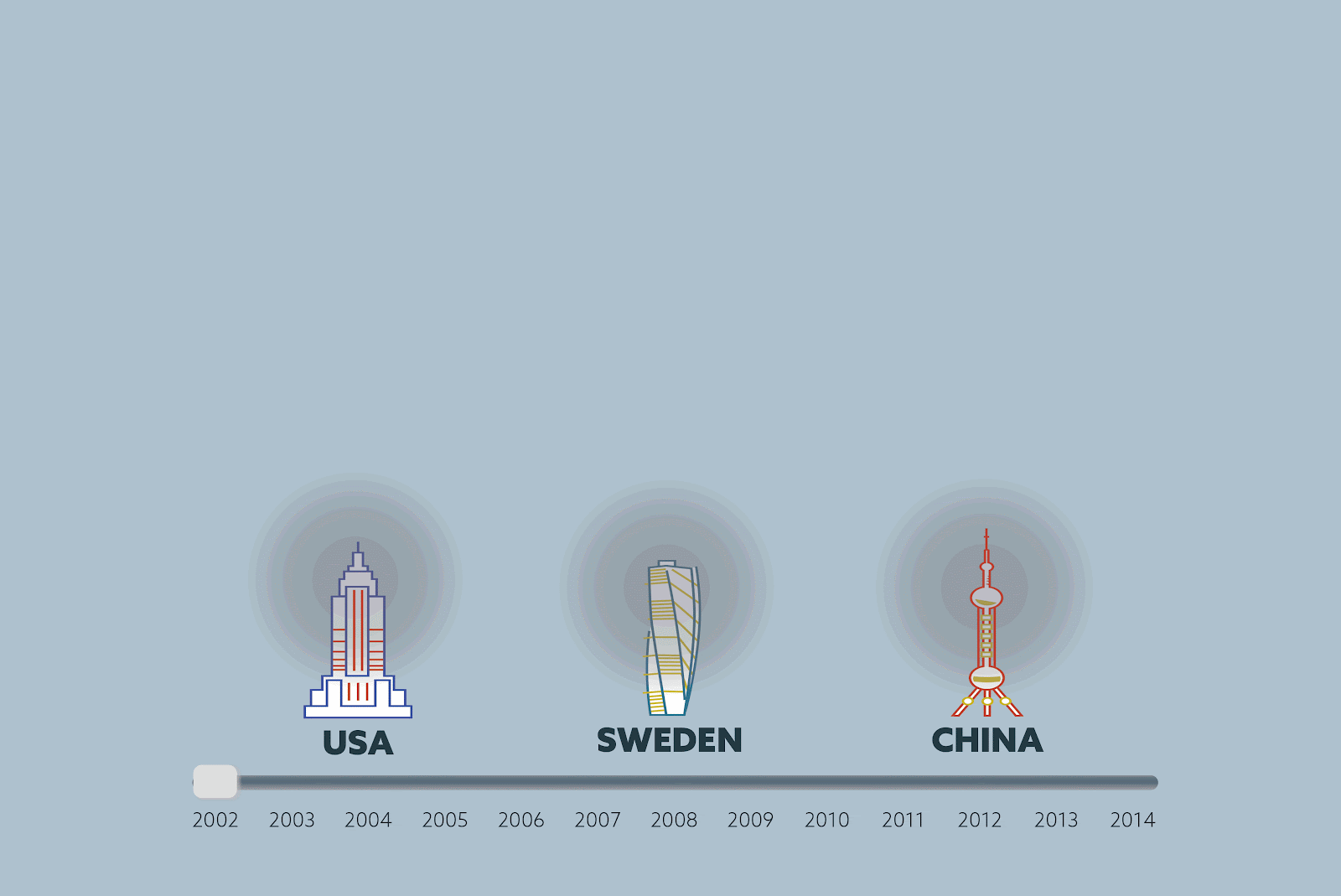
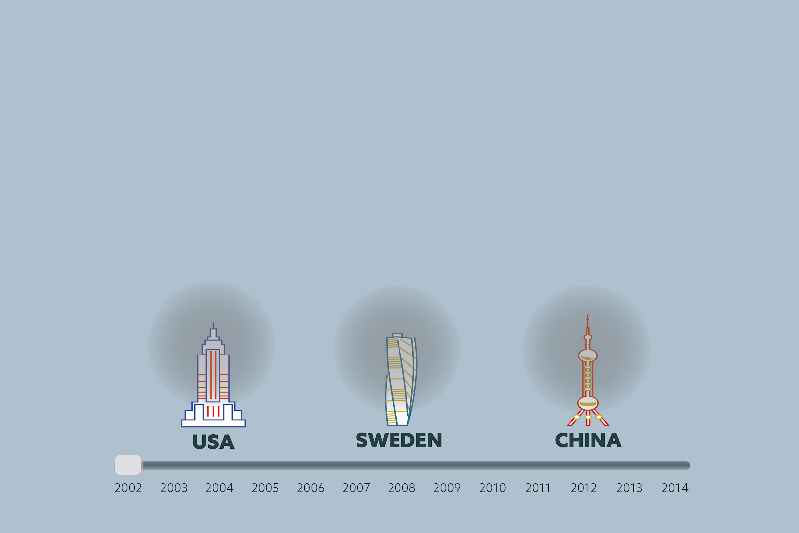
We designed our data story to be told on a large interactive board on the hallways of the conference. From far we aim to draw attendants’ attention by the size and the visuals of our data story.
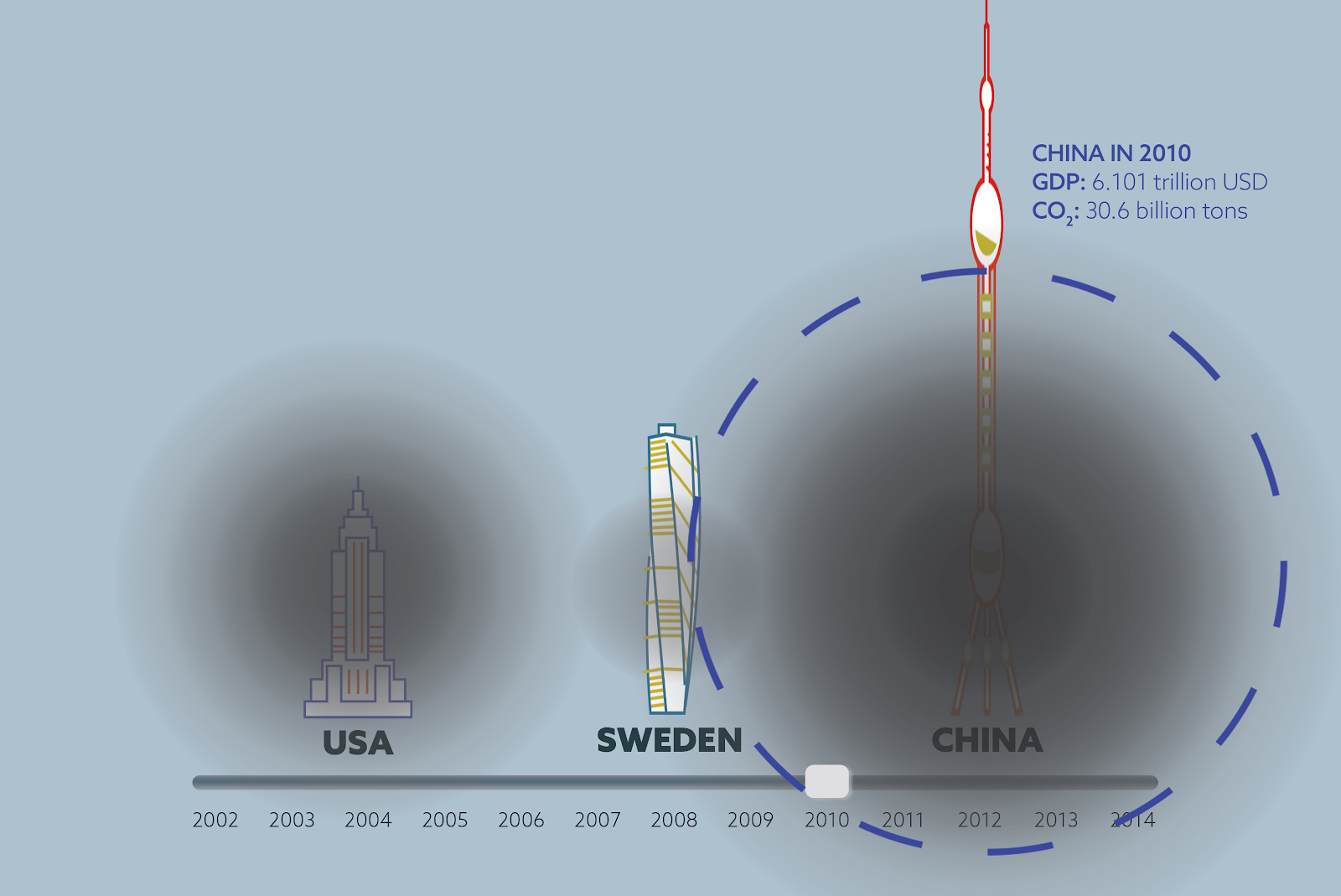
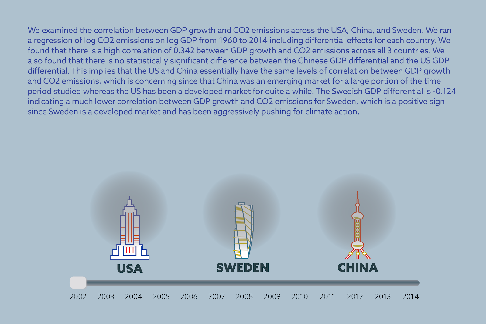
When the person approaches the interactive board, then they can drag the timeline to see the change in economic growth and CO2 emissions. The charts were created using Adobe Illustrator and Photoshop, with building height representing GDP growth rate and size of the the black circle representing CO2 emissions.
We selected the time range as 6 years before and 6 years after the 2008 financial crisis as it provides a good framing and structure for our story. We normalized the building heights, which represent GDP of each country, to 1 in 2002 so that we can emphasize economic and emissions growth over years across the 3 countries rather than the absolute GDP value. The density and size of the black circles represent the CO2 emissions, which were also normalized to 1 for the aforementioned reason.
While sliding the timeline, the viewer can also tap on the country that they’re interested in to see detailed statistics. We assume that our audience have the background to understand the statistics we’re showing in text because they understand economy.
After looking at countries individually, the viewer can also click on the summary option to see the results of the statistical analysis we do. We show the results as text with an explanation of the statistical analysis and the statistical terms which make the results significant.
We hope that after being moved by the visuals, our viewers can further discuss the statistics between each other.
For our data story, we used two datasets from World Bank: CO2 emission data(https://data.worldbank.org/indicator/EN.ATM.CO2E.KT) and GDP data (https://data.worldbank.org/indicator/NY.GDP.MKTP.CD). Both of these datasets span a timeline from 1960 to 2014 and we used all the data available for our data analysis. However we implemented the data visualization only for the years between 2002 and 2014 (centered around 2008) The reason for this decision is that we assume that our audience of world leaders and economists know about the 2008 recession and can have an immediate reaction when they see the timeline of the visualization.
The statistical analysis we ran with the CO2 emission and GDP data show that there is a statistically significant high correlation between change in economic growth and CO2 emissions in the United States and China, whereas in the case of Sweden, the correlation is much lower and less significant. Correlation between GDP growth and CO2 emissions is the same for the US (which is a developed economy) and China (which is an emerging economy), whereas correlation is significantly lower for Sweden (which is a developed economy.)
We found that there is a high correlation of 0.342 between GDP growth and CO2 emissions across all 3 countries. We also found that there is no statistically significant difference between the Chinese GDP differential and the US GDP differential. This implies that the US and China essentially have the same levels of correlation between GDP growth and CO2 emissions, which is concerning since that China was an emerging market for a large portion of the time period studied whereas the US has been a developed market for quite a while. The Swedish GDP differential is -0.124 indicating a much lower correlation between GDP growth and CO2 emissions for Sweden, which is a positive sign since Sweden is a developed market and has been aggressively pushing for climate action.
For the next iteration of our sketch, we would want to add all countries to our system so that the user could choose which countries they would like to compare and visualize in the beginning. We also would change the colors of our visuals to be stronger so that it can draw more attention and make the viewer feel something.
Chatting with people: I use Facebook Messenger and Whatsapp almost nonstop to chat with my friends. Today too I sent texts, photos and videos. I gave the data of the people I interact with and their numbers to Facebook. They will use this data in ranking the names on my Facebook messenger. They also store the photos and videos I shared with my friends since I can access them on our chat media any time.
I also exchanged emails with the company I’ll be interning with. I gave them data about my work authorization process.
Moving around town: I used my student ID at 11am to get into the gym at Stata Center. I gave my location data to MIT.
Today I got lunch at Cava at 1pm, where I gave my location data to the bank.
Getting online: I ordered stuff on Amazon today at 4pm. I gave my personal data, such as my address, my credit card details and my personal preferences to Amazon (which will be used for their recommender system).
Other things: It’s always funny to see ads on Instagram or Facebook of the brands I currently online shopped from or checked their shopping app on my phone.
Today I was looking at dresses on some brand apps I have on my phone and other apps (such as Facebook and Instagram) got this data of me liking these brands and immediately used it to show me targeted ads.
I saw this data representation called “Map of Misery” on the Economist recently, which shows the change in suicide rates in the United States.
Using county-level CDC (Centers for Disease Control and Prevention) data on the nearly half a million 25- to 64-year-old Americans who committed suicide between 1999 and 2016, the scientists calculated the expected number of suicides for each city. Then compared these expected values calculated from the past with the observed suicide rates to show whether the suicide rates increased or decreased.
The goal of this data presentation is to alarm people about the rising suicide rates in the U.S. The Economist article I read mentions that more than 48,000 Americans had taken their own lives in 2018, equivalent to 14.2 deaths per 100,000 population. This makes suicide the tenth-biggest cause of death in the United States—deadlier than traffic accidents and homicide. With these facts and the data presentation, the author of the article wants to raise concern about the climbing suicide rates and show the geographical distribution.
Another goal of the data presentation is to draw attention to correlations between suicide rates and geographical factors, such as ease of access to guns, deprivation, opportunities for social interactions, loneliness.
I think the “Map of Misery” does create a depressive mood for the audience, yet fails to have an alarming effect. If the use of colors were reversed and the higher suicide rates were depicted in red, the map could look more alarming and be more effective in raising an immediate concern.