The Life of a Storm

by Xio Alvarez, Sarah Mousa, and Devin Zhang

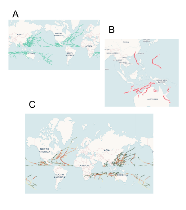
The tropical cyclones database includes granular meteorological data on all cyclones ever recorded by NOAA. While many people have some general familiarity with the categorizations given to cyclones, we precieved a gap between the highly specific data presented in the database and the physical impact of the storms themselves. Most people will understand that a category 5 is stronger than a category 2 cyclone, but the magnitude of difference and what that atmospheric pressure and wind speed actually appears as on the ground are less understood.

We decided to take this data and develop a sketch for a a tv series called “The Life of a Storm” which would connect the meteorological details of historical cyclones to the images and stories of their impacts on the ground. One thing that was clear from the data was that each storm moves through many phases and is felt differently in different places. Our news research also showed us that similar storms can have different impacts depending on how prepared people are for their arrival. The intention of this series is to educate a general public audience on the impacts of different storms and the types of preparedness and policies that are effective in mitigating their effects.

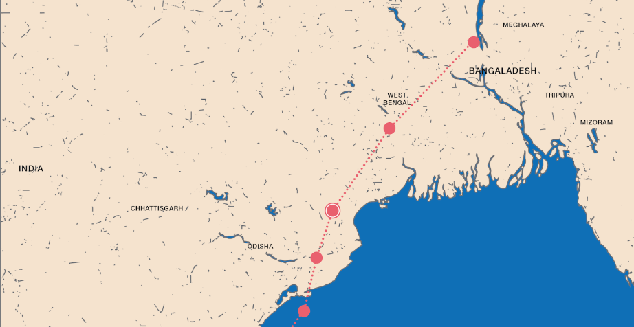
“The Life of A Storm: Hurricane Irma”

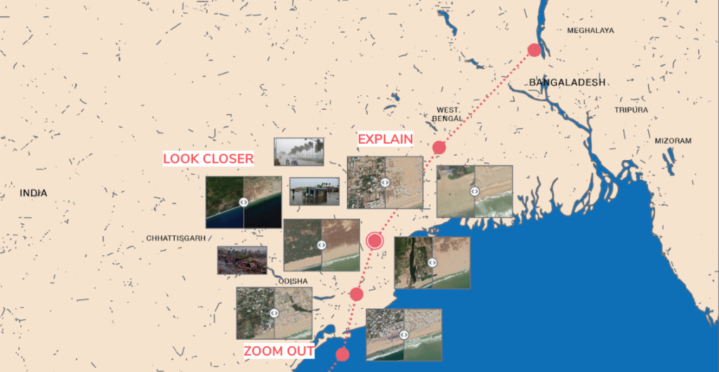
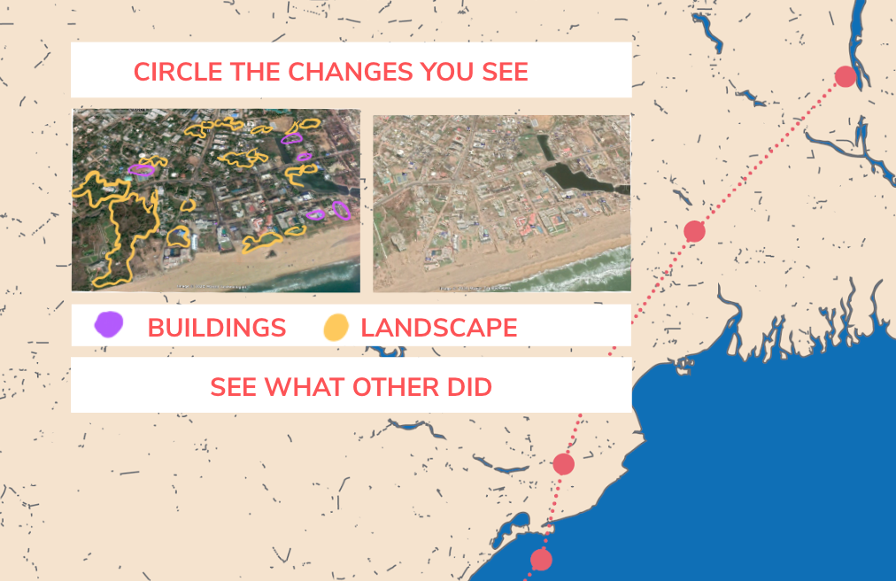
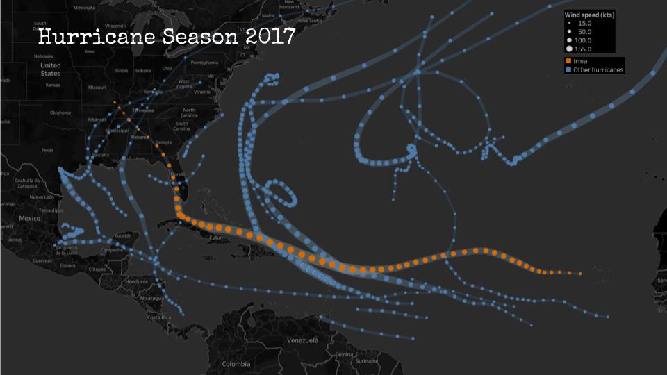
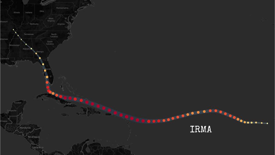
Our sketch looks at Hurricane Irma, one of many cyclones from the dataset that struck the Carribean and southern coast of North America in the hurricane season of 2017. Irma is a useful storm for us to use for this premier episode as it began as a category 5 and proceeded to make landfall as it progressed through its decline, tracking across western Florida before downgrading to a tropical storm and then depression over Georgia and Alabama. Our sketch geographically locates the storm as it downgrades, stopping at each point to understand how the effects were felt on the ground and what types of damage were typical in that area. We connect these images to stories from neighbors and victims in their own words.

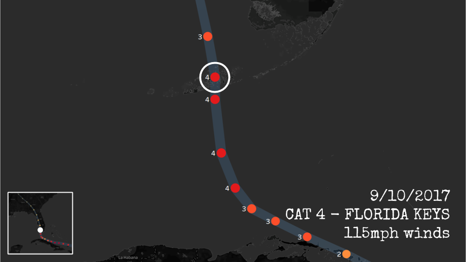
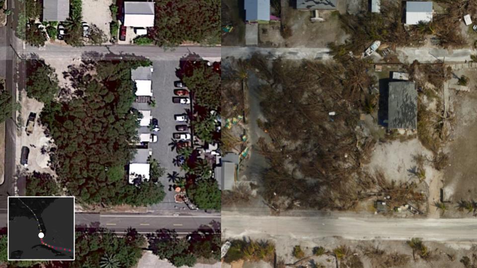
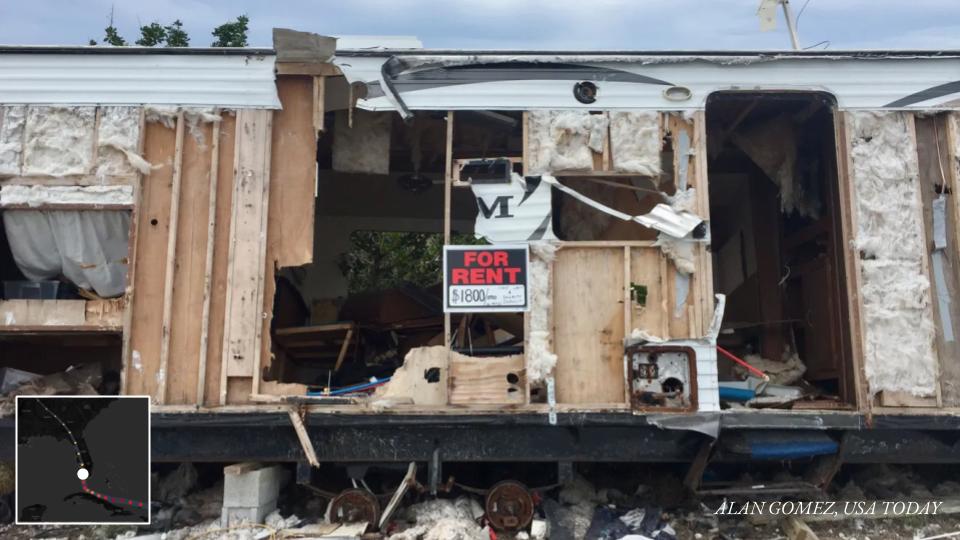
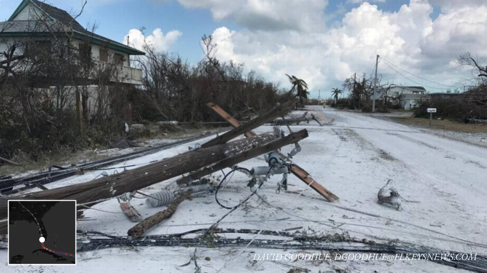
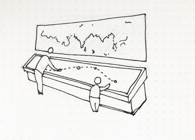
Our hope is that by traversing levels of abstraction (maps to satellites to photos), we are able to create a memorable connection between the technical language of emergency management and meteorology.

Other Sources

Satellite Images: Google Earth

News reporting:

Cuba:

  • https://www.miamiherald.com/news/nation-world/world/americas/cuba/article194517349.html
  • https://www.usatoday.com/story/news/world/2017/09/10/cuba-sees-devastation-hurricane-irma/651125001/

Florida:

  • https://www.sun-sentinel.com/news/weather/hurricane/fl-reg-keys-visual-then-now-20180907-story.html
  • https://www.miamiherald.com/news/weather/hurricane/article172742816.html
  • https://www.miamiherald.com/news/local/community/florida-keys/article217950495.html
  • https://www.orlandosentinel.com/weather/hurricane/os-hurricane-irma-damage-in-naples-and-southwest-florida-pictures-20170912-photogallery.html
  • https://www.washingtonpost.com/national/health-science/tampa-bays-escape-from-irma-was-more-than-luck-some-say/2017/09/15/5f7b618e-9a20-11e7-87fc-c3f7ee4035c9_story.html

Georgia:

  • https://wgxa.tv/news/local/photos-hurricane-irma-damage-across-middle-georgia
  • https://www.weather.gov/ffc/2017_Irma#winddamagephoto

Historical French Wine Labels

Team members: Claudia Chen, Sam Ihns, Robert M. Vunabandi

We explored the wine dataset (700 Years of Grape Harvests), and decided to take an approach where we are wine advertisers and our audience is made of wine and history enthusiasts. We advertise through wine labels, so we made 3 wine labels highlighting 3 specific points in history with interesting events related to the harvests of wine at that time.

Data

The 700 Years of Grape Harvests dataset contains, for each of 27 regions in Europe (most of which were in France), the number of days since August 31 after which grapes were harvested in each of the years from 1354 to 2007. While the time range is huge, a lot of the dataset was missing for various reasons. The main reason were that not all regions started recording this information at the same time (the region of Burgundy is the one that was first). In addition, due to various historical events, some parts of the data were missing heavily.

Sketches

For our sketches, we made wine labels. The idea behind each label is that the label will be attached to a wine bottle and will give specific details about the historical context under which the wine was made. We chose to focus on French regions because most of the dataset was focused on France and within the dataset, French regions had the least amount of data missing. So, each label presents a story in a specific point in time when a notable event took place and changed the history of wine in France. In addition to that, we chose to focus on specific regions (as opposed of looking at all the regions and comparing them) because it allowed us to better tell a compelling advertising story on a wine bottle.

So, here are the 3 sketches we have:

Great Wine Blights, 1868:

Champagne Riots, 1910:

World War II, 1941:

Video

Other Sources

Overall wine production:

Wine Blight:

1910 Riots:

World War II:

To Invest in Wine, Invest in Climate

How climate change impacts wine


By Eugenio Zuccarelli, Tyler Millis and Neil Pendse

Wine has been part of our society since the beginning of humanity. The first evidence of wine-making dates back to 6000 BC and the practice spans the millennia from prehistory to the Roman Empire, through the Renaissance, all the way to the present— and we are all thankful for that.

Wine-making has become not just like any other form of activity, but almost an art. An art that over these 700 years has become not only a pleasure for the palate but a form of alternative investment, especially in uncertain times. An art so important that we have detailed records of the grape-harvesting dates for the last 700 years.

Over just the last century, however, climate change has taken a toll on wine-making. Rising temperatures have shifted the harvesting dates earlier in the year, causing the grapes to ripen faster. The harvest date is, indeed, a key element of wine-making: harvest too early and the wine will not have developed the chemicals that give each region its unique flavour; harvest too late and the grape accumulates too much sugar, making the wine more alcoholic.

Over the last centuries, temperature and harvesting dates have oscillated together in a somewhat cyclical pattern. Temperature rose between the 10th and 14th century speeding up ripening, shifting the grape harvesting dates, which fell earlier in the summer. Temperature cooled down between 1400 and 1800, in what is called the Little Ice Age, and, correspondingly, grapes took longer to mature.

https://public.tableau.com/shared/F3BKP2B3F?:display_count=y&:origin=viz_share_link&:embed=y

Over just 100 years, climate took such a sharp increase, that grapes are now harvested almost two weeks before the historical average. Regions in the South of France have seen harvests wiped out by rising temperature. In July 2019 alone, some regions saw temperatures as high as 45.9 °C (114.6 °F). Many governments have pledged to limit temperature rise to 1.5 °C in the next thirty years, but this limited increase alone could have disastrous effects on wine production.

This not only threatens to continue to destroy vineyards themselves but also wine investors’ gains. If we do not act now, the rapidly shifting harvesting dates will irremediably change the taste of classics such as Bordeaux and Bourgogne wines, producing wine that is neither suitable to drink nor to invest, strongly damaging wine producers, connoisseurs and investors.


Who Are We: Investigative data journalists working for a magazine such as Bloomberg or The New Yorker.

Who Is Our Target Audience: Affluent people who invest in wine and have the resources to counter climate change through policy change both at the industrial and national level.

Goal: Plots of increasing temperature aren’t convincing enough for people to take action against climate change and sometimes even accept that the climate is changing. However, it has been seen that stories which people can relate to and which are backed by data have the power to convince people about a hypothesis. In this article, we are using people’s love for wine to convince them that they need to take action against climate change.

Tools Used: Static Maps, Interactive Maps (Tableau), Scatter Plots

The article can also be found here.

Datasets used: 

  1. Western Europe 650 Year Grape Harvest Date Database
  2. World Bank Group climate change knowledge portal

The Path of Damage

by Ife Ademolu-Odeneye, Cynthia Hua, Gaurav Pateker

The data we used shows that Cyclone Fani moved through North India causing significant damage to communities and ecologies. We wanted to tell this story in order to demonstrate the link between scientific data (on cyclones) and social data (on the damage they cause). We created an interactive, educational display for a science museum using data on the location and damage caused by a cyclone.

Data

Our initial data was the Tropical Cyclone Dataset from The National Oceanic and Atmospheric Administration, which gave the location and wind speed/pressure data for many cyclones. We ended up narrowing into use data on one specific cyclone, 2019’s Cyclone Fani, with data on location and windspeed.

Initial Data Exploration

This section is not part of our final sketch — it just explains our process, feel free to skip. We explored the data initially by mapping it several ways — by year (A), for a specific basin (B), and by wind speed/pressure (C). We observed that: 

  1. (A) A global map seemed too zoomed out — the localized, social impact of the cyclone’s damage seemed less visible. Therefore, we decided to focus on one specific cyclone — allowing us to zoom in and give a concise narrative instead of getting lost in the large scale of the data.
  2. (B) Mapping a cyclone’s path alone merely gave us a series of lines that did not immediately tell a story. Therefore, we decided to include additional data from outside the NOAA dataset — so that our narrative could go beyond wind speed and air pressure. 
  3. (C) Wind speed and pressure might be more informative if contextualized alongside the cyclone’s damage.  Therefore, we decided to demonstrat the social impact of cyclones — the way it caused damage to communities, infrastructures, and ecologies — in order to explain why tracking cyclones is important.

Data Sketch Summary

We decided to create an interactive art display for a science museum:

  • Audience — Families visiting a science museum looking for an engaging and educational representation of cyclones. The display should aesthetically draw in visitors (selective use of bright colors, not too much clutter) and allow for interactive learning.
  • Context — We imagine this map will be part of a larger exhibit on cyclones/weather. This map ties in scientific data with image data showing social impact. 
  • We focus on Cyclone Fani — a spring 2019 tropical cyclone hitting North India that was the strongest cyclone to strike India in the last two decades, causing severe damage to areas in its path.

Set-up

We created a table-mounted display that is:

  • Shows the path of Cyclone Fani over a larger background map of North India. Sits next to a wall map showing the global context.
  • Touch-interactive — Allows the user to select various points along the cyclone path to learn more.
  • Allows multiple people to interact with it simultaneously as would be the case in a museum setting
  • Table-top display — to allow users of various heights (children and adults) to interact with all aspects of the display

Display

Our map display shows the path of Cyclone Fani over a larger background map of North India:

  • The background is kept simple and two-toned so as not to distract the user from the main focus — the cyclone path. We removed map depictions of roads, rivers, mountains, labels/names or other detail irrelevant to our narrative. The path is the most noticeable bright color. 
  • The path has clickable points. When a user clicks on a point, more details about the cyclone’s impact at that point is revealed. 
  • When a user clicks on a point, interactive slider images pop up showing damage before and after. The user can also click LOOK CLOSER to learn more, EXPLAIN to read facts about the area/cyclone (including data on top wind speeds and date of cyclone activity) or ZOOM OUT to go back.
Main Display (after a user clicks on a point)
  • LOOK CLOSER: An interactive feature allows users to find changes before and after by circling them via the touchscreen. They can also click to see what other users circled. This makes the user pay more detailed attention to noticing what has changed themselves.
LOOK CLOSER Feature

Climate Change 4 Kids

Team Members: Sam Ihns, Samra Lakew, Robert Vunabandi

sketch slides

The data says that the United States is the country with the highest CO2 emissions per capita in the world. We want to tell this story because today’s children will be the group most impacted by the effects of climate change and should be able to advocate for themselves.

This sketch was designed for an intended audience of junior high students. We decided to focus on junior high school students because they are far enough in their educational journey to have been exposed to charts and different types of data visualization. At this age, they are also familiar with the concept of climate change but are still young enough to be forming their own opinions about the subject. Our aim was to use the World Bank global CO2 emissions data to contextualize the issue of carbon emissions in a way that provides children with enough information to empower them to learn more and take action but not so much that they feel overwhelmed or scared.

Inspired by this recent and popular comic explaining coronavirus to children, we chose to use a comic-strip inspired format for this piece.

Future improvements

In the next iteration of this sketch, there are a number of improvements we could make to build a richer, more compelling story that would effectively meet the goal of educating and empower kids to take on the issues of climate change.

  • Add suggestions on where the kids can go to learn more
  • Provide examples of other children who are making a difference in this space, including Greta Thunberg, Leah Namugerwa, and Autumn Peltier.
  • Share ideas for how kids can reduce their family, school, or community carbon footprint.