Advocating for Climate Change by Advocating for Wine

Eugenio Zuccarelli and Fernanda de Araujo


Background 

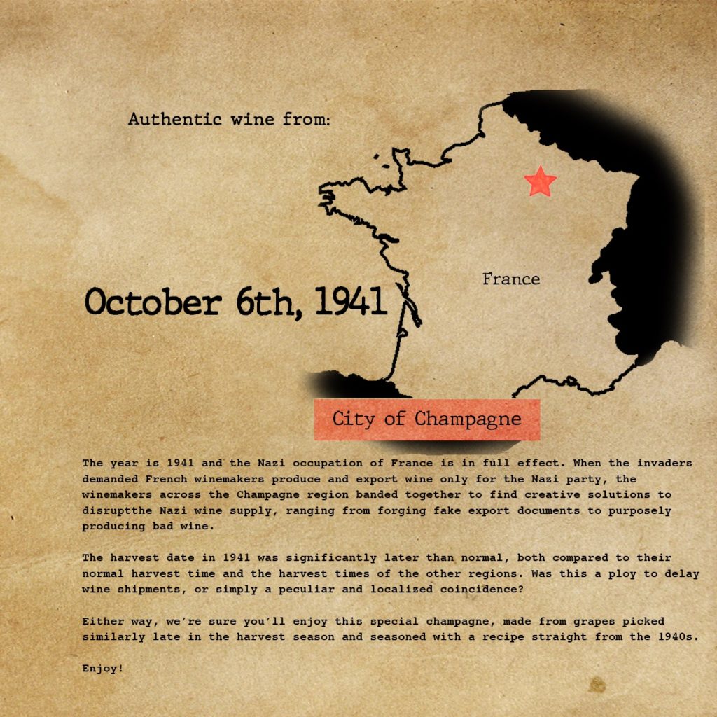
How climate change is impacting millennial winos and To invest in Wine, Invest in Climate Change

For our re-imagined project, we used the Instagram video format from Olivia and Smara’s “millennial winos” sketch and the advocacy angle of Eugenio, Tyler and Neil’s “To Invest in Wine, Invest in Climate Change” sketch. We created a full 1-minute Instagram video, with stock photos and videos of people drinking wine, vineyards as well as images associated with climate change. We also interviewed Valeria Ricci from La Mesma winery in Italy, through Zoom, and used short clips from the interview throughout the video. We used an eerie soundtrack that is both reminiscent of such Instagram videos and signifies the danger wine production is in due to climate change.

Because this is an Instagram video, our audience is social media users, especially those in their 20s and 30s. The images used in the video are of young people enjoying wine in social settings, so we hope viewers will see themselves in the images. Our main goal was to alert wine consumers in their 20s and 30s to this very real impact of climate change and galvanize them to take action.

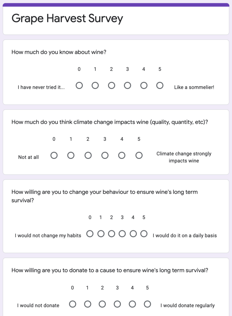
For our impact assessment, we focused primarily on investigating whether the video changed viewers willingness to pursue climate change action, such as donating to climate change funds and changing their personal behavior. We generated a Google Form that asked viewers 4 questions (one assessing previous knowledge about the issue and the rest o evaluate the base willingness to take action), had them watch the 1-minute video, and asked 3 follow-up questions to see if they were more likely to change their actions now. We also shared the video on Instagram and saw how it performed in the first 24 hours.

Google Form: https://forms.gle/aBC2pPLDsbSQzGjT6

Results

We shared the form with audiences in their twenties but without restricting to only wine connoisseurs at the beginning. By doing so, we were then able to collect more responses, and assessing their expertise in the form, we were able to only select those deemed passionate or wine savvy. We received 32 responses, 18 of which marked as savvy (people that self-assessed 3 to 5 in a competency scale up to 5).

On average, wine-savvy survey responders initially think that climate change’s impact on wine is 4.22 on a scale from 0 (not at all) to 5 (a key driver). After having watched the video, the same people report a 7% increase in perceived threat, stating that, on average, the impact of climate change is 4.50. More importantly, when asked “How willing are you to change your behaviour to ensure wine’s long term survival?”, people initially report 3.22 out of 5, while 3.61 after watching the video, an increase by 12%.

Finally, when asked whether they would donate to support a cause to ensure the long-term survival of wine, respondents report only 1.56 out of 5, while 1.83 after viewing the short piece, still remaining relatively low. 

Because our data sketch is in the format of an Instagram post video and meant to be viewed by social media users, we also chose to share the video on a private Instagram profile with 117 followers to see how the video performed. In the first 24 hours, the video accrued 47 views (40%) and 10 likes (8.5%). The last 11 videos of the Now This News (2.3 million views) profile had an average of 133,840 views (5.8%). Obviously, a private Instagram has a curated list of followers compared to Now This News that are more likely to watch a video, but still a solid performance for a 1-minute video on wine and climate change. 

Wine Label Feedback Collection

Sam Ihns and Claudia Chen

For our impact assessment, we collected feedback on the wine label sketch (here) from the maps/creative maps unit. Because this sketch came from a commercial perspective, we sought to survey the most promising commercial audience. We found that in the U.S., over 40% of all wine is consumed by millennials (source), so we surveyed 20 millennials to gain more insight about the effects of our historical wine labels. 

Before iterating on the labels, we wanted to figure out what people got out of the wine labels and how they interacted with the labels. We also wanted to find which of the three wine labels was most interesting/enticing. Our test plan was to send out a Google Form (pictured below), first getting insight on their drinking habits, then asking them to summarize the wine labels in one sentence and what their favorite label was.

The breakdown of our respondents’ drinking habits is as follows:

The breakdown of people’s favorite labels is as follows:

Overall, people liked the Champagne 1941 and the Bordeaux 1868 labels the most, but for vastly different reasons. People who preferred the Champagne 1941 label preferred it because they felt it had the most interesting and compelling story involving human beings. People who preferred the Bordeaux 1868 label preferred it because they felt the aesthetic and font matched the historical time period the best. People also said that they tended to read larger things like cereal boxes instead of smaller shampoo bottles, and that the labels themselves felt crammed and could be difficult to read in a sitting where an entire bottle of wine would be used. Finally, people said the map was difficult to read, so we shaded out the other countries. With these points in mind, we pivoted to produce a boxed wine label instead of a wine bottle label.\

As far as understanding effects of the labels themselves, people tended to be more interested in stories that were more directly related to human beings. For example, the Bordeaux 1868 label was about The Great Wine Blight, and survey respondents recognized that the blight was largely out of the hands of the winemakers, making the story less interesting than the Champagne 1941 label that talked about direct contact and communication with Nazis. We also found that people had drastically different interpretations in their wine label summaries- about 50% were acutely aware of the use of the historical perspective to sell more wine, while the other 50% were more focused on the story being told on the label.

A few people also mentioned that they felt negatively after they read the label because the story told wasn’t particularly happy, which could impact a wine’s sales negatively. However, it wouldn’t be good to deliberately make a sad historical story happier just for the sake of commercial sales/making the audience less sad. To balance this out, it would make sense to narrow our target audience down to history bluffs more and millennials in general less. This would also make future impact assessments more concise.

CO2 emissions of SUVs vs. midsize cars

This is a representation of yearly CO2 emission per year by SUV’s vs midsize cars, the 2 piles of soil are used to represent the weight of CO2 produced per year, the pile next to the tree represents the CO2 absorbed by a tree per year.

Gardening soil is used to represent CO2 emissions because of its resemblance partly because of its imagery of pollution and partly due to availability. Piles pf soil are made to look significantly bigger than the cars to emphasis the emission quantities.

Calculations:

Average CO2 emission for SUV’s  per year: 5933kg

Average CO2 emission for midsize cars per year: 4243kg

Difference: 1690kg

Typical CO2 amount absorbed by a tree: 22kg

Equivalent number of tree for the difference in CO2 emission: 77

Driving a midsize car instead of an SUV is equivalent to saving 77 trees, in terms of CO2 emissions.

Dataset:

US fuel economy dataset (2020)

https://www.fueleconomy.gov/feg/download.shtml

Raining Data

by Eileen Hu

I sketched out a data sculpture idea using the NYC street tree data that I worked with in sketch 1 (https://datastudio2020.datatherapy.org/2020/03/05/trees-in-nyc-sign-up-to-help/)


This sculpture would be an installation in Central Park near a playground so it would get traffic from kids. The sculpture would have umbrellas “planted” in the ground, creating a “street” lined with the umbrellas that people could walk down. This connects to the idea that street trees provide shelter and protect the urban environment around them. Originally I was going to mock up what one of the umbrellas would look like with colored paper cutouts, but I realized that the umbrellas in my house are mostly patterned and might be hard to set up in a standing position. Instead, I’m sharing some illustrations that hopefully are enough to convey the concept!


One out of five umbrellas would be knocked over, to represent the one in five street trees in the NY Street Tree Census that were shown to be not in good health (fair or poor health).

To add more information, the umbrellas would have graphics printed on them with a dye that changes from white to colored when wet, a technology that is used for novelty umbrellas.
People interacting with the installation would walk through the street and pour water on the umbrellas to reveal facts about NY street trees.


For example, an average street tree will intercept 1432 gallons of stormwater each year, equivalent to about 18 bathtubs. So out of the pattern of bathtubs on an umbrella, 18 would change color. I do need to think more about this representation because it makes the values look like a percentage.

There would also be an accompanying sign with information at the end of the installation that would also direct viewers to a website to learn more, in addition to an umbrella at the end with the call to action to “Show some T(ree)LC”.


I would try to set this up so that water poured out onto the umbrellas would not be wasted, maybe by having the umbrellas sitting in a channel that collects the water which could then later be used for watering plants. In addition, I would plan to have these umbrellas to be available for sale so that people could use them in their everyday lives and engage others.

Climate Change’s Impact on Wine

The sculpture uses the grape harvest dataset to show the harvest date across three different years. The glass contains the same quantity of liquid but coloured according to a colour scale ranging from red to blue. The earlier the date is the redder the glass, while the further ahead in time, the bluer the content, reflecting the hotter temperature experienced with earlier harvest dates (striking summer) and colder climates going towards Autumn. The year is marked on the body of the chalice, while the number of days with respect to the usual date is labelled on the base of the glass.

The choice of the colour palette allows us to strike the right visual when hitting the appropriate date, August 31st. When the harvest date is perfectly at the centre of the colour scale (0 days before or after August 31st), the wine glass assumes a purple colour, in between red and blue, making it look like a real wine glass. This also serves as a prompt for people to think that they would not drink either the blue or the red glass because they don’t seem glasses of wine at all. Only when the harvest date is the right one, wine is actually something pleasurable.

This installation could be placed together with explanations and more clear calls to actions, where people can be asked to donate to fight climate change, allowing wine to keep its purple colour.