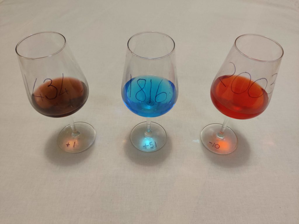
The sculpture uses the grape harvest dataset to show the harvest date across three different years. The glass contains the same quantity of liquid but coloured according to a colour scale ranging from red to blue. The earlier the date is the redder the glass, while the further ahead in time, the bluer the content, reflecting the hotter temperature experienced with earlier harvest dates (striking summer) and colder climates going towards Autumn. The year is marked on the body of the chalice, while the number of days with respect to the usual date is labelled on the base of the glass.
The choice of the colour palette allows us to strike the right visual when hitting the appropriate date, August 31st. When the harvest date is perfectly at the centre of the colour scale (0 days before or after August 31st), the wine glass assumes a purple colour, in between red and blue, making it look like a real wine glass. This also serves as a prompt for people to think that they would not drink either the blue or the red glass because they don’t seem glasses of wine at all. Only when the harvest date is the right one, wine is actually something pleasurable.
This installation could be placed together with explanations and more clear calls to actions, where people can be asked to donate to fight climate change, allowing wine to keep its purple colour.