Data Portraits at TED2017

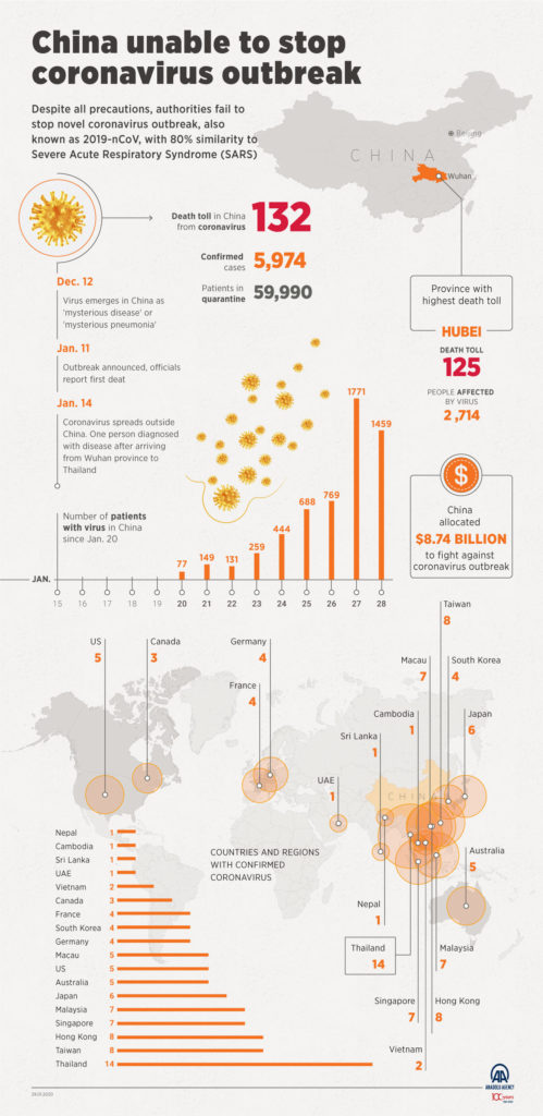
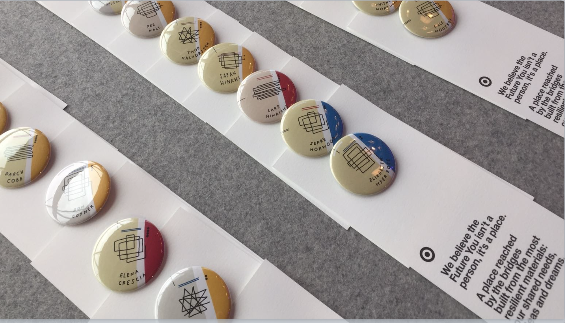
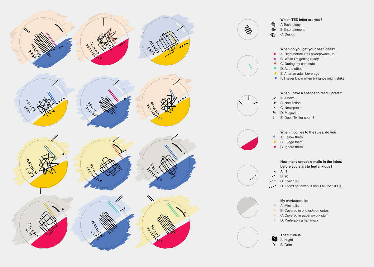
These are data portraits created by Giorgia Lupi for the attendees at TED2017 conference.

Link to the visualization page: http://giorgialupi.com/data-portraits-at-ted2017

Based on the data provided by individuals, a custom data visualization gets generated/hand-drawn, which is then printed and presented to the attendees in a conference in the form of a badge they can wear during the event. The information contained in the visualization is about the individual’s field of work, some casual personal preferences and tendencies. The badge is accompanied by a card with the legend to read the data.

The purpose of this badge/data portrait is to act as a playful icebreaker where other people can glance at someone’s badge and know some data points such as, whether the person comes from the tech field, design or entertainment, do they prefer to read fiction or non-fiction, etc. and initiate a conversation. This visualization is effective in social gatherings where people do not know each other.

I feel the visualization serves the purpose it’s designed for. Through the use of vibrant colors and hand-drawn aesthetic, it creates a playful visualization that works very well for data that is a bit more fuzzy than data that can be found in a scientific publication for example.

Spread of 2019-nCov

An infographic published by Anadolu Agency about the spread of 2019-nCov.

This infographic displays numerical and geographical data about the 2019-nCov virus. It uses a warm color palette and mostly numerical data to show how many people have been infected, how much money was allocated by China to fight against the outbreak, and how much the virus has spread around the world. It also calls out the death toll of the disease, shows a timeline of the disease’s progression, and shows the magnitude of its presence in other countries.

To me, it looks like one main goal of the infographic is to convince the reader that Coronavirus cannot be controlled (the infographic headline is “China unable to stop coronavirus outbreak”). Overall, the infographic is effective in doing this by showing qualitative data about the spread and the progression of the virus over time. However, the infographic could do a better job describing what precautions China tried to take, as it has a narrative that despite great effiorts, the government wasn’t able to stop the spread of the virus (“Despite all precautions, authorities fail to stop novel coronavirus outbreak…”). The infographic never describes what these precautions were, and only provides a numerical value of how much money ($8.74 billion) has been allocated to fighting the disease.

Because this was published on the Andolu Agency website, a Turkish state-run news site, the infographic seems to be directed to civilians. One interesting thing I noticed about the Andolu Agency website is that it has an entire section dedicated to just infographics. I am curious about who browses the infographics on this website versus who browses the traditional news stories.

A screenshot of the “Infographics” portion of the Andolu Agency website.


Navigating Buzzwords

Data presentation blog post by Eugenio Zuccarelli

Source: Gartner

In a world filled with buzzwords ranging from Internet of Things to AI and Edge Computing, navigating the innovation space can be quite tricky.

One aspect shared by mostly all the innovative technologies though, is the general trend they follow, starting from low key discoveries, until reaching maturity and widespread use.

Gartner, a global research and advisory firm, developed a general framework that captures all innovative technologies and maps them into a specific framework.

This framework, called Hype Cycle for Emerging Technologies, shows the general trend followed by technologies over time, mapping society’s expectations towards each innovation.

In particular, the chart lists all current technologies on x-y axes, where the position determines the general expectation over time. The innovations start from an “Innovation Trigger”, propelling them to peak hype, then to a minimum point for then coming back again at a more moderate pace, reaching stable progress.

By showing such information in a conceptual form, rather than being data-heavy, the Hype Cycle can be used to reach any audience. Indeed, the simple and relatable concepts expressed by the chart can be understood by any person with knowledge of the “common buzzwords”.

However, the chart can be even more useful for technical people, with a strong understanding of the technology environment that can benefit from using or investing in the technology.

Overall, the Hype Cycle aims at giving context to emotionally-inflated concepts such as AI, IoT and Cloud Computing. These concepts are usually able to capture the interest of the masses, but then showing similar patterns of disillusionment. Here, Gartner’s cycle successfully clarifies that some technologies are still in the early stages and overinflated, while other technologies have almost reached maturity, and are ready to become part of our daily lives.

How to Profit in Space: A Visual Guide | WSJ

https://www.wsj.com/graphics/new-space-race/

This scrolling data story shows a dataset on satellites orbiting the Earth, with the goal of highlighting the magnitude of the business opportunity and impact of recent space exploration developments. The main dataset is from the U.S. Space Surveillance Network, which contains details about each satellite orbiting the Earth, including the country of origin, purpose, and type (government/commercial). The data is visualized in both charts and in a model of Earth with its surrounding space.

The data is augmented by details on possible business opportunities, including satellite-based internet services such as SpaceX’s Starlink…

… as well as satellite imagery services, which is forecasted to be a growing industry in the coming years.

The purpose of the article is to inform the Wall Street Journal’s typical audience, largely business and finance-focused professionals, of the economic and business implications of current trends in space exploration and satellite launches. It also tries to educate the audience about some basics of orbital satellites, including the key government/commercial players, satellite and orbital types, and the risk of space debris.

The story’s bar charts and simple data visualizations very effectively show some of the key trends relevant to the industry: the shift from government to commercial, the rise of China as a significant player, the decreasing cost of launching payloads, and the increasing economic opportunity in satellite imagery. The visualization of satellite clouds in orbit is also an impactful one, emphasizing the magnitude and scale of the topic. While some orbits and satellite densities are exaggerated compared to actual sizes, the visualization serves its purpose well.

The story also does an effective job of visualizing the business opportunities of two specific companies, SpaceX and Planet Labs. However, from a storytelling perspective, it does not transition into these two cases very effectively. A visual demonstrating the presumed dominance of these two players in their respective industries may have better justified their inclusion.

The Opportunity Atlas

The Opportunity Atlas is an interactive data tool that visualizes and spatializes children’s outcomes in the U.S., defined by a slew of metrics, in their adulthood. To test out this tool, I zoomed in on my hometown Hixson, TN to see how children who grew up there fared later in life. For example, children from Hixson, TN who grew up in the poorest of households are likely to see little income mobility, though they fare better than their counterparts in neighboring census tract.  

The project aims to bring to life the multitude of factors that determine socio-economic mobility in the U.S. The tool allows users to test their own assumptions on income inequality, race, gender, place and space in the land of eternal promise. The Atlas draws on anonymized U.S. Decennial Census data from 2000 and 2010, Federal income tax return data, and the American Communities Surveys (ACS) data from 2005-2015 all combined to create one large dataset covering nearly the entire U.S. population.

The Atlas is accessible to the general public, but complex enough to appeal to social science students and scholars. Users can select pre-made stories to explore specific topics such as the effect of moving from one neighborhood to another in Chicago. Those interested in using the tool to answer their own questions can customize the map using panels to select outcomes of interest and neighborhood and demographic characteristics. Data can also be downloaded for those seeking to conduct their own research. 

 The Atlas, at large, is quite effective in achieving its goal. Aesthetically, the maps are pleasing with census tracts painted in pleasant pastels. The pre-made stories walk novice users through a series of maps and graphs that answer address issues faced by cities like Chicago and Detroit, using data to draw insights on complex urban issues such as the neighborhood effect.  The tool assumes a basic proficiency with statistics and can be difficult to use beyond its basic offerings.