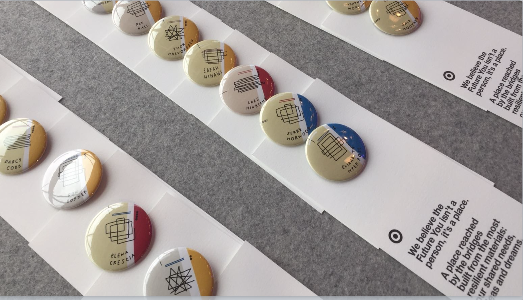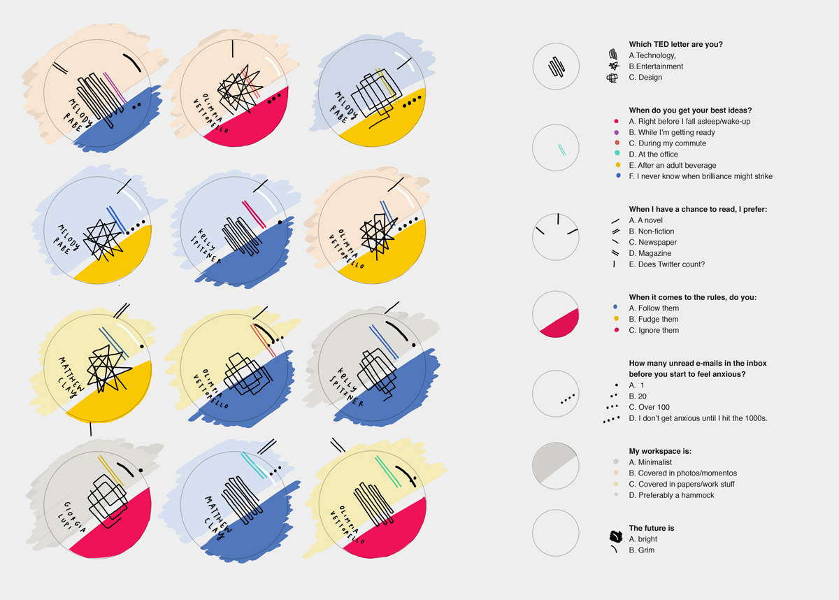

These are data portraits created by Giorgia Lupi for the attendees at TED2017 conference.
Link to the visualization page: http://giorgialupi.com/data-portraits-at-ted2017
Based on the data provided by individuals, a custom data visualization gets generated/hand-drawn, which is then printed and presented to the attendees in a conference in the form of a badge they can wear during the event. The information contained in the visualization is about the individual’s field of work, some casual personal preferences and tendencies. The badge is accompanied by a card with the legend to read the data.
The purpose of this badge/data portrait is to act as a playful icebreaker where other people can glance at someone’s badge and know some data points such as, whether the person comes from the tech field, design or entertainment, do they prefer to read fiction or non-fiction, etc. and initiate a conversation. This visualization is effective in social gatherings where people do not know each other.
I feel the visualization serves the purpose it’s designed for. Through the use of vibrant colors and hand-drawn aesthetic, it creates a playful visualization that works very well for data that is a bit more fuzzy than data that can be found in a scientific publication for example.