Global Air Quality

Data Source

This data sculpture uses the global air quality dataset (https://aqicn.org/data-platform/register/), showing daily air quality readings in cities around the world. In particular, high concentrations of PM2.5, or small particles less than 2.5 microns in diameter, are known to have a number of health effects and are a common indicator of air quality.

Audience

The intended audience would be for a group of kids or students, either in a classroom setting or somewhere public (like in a museum) where many students would be able to interact with the exhibit.

Concept

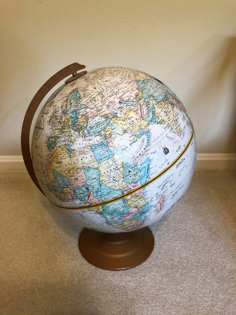
In our previous participatory sketch using the air quality data set, we wanted the audience to be able to place themselves in the data by picking where they live or a location of their choice to compare air quality data. In this sketch, we take this concept to a physical level by representing air quality on a physical globe.

Fingerprint mediums for different PM 2.5 concentrations.

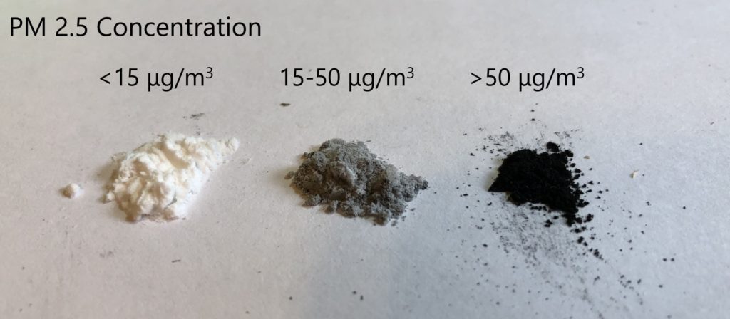
Air quality is represented by the color of various fingerprint mediums ranging from white to black. The mediums are simply a mixture powders (cornstarch and graphite powder) to create various shades of grey, with darker colors representing worse air quality. For this sketch, I was only able to create three different shades, but a more fully developed idea could use more granular shades and possibly ink instead of powder. The idea is that students would look up the yearly average air quality for a specific location (e.g. their hometown), and then create a fingerprint on the globe using the corresponding color/shade.

Creating a dark fingerprint on the globe for an area with poor air quality.

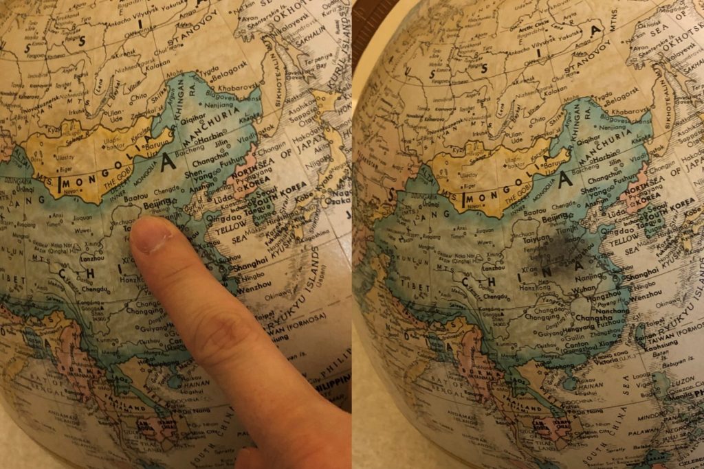
If there is a large group of students or other audience members, they would choose various locations around the world, with some overlap. As the fingerprints grow, there is an effect of ‘smog’ covering the areas with poorer air quality, whereas locations with better air quality would not see much of a change. In an actual sculpture we would likely use a globe with less coloring so that the fingerprints stand out.

Possible effect of additional fingerprints covering the globe.

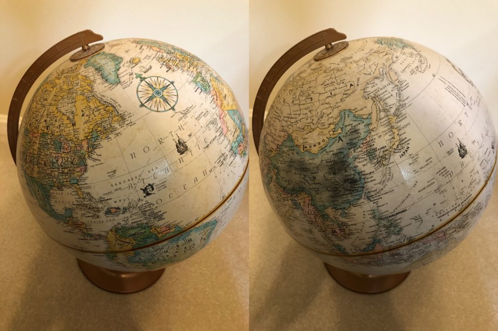
The eventual gray shading of areas with poorer air quality is an impactful effect and would hopefully help visualize the global impact of pollution. In addition, there is the effect of students feeling like they participated and left a part of themselves on the sculpture, so hopefully they feel that they may be able to make an impact on the solution.

Data Log – February 21

Action App / company / entity Data collected Category
Called my parents Apple – FaceTime Call log, time, length of call, location of caller and recipient Chatting
Texted classmates on WhatsApp 1. Facebook – WhatsApp

2. Google – Gboard
1. Time, location of messages, message content, images, message read-receipt and viewing activity

2. Keyboard typing activity on phone
Chatting
Messaged friends on Messenger 1. Facebook – Messenger

2. Google – Gboard
1. Time, location of messages, message content, message read-receipt and viewing activity

2. Keyboard typing activity on phone
Chatting
Moved around the city (walking, in a Lyft, etc.) Google Maps Background location history Moving around
Bought coffee 1. Chase  

2. Starbucks
1. Time of purchase, amount spent, vendor information

2. Time of purchase, amount spent, purchase information, credit card information
Moving around
Took a Lyft to the airport 1. Lyft

2. Chase
1. App interaction information (button clicks, swipes, time spent on app), pick-up location, destination, time, credit card information, driver and car information, the route I took

2. Time of Lyft, amount spent, Lyft vendor information
Moving around
Checked in to a Delta flight to NYC, went through security, and boarded flight 1. Delta

2. TSA (U.S. Government)
1. App interaction information, personal ID information, TSA number, flight information

2. Flight information, check-in information
Moving around
Ate dinner at a Mexican restaurant 1. Restaurant

2. Chase
1. Time of purchase, purchased items, credit card information  

2. Time of purchase, amount spent, vendor information
Moving around
Checked the weather app Apple App interaction information Moving around
Connected to WiFi MIT Device information, connection times, data sent through network Going online
Watched Netflix Netflix Time, location, viewing content and browsing activity Going online
Did research for thesis 1. Google

2. MIT
1. Search terms, browsing history

2. Browsing activity within MIT resources
Going online
Listened to podcasts1. Apple

2. WNYC
1. App browsing and listening activity, timing

2. Podcast download and listening activity
Going online

How to Profit in Space: A Visual Guide | WSJ

https://www.wsj.com/graphics/new-space-race/

This scrolling data story shows a dataset on satellites orbiting the Earth, with the goal of highlighting the magnitude of the business opportunity and impact of recent space exploration developments. The main dataset is from the U.S. Space Surveillance Network, which contains details about each satellite orbiting the Earth, including the country of origin, purpose, and type (government/commercial). The data is visualized in both charts and in a model of Earth with its surrounding space.

The data is augmented by details on possible business opportunities, including satellite-based internet services such as SpaceX’s Starlink…

… as well as satellite imagery services, which is forecasted to be a growing industry in the coming years.

The purpose of the article is to inform the Wall Street Journal’s typical audience, largely business and finance-focused professionals, of the economic and business implications of current trends in space exploration and satellite launches. It also tries to educate the audience about some basics of orbital satellites, including the key government/commercial players, satellite and orbital types, and the risk of space debris.

The story’s bar charts and simple data visualizations very effectively show some of the key trends relevant to the industry: the shift from government to commercial, the rise of China as a significant player, the decreasing cost of launching payloads, and the increasing economic opportunity in satellite imagery. The visualization of satellite clouds in orbit is also an impactful one, emphasizing the magnitude and scale of the topic. While some orbits and satellite densities are exaggerated compared to actual sizes, the visualization serves its purpose well.

The story also does an effective job of visualizing the business opportunities of two specific companies, SpaceX and Planet Labs. However, from a storytelling perspective, it does not transition into these two cases very effectively. A visual demonstrating the presumed dominance of these two players in their respective industries may have better justified their inclusion.