| Chatting With People |
| I started the day in Seattle and I used WhatsApp for both texting and calling, sent a number of emails using both Outlook and Gmail, texted with iMessenger, and made some comments on Instagram before my flight. I’m sure all of these logged my location and mapped out who I was interacting with. When I sent a few WhatsApp messages from Boston, that allowed the app to know that my location had changed. |
| Moving Around Town |
| Since I was traveling, I used Lyft twice (getting to Sea-Tac and then getting home from Logan), so that company knows I’ve switched coasts. I also traveled by JetBlue so my ticket got scanned at least twice (going through security and getting on the plane) and, because I bought my ticket using my Gmail account, both Google and JetBlue knew my travel plans beforehand and also my movements. While waiting for the plane I purchased hot chocolate with credit card, so Bank of America knows I was in Seattle, which they already knew because my Lyft account is associated with my credit card. Lastly, I went through two airports, so I definitely showed up in a number of security cameras. |
| Getting Around |
| I browsed Hulu, Twitter, NYTimes, New Yorker, NYTimes Crossword, some online Mahjong both before and during the flight. All of these (with the exception of Mahjong) are websites I have subscriptions for so they already have my basic profile. I also logged into most of these on JetBlue’s Fly-Wifi, so if they’re collecting data to add to my profile, they have all of this now. |
| Other Things |
| I have no idea if airport security saves data (probably), but if they do, there are now scans of me and my luggage in their files. |
Sule’s data log 02/20
Chatting with people: I use Facebook Messenger and Whatsapp almost nonstop to chat with my friends. Today too I sent texts, photos and videos. I gave the data of the people I interact with and their numbers to Facebook. They will use this data in ranking the names on my Facebook messenger. They also store the photos and videos I shared with my friends since I can access them on our chat media any time.
I also exchanged emails with the company I’ll be interning with. I gave them data about my work authorization process.
Moving around town: I used my student ID at 11am to get into the gym at Stata Center. I gave my location data to MIT.
Today I got lunch at Cava at 1pm, where I gave my location data to the bank.
Getting online: I ordered stuff on Amazon today at 4pm. I gave my personal data, such as my address, my credit card details and my personal preferences to Amazon (which will be used for their recommender system).
Other things: It’s always funny to see ads on Instagram or Facebook of the brands I currently online shopped from or checked their shopping app on my phone.
Today I was looking at dresses on some brand apps I have on my phone and other apps (such as Facebook and Instagram) got this data of me liking these brands and immediately used it to show me targeted ads.
Effects of Hydraulic Fracturing on Groundwater Contamination
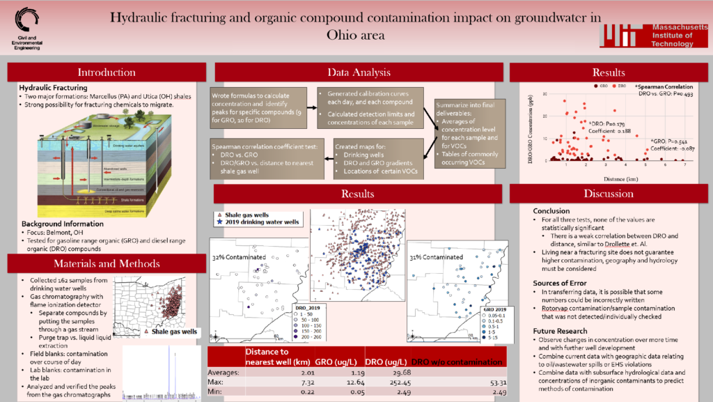
I recently watched two students present on their findings in their UROP this IAP. Their project was in relation to contamination of groundwater in Ohio due to hydraulic fracturing. They showed not only the data, but the process for gathering that data and discussions of the impact of that data. They specifically show the amount of gasoline range organic (GRO) and diesel range organic (DRO) compounds for given locations around Ohio in relation to gas wells and drinking water wells. They also graph how the amount of DRO and GRO compounds change based on distance (distance to the closest gas well, but I’m not sure).
Since this presentation was given at an event for multiple UROP students to show their findings, I believe the audience is supposed to be MIT students and faculty from any department. I imagine they created the presentation for the express purpose of explaining the process and results of their research. It seemed that the data did not match their expected results, so they leave the data open to discussion, to talk about errors in the process or ways to rethink the analysis of the data.
I did not find that the way the data was presented was effective. I think the process was carried out right, but the data visualizations were hard to follow and gather results from. With the separation of the three maps, it was hard to really tell how each data point related to placement of gas and water wells. The presentation did not compare the data to what non-contaminated groundwater would look like either. Putting the data into more context within the data visualizations would have been more effective.
Shapolsky et al. (Hans Haacke)
Data presentation blog post by Cynthia (Xi) Hua
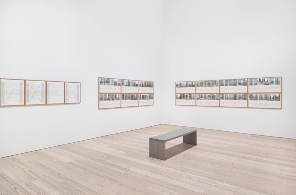
Shapolsky et al. Manhattan Real Estate Holdings, a Real-Time Social System, as of May 1, 1971 (Hans Haacke) was an artwork, and data presentation, that critically documented unfair land ownership in New York City.
The work consisted of 142 photographs of buildings labeled with data on their ownership, based on data across roughly a twenty-year period. The piece also included a series of diagrams created by the artist that showed how all these buildings were ultimately tied to the Shapolsky family, notorious NYC slumlords, in some way. The diagrams demonstrated how the Shapolsky family used various dummy corporations and a nepotistic business network to control large swathes of land in the Lower East Side and Harlem, while the street-level images showed the neglected conditions of the buildings. The piece revealed how housing was being bought and maintained primarily for economic profit of the wealthy owners, rather than for the quality of life of the impoverished tenants.
Haacke’s piece is an early example of data visualization as artwork. The data collection of 142 photographs reinforces the socially conscious nature of the piece — the repetition seems to say that the narrative of the work extends across this many buildings, this buildings windows, this many families. At the same time, the piece stitches disparate experiences together into one narrative. It is powerful in using the act of data collection to create a narrative of landlord abuse that would not necessarily be apparent with any individual piece of evidence.
At the same time, the piece was meant to go up at the Guggenheim, far from the low-income neighborhoods it depicts. In this respect, I think more contemporary data-based critical artworks could improve and place themselves more directly within the communities in which the operate. In fact, there were claims the Guggenheim’s Board of Trustees was itself tied to the Shapolsky family — and Haacke was later asked to remove the piece by museum directors possibly for this reason. This piece brings up a common concern in critical artworks, including data visualizations, in terms of how to navigate both within and outside of existing systems of power. It also raises the question of when and why socially-engaged projects should be presented as artworks, within museum settings, when they are also operating as objects of journalism and activism. I felt that the piece, were it to have been created today, could have been improved by incorporating activist elements that also directly targeted the problem.
World Bank Global Project Status Interactive Geo-Map
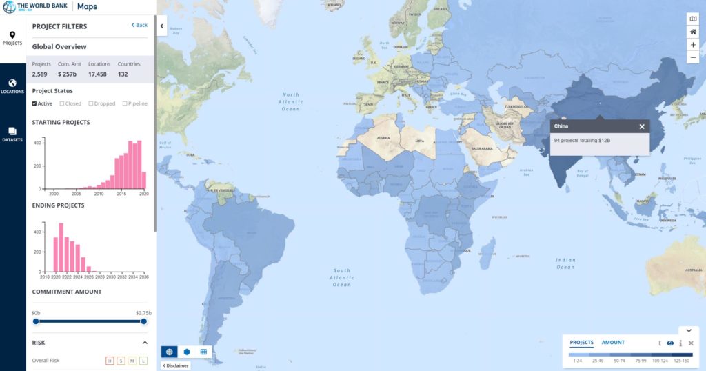
The interactive map shows the geographical information of the world bank projects and datasets. Users can get insights from different dimensions, including regions, countries or custom places. There are many data attributes behind the map. Basic key elements such as the number of projects, the project value amount, locations of projects, and countries. In the default mode, the color gradient means the investment amount, the darker the color is, the more the investment. Users can also select projects with specific cares or features, for example, they can track the projects’ progress through risk level, performance and start/end date.
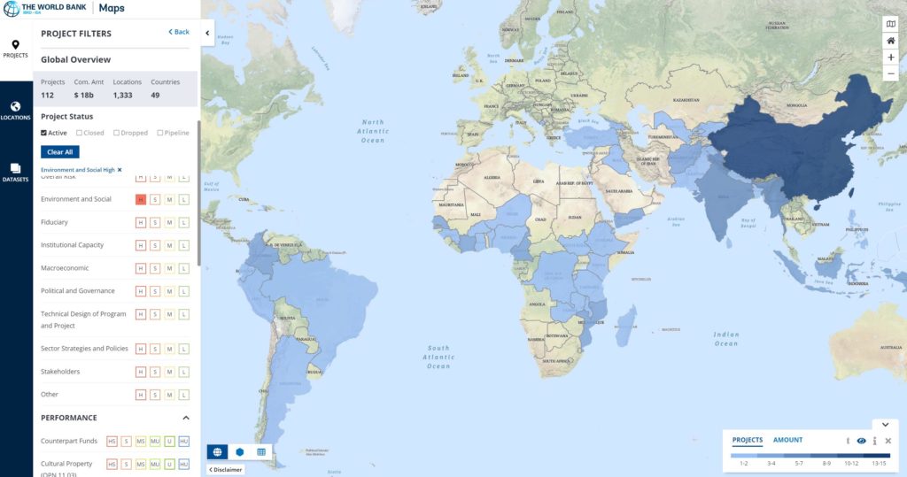
The audience is very broad for this map. They can be people who care about the developing world economics, NGOs who want to study the regional program status or university students, researchers who want to get world bank investment data for research proposes, government policymaker/officers who engaged in relevant projects.
I think one of the key objectives for the map is to show the organization transparency for world bank. According to the World Bank’s Policy on Access to Information, the world bank have the responsibility to show the public where and how the world bank carries out its projects and how the fund is invested. The key propose of this map might be to expend the public’s horizon from a global point of view, empower people with rich data sources to reduce poverty.
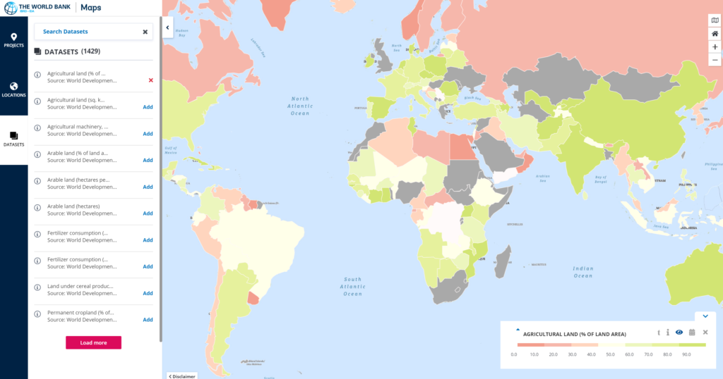
The interactive map is a very effective way to achieve its primary goals—— transparency to the public and empowers the public with a rich global data sources. As mentioned above, users can get access to each level and dimension of project related data easily by filters. The project status are also categorized by under preparation, under implementation, analytic and advisory activities, and board proceedings, etc. The map also integrated more data sources in the world level, from agriculture to the informal employment status, which can provide strong support for the public and researchers to know worldwide situations.