Understanding Homelessness

http://maps.sasaki.com/visualizations/homelessness/

Map depicting every 5 homeless people as 1 dot.

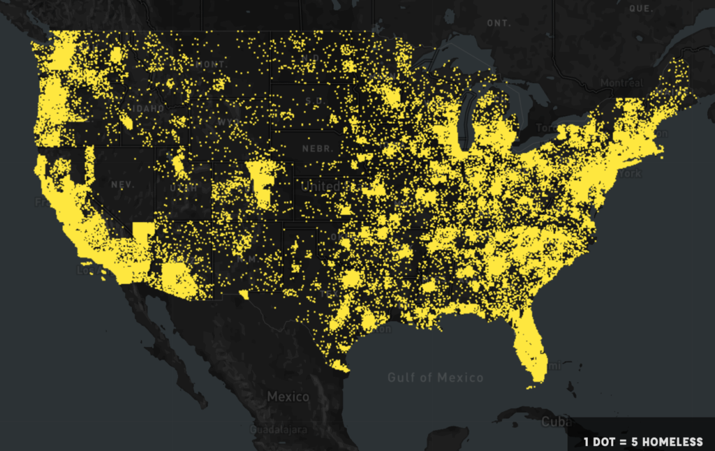
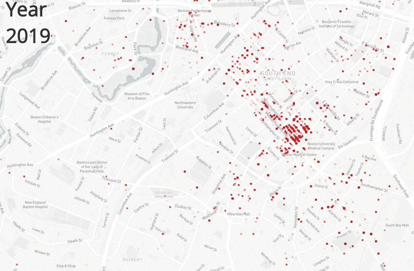
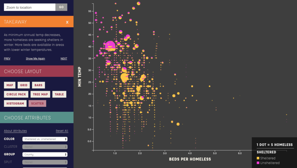
This is an online interactive tool developed by Sasaki for understanding the homeless crisis in the US, which I recently saw presented by its creator, Gretchen Keillor . Relying on data from January 2015 where volunteers manually counted over 500,000 homeless, the project begins by representing every 5 homeless people as one dot and showing where they reside geographically.

The website the quickly turns control over to the user through a simple options panel of drop down menus at the left side of the page, which allow other information besides location to be represented on the map.

Map depicting overlap of educational spending and homeless.

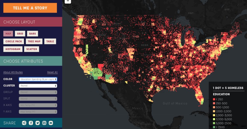
There are over 30 parameters associated with homelessness that can be overlaid onto the map, ranging from max and min temperatures, to per capital educational spending, to the margin of Barack Obama’s 2012 presidential win, to the per capita number of homeless bed available. As interesting as seeing how these different data points overlap is, the interface then goes a step further. Although it’s helpful to see how these things map geographically, it’s difficult to compare amounts when they’re represented as dots strewn across a map. For this reason, the menu to the left allows the user to then rearrange the dots into bar charts, scatter plots, grids, etc, while adding organizational layers like region, children v. adults, or bed types.

Histogram depicting homeless number as Y axis, margin of Obama’s victory as X axis, and dots colored by amount of per capital educational spending.
Circle pack graph representing where homeless reside by region as different circles, and colored by educational spending per capita.

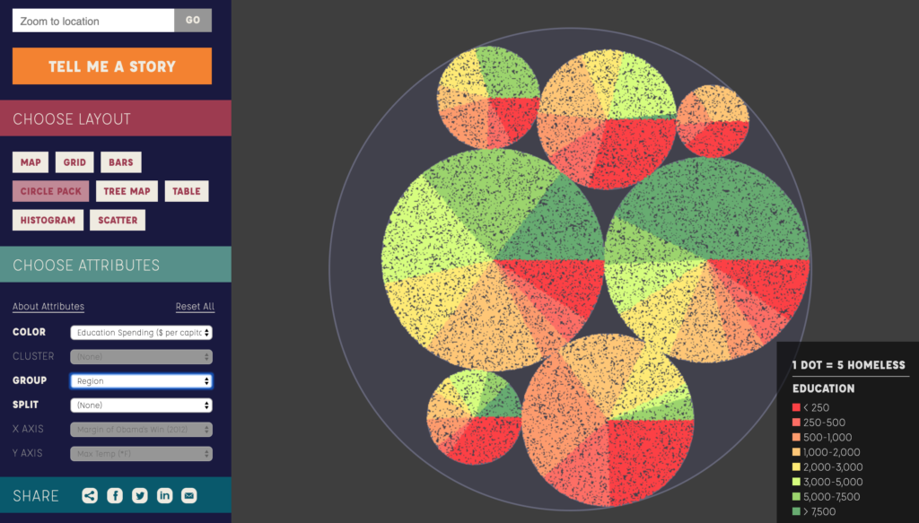
The graphs generated by the user’s drop-down selections then allow the user to scroll over them in order to get labels about the groups represented, like region if the graph is organized that way, as is shown in the circle pack diagram above.

Finally, the interface includes a “tell me a story” option, where the data drop downs are turned off, and the user is led through one specific narrative, including small blurbs explaining the take-aways from each digital representation created.

Slide 3 in the “Tell Me a Story” option, showing how sheltered homeless coincides with minimum temperature.

I think the major success of this interface is that it allows interaction and exploration from users without showing any large statistics or numbers, relying entirely on the visuals to give impressions of relationships between parameters. In a way, however, this is also it’s greatest problem, as some visualizations generated are extremely difficult to gain intelligible findings from, and the user can easily become lost changing parameters and representation style without any meaningful understanding of what the dots zooming around and rearranging actually implies. Even the “Tell me a story” option fails to provide an actual narrative, instead simply making a few choices about which unrelated homeless stats to show. Additionally, by representing 5 homeless as 1 dot, and then allowing the dots to be moved off the map and into graphs, it’s relatively dehumanizing, as I personally quickly lose sight of the fact that each dot is 5 people.

Overall, I like this project, and think it serves as a good model for how to engage an audience in a particular problem, even if I wonder if the final result could have been more successful if the users had been given slightly less control.

Discarded Needles Around Boston

https://bostonopioid.github.io/discarded-needle/index.html

I first explored Discarded Needles last year, and since then its impact has stayed with me and to an extent changed how I view the city of Boston. It combines its primary dataset with a series of gripping interviews and images that really enhance the entire narrative. All in all, I believe this is an excellent example of data storytelling.

The story aims to examine the rise of the opiate crisis in Boston using the dataset of citizen reports of needles on the ground. I imagine this data was taken from the local 311 office, and perhaps it could be taken through the Freedom of Information Act. The story opens with the total amount of needles reported in large bold letters, a staggering amount that draws in the reader.

From here, the writers weave together several interviews alongside heavier data analysis to weave their story.

This bar graph does alright at showing the magnitude of the problem over time, but I think even more revealing is when each data point is laid over the city of Boston based on time and geographic location.

Apart from the data, the background of the story is filled with pictures of needles found around Boston, decrepit areas, and other elements of the issue. The most pivotal piece of media in this story is the final picture, drawn by a first grader talking about the needles they find around their school. 

I believe the goal of this story is to highlight the opioid epidemic in and around Boston, an issue that is obviously heavily affecting the whole nation but can be completely overlooked locally by Boston residents (as in my case). The writers do not assert a path forward or lay out clear next steps, instead they include many instances where the volunteers and people currently involved feel futile and ignored by the local government. In this way, I believe this piece is also designed to raise awareness of the government’s apathy toward this subject. I believe the audience for this piece is local Bostonians. Many of the locations, including “Methadone Mile,” “the Long Island Recovery Center,” and “the Orchard Garden School” are not explained in a way that would give context to those outside Boston. On top of this, the lack of a real call to action at the end of the story reveals that the authors intended for this story to make an impact on the local level rather than a national one.

America’s suicide rate has increased for 13 years in a row

Source: The Economist

I saw this data representation called “Map of Misery” on the Economist recently, which shows the change in suicide rates in the United States.

Using county-level CDC (Centers for Disease Control and Prevention) data on the nearly half a million 25- to 64-year-old Americans who committed suicide between 1999 and 2016, the scientists calculated the expected number of suicides for each city. Then compared these expected values calculated from the past with the observed suicide rates to show whether the suicide rates increased or decreased.

The goal of this data presentation is to alarm people about the rising suicide rates in the U.S. The Economist article I read mentions that more than 48,000 Americans had taken their own lives in 2018, equivalent to 14.2 deaths per 100,000 population. This makes suicide the tenth-biggest cause of death in the United States—deadlier than traffic accidents and homicide. With these facts and the data presentation, the author of the article wants to raise concern about the climbing suicide rates and show the geographical distribution.

Another goal of the data presentation is to draw attention to correlations between suicide rates and geographical factors, such as ease of access to guns, deprivation, opportunities for social interactions, loneliness.

I think the “Map of Misery” does create a depressive mood for the audience, yet fails to have an alarming effect. If the use of colors were reversed and the higher suicide rates were depicted in red, the map could look more alarming and be more effective in raising an immediate concern.

Map of Coronavirus Outbreaks

The data that’s being shown in this map are the locations of reported cases of the 2019 coronavirus infection. In addition to marking where cases have been reported, the map also indicates how people have caught the virus. I think the audience of this map are public health officials trying to get a sense of where the epidemic is spreading. If I had to guess, it seems like the goal of this data presentation is twofold. First, by looking at the map, the viewer might be able to get a sense of where the epidemic has spread (or at least where cases have been reported). Second, the map is an interface to find specific outbreaks and learn more about them. When a user clicks on a marker, it brings up a sidebar with details. I think this visualization is effective in the second objective, but not the first. It feels natural to index specific outbreaks of a global epidemic in terms of location. Displaying these geographic units on a map makes navigation easy, especially at different levels of hierarchy (i.e. city, province, and country). That being said, the map is less effective if the goal is to take away high-level conclusions about the epidemic. The map does not display any temporal information, so any notion of “spread” is lost, which is crucial if one wants to contextualize the data on the map. It also doesn’t make clear that these are only reported cases, so the true numbers will certainly be different than those shown here.

Presidential Approval and War

Source: https://www.theguardian.com/news/datablog/2020/jan/04/trump-iran-suleimani-president-approval-ratings

The above graphic includes four, line charts that show U.S. presidential approval ratings during their time in office. The first three charts are of former U.S. Presidents, Johnson, H.W. Bush, and W. Bush. All three charts show a sharp uptick in approval ratings immediately following an act of war between the U.S. and another country. The fourth chart shows the current approval ratings for Donald Trump and the U.S. recent attack Irans highest military official is noted on the x-axis without any data after that moment.

The audience here is anyone concerned with U.S. politics. Given that the article is written for the Guardian, it likely that a liberal person or a moderate conservative would be interested in this information. It’s less likely that this graphic would sway someone who is supportive of this administration and so I would not include them as part of the intended audience.

By juxtaposing information from three similar, historical situations the graphic speculates that the U.S. actions in Iran are motivated by President Trump’s low approval ratings. However, it does not explicitly say this. The graphic serves two purposes: validating the beliefs of someone who is already critical of the current administration and providing food-for-thought for a moderate or independent voter.

I think this method of conveying information is effective because the article does not tell the reader what to think but instead provides a small puzzle for the reader to solve. Solving the puzzle, allows the reader to come to their own conclusion. This is a powerful tool because people are generally more inclined to believe something that they think they came up with themselves — despite the fact that there is only one conclusion that you can arrive at with the information available in the graphic. The current political climate is such that discussions are often heated between opposing viewpoints and little is actually heard. This method of conveying information is less combative and assumes the reader’s intelligence.