Data privacy: Boomers v. Millennials

Source: Pew Research Center

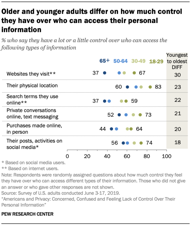
This data presentation is about what people belonging to different age groups have to say about how much control they have over who can access their personal information. It has been taken from a survey of US adults conducted by Pew Research Center in 2019. 

The wordings used are not too domain specific and are easy to follow. This data presentation is intended for those who are interested to know more about where people stand when it comes to data privacy.

The goal of this presentation is to outline that older and younger people differ when asked about how much control they have over who can access their personal information. The people belonging to 65+ age group feel that they have little control, while people belonging to the 18-29 age group feel relatively more in control.  

The choice of using the different data categories on the y-axis makes the graph more readable. The point that the author wants to make is highlighted in the heading, which makes it very clear. The column in the gray which gives the difference between the youngest and the oldest age groups is very instrumental in backing the point made at the top. 

The presentation is effective but it can be improved further. Instead of using points, if a multi-category bar chart was used, it would make the graph easier to read. This would also eliminate the need of the column on the right. Additionally, the X-axis scale is a bit confusing. It hasn’t been clearly mentioned if the scale indicates the percentage of people who say or the percentage of people who say they don’t have control over who can access their data. 

Homelessness in King County, WA

link here

All Home King County is the Seattle/King County Continuum of Care (CoC), which is the designation of local homeless housing task forces across the United States. They are therefore the body that coordinates and implements the regional programs targeting the homeless crisis. The visualization is a part of their online dashboard presenting data that represents the response system implemented in the County.

In this visualization, All Home is sharing demographic information on those who are accessing services as of the end of October of last year. It includes an overall count (13,003 households experiencing homelessness) and then proportions representing their status (sheltered/unsheltered/unknown), their population category (adults/families/youth), their veteran status, and their race/ethnicity vis a vis the general King County Population according to ACS 2017.

The dashboard and the data overall are part of a somewhat recent initiative to try and track more annually granular data on homelessness in the CoC, since federally mandated counts only happen nation-wide once a year. The audience is likely as much for the CoC themselves as it is for a somewhat informed public. In previous years, Seattle/King County had the 3rd largest homeless population in the country, and was under a lot of (reasonable) pressure to show positive results of programs. This dashboard is not only in part about accountability, it is also a means of sharing information and hopefully positive progress on the crisis at hand.

I think that this is a reasonably effective visualization, though I am slightly concerned with data freshness since it says it was last updated in October of last year. Though another tab on the page tracks the count of homeless individuals/households and how it changes over time, it does not show the same demographic breakdowns over time, which I think would be interesting though maybe less compelling.

Ebola vs Other Diseases

Data: The plot above is visualizing the relative mortality rate and contagiousness (R0) of various diseases by utilizing a simple and familiar scatter plot. Similarly simple, it further educates the public on primary transmission methods via color coding. As a an added aid the scatter plot is further partitioned and labeled into qualitative labels intended to help viewers confirm and internalize their intuition.

Audience: This is clearly intended for the general public. The details of the data have been abstracted down to what is familiar to a non-medical and reasonable educated viewer. If we consider the viewers most likely to view this plot, it is probably someone who is already aware of Ebola’s impact and is investigating further, so the level of detail is just right.

Goals: The image is trying to give the public a general understanding of the risks involved with ebola relative to other diseases with which they are likely more familiar. v

Effectiveness: Its a decently effective visualization overall however it could communicate its message more efficiently. Again, the message is clear and it answers all the question the public is likely to have, but the author could have used a few more visualization techniques to clean up the plot and highlight the most important information.

Note: The category block would not work when posting this so I’m unable to post this as a “viz reviews” category.

Analyzing Personal Contribution of The Beatles Members

Source: http://duelingdata.blogspot.com/2016/01/the-beatles.html

Recently, I have stumbled upon this great infographic analyzing the individual contribution of each of The Beatles members. It uses creative ways to communicate information in a clean and aesthetic fashion.

In the first graph, the author succeeds in explaining in an easy-to-understand presentation of the different songs that each member wrote with a few details about each song. The author uses a combination of (1) An silhouette of the author to identify him, (2) A color of the line to assign each song to its creator, (3) Location on the horizontal axis to represent year, (4) Location on the vertical axis to represent billboard rank, and (5) A color of the note to (also) represent the year. Five clear pieces on a single graph. The only thing that I would change in order to improve this format is to color the note (5) in the same color of the line, as coloring it according to the year doesn’t add any information and only causing confusion.

The third part, about the most common words, is a little stale to my taste. Beyond the notion that Love is the most common word, it’s hard to get any interesting insights from it.

The ending part is again clear and creative. I loved the heart sign to represent love songs, and it is easy to get a notion of the distribution for different members. The only improvement that I could suggest for this part is explaining the meaning of the horizontal line in the middle of each box, which, I can only guess, means average.

How Global Trade Runs on U.S. Dollars | WSJ

Youtube Video Link

Global Currency Trades for Various Currencies

The video uses the data shown in the image above to make the case that the US dollars is used in more global trades that any other currency, then it goes on to explain that because of that fact, almost all global trades technically touch US soil. That gives US a lot of power to enforce doing business in a way that is compliant with US laws.

This video is shared by the Wall Street Journal, so I believe that the target audience is probably just about everyone. However, it wouldn’t be far-fetched to say that its subscribers are likely left leaning, which would imply that maybe the content it releases is for slightly left-leaning individuals.

Overall, it appears to me that the goal is to show how much power US has and at the same time show that a growing number of countries are working to stop this kind of power that the US has. And to that, it’s up to the reader to form their opinions. If that is the goal, then I think this is effective. The video was very much leaning on an informational side, and so it let’s me make my own decisions about what I think should or shouldn’t happen.