Patricia’s Data Log 2/23

Chatting with People

I was in constant communication with people over WhatsApp and IMessage throughout the day, including sharing a playlist I made on Spotify with two people who then both used it to run – which I’m sure Spotify noticed. Around 2 I logged into the MyFitnessPal app to enter what I’d eaten in the day, and was prompted to allow location access, which I said yes to without thinking, and then immediately paused to wonder why a nutrition app needs my location – so I went back into my app settings and turned off its location access, but at that point it would’ve already located me at least once today. I also checked the weather app frequently, which tracks my location.

Moving Around Town

To start, I wear a Fitbit every day, so my walk to my friend’s home for breakfast, my run, and my errands were all tracked, along with my location and heart rate.
At 2:30 I went for a run, and using Strava to track the run which absolutely takes my location/ route and stats, and listened to a playlist on Spotify, which I always listen to when I run, and which I know Spotify stores the statistics on (my annual roundup of most listened to music on Spotify is always a carbon copy of my workout playlist). On the run, I would’ve been recorded on multiple cameras, as I ran by MIT’s campus and multiple banks and retail buildings.

Later in the day I walked to Whole Foods for a few ingredients for dinners for the week, and paid using my credit card, which allows Whole Foods to identify my and add my purchases to their profile on me.

Around 8pm I then realized that I needed quick oats for a cookie recipe, so I ran out to the convenience store on the corner, which has security cameras that recorded me, and where I paid for my purchases with my credit card.

Getting Online

I googled the results of the Nevada caucus in the morning, and then immediately followed that with a google about what the process of the Nevada caucus is, which other states have caucuses instead of primaries, and then what the schedule of the next few primaries/caucuses are.

I checked the Data Storytelling website midday, including logging into WordPress, to get a sense of how to write this blog post, and then logged into my Outlook email, which I’m sure Microsoft timestamped/recorded. I then logged into google calendar to add several events to my week based on emails I was checking.

While I was cooking dinner, I logged into my sister’s amazon prime account to watch a show, which would have logged what I watched and for how long, as well as possibly my location(?) – I’m fairly sure amazon must know it was me and not my sister. I then also looked up a recipe I was following on a blog, and then re-googled the Nevada caucus, and results were still being reported.

Other Things

I wear a Fitbit every day, so my walk to my friend’s home for breakfast, my run, and my errands were all tracked, along with my location and heart rate.
Understanding Homelessness

http://maps.sasaki.com/visualizations/homelessness/

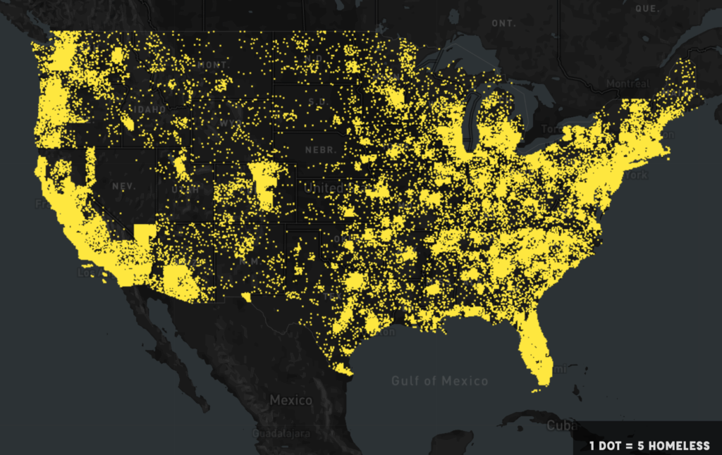
Map depicting every 5 homeless people as 1 dot.

This is an online interactive tool developed by Sasaki for understanding the homeless crisis in the US, which I recently saw presented by its creator, Gretchen Keillor . Relying on data from January 2015 where volunteers manually counted over 500,000 homeless, the project begins by representing every 5 homeless people as one dot and showing where they reside geographically.

The website the quickly turns control over to the user through a simple options panel of drop down menus at the left side of the page, which allow other information besides location to be represented on the map.

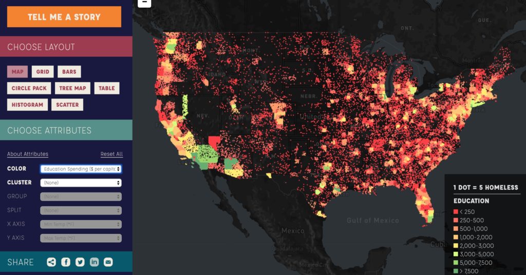
Map depicting overlap of educational spending and homeless.

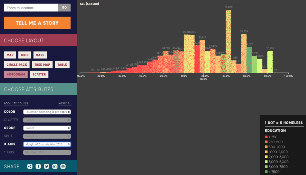
There are over 30 parameters associated with homelessness that can be overlaid onto the map, ranging from max and min temperatures, to per capital educational spending, to the margin of Barack Obama’s 2012 presidential win, to the per capita number of homeless bed available. As interesting as seeing how these different data points overlap is, the interface then goes a step further. Although it’s helpful to see how these things map geographically, it’s difficult to compare amounts when they’re represented as dots strewn across a map. For this reason, the menu to the left allows the user to then rearrange the dots into bar charts, scatter plots, grids, etc, while adding organizational layers like region, children v. adults, or bed types.

Histogram depicting homeless number as Y axis, margin of Obama’s victory as X axis, and dots colored by amount of per capital educational spending.
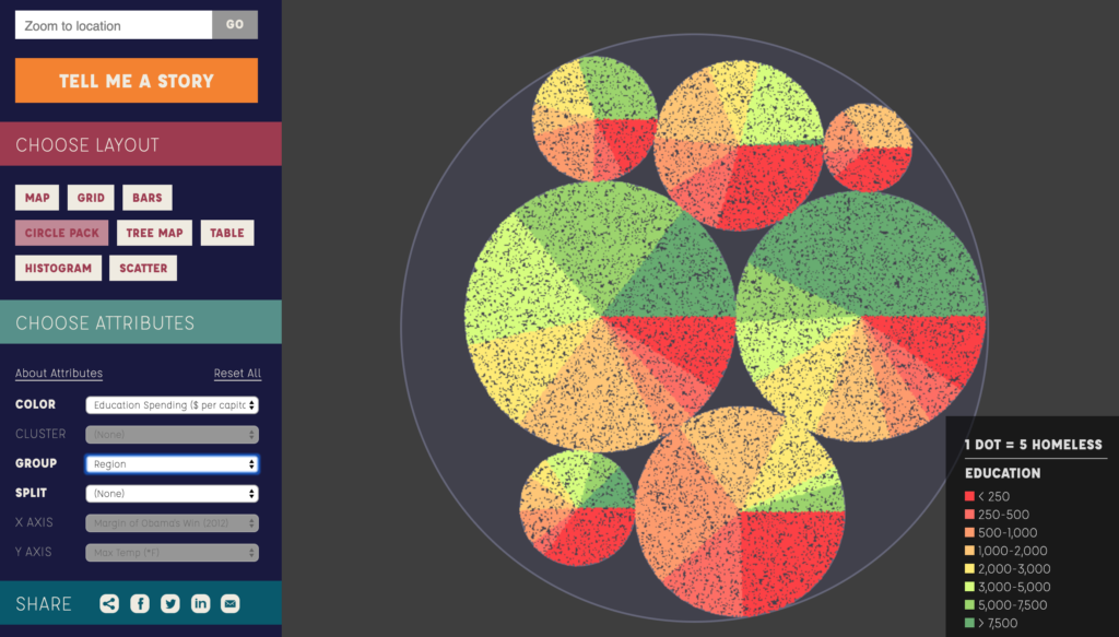
Circle pack graph representing where homeless reside by region as different circles, and colored by educational spending per capita.

The graphs generated by the user’s drop-down selections then allow the user to scroll over them in order to get labels about the groups represented, like region if the graph is organized that way, as is shown in the circle pack diagram above.

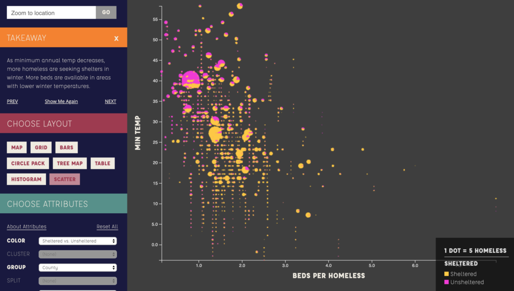
Finally, the interface includes a “tell me a story” option, where the data drop downs are turned off, and the user is led through one specific narrative, including small blurbs explaining the take-aways from each digital representation created.

Slide 3 in the “Tell Me a Story” option, showing how sheltered homeless coincides with minimum temperature.

I think the major success of this interface is that it allows interaction and exploration from users without showing any large statistics or numbers, relying entirely on the visuals to give impressions of relationships between parameters. In a way, however, this is also it’s greatest problem, as some visualizations generated are extremely difficult to gain intelligible findings from, and the user can easily become lost changing parameters and representation style without any meaningful understanding of what the dots zooming around and rearranging actually implies. Even the “Tell me a story” option fails to provide an actual narrative, instead simply making a few choices about which unrelated homeless stats to show. Additionally, by representing 5 homeless as 1 dot, and then allowing the dots to be moved off the map and into graphs, it’s relatively dehumanizing, as I personally quickly lose sight of the fact that each dot is 5 people.

Overall, I like this project, and think it serves as a good model for how to engage an audience in a particular problem, even if I wonder if the final result could have been more successful if the users had been given slightly less control.