Keep calm and drink more wine, unless you can’t!

The idea of this sculpture is to map the effect of climate change of wine production. The medium is a video in a wine store or a restaurant and the audience is people who visit this establishment. The goal of this video is to make people, who love wine aware of the fact that they might not have their favorite wine a few years down the line and encourage them to donate to causes which are fighting climate change.

As the average temperature has increased in the past half century viticulturists today are forced to harvest the grape crop much earlier than the ones from two generations ago did. It’s all good and well today because the grape crop is still being produced but there’s a scare that with increasing summer temperatures, in the distant future, regions around the world which are known for their wine won’t be able to produce any grape crop. One such region is Bordeaux!

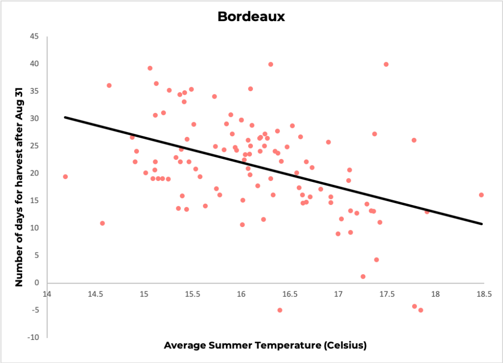
Viticulturists from Europe have maintained logs of harvest dates for the past 650 years [1]. A simple scatter plot shows that as the average summer temperature increases the harvest date gets nearer to August 31 (number of days for harvest after August 31 is used as a standard measure in this industry).

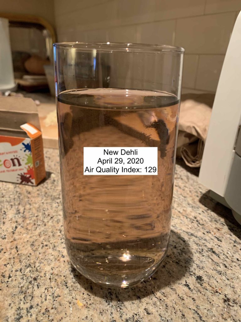
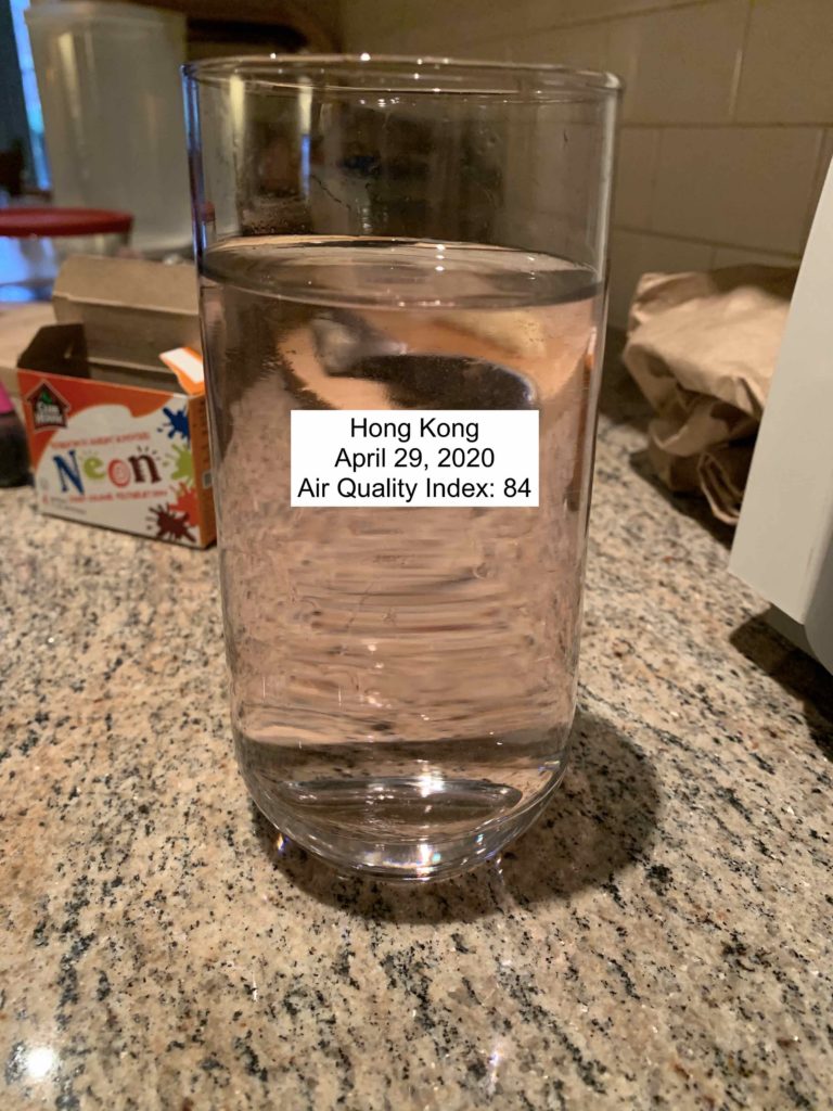
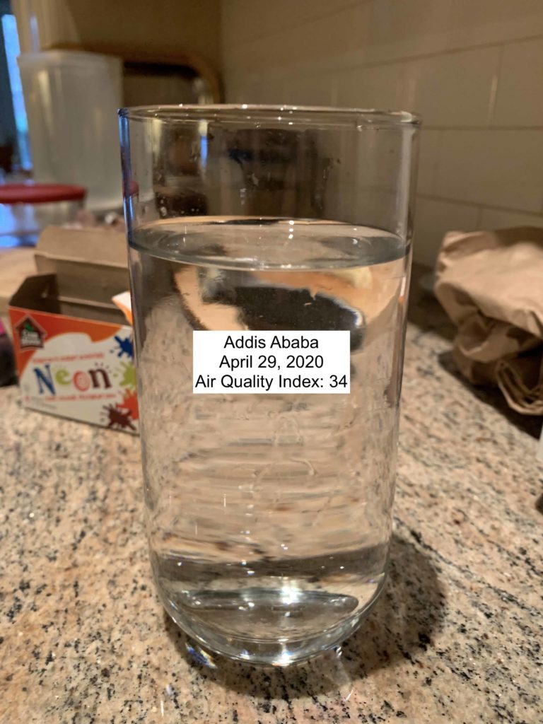
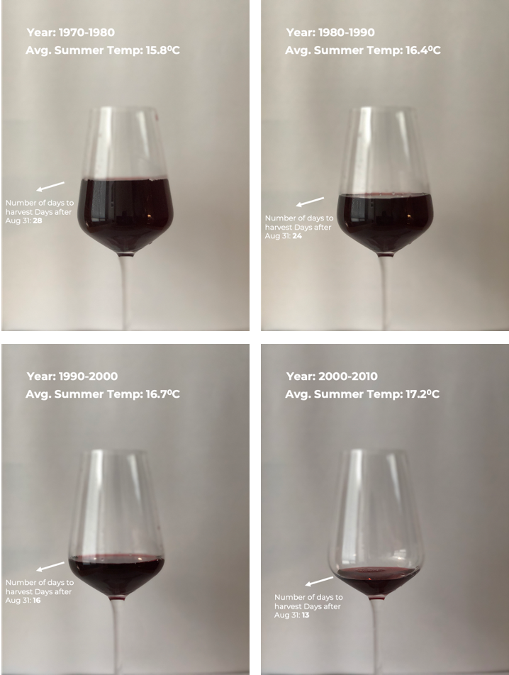
I used wine itself to represent this trend. The amount of wine in the glass is indicative of the harvest date. More the wine later the harvest date (which is better) and lesser the wine earlier the harvest date (which is bad).

The sketch below shows this trend for 4 different cases (values are averaged over 10 years to smoothen the values).

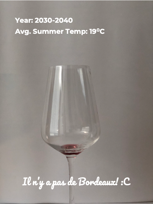
After showcasing this trend, the audience sees another glass which is empty. This represents the future, where the average summer temperatures have made it impossible to produce wine in Bordeaux (the data here is just a guess and lacks scientific backing). The audience will be asked to take an action (donate to a cause which fights climate change).

References:
[1] Daux, V., I. Garcia de Cortazar-Atauri, P. Yiou, I. Chuine, E. Garnier, E. Le Roy Ladurie, O. Mestre, and J. Tardaguila. 2011. An open-database of Grape Harvest dates for climate research: data description and quality assessment. Climate of the Past, Vol. 8, pp. 1403-1418, 2012 www.clim-past.net/8/1403/2012/ doi:10.5194/cp-8-1403-2012

Drink Your Pollution

I wanted to experiment with using water as a medium for data storytelling. In particular, I thought water could be an interesting way to tell data stories through other senses like taste and touch.

The dataset I’m using is the air World Air Quality Index Project dataset. In the original data story I worked on, we tried to make pollution tangible by showing it through video filters. In the same vein, I wanted to show air pollution by mixing food coloring and water according to how much pollution is in the air at a given place and time.

The audience of the data story would select a time and location and then drink the water associated with that air quality index reading. Potentially this could be used to compare between places or a single place over time. I think the latter would be more effective because you could “drink” the air of your home 100 years ago to feel the difference.

Since the video filters were originally a data story for GreenPeace, this could be an in person component of this campaign for canvassers to use. The feeling associated with drinking murky water would hopefully help create an emotional response to poor air quality and generate support for the fight to reduce air pollution.

Global Air Quality

Data Source

This data sculpture uses the global air quality dataset (https://aqicn.org/data-platform/register/), showing daily air quality readings in cities around the world. In particular, high concentrations of PM2.5, or small particles less than 2.5 microns in diameter, are known to have a number of health effects and are a common indicator of air quality.

Audience

The intended audience would be for a group of kids or students, either in a classroom setting or somewhere public (like in a museum) where many students would be able to interact with the exhibit.

Concept

In our previous participatory sketch using the air quality data set, we wanted the audience to be able to place themselves in the data by picking where they live or a location of their choice to compare air quality data. In this sketch, we take this concept to a physical level by representing air quality on a physical globe.

Fingerprint mediums for different PM 2.5 concentrations.

Air quality is represented by the color of various fingerprint mediums ranging from white to black. The mediums are simply a mixture powders (cornstarch and graphite powder) to create various shades of grey, with darker colors representing worse air quality. For this sketch, I was only able to create three different shades, but a more fully developed idea could use more granular shades and possibly ink instead of powder. The idea is that students would look up the yearly average air quality for a specific location (e.g. their hometown), and then create a fingerprint on the globe using the corresponding color/shade.

Creating a dark fingerprint on the globe for an area with poor air quality.

If there is a large group of students or other audience members, they would choose various locations around the world, with some overlap. As the fingerprints grow, there is an effect of ‘smog’ covering the areas with poorer air quality, whereas locations with better air quality would not see much of a change. In an actual sculpture we would likely use a globe with less coloring so that the fingerprints stand out.

Possible effect of additional fingerprints covering the globe.

The eventual gray shading of areas with poorer air quality is an impactful effect and would hopefully help visualize the global impact of pollution. In addition, there is the effect of students feeling like they participated and left a part of themselves on the sculpture, so hopefully they feel that they may be able to make an impact on the solution.

Honeybee Population Decline

For my data sculpture I looked back at my project 3, in which we explored the honeybee data set. I was particularly struck by the “loss data,” which mapped the percentage of colonies that died off per year in each state. From our project I knew that over time the amount of honeybees dying every year has steadily increased, so I checked around the data to find a state that showed a particularly drastic increase in colony loss while also hosting a large amount of colonies. Lo and behold, Texas met these criteria.

I had a bottle of honey lying around (from a beekeeper friend back in Boston!) so I used the amount of honey left in the bottle to represent the amount of bees that survived each year. While this particular metric is fairly ambiguous and can’t necessarily be gleaned just from looking at the graphic, I feel like the overall narrative that bees are dying at an alarming rate is still conveyed.

After taking the three pictures of the honey I just threw them in Photoshop. I’m not particularly happy with the background and labels but I struggled to find ways to improve them without making the picture needlessly complicated. For instance, I thought about putting the actual loss percentages on each bottle along with the year, but without a text explanation of what the percentage means it was not very powerful. In the end I decided this simple design worked best.