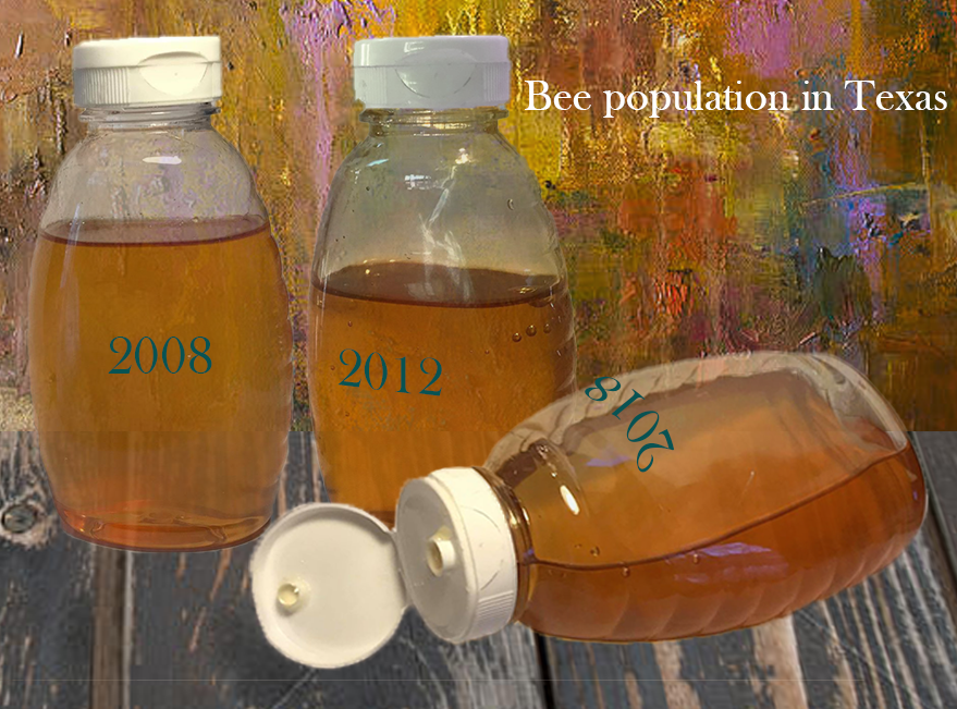
For my data sculpture I looked back at my project 3, in which we explored the honeybee data set. I was particularly struck by the “loss data,” which mapped the percentage of colonies that died off per year in each state. From our project I knew that over time the amount of honeybees dying every year has steadily increased, so I checked around the data to find a state that showed a particularly drastic increase in colony loss while also hosting a large amount of colonies. Lo and behold, Texas met these criteria.
I had a bottle of honey lying around (from a beekeeper friend back in Boston!) so I used the amount of honey left in the bottle to represent the amount of bees that survived each year. While this particular metric is fairly ambiguous and can’t necessarily be gleaned just from looking at the graphic, I feel like the overall narrative that bees are dying at an alarming rate is still conveyed.
After taking the three pictures of the honey I just threw them in Photoshop. I’m not particularly happy with the background and labels but I struggled to find ways to improve them without making the picture needlessly complicated. For instance, I thought about putting the actual loss percentages on each bottle along with the year, but without a text explanation of what the percentage means it was not very powerful. In the end I decided this simple design worked best.