Using data for vehicles from the U.S. Department of Energy’s Fuel Economy measurements, I created a data sculpture to show the effect of air pollution on people’s vehicles.
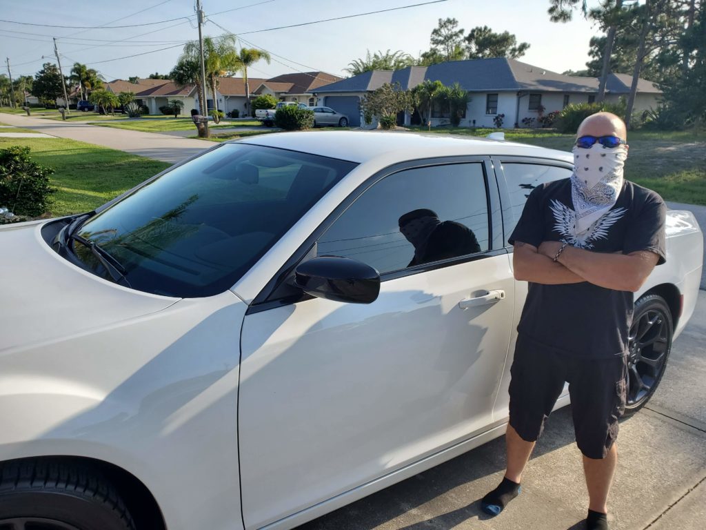
In order to present this data, I used different masks to restrict breathing that aligned with a vehicle’s air pollution score. The worse the car’s air pollution, the more restrictive the mask would be. The rating is on a scale from 1-10, (with the higher rating meaning less air pollution from the vehicle) so a rating of 10 would have no mask at all as compared to a 1 having a heavy duty mask. The reason why the mask is used to represent the air pollution score is so that way people would have more trouble breathing naturally, which would happen with more and more air pollution.
This would ideally be part of an exhibit, where people who take part are given a mask that corresponds with the rating of the vehicle they arrived in to the exhibit. They would have to walk around the exhibit, constantly aware of the toll their car is having on the environment. For a less active experience, this sculpture could be more static in an exhibit, showing what different masks would look like next to various types of vehicles.