Impact Assessment – Cars in Space

Project by: Cynthia Hua, Devin Zhang, Gaurav Patekar

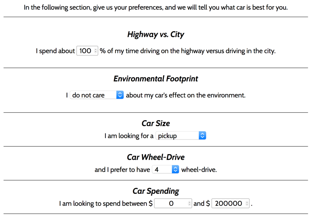
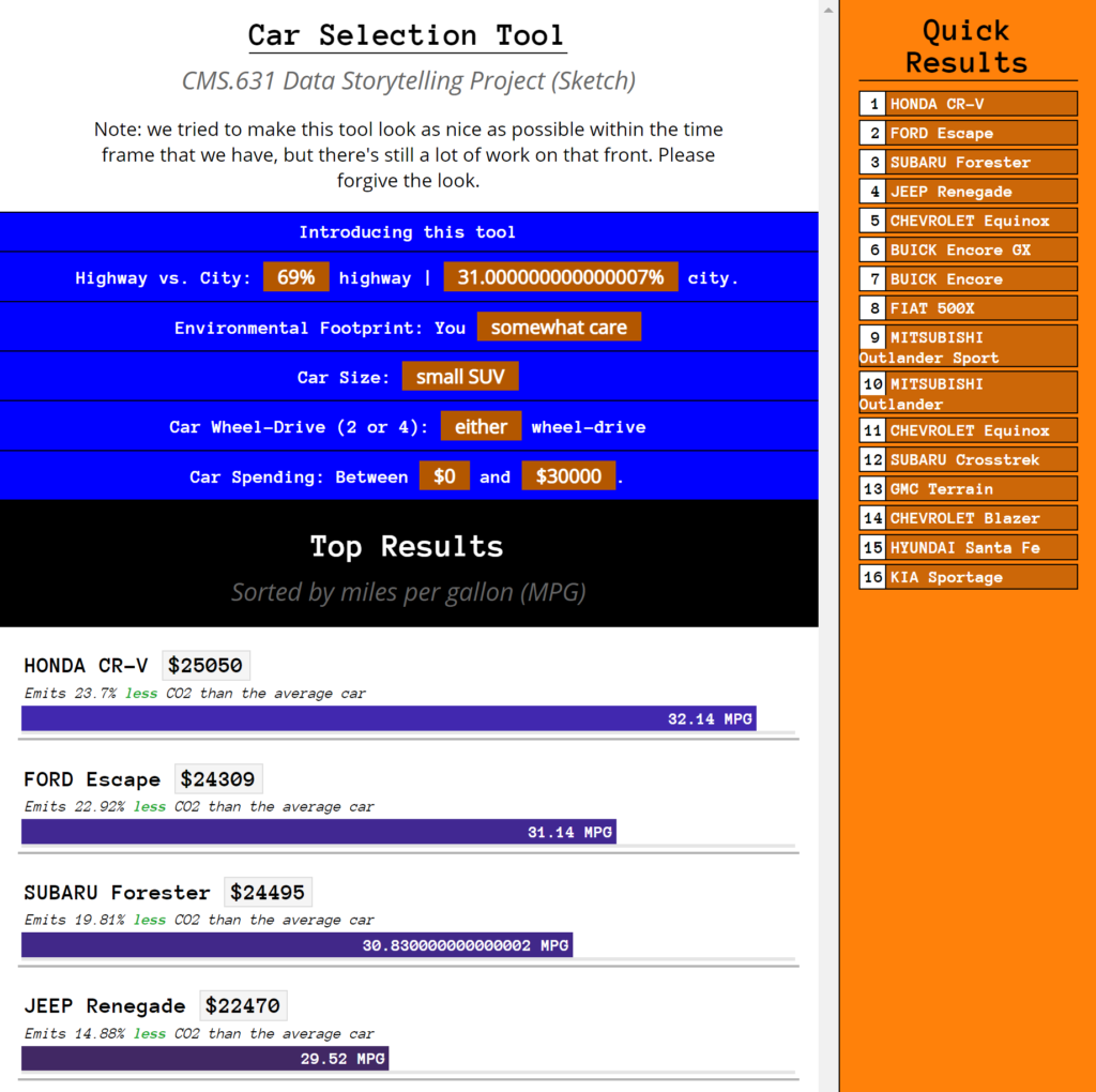
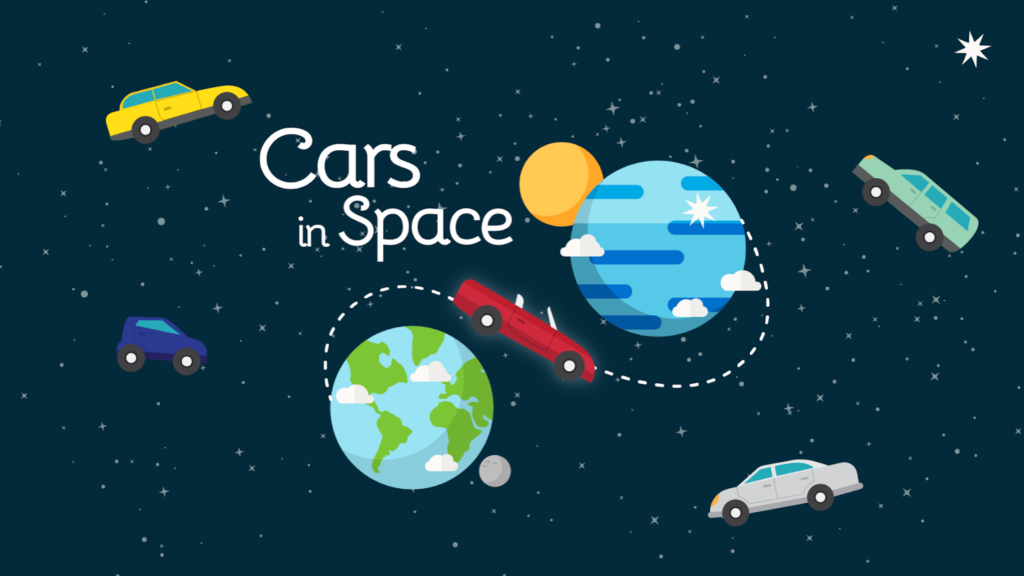
In the participatory game project, We created a web-game, Cars in Space!, to provide a fun and accessible educational experience on why and how to choose greener cars. We used the Environmental Protection Agency’s Fuel Economy Data which shows how fuel-efficient cars can produce drastically lower CO2 emissions, while also saving the driver money due to reduced gas costs. Link to the sketch: https://datastudio2020.datatherapy.org/2020/04/22/cars-in-space-a-data-game/

As the game was well fleshed out in terms of the game mechanics and visual style, we chose to keep it same as before. We shortened the original slide deck to include only the game screens and info on the game play to be shared with prospective users.

Audience:

Our target audience is young car buyers aged 18 – 40. This might include a college student buying a first car, a young professional buying a car for work or a parent buying a family car. We are interested in young buyers because we believe we can impact their car buying decisions over a lifetime by educating them early and because young people have the most cause to be invested in a cleaner environment. 

Goals:

Through a logic modeling exercise we mapped out activities, the output of the game as well as the desired short, mid and long term impact.

ActivitiesOutputShort Term ImpactMid Term ImpactLong Term Impact
Play car riding gameGet to do a fun activityFeel goodTell friends about the game 
Choose carsLearn about cars and pollutionAwareness of car pollution and car types  
Read popups about pollutionGet to know more about emissions, reiterated in the printable car buying guideTell others about car pollutionShare learnings with friends and family buying carsInternalize the learning about car types, sizes and pollution 
Read popups about upgradesGet to know various car names, reiterated in the printable car buying guide.Sense of wokeness  
Get a printable car buying guideGet to know how cars compare to each otherApply learnings to car buying decisionsApply learnings to car buying decisions 

Based on the impact we wanted to test, we chose to go with a semi-structured interview method as it would allow us to collect qualitative data that we could use to improve the game.

We spoke to 5 prospective users selected as per the audience criteria listed above (age 18-40, considering buying their first car). Since the game is not interactive at the moment, we felt it would better to give a brief run-through of the game to the users over a call, answer any doubts they have about the game and then proceed with the interview questions. We had a series of questions for the interview covering many of the impacts listed above. Each interview lasted about 15-40 minutes. Link to the questions and the interview data: https://docs.google.com/spreadsheets/d/1S_9dh0DbCIFlCNdDzhwzjlPcpD7DC_wTMml8Pa2RQlk/edit?usp=sharing

Feedback from the interviews:

We found that most of our users rely on online sources of information for car research along with personal experience in some cases. None of the users directly referred to the car fuel efficiency data from EPA.

Prior to the interview, the most important factors for the users were the price of the car, fuel costs along with environmental impact. When we asked the same question post-interview, the answers still remained similar, price and fuel costs were still the important factors but there was an increased awareness of the environmental impact.

While 3 out of 5 users said they would click on this game 2 users did not want to do that if the game appeared as an advertisement, all users were willing to play the game for 2 – 10 minutes, in terms of game enjoyment, for the majority of the users it was conditional on how the final game would look and feel and the complexity of the gameplay. All the users were able to understand the game and gameplay after the initial run-through.

We got valuable feedback about if the users found the information useful and if it would be helpful to them in their car buying decision. The majority of the users found the information about CO2 emission new and educational. There was feedback from one user about the information being too simple. One of the users mentioned how they don’t really know what to make of the numbers as they seem to abstract to them and suggested contextualizing the numbers through the number of trees burnt or breathing problems developed through deterioration in air quality.

While some users were able to relate the cars in the game to real-life cars, some users found it difficult because of the cartoonish style of the graphics and mentioned how the style gives them the impression that the game is meant for a younger audience.

Users in general found the popups in the game informative, some of the users suggested making the popups shorter or make the key piece of imfromation stand out better as currently there is a lot of text in the game.

Users saw value in the car buying guide at the end of the game. Some of the users said they would prefer an image they can share on social media instead of printing the guide.

In terms of additional inputs, users asked for additional levels of complexity in the game to keep them engaged, there were recommendations for periodically updating the game with data for newly released cars, including information about the longevity of cars, carbon emissions from the car manufacturing process and the impact of using alternate fuels

Air Pollution Video Filter Campaign

Team: Josh Feldman, Samra Lakew, Neil Pendse

Initial Iteration: https://datastudio2020.datatherapy.org/2020/04/22/data-story-telling-studio-sketch-3-air-filters/

Changes in this iteration:

Based off the feedback we received from the class in our initial iteration, we changed the following in our data story:

  • We removed references to changes in air pollution caused by the coronavirus in order to simplify the design
  • We heard that the scrolling to see different time periods was confusing, so we removed that feature.
  • We made the data story more interactive by only showing the clean air filter once the user signed up for the campaign
  • We added Greenpeace branding
  • We only map the air quality index to color and not to the width of the bar, since we heard that it wasn’t clear that the bar changed based on your location.

Audience:

Our audience remained the same. Our intended target audience is under 40 because they will have to live with the effects of poor air quality. If Greenpeace gains their ongoing support, it will ensure the continuity of our organization and movement. There is no specific region we are targeting with this campaign.

Goals

Our goals were to:

  1. Increase signatures for this Greenpeace campaign on clean air
  2. Engage our audience in the fight for clean air
  3. Increase support for Greenpeace

We based these goals off of our logic modelling exercise.

Test Plan

To evaluate our campaign, we made an online form where users would complete a pre-survey, try a static version of our data story, and complete a post survey.

Results

We received 20 responses to our survey. 95% of our respondents were between 20 and 30 years old, which is within our target audience. While we can make some tentative conclusions about how users in this age range respond to the data story, it is unclear how those under 20 or in their thirties will react to the campaign. While limited with respect to age, our sample covered a few different types of locations including Beijing, Singapore, New York, Los Angeles, New Delhi, and Cambridge (MA). 

Positive feedback:

  • 100% of respondents understood that it was a Greenpeace’s project
  • Positive impressions of Greenpeace grew from 17.6% to 70.6%
  • 94.1% of people said they had fun with the filter!
  • The proportion of people saying they were not likely to take action to improve air quality in their location dropped from 40% to 20% (though all of these people changed to the “somewhat likely” category)

These results suggest that our current iteration of the data story is improving millenial’s perception of Greenpeace and that they had fun with the filter. There was also some evidence that the data story made it more likely that our users will take action to reduce air pollution, but very few respondents were confident that they would do so. Ideally we would follow up with our users to see if their behaviour changed.

Negative feedback:

  • 58.8% of people were “somewhat likely” to share the filter 
  • Users did not change their opinion on the quality of air in their location
  • 64.7% said they would sign up for the newsletter. 

The negative feedback we observed in the surveys suggests that we need to learn more about why users don’t want to share the filter. It is also interesting that many users said they had fun with the filter and felt like the air quality in their area was poor, but didn’t sign up for the campaign. We need to learn more about the barriers preventing users from signing up for the campaign.

In the free text sections of the survey, we got the feedback that we should change some stylistic aspects of the filter:

  • “Simpler explanation for laymen”
  • “poop emojis in the filter were a bit excessive tbh”
  • “the filter should be more appalling”

This suggests that the playful tone we took might not be most effective for this subject. We should experiment with how users respond to a serious/appalling story in a medium that is typically light hearted.

Conclusions

  1. Our current iteration of the data story is improving millenial’s perception of Greenpeace
  2. Our audience is having fun with the video filters
  3. There is some suggestive evidence that our audience is being motivated to take action to fight air pollution – we should follow up on this.
  4. We need to learn more about why users don’t want to share the filter.
  5. We need to learn more about the barriers preventing users from signing up for the campaign.
  6. We should experiment with how users respond to a serious/appalling story in a medium that is typically light hearted.

A Better Tool to Narrow Down Your Car Purchasing Options

Tyler Millis, Robert M. Vunabandi

Background

              In our previous project, Fernanda Ferreira, Tyler Millis, and Robert M. Vunabandi created a tool to narrow down car choices based on user preferences. You can find more information in our previous blog post linked here and see our original tool pictured below.

Current Project

              Based on the feedback from last time, we overhauled the tool to make it easier to use and the results clearer. This involved walking the user through each preference and then showing the results both on the side and then as a bar graph below. Since we asked the user about their care for the environment and we wanted to make sure to highlight that in the results, we also now show how each car’s pollution relates to the average car’s pollution in order to give some reference. We also simplified the charts below our tool so it now details two environmental scores against car price instead of various charts with multiple encodings.

              Our audience for this tool was anyone looking to purchase a car. We envisioned this tool being useful whether you were anyone first-time buyer to a car enthusiast. Ideally, this tool would be used to help someone narrow down which cars they may want to purchase, but if they’ve already selected a few cars and were looking for detailed information, this tool might not be enough for them.

              We wanted to test two different types of goals. First, we wanted to test whether our tool made an impact on the user, such as increasing their knowledge on cars or making them think more about which factors they consider when buying a car. Second, we wanted to test the effectiveness of our tool, such as the ability to help users narrow down cars to buy or providing enough information to help them choose a vehicle. In order to test these goals, we created a survey where users would answer questions before viewing the tool and then see how their answers changed after the survey, as well as evaluating the tool generally. We initially planned to roll this survey out in the Class of 2020 Facebook page since a lot of students may be looking to buy cars soon, but realized such a post wouldn’t match the climate of posts happening currently. Instead we reached out to a variety of friends and family, some of whom are thinking of buying a car soon.

              You can view our tool here.

Feedback

              Our tool seemed to meet our goals, but there is room for improvement. For each of our questions on our survey, we used a 1 through 5 scale, with 1 being more negative, such as “Strongly Disagree,” and 5 being more positive, such as “Strongly Agree.” From our survey, we found that roughly a third of respondents’ understanding of cars increased by one point with the rest staying the same. Forty percent of users felt more confident in the factors they would consider when choosing which vehicle to buy, with an increase in anywhere from one to three points. Roughly twenty percent of respondents had an increased knowledge on cars’ impact on the environment after using the tool, whereas thirty percent felt their understanding had decreased. This was interesting to see, that users felt their understanding had decreased, but it is possible we made them question what they knew about the topic, otherwise we need to make our tool clearer in regards to the environment. In general, users found the tool helpful, thought it had the information to help them choose a vehicle, and thought it was effective, with only a few feeling more neutral or enthusiastic about these metrics.

              We also asked our testers about additional information we could provide in the tool and other changes we could make to make it more effective. Eighty percent of users offered additional metrics for cars that would be helpful. These included various features, such as safety, reliability, acceleration, pictures, used versus new, ratings, and more. Unfortunately, most of these were not offered in the data we were working with, but we agree that most of these would be useful to show, but we’d have to think more deeply about how to show so much data without overwhelming the user. Beyond these features, users also thought the UI could use some work. Some users found the colors and result updates distracting, whereas others thought the tool should be more mobile friendly. Some testers also thought that the graphs were intimidating or could use better transitioning, so we might want to think about how we can better simplify these graphs, provide other ways to show the data, or lead into the graphs better.

              Overall, we seemed to meet our goals of creating an effective tool and increasing user understanding of the material in our tool, but there is a variety of places we could work on to optimize these goals.

Economic Pollution

Sule Kahraman, Hamed Mounla, Sarah Mousa

The data says that correlations between economic growth rates and carbon emissions vary widely across country. We want to tell this story because it could undermine a key argument for non-restrictive emissions policies and drive greater policy actions towards curbing environmentally-harmful emissions. 

Original Post: The original blogpost we used for this assignment is on charting correlations between CO2 emissions and economic growth. Originally, that post was designed for a politically-influential audience; we suggested attendees of the Davos World Economic Forum since it uniquely gathers influential figures from around the world. The message of the visuals is that 1) economic growth is possible without dramatic increases in carbon footprints and that 2) policy actions can shape outcomes both in terms of growth and carbon emissions; or namely, that it is policies that dictate correlations between economic growth and carbon emissions.

Updated Presentation: We incorporated feedback recieved on that assignment with the main goal of enhancing the clarity of the visuals for the audience. Our study participants received this updated version of our presentation. In this version, we updated for clarity, with knowledge that audience members would interact with the visuals with no added explanations from our end. One important addition is a legend and key for our visual, to ensure that the symbols we used are understood. Additionally, we added messaging throughout the presentation, hinting towards our motivation and process for creating these visuals.

Our Audience Is: For this assignment, we needed to identify a different audience than originally intended (Davos participants), due to logistical constraints. We opted for members of the MIT Energy Conference – a local, student audience with interests in energy policy and who aspire to be influential in this field. We expect that this audience is somewhat knowledgable and opinionated regarding the topic, making them, like Davos participants, potentially more difficult to convince if they have opposing views. For those who already hold an opnion similar to our messaging, our project may simply serve as confirmation.

Our Goals Are: With this assignment, we wanted to test: 1) whether the message of the visualizations–that economic growth rates and CO2 emissions are not intrinsically highly correlated–is clear; 2) how audiences with different degrees of background knowledge; certainty in their opinions; and of diverse baseline opinions react to the message in terms of their opinions, and motivations to take any relevant action; and 3) what type of action, if any, did the visualization inspire.

Test Plan: In designing an assessment of the effects of the data visualizations, we opted to use a pre- and post-survey, consisting of questions that the recepient would answer before and after viewing the visualizations. Theoretically, the survey is underpinned by the assumption that 1) audiences viewing this have diverse knowledge, experience, and opinions on the topic at hand; and 2) individual perspectives impact the way that recepients understand and interpret the visualizations. In an attempt to identify how these factors may impact interpretation, in the pre-survey we ask the recepient to 1) self-rate their expertise on economic growth and climate change topics; 2) identify their prior opinion on the relationship between economic growth and climate change; and 3) rate their level of confidence in this opinion. We hypothesize that the visualizations may not be as effective for those highly confident in an opposing view; although it could convince those less confident in the same view, and it can serve as confirmation for those already in agreement. In additoin to asking for their opinion on the topic in the post-survey, the recepient has the opportunity to answer an open-ended question on how the visualization affected their views on the topic; and an additional open-ended question asking whether and what actions the visualization may have influenced. The open-ended questions leave room for more in-depth understanding of unanticipated effects of the visualization.

Results: 

Our test consisted of 5 participants.

  • Level of background: Participants self-reported background knowledge ranging from 4-7 on a scale of 1-10
  • Baseline Opinion: Most participants believed that the relationship between economic growth and carbon emissions is positive; a minority believed that there is no significant relationship. 
  • Level of Confidence: Participants were confident in their answers, and self-reported a confidence-level of 5-8 out of 10.
  • Impact on Opinion: No participants reported that they were un-affected by the presentation; they reported either that 1) their baseline opinion was confirmed; 2) their opinion was changed; 3) that they were now unsure and needed to conduct additional research; or 4) no change. The participants then explained further in the open-ended question–showing us that even for respondants who reportred a confirmed-opinion or no change, there was important changes in their thoughts on the underlying mechanisms between economic growth and CO2 emissions. For example, one respondant noted that: 

While there is still seems to be a positive relationship between economic growth rate and carbon emissions, the relative increase in the latter doesn’t necessarily have to scale linearly with the former. By pursuing environmentally-friendly policy initiatives, we can mitigate the environmental risk of economic growth.”

This important subtlty around the nature of the correlation and the underlying mechanism is at the core of our message, and appears to have been successfully communicated.

  • Action: Our presentation does not come with an explicit call to action–designed for influential policymakers, it is intended to inspire action with the scope of the professional work of the individual viewer. This audience is students, and we expected, at least, an interest in learning more about the topic. One participant did note this–“I looked more into how Sweden’s policies (and those of Scandinavia in general) have been able to mitigate its carbon footprint as it grows economically, as compared to the US and China.” For one participant, it prompted further digging into a tangential topic: “I am interested in how the after-effects of carbon footprint of large economic world players materializes most heavily on the poorest and most underdeveloped locations.” At the level of this particular audience, prompting further thinking on and research into a topic is an ideal action-based outcome.
  • Room for improvement: Our audience was left convinced that for some countries it is possible to achieve economic growth without a high level of carbon emissions; but they were left wondering exactly how this was done, and which policies created this effect. In a future opportunity to expand on this project, we would go further in identifying and demonstrating links between specific policy actions and emission outcomes in Sweden vs the US and China. 

5Boro Bouquet Feedback

by Xio Alvarez, Eileen Hu, and Olivia Yao

CONTEXT

Original Sketch

Intended Audience: New York City residents, tourists planning to go to NYC, flower enthusiasts

GOALS

Our goals in testing this sketch with its intended audience can be broken out into short, medium, and long-term goals.

Short Term: look appealing enough to engage organically, leave knowing more about the colors of flowering trees in the boroughs, and share the visualization with others

Medium Term: to promote inter-neighborhood travel and tourism around trees to see flowers, to avoid neighborhoods with high flowering rates when allergies are a concern, to visit NYC to see flowering trees

Long Term: increased citizen engagement/involvement in tree/flower planting in their own neighborhood, increase requests for tree planting through parks, public works projects, increased volunteer-ship in urban forestry and parks, increased pride in place/ownership of the neighborhood.

Our original test plan was to run a survey on the charts themselves through a google form (form found here) shared through our own social networks concurrently with a more in depth interview series with a few people walking through the sketch of the site as the original sketch intended the final product to be. By bifurcating our testing/interviewing processes, we hoped to get an understanding of the high-level readings of our graphics through the standalone surveys and a more in depth understanding of our audience’s needs in the visualization through the in-depth interviews.

FINDINGS

From our standalone survey, we found that, at the resolution that the sketch was rendered, we needed to provide more context in order for the visualization to be approachable. With the introduction of a bit more explanation, most respondents felt that they had learned something new from the charts, and expressed an interest in learning more about their city’s greenspace. Some comments we received were:

“it’s pretty! could you make the graphs look like flowers? That would maybe make it more shareable.” 

“i think the site made the charts more understandable but just looking at the charts alone, I was really confused at what I was looking at.”

This feedback tracked with what we heard in our in depth interviews. Some interviewees found the visualizations not technical enough and bemoaned the loss of data resolution in the representation, while others said the symbology could be leaned into further in order to be more approachable, making the graphs even more floral and introducing representative flower images. We also heard that we needed to provide more contextual information to introduce the dataset and the graphs before allowing people to explore the data through the graphs. Many said that pushing the visuals would make it more engaging, and we read from that the sense that the data alone might not bring people in. That said, most interviewees reported that they felt like they had learned something new by engaging with the visualization, either about trees or about the city.

Moving forward, we saw two areas for improvement — with the standalone charts, we thought it would be important to introduce a title and a questioning prompt in order to bring people in more directly, as well as adding flowers to contextualize the colors. With the interactive explorer, we would look to introduce more clear levels of reading into the visualization, with more depth and more clarifications of the data. One thing we heard in our interviews that we thought would be interesting to introduce was a map component, moving beyond neighborhood names to allow users to explore the data in a new way. In a later iteration of the project, we might consider also allowing users to switch between different graph types, using the radar graph flowers as a hook but giving users a more familiar way to explore the data.