The graphic shows the Iowa Caucus results that were last updated Feb. 6, 2020, 12:11 a.m. ET.
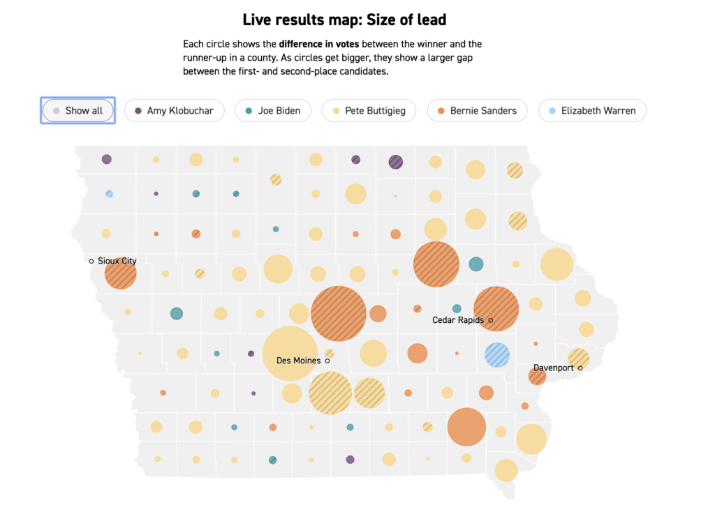
The aim of the graphic is to give details about how the candidates are doing in different parts of the state at the most recent count. I believe it is effectively showing the key areas are for specific candidates. It is slightly unclear who has an overall majority however the graphics are ordered with the candidate with the most votes showing first, but this is secondary to the bright pictures that show the spread over the state.
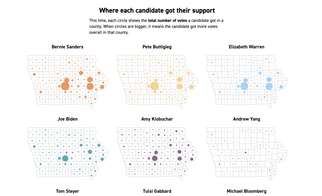
The audience is people who pay attention to politics, as people who don’t are likely to only read headlines and leaderboards, especially before the votes have been completely counted.
The interesting part about live-updating graphics is that they need to tell a story even as the data used is continuously changing. When choosing scales on static data, it is easier to select those which highlight specific points or accurately give the details required.
In this graphic, I presume that there is a ratio to translate the number of votes to circle size. It is possible that they used estimates of voter turnout to determine the ratio before results came in, in which case there is a secondary source of data that went into creating this graphic. If this is the case, choosing ratios too high would create circles that are too small and similar in size to be meaningful. Choosing a ratio too small would create circles that are too large and overlapping. On the other hand, if the ratio was dynamic, a person continuously checking the graphic could see changes that imply that candidates have lost/gained votes as the ratio adapts to the data.