Sketch 1 – Bluebikes

By Ife Ademolu-Odeneye, Josh Feldman and Tyler Millis

The data says that one singular bluebike (to be specific the bike with ID 218) has been used many times and covered many miles. We want to tell this story because people don’t realize how much impact each individual bluebike has. By revealing this information we hope that people will be encouraged to join the movement of people switching to bluebikes.

The StoryBoard of Our video

The target audience is Boston commuters in the age range of around 16 to 40 years old.

We chose this audience because knew we knew we wanted something climate-focused. Therefore we decided to target people who could possibly be regular users as this would have a greater environmental impact than occasional users who would only use the bike once.
We considered having our target be the city council or local government but we realized that the bikes are already there we just have to encourage more people to use them.
When we narrowed our age range of commuters down to 16-40 years, this allowed us to tap into an aesthetic that is typical of a younger audience, with simple colors and shapes.

Data sources

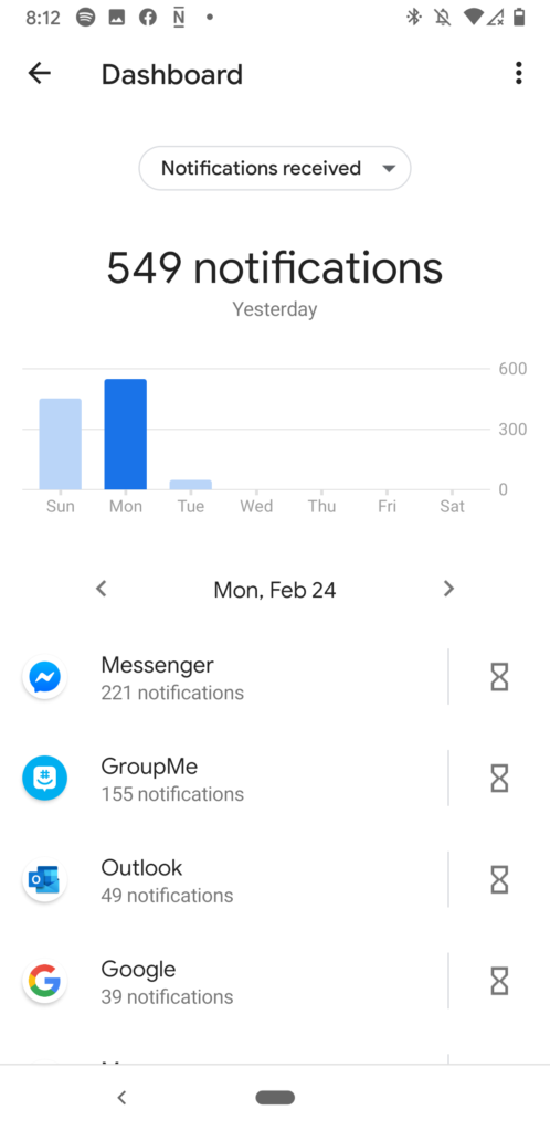
The majority of our data was collected by Blue Bikes themselves. From this data, we were able to pick one bike ID and look for all its occurrences in the data. We wanted to pick a bike that had travelled a typical number of miles for a bike that was at least 5 years old. We wanted the bike to be at least 5 years old because newer bikes would not have travelled as many miles, which would be a less compelling story and would artificially reduce the amount of carbon saved. We did this visually with Tableau. Using Tableau, we could filter by bike ID and then sum up different values and counts.
In order to make claims about the amount of carbon dioxide saved by using blue bikes we looked at how much the average car would produce if it traveled the same distance according to the United States Environmental Protection Agency.
To allow us to create a comparison to the energy created by houses we used data from the U.S. Energy Energy Information Administration.

Choices made

Using a video allows us to present the data sequentially in a way very clearly for the audience. In addition, it allows us to use audio to narrate our data creating a more immersive experience. We chose blue to be our theme color as we are aiming to get people to remember “bluebikes” and using their companies color would help get people to remember it.
Slide 15 shows a graph identical to slide 14 however flipped upside down. We chose to flip the chart in this way because we wanted the idea that “up” was good and “down” was bad in the quick change between the slides.
The setting of the interviews in slides 20 – 22 is a photo taken by Josh Feldman. We liked this location because you have the blue bikes directly opposite a gas station. Our idea would be to conduct the interviews at this location and possibly gets some video of people in the gas station to draw attention to it.

Script

Narrator This is bike No. 0218
This one bike that been ridden over 3400 times
And visited 236 amount of stops
It’s been ridden by everyone from a 17-year-old to a 76-year-old
In its 5 year lifetime, it traveled over 4000 miles
If the average car had traveled that distance it would have produced 1.6 million grams of CO^2
In comparison Bike 218 produced nothing

How could you have the same impact as BlueBiike has?
Interviewee 1I could use no electricity at home for a week?
Interviewee 2
For a month
Interviewee 3For 2 weeks
NarratorWell, the real answer is 111 days.
111 days of complete darkness
Well that’s a lot of darkness 
Join the BlueBikes movement – the easiest way to fight climate change

Data Log – Ifeoluwapo Ademolu-Odeneye

I started my day in the Student Center, as I worked there overnight Sunday. The study space has tap access so every time I used the bathroom or filled up my water bottle I would use my ID giving location data and information about the usage of the space.

I bought a plane ticket. This is notoriously a process that takes a lot of data using cookies. I also bought this ticket after monitoring a price tracker with alerts for the last two months and waiting for the price to drop. I bought the ticket after receiving an alert e-mail and following the link in the e-mail so there is data given to google about how successful this service is. I also used my credit card to buy the ticket.

P-set printing, using the Athena system and my MIT ID

Overleaf – Writing in LaTex on an online editor meant constant data transfer. I also continually used google for help with the project I was working on.
Google Photos – I take pictures of notes etc. Google Photos has a feature that allows you to search your own photos using tags that they have given it using AI/Machine Learning. I would search my photos for words like “blackboard” to filter to the photos I had taken in class. When you make these searches the algorithm improves by looking at what you click after the search is completed.

I went to Dunkin to buy a bagel – used a debit card

While working, I used my phone continually. I would check my phone, group.me, Instagram, text, Snapchat – on all these apps they collect data on how long I use the app which buttons I press what I like what I don’t like.

Walked back to my dorm where I use my MIT ID to gain access.

Youtube – I use youtube to watch “comedy bites” – clips from tv shows compiled into smaller chunks because I don’t have time. Youtube is collecting data on what videos I watch all the way through vs when I choose another. They collect data on how long I watch an advert before I click “Skip Add”. They also let you up/down vote on adds to collect data on what you do and don’t like. I don’t click these but even refusing to participate is data.

I then went to class – I use paper to take notes so no data there but I do check my phone during class so the previous discussion continues

I attending a 6.036 (Intro to Machine Learning) LA meeting. Used Google Docs to give feedback on homework. I then helped at office hours for 6.036. There is a queue system where people go online ask for help and then I click a button to say I am currently giving them help. This collects data on how many people I help and how long it takes me to help a student. I also use a google form to check in and tell the staff that I turned up for my shift. We also use an online code editor which collects information on usage

I reported my weekly worked hours on ATLAS so I can get paid.

Online CrossWord Solving with friends – timing how long it takes me to complete the crossword.

In addition, Google Maps creates a map of where I’ve walked however I chose to not include this here for safety.

Politico – Iowa Caucus Results

The graphic shows the Iowa Caucus results that were last updated Feb. 6, 2020, 12:11 a.m. ET.

Source https://www.politico.com/2020-election/results/iowa/

The aim of the graphic is to give details about how the candidates are doing in different parts of the state at the most recent count.  I believe it is effectively showing the key areas are for specific candidates. It is slightly unclear who has an overall majority however the graphics are ordered with the candidate with the most votes showing first, but this is secondary to the bright pictures that show the spread over the state.

Source https://www.politico.com/2020-election/results/iowa/

The audience is people who pay attention to politics, as people who don’t are likely to only read headlines and leaderboards, especially before the votes have been completely counted.

The interesting part about live-updating graphics is that they need to tell a story even as the data used is continuously changing. When choosing scales on static data, it is easier to select those which highlight specific points or accurately give the details required.

In this graphic, I presume that there is a ratio to translate the number of votes to circle size. It is possible that they used estimates of voter turnout to determine the ratio before results came in, in which case there is a secondary source of data that went into creating this graphic. If this is the case, choosing ratios too high would create circles that are too small and similar in size to be meaningful. Choosing a ratio too small would create circles that are too large and overlapping. On the other hand, if the ratio was dynamic, a person continuously checking the graphic could see changes that imply that candidates have lost/gained votes as the ratio adapts to the data.